That’s how I wish it would lookIt’s 99.9% certain at this point. Cases already being produced:
View attachment 2529268
View attachment 2529272
Actual iPhone Pro body?
View attachment 2529269
From Majin Bu on X.
Got a tip for us?
Let us know
Become a MacRumors Supporter for $50/year with no ads, ability to filter front page stories, and private forums.
All 15 New iPhone 17 and iPhone 17 Pro Colors Revealed in Latest Leak
- Thread starter MacRumors
- Start date
- Sort by reaction score
You are using an out of date browser. It may not display this or other websites correctly.
You should upgrade or use an alternative browser.
You should upgrade or use an alternative browser.
Totally. I loved the metallic burnt orange iPod ShuffleFinally orange! 😍
I personally would prefer a darker more saturated "burnt" orange, but hey, at least a step in the right direction! 👍
Colorway is not an Apple term. Nike, Adidas, Levi’s all use the term to describe a color.
Sometimes those companies use it correctly. “Colorway” refers to a color scheme with two or more colors. Like a pair of shoes that is both black and blue. But more often I see it used simply as a substitute for the word “color”, which it isn’t.
What good are the colors if they have that hideous square on the back
I’m still hoping they pushed physics to its limits and created a seamless transition from aluminum to glass on the back panel cutout.
I would love if Apple bring Rose Gold back. That was my all time favorite color.Make a pink / rose gold Pro (or Air, I guess), it'll do numbers Tim I promise!
So the best thing we’re getting is an orange phone.
And the crowd goes mild.
And the crowd goes mild.
I don't recall Apple ever using the word colourway (although I could be wrong). It's predominantly a clothing and textile term, something that grew to mainstream use from the sneaker industry.Definitely not the only one.
It's nauseating Apple BS in one of its higher forms.
The camera bump will be there but the gradient rectangle wont; MacRumors doesn't even consistently show it on their mockups.What good are the colors if they have that hideous square on the back
I miss the alpine green when it was out.Please bring back the green.

This really doesn't match the camera lens ring that shows a more shiny metallic color. Hopefully it will be darker.
The rings usually match the color of the metal band around the phone, which is generally somewhat different from the color of the back side. I’d say they fit well enough:This really doesn't match the camera lens ring that shows a more shiny metallic color. Hopefully it will be darker.
For comparison, the Desert Titanium rings/band vs. back side:
Last edited:
I can deal with the camera the rectangle is a no go. Anytime there’s a MR article about the 17 pro I see it. Only time I haven’t is on 17 and 17 airThe camera bump will be there but the gradient rectangle wont; MacRumors doesn't even consistently show it on their mockups.
Switched to an S25 Plus from the 15 Pro in April but missing the iPhone tbh. May go for a Blue 17 Pro Max or even the Orange depending on the shade.
We’re going to have an absolutely massive camera island on the back of the pros that’s going to be whatever color you picked. Most cases don’t cover this part.I'm not even sure why we care about colors at all? From the front you don't see it, if you have a case you don't see it. So who is looking at the back of their naked phone?
The color has never been more relevant at least for the pros.
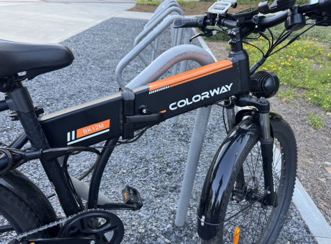
Haha. I just checked out their site — kinda weird to call the brand Colorway when their bikes are almost devoid of colour.
Dark Blue = Red Bull;As an F1 fan with a minor soft spot for McLaren, I have to say “Papaya rules.”
Papaya = McLaren.
Apple is going all in on this F1 thing. I dig it. 🤣
I haven't really cared until this point, but all of the sudden I am getting annoyed with Apple's colors. I mean, come on. Just pick a gray/dark, a blue, a green, a pink/purple, a silver/white and stick with it. Then have some type of special color each year...aqua, salmon, whatever. They tiny color tweaks here and there to mostly the same boring set of limited options doesn't work well for something as personal as phones. Laptops and iPads? Gray and silver, fine. But for phones, a little expansion in available colors and sticking with 4-5 base options y/y would be a welcome change in my book.
Register on MacRumors! This sidebar will go away, and you'll see fewer ads.


