Got a tip for us?
Let us know
Become a MacRumors Supporter for $50/year with no ads, ability to filter front page stories, and private forums.
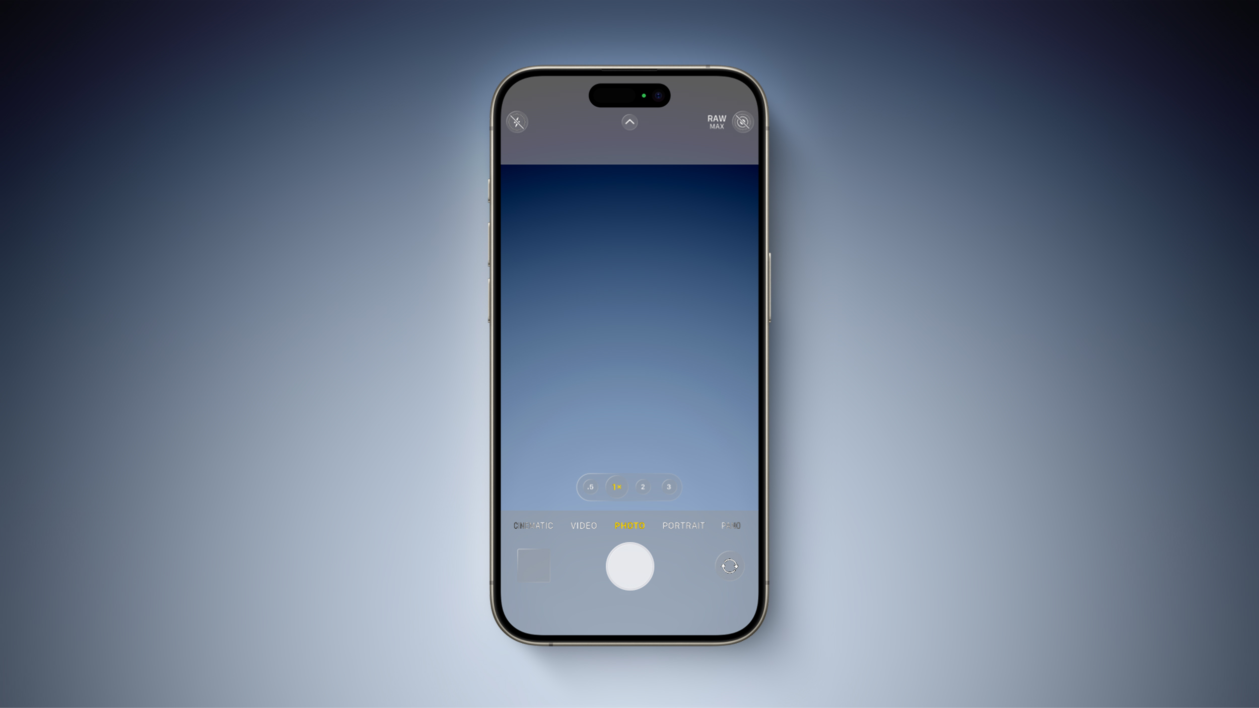
Alleged iOS 18 Design Resource Reveals visionOS-Like Redesign [Updated]
- Thread starter MacRumors
- Start date
- Sort by reaction score
You are using an out of date browser. It may not display this or other websites correctly.
You should upgrade or use an alternative browser.
You should upgrade or use an alternative browser.

I'm not opposed to a visual overhaul, but I wish they would just make better use of the existing space.
My Pixel 5 had a slightly smaller screen than my 15 Pro (6" vs 6.1") and yet it felt more spacious in so many ways.
More icons, more rows, widgets being more flexible in terms of scaleability etc
I like iOS in many ways, but it just feels rigid and inflexible in some ways that are no longer necessary. In more ways than one, Apple just needs to ease up on trying to control everything.
Lounge vibes 05
macrumors 603
The Department of Justice lawsuit is likely going to go on for years.But will it actually happen? Given the legal pressures from US DoJ and the EU, we may just end up with iOS 17.x but with better integrated third-party app and hardware access insteasd, so the UI changes plus AI may not occur until OS 19 in 2025.
And it’s very likely that iOS 18 is pretty far in the development cycle, wouldn’t even be surprised if they start compiling the first dev beta within the next month and a half or so.
Terrible terrible idea. Pagination gives each app a spatial location. I know a particular app is on page 2 row 3. For example. Can not do this with infinite scrollling. I and many others have frequently used apps i the same positions on different pages . Removing the concept of pages is a terrible UI idea Looks at all these websites that do it, it means you can no longer direct people to a reference on a page. You say something like go to the main page, keep scrolling , yeah, keep scrolling, instead of third article on page 3 or something similar. Im all for choice thiugh so make it an option but infinite scrolling sounds terrible. How do i get back to any position from a given position? I have to scroll up past each app instead of using pages.redesign the home screen
pagination still makes zero sense. just have infinite vertical scroll.
Ironically they have been making the scroll bars tinier and tinier with each os iteration so i guess they do t want us to scroll anyway
Mac Fly (film)
macrumors 68040
headlessmike
macrumors 68000
I thought this was a weird looking iPhone 4 at first glance.
coolfactor
macrumors G3
Rubbish. 50 shades of grey. Why is Apple determined to remove all contrast from iOS and MacOS?
We don't know what we don't know.
I agree with you, whites on greys would be a poor design approach, so let's hope that Apple agrees.
oneMadRssn
macrumors 603
I agree with everything you said.The last redesign of iOS was over a decade ago.
I am totally here for a refresh. Let’s bring a little bit of that skeuomorphism back! We’ve had this boring, basic flat look for way too long.
I still hold some resentment towards everyone who bitched so much about skeuomorphism. I liked it more.
People forget that the current general iOS look and feel dates back to iOS7 from 2013! The prior skeuomorphism-heavy UI lasted only ~6 years. For a bit more context on UI lifecycles, Ive's flat iOS design is 1.5x as old as Windows XP was when it was replaced and that was UI design language that almost everyone universally agrees lasted far too long should have been replaced long before it was. I think Ive's flat iOS design language is the Windows XP of Apple's OSs - wasn't very good to begin with, past it's welcome, and long overdue for a change.
I also really like how the visionOS design elements are a bit more skeuomorphic. It's not over the top - we're not going to get leather stitches in the notes app or a reel-to-reel spinner in the podcast app again, but there is something more tangible and 3D about it that I quite like as long as they nail the contrast and usability.
applefan8254
macrumors 6502a
cool. Can we get a guest mode like visionOS then? would prefer multiple user profiles, but if we could at least get a guest mode like visionOS has, that would be appreciated.
gatorvet96
macrumors 6502
ItchyRat2160
macrumors 6502
Dreadful design if true. The whole point of the VisionOS design is to be transparent because you need to be able to SEE THROUGH it because of the AR/XR nature of the product. That's not true of iPhone and grey-scaling the whole OS and decontrasting all of the design elements will make it ugly and much harder to use for many people. I really hope this isn't how iOS ends up looking but Apple make terrible design decisions all the time, so who can never be sure? ¯\_(ツ)_/¯
Last edited:
Everybody seems to hate this idea, but I’d be willing to try it so long as it were optional.redesign the home screen
pagination still makes zero sense. just have infinite vertical scroll.
Buttons with no outline are going to be a usability nightmare.
Don't know why everybody is begging for change just for change's sake. The UI as designed works just fine. If it ain't broke, don't fix it.
Don't know why everybody is begging for change just for change's sake. The UI as designed works just fine. If it ain't broke, don't fix it.
sdf
macrumors 6502a
If they do this (and I don't believe it) it'll be just part of Apple's UI cycle.Rubbish. 50 shades of grey. Why is Apple determined to remove all contrast from iOS and MacOS?
From System 6 to System 7 to Mac OS 8, from Aqua to Brushed Aluminium, this is just what Apple does. Sonoma has been my favorite design so far, getting really close to System 6's aesthetic, but even there they screwed with the menu bar and dropped control borders almost entirely.
n-evo
macrumors 68020
I resent the fact Apple went completely overboard with the skeuomorphism. That's what made people hate it after a while. Especially on macOS. To be honest I liked Mac OS X Panther's Aqua the most: it was clean, they ironed out most of the issues of previous versions and easy on the eyes. Especially with graphite appearance turned on. By the time Mac OS X Tiger was released the many window and toolbar button styles became an incoherent and inconsistent mess. They fixed that with Mac OS X Leopard, but there I really hated the brown/grey-ish window chrome and 3D Dock. With OS X Lion Apple fixed the window chrome color, but they went completely overboard with the skeuomorphism in apps like Contacts, Notes and whatnot.I still hold some resentment towards everyone who bitched so much about skeuomorphism. I liked it more.
thejadedmonkey
macrumors G3
Pagination provides a visual cue as to where the user is within a list. In an infinite list, there's no top or bottom, which makes identifying your location harder.redesign the home screen
pagination still makes zero sense. just have infinite vertical scroll.
Of course this is also the company that brought you the UI abomination called the dock, so it might happen.
Samplasion
macrumors 6502a
I totally agree. On the other hand, though, it did make for a nice surprise when I booted an app I made on my 13 mini for the first time and noticed it looked exactly the same as on the 13 Pro simulator, just smallerI just hope the new UI won't be less space efficient. I hate this trend that because screens are larger, UIs can waste more screen space when presenting data. Let us enjoy using our big phones to see more data on the screen at once!
MallardDuck
macrumors 68000
Oh please, no translucent controls, or for the love of God give us a way to turn it off.
MallardDuck
macrumors 68000
I absolutely detest infinite scroll. It makes it a massive pain to jump to the beginning or end of a page. one of the worst design patterns ever.redesign the home screen
pagination still makes zero sense. just have infinite vertical scroll.
Slix
macrumors 68000

Steve121178
macrumors 604
Apple doesn't 'do' major redesign. They do fragmented incremental updates, so not all portions of the OS & first party apps will be upgraded at once. It will be done over multiple years which is why iOS, iPadOS & macOS evolve at a snails pace.
dontwalkhand
macrumors 604
Samplasion
macrumors 6502a
Now I can't unsee it haha. It kinda looks like the glass phones from 2017 Nickelodeon shows.I thought this was a weird looking iPhone 4 at first glance.
scorpio vega
Suspended
Gross. Save that for lagdroid.redesign the home screen
pagination still makes zero sense. just have infinite vertical scroll.
Register on MacRumors! This sidebar will go away, and you'll see fewer ads.