Become a MacRumors Supporter for $50/year with no ads, ability to filter front page stories, and private forums.

honglong1976

macrumors 68000
Original poster
Jul 12, 2008
1,676
1,135
UK
Honestly, I don't think Apple has anything to worry about.

The new watches look absolutely awful!

I had an LG G Watch and Asus Zenwatch previously. I thought they were pretty good. Till I owned an Apple Watch. They are trying to be so much, they actually want to be a phone, rather than an extension of it, which the Apple Watch is. They are also humongous and look weird!

Anyone go from Android Wear to Apple Watch? Would you consider Android Wear again?
 
  • Like
Reactions: clauzzz203
They are horrible failures...DOA. Android Wear OEMs and Google are lost at the purpose of a smartwatch and what potential it holds.
 
  • Like
Reactions: jw5722
Future of smartwatches will be in fitness and health. Android Wear watches have horrible heart rate sensor...basically useless with any movement. I tried my brother's LG Urbane and its HR measurements were useless. Step counter was hit or miss.
 
I was an Android guy for years. Owned several android wear watches and Samsung both the Gear S2 to and S3 watches. None of them are any good. Apple doesn't have much to worry about.

Round is good but that's about it.
 
I was an Android guy for years. Owned several android wear watches and Samsung both the Gear S2 to and S3 watches. None of them are any good. Apple doesn't have much to worry about.

Round is good but that's about it.

This to me, is the most requested feature for the Apple Watch. I love the current design, but diversity is needed, being one size doesn't fit all. I'm not sure if Apple will expand on this, but I so see this being a strong possibility when the Apple Watch is completely overhauled, which could happen in 2018.
 
  • Like
Reactions: OllyW
Round = poor display of data. No round TV. No round smartphone. The only things that are round are analogs.

Android watches are unappealing to me because they're referencing mechanical watch aesthetics too literally thus ironically they're too skeuomorphic. Whereas the Apple Watch, like Apple Pencil, feels familiar and better thought through. Not sure what a round display would accomplish with list-based user interfaces.
 
  • Like
Reactions: BarracksSi and Thai
Round = poor display of data. No round TV. No round smartphone. The only things that are round are analogs.

It Has nothing to do with a poor display of data. Is everything to do with the practicality of displaying the data on the display and utilizing the full potential of the display, Which the Apple square design does not do.

You can't really compare a TV or smart phone to a watch. Because if that's your argument, other smart Watch manufacturers have already debunked that. Samsung has expanded the S3 display where everything can be displayed the Apple Watch can. Actually, the Apple Watch bezel restricts a lot of potential area for more information to be displayed, even more so On the 38 MM.

If you're questioning anything I'm posting. Look at the thread link I posted below and refer to post #214 (And page 9 for that matter) by Forum member KDarling. He knows exactly what he is talking about.

I personally have no desire for a round Apple Watch. But you are incorrect in some respects.

https://forums.macrumors.com/thread...r-design-changes.2025393/page-9#post-24156530
 
  • Like
Reactions: rjohnstone
It Has nothing to do with a poor display of data. Is everything to do with the practicality of displaying the data on the display and utilizing the full potential of the display, Which the Apple square design does not do.

You can't really compare a TV or smart phone to a watch. Because if that's your argument, other smart Watch manufacturers have already debunked that. Samsung has expanded the S3 display where everything can be displayed the Apple Watch can. Actually, the Apple Watch bezel restricts a lot of potential area for more information to be displayed, even more so On the 38 MM.

If you're questioning anything I'm posting. Look at the thread link I posted below and refer to post #214 (And page 9 for that matter) by Forum member KDarling. He knows exactly what he is talking about.

I personally have no desire for a round Apple Watch. But you are incorrect in some respects.

https://forums.macrumors.com/thread...r-design-changes.2025393/page-9#post-24156530

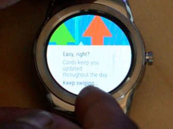
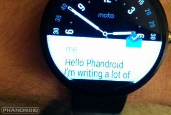
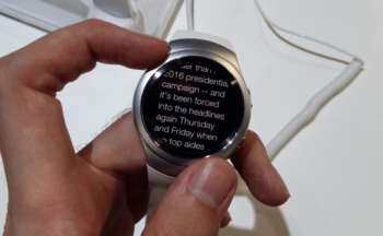
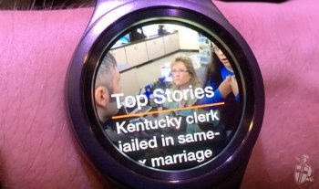
Have you used an Android Wear watch (that is round)? I have. Texts get cut off...the only full screen effect is in the middle of the watch. Now, there are some apps that manage the circle but then you have black bars or empty space on the sides.

Apple Watch bezel? The round watches have no bezel? Not sure about you, but there are PLENTY of bezels on most Android Wear devices (including the latest from LG)! How about flat-tire on many Android Wear watches...is that not a bezel too?

And see pics below...there HUGE empty spaces on the sides of a round watch that is nothing. And you're comparing that to the Apple Watch bezel?!

38mm Apple Watch data is scaled down, but not restricted.

Below are pics of various Android Wear and one Samsung S2. I particularly like the last picture..."Top Stories...." the cutoff basically changes the whole story! :D
 

Attachments

  • IMG_0238.JPG
    IMG_0238.JPG
    55.1 KB · Views: 229
  • IMG_0239.PNG
    IMG_0239.PNG
    310.4 KB · Views: 241
  • IMG_0240.PNG
    IMG_0240.PNG
    235.9 KB · Views: 298
  • IMG_0241.JPG
    IMG_0241.JPG
    58.3 KB · Views: 232
Last edited:
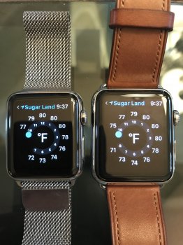
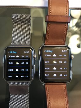
Below are two shots from my and wife's AW. Mine is 42mm, her's is 38mm.

Basically, seemingly, the 38mm shows slightly less height and width in data presentation but not noticeable unless side by side.
 

Attachments

  • FullSizeRender.jpg
    FullSizeRender.jpg
    2.4 MB · Views: 292
  • FullSizeRender 2.jpg
    FullSizeRender 2.jpg
    2.3 MB · Views: 290
Last edited:
The watch Style actually looks pretty hot
Really minimal and small, though they did axe some "important" things (subjective) to achieve this

such as key areas like NFC and GPS, and a heartrate sensor, but I wouldn't call them deal breakers, although I appreciate their presence
 
This is AccuWeather on Android Wear 2.0...notice that the two sides of the words are left blank to allow for data to be presented in the middle of display...so, in essence WASTED SPACE/BEZELS/PIXELS on the sides! And yet, you still have the cut-off phenomenon! And people here criticized Apple for the (minimal) bezels on the Apple Watch?!!
 

Attachments

  • IMG_0246.PNG
    IMG_0246.PNG
    21.2 KB · Views: 187
Android watches are unappealing to me because they're referencing mechanical watch aesthetics too literally thus ironically they're too skeuomorphic.

This !

As a traditional watch guy, I first thought the idea of a round smart watch was appealing and would look good - however this is NOT the way to do it - they even try to make the background on the watch face look like it has reflection of light? Wtf? I use an analogue watch face on my AW, but it isn't trying to fool anyone to think it's a normal watch

c61efd74-25ab-4a9c-89ea-6c298669f267.jpg

That looks like the Huwaei Smart Watch. Which is a very nice Watch as well.
 
The Huawei watch doesn't even have ambient light sensor (you have to adjust brightness manually). Talk about poor usability.

I can't speak any personal use with the Huawei Watch. I was commenting on how the hardware looks and the reviews have said the build quality is nice.
 
  • Like
Reactions: xDKP
That looks like the Huwaei Smart Watch. Which is a very nice Watch as well.

Might be a nice watch, and might have better watch faces than this, but they should stop trying so hard to make it look like a manual watch.. Again - I'm all for analogue faces, but they should embrace the fact that they are digital watches, and not look like they are embarrassed about it - this for example looks way better in my book.

complications-main-image.png


I for one, would LOVE this watch face - just replace steps with my activity rings (keep them white) and the right one the weather and buttom one calendar icon and time for next meeting.
 
Last edited:
  • Like
Reactions: 44267547
Might be a nice watch, and might have better watch faces than this, but they should stop trying so hard to make it look like a manual watch.. Again - I'm all for analogue faces, but they should embrace the fact that they are digital watches, and not look like they are embarrassed about it - this for example looks way better in my book.

complications-main-image.png


I for one, would LOVE this watch face - just replace steps with my activity rings (keep them white) and the right one the weather and buttom one calendar icon and time for next meeting.

Very simplistic and a clean interface. I agree as well.
 
I can't speak any personal use with the Huawei Watch. I was commenting on how the hardware looks and the reviews have said the build quality is nice.

OK outside appearance. The lug spacing is too narrow for a watch of its size IMO. You have to see one in real life to see it. There is a bezel around the display which makes swiping not smooth. Charging by lining up the pins on the underside. Pins are made of copper, which rusts. And what does our sweat do to metallic materials? Rust.

On the inside, it is a pretty cheap looking in construction and design: http://www.androidpolice.com/2015/0...aker-inside-it-but-it-doesnt-do-anything-yet/
 
I have LG Watch Urbane and it looks nice but haptic feedback is terrible. New Android Wear 2.0 OS does not look good with my Urbane. I stay with my AW!
 
Might be a nice watch, and might have better watch faces than this, but they should stop trying so hard to make it look like a manual watch.. Again - I'm all for analogue faces, but they should embrace the fact that they are digital watches, and not look like they are embarrassed about it - this for example looks way better in my book.

complications-main-image.png


I for one, would LOVE this watch face - just replace steps with my activity rings (keep them white) and the right one the weather and buttom one calendar icon and time for next meeting.

Again this is all a matter of opinion, and personal style. I happen to agree with you. But I've also seen some very cool skeuomorphic watch faces, which I might consider wearing as an option, about as much as I might consider wearing a Mickey Mouse watch face -- which is also essentially a skeuomorphic representation of timeless analogue watch face, but Apple nonetheless offers it. Moreover, I would never buy a gold iPhone, but Apple can't keep 'em in stock.

And that's really the point -- Android offers dozens of options for the customers and Apple offers about a dozen. Wether Huawei choses to advertise with that one skeuomorphic watch face or not, the Android customer can download a myriad of choices to pick from to match whatever style they prefer.
 
  • Like
Reactions: xDKP
Again this is all a matter of opinion, and personal style. I happen to agree with you. But I've also seen some very cool skeuomorphic watch faces, which I might consider wearing as an option, about as much as I might consider wearing a Mickey Mouse watch face -- which is also essentially a skeuomorphic representation of timeless analogue watch face, but Apple nonetheless offers it. Moreover, I would never buy a gold iPhone, but Apple can't keep 'em in stock.

And that's really the point -- Android offers dozens of options for the customers and Apple offers about a dozen. Wether Huawei choses to advertise with that one skeuomorphic watch face or not, the Android customer can download a myriad of choices to pick from to match whatever style they prefer.

Agreed - As much as I hate the Skeumophic faces, I really would love a whole lot more to choose from - there are just way too little watch faces - just the fact that a massive watchOS update like 3.0 only got a couple new ones, were a massive disappointment
 
  • Like
Reactions: petsk and 44267547
Agreed - As much as I hate the Skeumophic faces, I really would love a whole lot more to choose from - there are just way too little watch faces - just the fact that a massive watchOS update like 3.0 only got a couple new ones, were a massive disappointment

I didn't care for numerals or the Activity Watch face. I mentioned before in another thread to bullitmustang, I would really like to see Apple open third party Watch faces for developers.
 
  • Like
Reactions: xDKP
I didn't care for numerals or the Activity Watch face. I mentioned before in another thread to bullitmustang, I would really like to see Apple open third party Watch faces for developers.
Developers or at least somehow selected partners? Maybe a Super MARIO face (not for me but others?) and Nike faces for download when you install the running app? A Endomondo face? A cool couple of big brands could make a big difference
 
Register on MacRumors! This sidebar will go away, and you'll see fewer ads.