Become a MacRumors Supporter for $50/year with no ads, ability to filter front page stories, and private forums.

Alex Crane

macrumors member
Original poster
Jul 8, 2013
84
15
Moscow, Russia
Hello there.

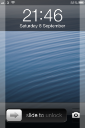
I think this little arrow is most conspicuous element in beta 4.

I don`t like the little arrow afore "slide to unlock". Home screen became asymmetrical.

IMG_1684.PNG

Users which used iPhone before iOS7 shouldn`t have unlock problems at all.

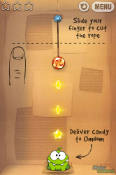
For the new users Apple should implement some kind of "tutorial mode" like it done in the "Cut the rope" game.
499866-cut-the-rope-iphone-screenshot-level-1-1-the-first-few-levels.png

Once user does the action right, the tutorial tips stops showing. I think it would be nice and cool.

What you think?
 
I personally think it looks terrible; although, I see why they went that route..

I'm not gonna let it ruin my day, though :cool:
 
Hello there.

I think this little arrow is most conspicuous element in beta 4.

I don`t like the little arrow afore "slide to unlock". Home screen became asymmetrical.


Users which used iPhone before iOS7 shouldn`t have unlock problems at all.

For the new users Apple should implement some kind of "tutorial mode" like it done in the "Cut the rope" game.


Once user does the action right, the tutorial tips stops showing. I think it would be nice and cool.

What you think?
No need. Arrow looks fine.

A base OS shouldn't need special instructions for such a mundane task, it should be intuitive. If it does need special instructions, Apple's HFE guys failed.
 
Um.....tutorials are completely anti-HIG (Apple human interface guidelines). Tasks should be self-explanatory. If you need a tutorial to do something, it's probably too complex.
 
i don't care about the stripes above and below the corner (even though i hope they remove it)
but the arrow near "slide to unlock" it's little annoying :(
 
Um.....tutorials are completely anti-HIG (Apple human interface guidelines). Tasks should be self-explanatory. If you need a tutorial to do something, it's probably too complex.

Hmmm... Didn`t know that.

I was trying to imagine how it will be.

Mo1Tq3i.png

I`me sure that Apple designers will do better though =)))))) And hey, this will appear just once =)
 
Last edited:
Before: "It's not obvious how to unlock the phone! I handed my friend my phone with iOS 7 on it and he kept sliding up to unlock!"

After: "This new arrow is annoying."
 
I don't even really think it requires a tutorial. Even if you've never used an iPhone, you'll figure out how to unlock it.

It's not like it's hard to figure out.
 
I don't see any problem with it. Arrow is there to show you which direction to swipe (Trust me, when it wasn't, some people did try to swipe up to unlock) Looks nice and clean to me. Pretty self self-explanatory, the way it should be.
 
A base OS shouldn't need special instructions for such a mundane task, it should be intuitive. If it does need special instructions, Apple's HFE guys failed.

100% agree.

But now it`s asymmetrical :(

AIhpUkm.png

Lock screen is the face of iOS along with SpringBoard. It must be PERFECT! There must be another way.
 
Last edited:
100% agree.

But now it`s asymmetrical :(

View attachment 425513

Lock screen is the face of iOS along with SpringBoard. It must be PERFECT! There must be another way.

Does it really matter. They might tweak it before the GM.

----------

Before: "It's not obvious how to unlock the phone! I handed my friend my phone with iOS 7 on it and he kept sliding up to unlock!"

After: "This new arrow is annoying."

People are never happy.
 
I just noticed that I don't look at the screen until its unlocked. Once I hit the home button, I just swipe without staring the the lockscreen. I guess it won't be a big deal for me.
 
It was added because so many people complained. Why people were swiping the other direction is beyond me!
 
Seriously how can a tiny arrow like that be annoying? What am I missing? :confused:
 
Register on MacRumors! This sidebar will go away, and you'll see fewer ads.