Become a MacRumors Supporter for $50/year with no ads, ability to filter front page stories, and private forums.
By the way, why we can`t unlock device in BOTH directions? I think it would be useful for left-handed people for example =)))

Just checked out, personally, I can unlock in both directions with the same comfort.
 
By the way, why we can`t unlock device in BOTH directions? I think it would be useful for left-handed people for example =)))

Just checked out, personally, I can unlock in both directions with the same comfort.

I actually thought it worked that way when I loaded up beta 1. It would have been great for all the left-handers.
 
No man, seriously! Why complicate things? And why is that Phone icon on the left side anyway? It will just confuse the already confused people.


Many of Android people not getting confused ;) (I`ve never used Android though.)

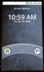
android-eclair-lock-screen.jpg
 
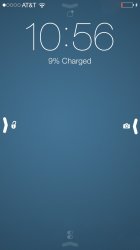
How about something like this?

With the icons up top and down below, you wouldn't even need the arrows, really.

I don't know. I'm not a fan of how "hard left" and "hard right" the unlock and camera are really.

I would hate designing for an overhaul for the iPhone. Those poor developers can never win...
 
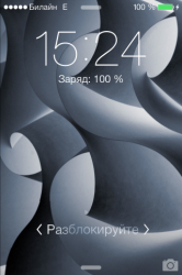
Try to tap the camera icon. See what`s happening? UI showing in which direction you should move it.

Now try to tap the "slide to unlock" text. See? The same thing. Along with "unlock in both directions", this asymmetric (I insist) arrow not needed.

----------

How about something like this?

It`s tooooo different (from iOS6) =)
 
Try to tap the camera icon. See what`s happening? UI showing in which direction you should move it.

Now try to tap the "slide to unlock" text. See? The same thing. Along with "unlock in both directions", this asymmetric (I insist) not needed.

----------


It`s tooooo different (from iOS6) =)

Like the rest of iOS 7.
 
i don't understand why so many of you think a little arrow is ugly. how long do you spend looking at your lock screen?

Ohh... Now I have iPhone 4, but when I get iPhone 5S with amazing parallax effect on a lock screen, I`ll spent hours there =))))
 
Hmmm... Didn`t know that.

I was trying to imagine how it will be.

View attachment 425509

I`me sure that Apple designers will do better though =)))))) And hey, this will appear just once =)

You think a giant man hand is better than a small arrow point? Good lord!

It doesn't really affect me at all. I hardly realized it was a change until some people got all aggravated about it. There are so many other things in my actual life that are more pressing and annoying than a little arrow.

But hey, down with Ive and his ******** arrow!
 
Like the rest of iOS 7.

Really? Maybe only visually. In fact all elements in 90% of cases on the same places. Have a look at Settings app, Phone app, Messages. All the elements have a new look, but on same places and behave the same way.
 
Register on MacRumors! This sidebar will go away, and you'll see fewer ads.