Become a MacRumors Supporter for $50/year with no ads, ability to filter front page stories, and private forums.
I find it a little too flashy for me in iOS. Like something you really like at first but quickly get tired of it. I found even with my iPhone 6 and especially with my iPhone 4S a noticeable increase in performance with it off. So I just turned it off.

In OS X its the same way but I don't notice any performance difference either way (some do especially 5k m290x owners) so I just leave it on. Its not quite as noticeable in OS X too IMO.

Regardless, don't like it? Turn it off. I did and I'm happier with it that way. I can always turn it back on.
 
Apple used transparency to make previous iOS devices struggle with it. Then they easily justify saying that iOS has become resource heavy and all our old hardware does not run smoothly due to it.

Transparency/Translucency is part of Apple's "Planned Obsolescence Strategy"

Close but not quite.

It's a strategy to keep all the cheap smartphones out there from being able to look and work like iPhones.

The idea is that if someone wants to really compete with Apple they need to dump a ton of money into the hardware to keep up. It's so Apple's competitor remains Samsung and doesn't become "and 50 small Chinese companies too."

Yes, this does have the result of making old iPhones obsolete. But that's clearly the side effect of what is a much more important reason. The gains of getting Apple customers to upgrade slightly faster is peanuts compared to the losses in Chinese sales if the iPhone is no longer unique.
 
To the OP: Under what circumstances is it supposed to make things harder to read? Do you mean when you pull up the settings menu or when you try and read the app titles along the bottom bar?

One example is the notifications screen in iOS. I have a plain black background. when I pull down, the text is hard to read (with transparency on) and the little "x" to dismiss them is very hard to see at all.
 
One example is the notifications screen in iOS. I have a plain black background. when I pull down, the text is hard to read (with transparency on) and the little "x" to dismiss them is very hard to see at all.

Something doesn't sound right. If I toggle Reduce Transparency on, I have a dark black background and bold white text. Very in your face.

If I toggle it off, I have a softer, medium grey background with still very white text. The "x's" are very easy to see. And my eyesight even with glasses is not great. Maybe there is a phone issue? :confused:

I have found stock iOS themed very nice for me--
 
One example is the notifications screen in iOS. I have a plain black background. when I pull down, the text is hard to read (with transparency on) and the little "x" to dismiss them is very hard to see at all.

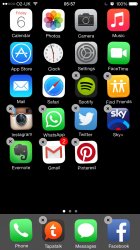
I agree the little 'x' is difficult to see with a plain black background but you generally know where they are in that window anyway in my experience. This can be rectified of course if it's an issue with a lighter wallpaper. I tested the theory.
ImageUploadedByTapatalk1425625538.490978.jpg
ImageUploadedByTapatalk1425625554.679987.jpg
 
I agree the little 'x' is difficult to see with a plain black background but you generally know where they are in that window anyway in my experience. This can be rectified of course if it's an issue with a lighter wallpaper. I tested the theory.
View attachment 533236
View attachment 533237

Exactly. Your notifications screen looks just like mine with transparency on and a dark background. But really, this is ridiculous! How is this good design? Dismissal icons (X) that can hardly been seen? Come on Jony!
 
I agree the little 'x' is difficult to see with a plain black background but you generally know where they are in that window anyway in my experience. This can be rectified of course if it's an issue with a lighter wallpaper. I tested the theory.
View attachment 533236
View attachment 533237

That's weird, my Notification screen is much softer than that. No bright colors as part of backround. And, the x's are easily visible. Not in your face, but no problem seeing them. :confused:
 
I can also see, upon experimenting, the x's can be more or less visible depending where the fall on the screen in relation to the backround color. But, I never have an issue seeing them. :)
 
I love it. But Apple has poor design thought and have gone overboard by using it everywhere. That is damn idiotic.

Imagine if transparency was not there on
1. Keyboard (Absolutely not needed. Implemented only to render old incapable devices to become obsolete)
2. Safari titlebar drop down menu (Not needed. Only Air 2 handles it without stutter)
3. Control and notification centre (Might be needed but can do without it)

Lag and stutter complaints would have reduced by 80%.

Completely agree. I love the translucency, it's a huge part of what makes me like the iOS 7+ design. However, like you said, they went way overboard, adding it into every little nook and cranny of the UI. It's insane.

Adding in that little drop down window in Safari when you tap the URL bar? Unnecessary. Translucency of keyboard? Unnecessary. Translucency of other window-menu like things (Seen in maps when you drop a pin, tapping the share button in safari, hitting the info button on a reminder you're editing, etc) is unnecessary as well. All those things cause such severe lag yet you barely EVER see the translucency effects of them because they put such a heavy white tint on them.

Plus, if you take those areas of translucency into context, the translucent share sheet and URL bar drop down menu, they appear in safari. Most all web pages are primarily white anyway, so the translucency is putting a huge unnecessary load on the system.

Same thing can be seen in the headers of settings and messages, for example. You know how scrolling in the wallpapers section of settings is stuttery? Probably is primarily caused by the blurring at the top of the screen (which you will barely notice at all). You know how messages sometimes stutters? The white bar at the top has translucency effects as well, causing strain. Combined with the translucent text entry box and the momentum-based bounce of the messages, it can be a lag fest on older devices. Take away the translucency of the header, take away the translucency of the text entry box, take away the translucency of the keyboard, and bam. You have an iPhone 4S running messages at 60FPS all the way through, and the UI looks almost identical.

I think sacrificing that little tiny bit of blue/green color you see in the keyboard when sending a message is perfectly fine to do if it makes the animation smoother. I mean, cmon. My mini 2 is a year old and simply sending messages often has quite a lot of stuttering to it. Turn on increase contrast and the animation is perfect, but everything looks almost exactly the same.

I don't think they should get rid of the blurring of CC/NC though. Those are probably the most awesome implementations of the translucency. Currently, their main issues are with the lockscreen, the keyboard, and open folders.

They could fix the lockscreen issue by making "Slide to Unlock" disappear AS SOON as NC/CC start to enter the screen.

They could fix the keyboard issue by removing the unnecessary transparency of the keyboard.

And for the folders, I'm not even sure. It seems that there is some sort of general inefficient code there, because on an iPad if you are in portrait, CC/NC lag with open folders but they aren't even blurring the folder. Just fading it in the background. Don't understand why CC/NC run smooth in, for example, safari tab view, blurring an already blurred scene, but it doesn't run smooth over folders.

Anyway, I think I'm finally done with that tangent. There's a lot of beauty to translucency, but it has to be used in moderation, and it has to be implemented carefully and intelligently.
 
Anyone else tired of Transparency?

That's weird, my Notification screen is much softer than that. No bright colors as part of backround. And, the x's are easily visible. Not in your face, but no problem seeing them. :confused:

I think the app icons down the right hand side of the screen have a part to play in the visibility on the notification screen. The darker the icons the more difficult it is to see the 'x's over the top I think. My screen brightness is set to about half or just under too.
 
I think the app icons down the right hand side of the screen have a part to play in the visibility on the notification screen. The darker the icons the more difficult it is to see the 'x's over the top I think. My screen brightness is set to about half or just under too.

Yes, in playing with it I did notice how the X's readability can vary. But, they are still always visible to me. I have always liked medium transparency on my phones. Just a matter of taste I guess. :)
 
Apple used transparency to make previous iOS devices struggle with it. Then they easily justify saying that iOS has become resource heavy and all our old hardware does not run smoothly due to it.

Transparency/Translucency is part of Apple's "Planned Obsolescence Strategy"

There is no such a strategy
 
How cute.

On a serious side, we all know that. But current stutter fest on iOS 8 leaves a lot to be desired.

Every time I'm reading about "stuttering" I just smile...
Btw, iOS 8 fluidity could be better, but that has nothing to do with an imaginary planned obsolescence. That's my point.
 
Every time I'm reading about "stuttering" I just smile...
Btw, iOS 8 fluidity could be better, but that has nothing to do with an imaginary planned obsolescence. That's my point.

I highly doubt that iOS 8 stutters a lot because of built in obsolesce. I've seen enough stuttering on Apple store iPhone 6's and friends and family's iPhone 6's - Apple would never purposefully attempt to make software run poorly on its brand new devices.

iOS 8 stuttering is due to the fact that a huge amount of effort went into the massive amount of new APIs and features that went into iOS 8 - it was probably more important that they had features working properly before they optimised other things like animations (though I feel that there is a lot of instability in iOS 8 apart from the stuttering). So basically I think, due to a really tight schedule, they just ran out of time to get iOS 8 as polished as it should be - lets not forget that they also took developers off iOS 8 to help finish Yosemite.

It is possible.

I don't know if you explanation about developers diverted to Yosemite is plausible. A company like Apple has plenty of resources to keep different teams on parallel working.
I just think iOS 8 was a big step in the right direction, not fully optimized, following another big step on the graphical side (iOS 7). Now they need to consolidate it.

https://www.macrumors.com/2014/05/01/wwdc-2014-os-x-focus/

It was widely reported that resources were moved. The same thing happened in 2013, where Apple moved OSX resources over to iOS to help finish iOS 7.

Its obviously not the only reason for the issues, but I would say that its one of the reasons that it hasn't been properly optimised.
 
Register on MacRumors! This sidebar will go away, and you'll see fewer ads.