+1
Sent an email to the developer, hopefully he could bring some changes to the app icon nevertheless this is an awesome app, hands down!
Hi there guys. Glad to see the feedback, it's really appreciated.
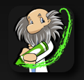
That said, a few things need to be mentioned. First off, the icons you are pointing to are not the actual icons on the device. These are the icons you get on the device itself:
and
Now, you may be wondering why i changed the icon. The reason for this was the *unending* stream of complaints i got about the old icon. Here are some interesting stats:
I never got any less than *5* emails a day complaining about the old icon. And usually the number of emails was much higher. My total number of icon complaints was over 5000 emails. *5000*. That was out of a total of 13000 personal emails i got form people asking me to change something in my app. So already, about 40% of the feedback was that hte icon sucked and that people wouldn't use my app because of it.
The feedback included the following issues:
1) people hated the inverted corners
2) people hated the red
3) people hated the lack of shinyness
4) people hated the 'pizza' on the front
5) people didn't understand what it was, or what it had to do with movies
6) people didn't like the graininess
7) the gold foil effect looked ugly and muddy
8) people thought it was sloppy that the film strip went outside the border
With that constant deluge of feedback, i decided that i'd had enough and that i'd wrk on something new. With the help of a designer we came up with the film strip ideal (after all, it's very iconic and representative of the movies). I also liked the idea of the countdown timer that you see at the beginnign of movies (also iconic). We put it all together and came up with several varieties that had plusses and minuses. I then put it up to a vote that i sent out to a thousand people that had given me *any* feedback. Of those people, 80% picked this icon. 15% were neutral, and 5% didn't like it. That was far better than the 40% feedback i was getting from people being negative about the old icon.
This variety was chosen because the other options looked too dark or too gray (i.e. they didn't have color), they didn't make sense (i.e. they had the number '5' in the middle which confused people).
Similarly, to keep with the new 'filmstrip+countdown' theme, i changed the background at launch to have the circle with the rotating 'radar' thingamajig.
Since making the change my complaint count has gone down to 1-2 complaints a *week*. (that's 1/5 the previous rate), and my download rate has gone up by 30%!!
So, while i recognize that some may not like the new icon, realize that the change was done on purpose, and that it seems to have been the right choice for my customers and for me.
Also, i hope that if you give it time it will grow on you. If you don't feel that it will, please petition apple to allow app authors to have multiple icons. I will happily provide the old icon again for people who still want it.
I think what i've learned from this is that you can never please everyone. (heck, i've gotten some complaints from people who like the new icon, but are upset that i didn't have it in the beginning!). And that any change you make will make some people upset and make them think that you had no reason for doing it. That couldn't be any further from the truth. I spend a ton of time working and tweaking on NowPlaying, and i only do things because i think it's worth it. Unfortunately, people only see the end result, and if they don't like it, they think it's a crap decision. I'd really like for people to consider that they are not my only customer, and that i have to deal with over 5 million people who all want different things.