Got a tip for us?
Let us know
Become a MacRumors Supporter for $50/year with no ads, ability to filter front page stories, and private forums.
App Store Connect App for Developers Gets Fresh Icon, New Features
- Thread starter MacRumors
- Start date
- Sort by reaction score
You are using an out of date browser. It may not display this or other websites correctly.
You should upgrade or use an alternative browser.
You should upgrade or use an alternative browser.
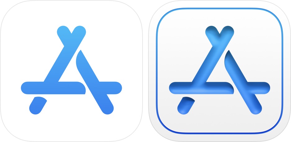
Very Big sur-esque expect iOS 15 to have icons that look exactly like this

Last edited:
I think it's kind of funny that my brain is stuck alternating between whether or not it's supposed to be a drop shadow and the icon part is cut out of the white, or it's under lighting on a rounded aqua-style icon.
It's just not all that great and definitely not well-considered.
It's just not all that great and definitely not well-considered.
I do like the outer thin frame. But the letter itself... I don’t even know if it is a carved inset or roundish dirty blue candy.Eesh, if I didn't know any better I would think the 'old' icon was the newer one... looks way cleaner.
On the feature set, wasn’t that possible already? Expire builds and making limited email lists was definitely possible.
Someone at Apple discovered the Inner Shadow FX in Photoshop. For their next trick they'll change the default values!
I really like skeuomorphism and preferred iOS with it - I’d welcome it back
The most important question is, of course, is the icon an innie or an outie?
iOS 15. Brought to you from Fisher-Price.
The icon makes no sense ... the white marks on the original were to depict shadows of the three bars overlapping, but now it’s a cut out of that... horrible
yeah, horrible.Whatever happened to the 'simplicity' mentality? I thought we went from these 3D lots of 'depth' icons to flat to make them cleaner and simplistic (flat)? Now we're going back to that? 🤔

New icon on the right
I like the new icon because it brings back some skeuomorphism. I wish it were even more skeuomorphic. I despise flat design. I am against a mid-point of semi-flat/semi-skeuomorphic. I want to see a return to full-blown Steve Jobs-era skeuomorphism. Skeuomorphism is about making things more intuitive and user-friendly. Jobs knew better than to copy Microsoft's user-unfreindly introduction of flat design.
The main problem with this new icon design is that it doesn't seem to understand / respect the original idea. The original "A" cleverly used a flat design to give the impression of three sticks being piled alternatingly on each other. The "negative space" has the blue background shine through, to give the impression of each stick casting a shadow on the one below.

Like it or not, it is actually a clever design: flat yet 3D. The Blue on White version (old version in this article) doesn't work any longer, because swapping colors removes the shadow logic, but I would still bye it as a means to link the two, yet have them be distinguished products.
But applying a 3D gradient to the "sticks" (whether that is supposed to cut out the shape or give the sticks a 3D shape) just doesn't make any sense. As if who ever did the new one did not understand the original design. Maybe it is time for a new icon area but then the designs should start from the original ruler, pen, brush icon and re-interpret it in whatever new approach is taken, instead of taken an interpretation and just apply some effect to it.
Last but not least - having grown up in East Germany, the App Store icon always reminded me wayyyy too much of the East German Flag:

Good old times ... good old times 😃
Like it or not, it is actually a clever design: flat yet 3D. The Blue on White version (old version in this article) doesn't work any longer, because swapping colors removes the shadow logic, but I would still bye it as a means to link the two, yet have them be distinguished products.
But applying a 3D gradient to the "sticks" (whether that is supposed to cut out the shape or give the sticks a 3D shape) just doesn't make any sense. As if who ever did the new one did not understand the original design. Maybe it is time for a new icon area but then the designs should start from the original ruler, pen, brush icon and re-interpret it in whatever new approach is taken, instead of taken an interpretation and just apply some effect to it.
Last but not least - having grown up in East Germany, the App Store icon always reminded me wayyyy too much of the East German Flag:
Good old times ... good old times 😃
Register on MacRumors! This sidebar will go away, and you'll see fewer ads.

