
Become a MacRumors Supporter for $50/year with no ads, ability to filter front page stories, and private forums.

Bash:
sudo mkdir -p /Library/Preferences/FeatureFlags/Domain && \
sudo defaults write /Library/Preferences/FeatureFlags/Domain/Wallpaper TahoeCombined -dict Enabled -bool true

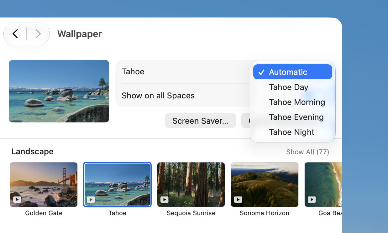
This command used to work just for Tahoe wallpapers, and you could add the GG ones, but it no longer works in Beta 6 because they incorporated the functionality into the main code path.
Thank you so much, finally the internet proves nice people still exisit 😁
 
  • Like
Reactions: Apple247
Yippee….more wallpapers.

In the meantime we can not set the finder window to the size that works for us and for it to be saved after a reboot. Have to resize it every time.

We also still don’t have a real click-through.
Almost doubling our mouse clicks on daily basis.
This coming from the company that pretends to be all about health.

But…we did get more wallpapers. Oh yeah!!!
 
I know there are some happy Mac users out there seeing aqua-esque traffic light buttons for the first time in like 15 years 🚥
Aqua was peak UX. I switched to Mac after using iPod Video and ITunes on XP to manage it along with my Shuffle. I was highly impressed with it, enough so that I requested a MacBook Pro 17” for college rather than a Windows PC.

The UX coupled with the switch to Intel made the switch a no-brainer. Oh how I wish I was old enough to invest in AAPL in 2006.
 
I am happy that after the hammering down of macOS UI and removing all personality from it, the Liquid Glass in 27 is looking very promising (the 26 implementation was bad with inconsistent layering, visual issues etc). If only Apple would now just Cmd-C/Cmd-V the aqua traffic light buttons from lion, I will be so happy.
 
Regarding the grey traffic light... I suspect that's how many drivers see the world... a "grey area"... they _could_ stop or they could go... it's up to them, rather than what is best for other drivers. 🤣
 
Speaking of the traffic light buttons, their ”click area” is one of the things I feel could be a bit larger compared to the windows their in. When in Windows 11 the larger size areas for the corresponding function is something I find quite nice whereas macOS often gives a little bit of friction when it comes to clicking the right button.

Just a thought…

As macOS becomes more touch-friendly, you'll see that type of dynamic touch target being adopted throughout the UI. That's exactly how the iOS keyboard works. It "learns" where you naturally tap a key, even if it's off-centre. When you do an auto-correction on a typed word, it updates the touch areas to correspond to the key(s) you originally intended to press.
 
It’s not new, it’s the grayed out option for when one of the buttons isn’t available (for instance, the zoom button on a fixed-size window)
Oh, I see. It’s a mockup showing a fourth button state. I mistakenly thought it was a screenshot showing some new window button layout.
 
It's a bit tough to show a photo of the Golden Gate (the expanse) without showing the bridge.
You can get nice views of most of the Golden Gate from slightly west of the bridge. There are views slightly higher than bridge level on the San Francisco side, and much higher from the headlands on the north side. If you are on a bicycle, you can access the western sidewalk of the bridge at certain times (mostly on weekends, limited on weekdays). Pedestrians are limited to the eastern sidewalk.
 
You can get nice views of most of the Golden Gate from slightly west of the bridge. There are views slightly higher than bridge level on the San Francisco side, and much higher from the headlands on the north side. If you are on a bicycle, you can access the western sidewalk of the bridge at certain times (mostly on weekends, limited on weekdays). Pedestrians are limited to the eastern sidewalk.
As (presumably) Guy de Maupassant used to say (not an exact quote!), "The only place I love to be in Paris is on the Eiffel Tower. Because one cannot see it from there."
 
As (presumably) Guy de Maupassant used to say (not an exact quote!), "The only place I love to be in Paris is on the Eiffel Tower. Because one cannot see it from there."
Yes, that is attributed to de Maupassant. And then there are those of us who would rather be at Tour Montparnasse, as one can see the Eiffel Tower but not that monstrous eyesore. 😀 And I would rather be where I can see the Golden Gate Bridge. But we are wandering far off topic....
 
As macOS becomes more touch-friendly, you'll see that type of dynamic touch target being adopted throughout the UI. That's exactly how the iOS keyboard works. It "learns" where you naturally tap a key, even if it's off-centre. When you do an auto-correction on a typed word, it updates the touch areas to correspond to the key(s) you originally intended to press.
It has bugged me since OS X Lion when they made the window controls smaller!
 
Register on MacRumors! This sidebar will go away, and you'll see fewer ads.