DickieSmith
macrumors member
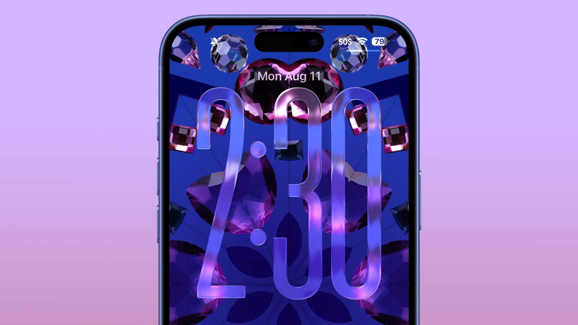
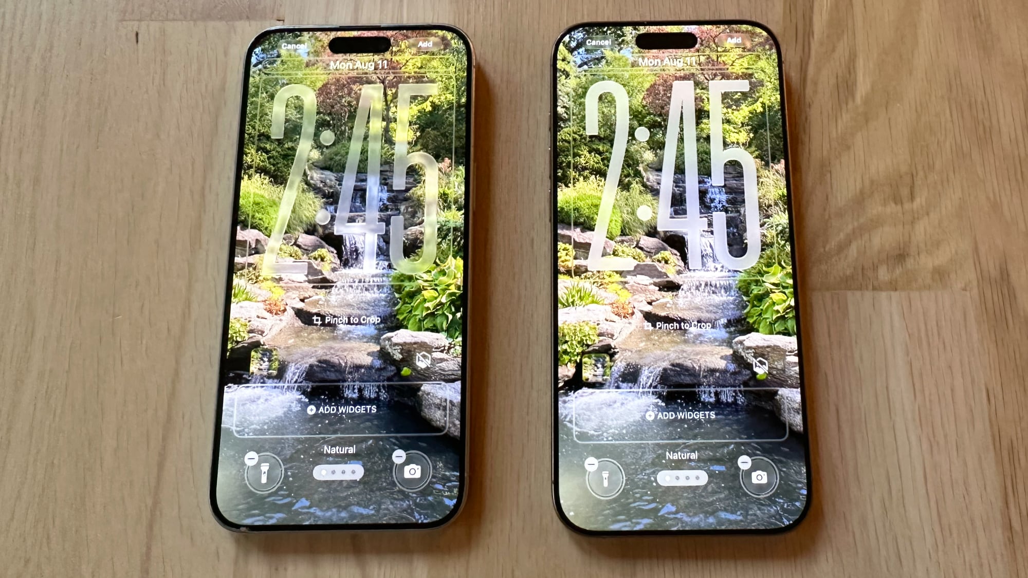
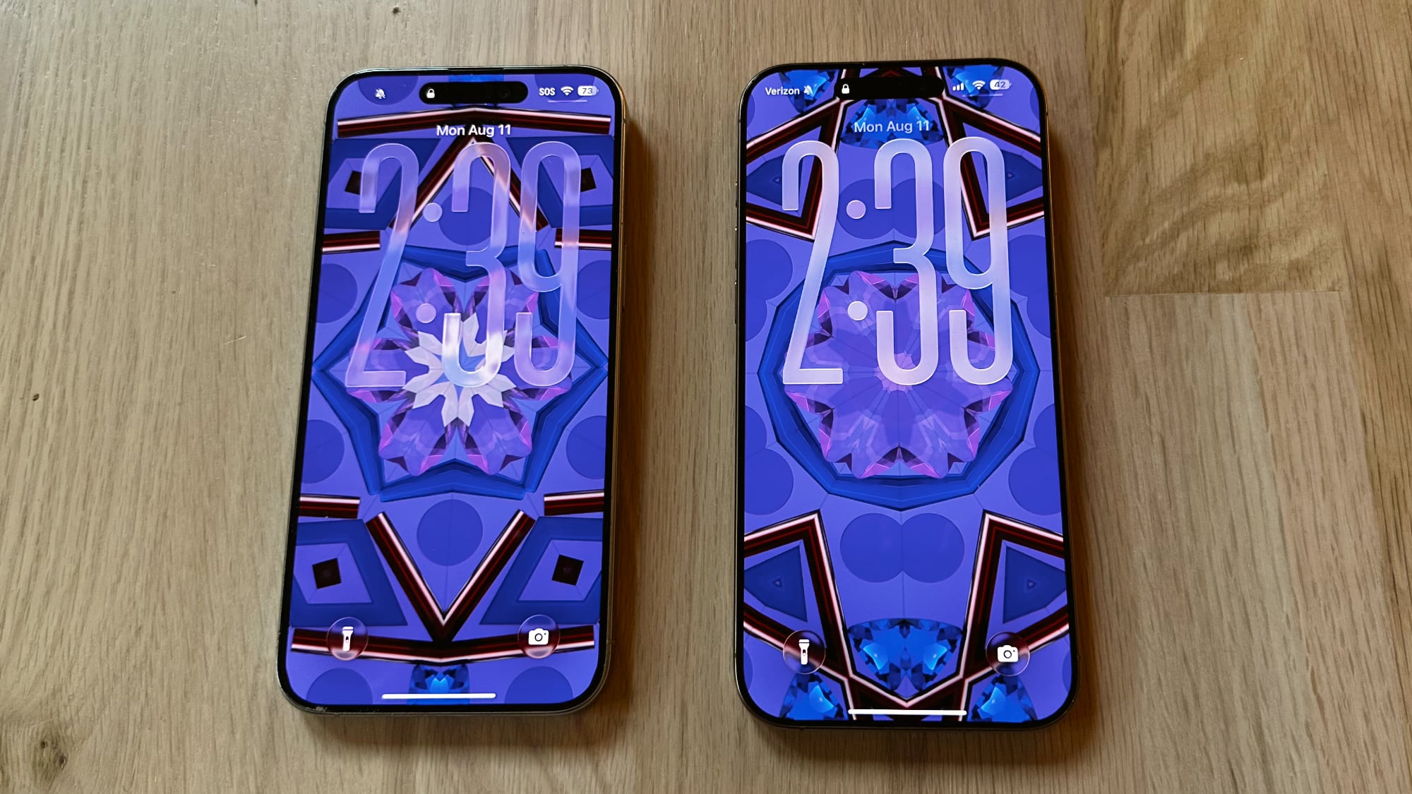
Crazy idea - how about an opacity slider when customising the lock or Home Screen.
They already have sliders to customise the Home Screen for the tinted icon aesthetic, is one more that lets those who struggle with transparency adjust the opacity to suit their preference really going to hurt?
They already have sliders to customise the Home Screen for the tinted icon aesthetic, is one more that lets those who struggle with transparency adjust the opacity to suit their preference really going to hurt?