Become a MacRumors Supporter for $50/year with no ads, ability to filter front page stories, and private forums.
It works for me, because I expect LEFT > RIGHT to be the order for “worse” and “better” …

Having a website detect what your personal opinion on a design was, and dynamically change it just for you, based on your opinion, well that might take some programming. 🤣

Especially if you change your mind.
 
  • Like
Reactions: eifelbube
This sounds like ragebait but...

How has Apple got to the point of Beta 6 release where it's STILL tweaking something as fundamental as this?

This isn't an alpha release. This should be set in stone by now via usability testing in the lab. At this point we should be testing the functionality against expected outcomes, not expecting it to flipflop with literally each release.

Something is rotten in the state of Denmark.
 
idk i just don’t see this as a lasting design language. it feels like it was developed as concepts and theories and looking pretty on a screen, and once they started moving into real life user experience things have fallen apart. i’m glad they continue to refine things, but actual readability and usability seem to suffer in preference of something looking “cool”. again, fine as a concept, just doesn’t work great in practice.
I second Dustin's words. I couldn't have said it better myself. I feel we're at the point in iOS where we have a mature design technology, and now we're only making changes just to make changes. If it's not broke, don't fix it.
 
“Quickly” is what to you?

Mac OS X 10.0 to OS X 10.10 Yosemite spans 13 years of Aqua interface.
Quickly to me is 10.0 to 10.3 (and maybe even earlier). Here are 2 screenshots for you.

Instead of being so agressive, try humility, you may still have a thing or two to learn.

1754991589983.png


1754991749848.png
 

Attachments

  • 1754991581328.png
    1754991581328.png
    471.2 KB · Views: 17
Literally, but they won't because they don't want you to be able to turn off their BEAUTIFUL NEW INNOVATIVE UI 💩
Certainly in Accessibility we'll be able to reduce/turn off transparency.

But having a slider might not be the best solution. I think it’s not just a matter of personal preference, but also different contexts and apps where transparency works well or not. As someone suggested earlier, Apple could provide developers with 2-3 UI presets for their app, similar to how we used to have brushed metal and default aqua.
 
Like the one on the latest beta, it is more transparent. But agree that it might make it slightly more difficult to read with certain wallpapers. Best option is to have a slider to choose the transparency level. However don't think that it will happen.
 
  • Like
Reactions: mganu


Apple is continuing to tweak the way that the Liquid Glass design looks ahead of the iOS 26 launch, and the latest beta makes a change to the Lock Screen.

ios-26-liquid-glass-lock-screen-beta-6.jpg

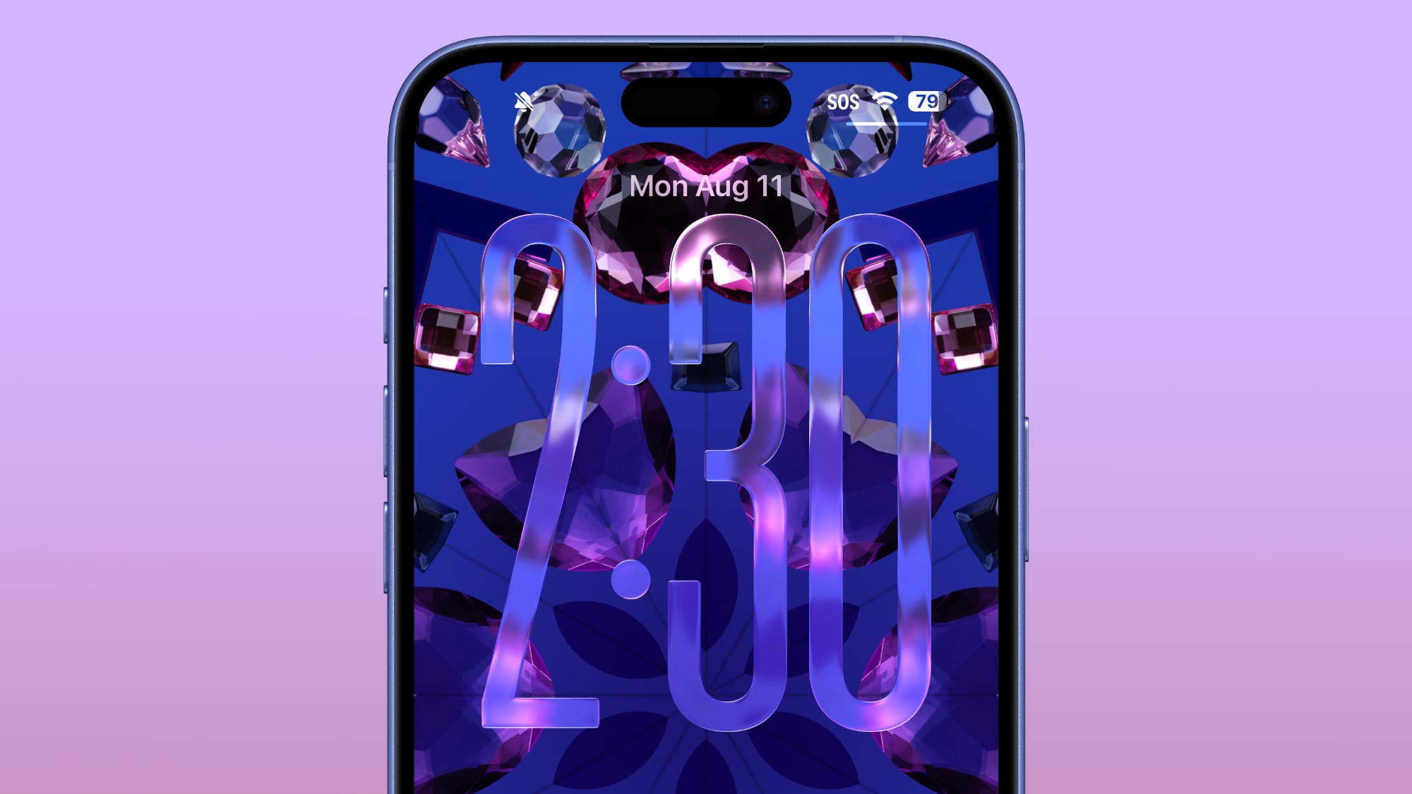
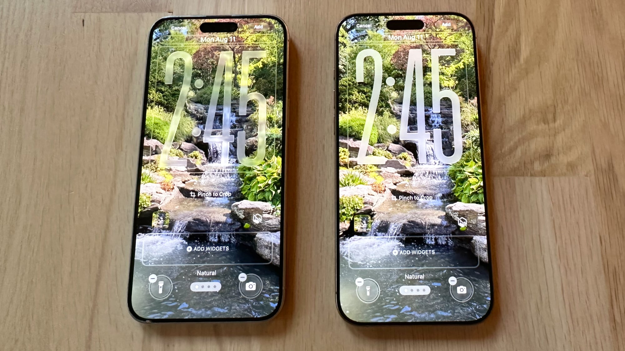
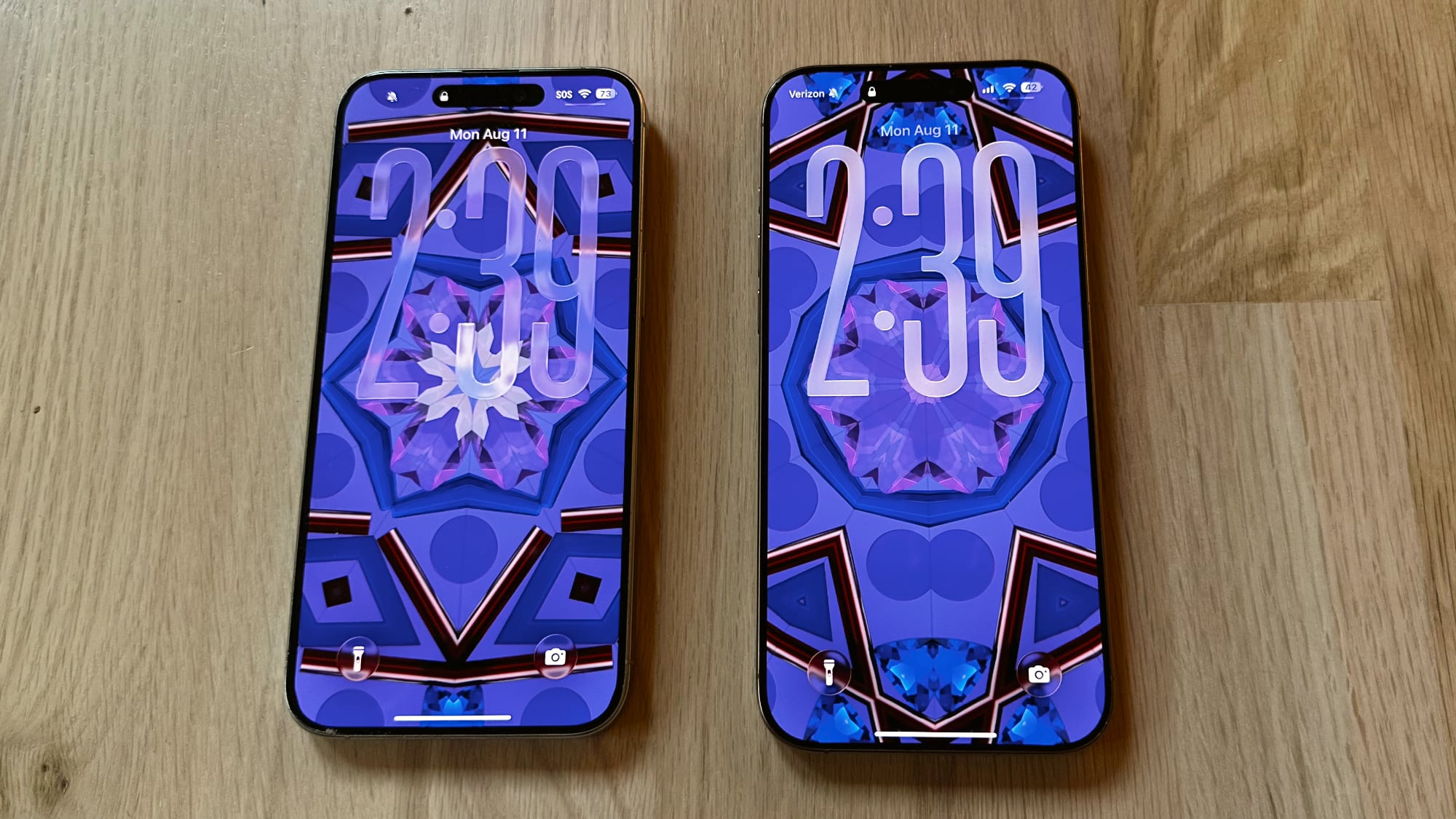
The Lock Screen clock has been updated with additional transparency, allowing more of the background to peek through.


ios-26-beta-6-liquid-glass-lock-screen.jpg


Beta 6 on left, beta 5 on right

The clock also has more of a 3D, floating look, which is in line with the rest of the Liquid Glass design. Apple didn't change the Liquid Glass look of the control buttons, but the icons are larger. Lock Screen widgets haven't changed.


ios-26-liquid-glass-lock-screen-changes.jpg


Beta 6 on left, beta 5 on right

With the updated floating design and added translucency, the clock can be somewhat harder to see on certain darker backgrounds, but it is definitely more of a Liquid Glass aesthetic.

Apple has been tweaking different iOS 26 design elements throughout the beta testing process as it aims to perfect Liquid Glass before the iOS 26 debut in September.

Article Link: Apple Changes Liquid Glass Again in iOS 26 Beta 6
You don’t have to use the glass effect when using such a busy background. You could have used some taste and chosen a better suited background so we could get a better idea of its potential.
 
I'm really not sure why this needs to keep being reiterated, but here we go again: the BEFORE image always goes on the LEFT, the AFTER goes on the RIGHT. Just like how we read english text, from left to right. Understand?
It’s engagement bait.
 
I fear this whole design is a failure and Apple is heading into a dead end. Much too complex to manage properly. As much as I love the idea, it might make sense in specific situations but not for the whole OS. Apple tried translucent UIs with Aqua (translucent menus) and quickly reverted back. Unreadable text and blurry UI just doesn't make sense.
The whole thing reminds me A LOT the Windows 8 fiasco.
 
  • Like
Reactions: stx66
idk i just don’t see this as a lasting design language. it feels like it was developed as concepts and theories and looking pretty on a screen, and once they started moving into real life user experience things have fallen apart. i’m glad they continue to refine things, but actual readability and usability seem to suffer in preference of something looking “cool”. again, fine as a concept, just doesn’t work great in practice.
Absolutely! It seems they got drunk on their "wonderful" UI "innovation". I know times change, but still mourn the MacOS 9 look Platinum.
 
More transparency, while looking good, defeats the overall purpose of the AOD (Always On Display). That's my take on this.
I know this is still an unfinished product, and I am hoping the design tweaks made to the OS will turn out to be useful.
 
I fear this whole design is a failure and Apple is heading into a dead end. Much too complex to manage properly. As much as I love the idea, it might make sense in specific situations but not for the whole OS. Apple tried translucent UIs with Aqua (translucent menus) and quickly reverted back. Unreadable text and blurry UI just doesn't make sense.

Ok so I’ve been trying to steer of the countless videos showing off 26 beta but from the little I have seen (mostly the preview from Apple earlier in the year), Apple has actively tried to address readability by having the battery icon and percentage, for example, react to what background is behind it.

Are you not on the beta or not seen much of it? If I remembered correctly, what you’re saying isn’t a problem…
 
Last edited:
  • Like
Reactions: aperfectcircle
I fear this whole design is a failure and Apple is heading into a dead end. Much too complex to manage properly. As much as I love the idea, it might make sense in specific situations but not for the whole OS. Apple tried translucent UIs with Aqua (translucent menus) and quickly reverted back. Unreadable text and blurry UI just doesn't make sense.

A major problem is: Someone high enough up at Apple must still be clinging to a "skeuomorphic derangement syndrome" mindset... Clinging to the thought that "what works in real life shouldn't be remotely replicated on a digitial/mobile device" because....because....I have no idea why.

"Because Designers need to design something" and "because Marketing needs something shiny and new every so often" is all I can think of.

- We don't use translucent paper on our desks.

- The paper on our desks and books doesn't turn blurry and unreadable towards the edges.

- We often prefer a matte finish for things requiring focus, like screens and key interfaces.

So why introduce translucent shiny gingerbread that only 1) looks different than before while 2) and is harder to read in most every instance I've seen so far...
 
Last edited:
Register on MacRumors! This sidebar will go away, and you'll see fewer ads.