
Multiple sources have claimed that iOS 19 will introduce a new design with more translucent buttons, menus, notification banners, and more, and there is now another clue that points towards this glass-like appearance.
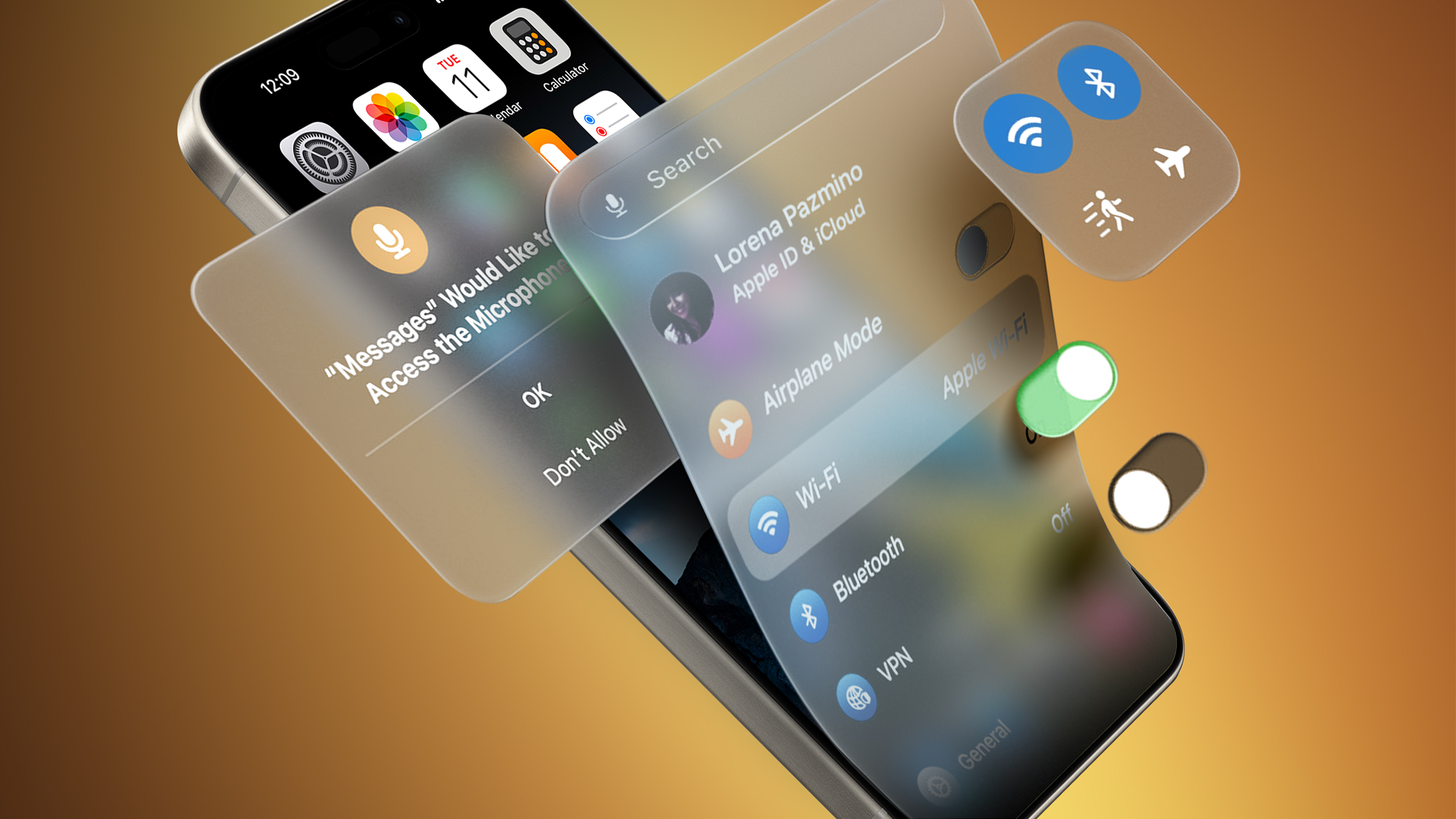
Bloomberg's Mark Gurman today said the new design project is codenamed "Solarium" internally. A solarium is a room with glass walls that allow in plenty of sunlight, so this codename further hints at iOS 19 having a "glass-like" appearance with translucent interfaces. The new design is expected to look similar to visionOS for the Apple Vision Pro.
Jon Prosser has shared alleged renders of iOS 19's Camera and Messages apps on his YouTube channel Front Page Tech, and both apps have more translucent designs. However, there is some debate over the extent of the design changes.
Gurman previously claimed that iOS 19 could have the biggest design changes since iOS 7 introduced a much flatter appearance in 2013.
Apple's annual developers conference WWDC returns on Monday, June 9 this year. The first iOS 19 beta should be made available to developers for testing immediately following the opening keynote that day, and the software update should be released to the general public in September. Even the WWDC 2025 logo might hint at iOS 19's new design.
Article Link: Apple Codename Provides Clue About iOS 19's Rumored New Design


