Got a tip for us?
Let us know
Become a MacRumors Supporter for $50/year with no ads, ability to filter front page stories, and private forums.
Apple Codename Provides Clue About iOS 19's Rumored New Design
- Thread starter MacRumors
- Start date
- Sort by reaction score
You are using an out of date browser. It may not display this or other websites correctly.
You should upgrade or use an alternative browser.
You should upgrade or use an alternative browser.
And a toggle to turn off wiggle-mode on home screen and control center 🫨😬Im really not a design focused person. I need functionality. How about an archive button in iMessage. Or even better, dual app support with external display support. A Stage Manager Lite… but one that actually works well…?
Tell me, when was the last time Apple was ready with anything? Google, and I hate everything related to them, unlike Apple, releases products that are not ready, but releases them. Apple announced a product and did not deliver. Apple Intelligence, if they do not buy OpenAI or Claude or another ready model, they will probably not catch up with this train. The legacy and vision of Tim Cook – nobody needs Vision Pro and no real assessment of the potential that LLMs bring.There is no such thing as Sirigate. Only a few certain people are making a big deal about a missed deadline. It is better for Apple to make it right than pull a Google and release something before it is ready.
The problem with Microsoft is that it is not a love brand. Microsoft is a hammer that people have to use. There are few people who choose Windows because it is Windows. They decide on Windows because it will run the software they need. Windows is most often a necessary tool to perform a given task. They would rather not relearn it because they do not like it. MacOS is frequently selected for the system itself. Because Finder, Safari, Preview, Notes, FindMy… you name it.One thing I can't understand is that I always thought that in the future if there is gonna be a redesign it will be for paradigm shift like when MS went from windows CE style to Windows phone 7, like invent entirely new concept how we use our phones. Yet MS went too ahead of time that as it seems even in 2025 we still did not figure out that there is something else then just icons.
I mean it doesn't matter if you make them rounded or squircle, it's still same old stuff just with different shape.
And now you're telling me there is no one in the world who is able to bring something new not even in bilion dollar company?
So we are supposed to be enthusiastic with slightly less flat but still flat design with more glass then it was in iOS7, is that it?
If so don't even bother. Or if you do, don't mention it, it's still the same design with different skin at least make sure you wont make it too form over function with too many redundant taps to open various submenus where there weren't any before.
Changing Windows causes frustration — if I have to use Windows... well so be it, but I would rather not relearn it.
You mean the same snow leopard that had a (pretty controversial at the time) translucent menu bar, 3D Dock and rewritten Finder with tons of animation?
I swear, sometimes you people are just fighting imaginary enemies.
“ I hate translucency, let’s go back to snow leopard where there was… Plenty of translucency”.
If that one brought on translucent stuff … then I must have turned it off with TinkerTool.
Anyway. My oldest mac mini is my iTunes jukebox, and it is a joy to use because it is in color
")
I understand your point, but I'm not a developer...I'm a consumer. I personally, appreciate the skeuomorphic approach. Additionally, my understanding is that recent innovations like AI, in coming years - will help facilitate these actions more, freeing up time for Devs to focus on QA and other big picture initiatives. Just my personal thoughts.While some people keep requesting this, do you have any idea of how much of a nightmare that was for developers? Bringing it back will slow down everything.
We had to create the left edge of a button, and the right edge, then the bit in the middle that would be used to fill in the width of the button. Then, for the Back button with its left-pointing triangle, another image needed to be created. You couldn't use a plain colour for the background of your app, you had to have wood, steel, or paper, etc. It was a nightmare, and all so you could look at a fake bookshelf on a 4-inch screen.
Not every developer is also a graphic artist, so pre-iOS 7 an app was either coded well or looked nice, unless you were part of a team in a company. Indie devs had it hard.
Let us see, perhaps the Apple ship now has one slow speed forward and five in reverse? They have to go back to square ONE and start over with SIRI and probably the rest of that sub system.
If one builds a house on quick sand, tis very hard to get above a first floor.
If one builds a house on quick sand, tis very hard to get above a first floor.
you'd may or may not be surprised how much IP gets in the way of innovation. likely many better ways are patented and can't be tread on yet aren't being used.One thing I can't understand is that I always thought that in the future if there is gonna be a redesign it will be for paradigm shift like when MS went from windows CE style to Windows phone 7, like invent entirely new concept how we use our phones. Yet MS went too ahead of time that as it seems even in 2025 we still did not figure out that there is something else then just icons.
I mean it doesn't matter if you make them rounded or squircle, it's still same old stuff just with different shape.
And now you're telling me there is no one in the world who is able to bring something new not even in bilion dollar company?
So we are supposed to be enthusiastic with slightly less flat but still flat design with more glass then it was in iOS7, is that it?
If so don't even bother. Or if you do, don't mention it, it's still the same design with different skin at least make sure you wont make it too form over function with too many redundant taps to open various submenus where there weren't any before.
but also, the market really doesn't like anything too new, even if it's better. you need to tiptoe to the conclusion, live tiles were inherently better, but there wasn't enough of a middle step to get there. I think widgets are that attempt.
I remember folks hating Snow Leopard when it came out because there were new flashy features.With the benefit of hindsight a lot of people were comparing Snow Leopard to Lion. Lion was probably even worse when it first came out. It felt slower. Most people at the time were running MacOS on a mechanical drive and performance-wise even later releases of Lion never got back up to where Snow Leopard was. That’s where this lore about Snow Leopard performance and stability comes from.
The truth about Snow Leopard? Yes, it took up less storage space, but the real reason for the ‘optimizations’ was to cut out PowerPC Macs and force those users to buy new Intel ones. A competent PR department has a way to spin a bad thing and make it sound good - and in this case it worked exactly as planned.
Didn’t they try something like this before?
Multiple sources have claimed that iOS 19 will introduce a new design with more translucent buttons, menus, notification banners, and more, and there is now another clue that points towards this glass-like appearance.
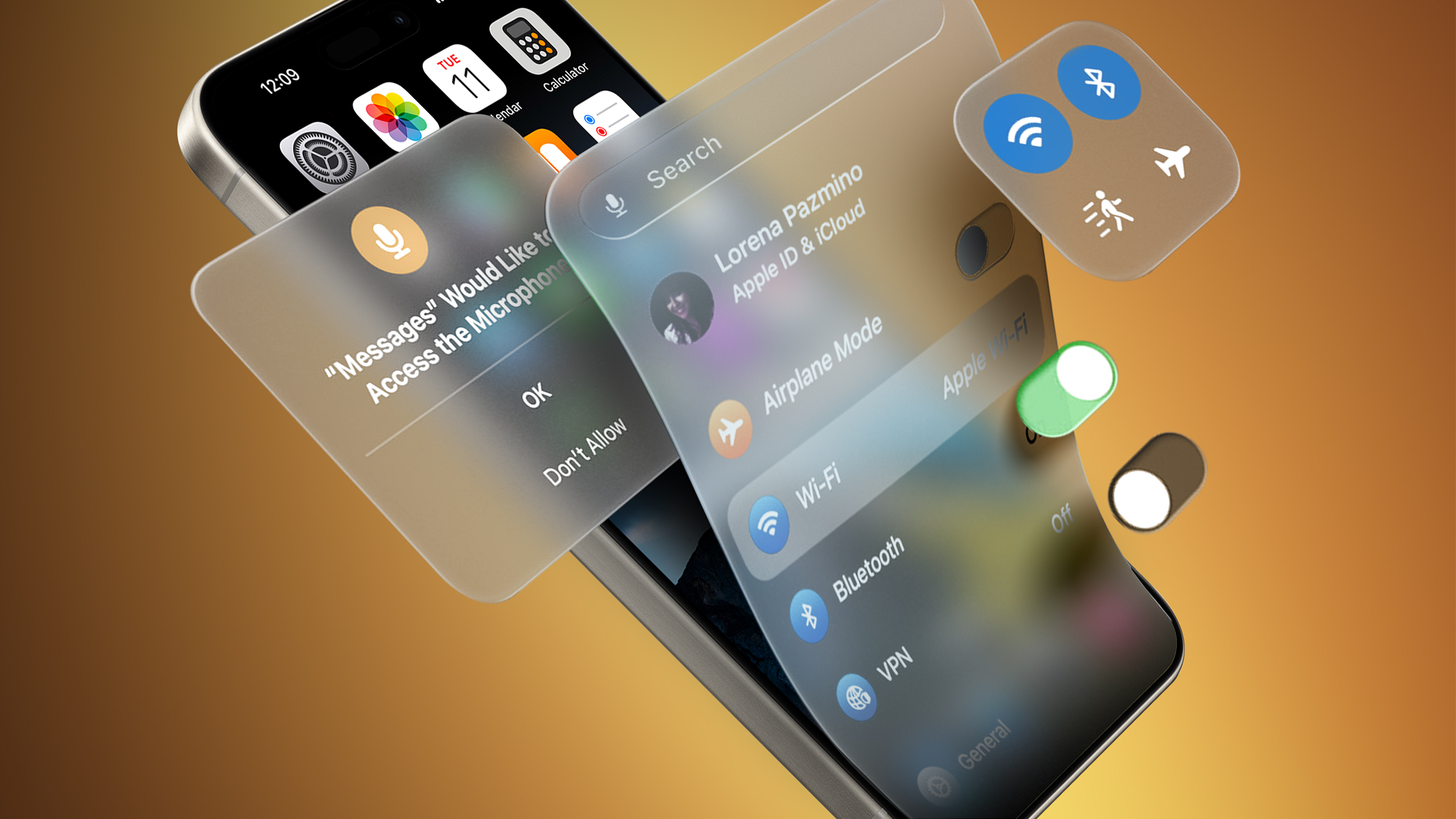
Bloomberg's Mark Gurman today said the new design project is codenamed "Solarium" internally. A solarium is a room with glass walls that allow in plenty of sunlight, so this codename further hints at iOS 19 having a "glass-like" appearance with translucent interfaces. The new design is expected to look similar to visionOS for the Apple Vision Pro.
Jon Prosser has shared alleged renders of iOS 19's Camera and Messages apps on his YouTube channel Front Page Tech, and both apps have more translucent designs. However, there is some debate over the extent of the design changes.
Gurman previously claimed that iOS 19 could have the biggest design changes since iOS 7 introduced a much flatter appearance in 2013.
Apple's annual developers conference WWDC returns on Monday, June 9 this year. The first iOS 19 beta should be made available to developers for testing immediately following the opening keynote that day, and the software update should be released to the general public in September. Even the WWDC 2025 logo might hint at iOS 19's new design.
Article Link: Apple Codename Provides Clue About iOS 19's Rumored New Design

I really hope we don't end up with even less information density. So much padding in the current iOS design language, to say nothing of all the other innovative ways to waste screen space.
Different people have different opinions, yep. That's how it works.So to be clear, based on this thread:
Apple should give up on this glass design and focus on skeuomorphic designs like they used to.
Apple should definitely never ever use skeuomorphic designs like they used to.
Apple should do more with the glass design
Apple copied the glass ideas from Windows Vista
Apple did not copy the glass ideas from Windows
Apple should stop adding new features and focus on bug fixes
Apple will die if they don't get some cool new original features implemented.
Tim Cook is only in this for the money and doesn't care about customers, designs, or anything.
Tim Cook is deliberately trying to tank the company with bad decisions. Its the only thing that makes sense (how does that make sense, exactly?)
Sirigate is dooming Apple
Sirigate is not a thing
Am I missing anything?
And, as a consumer, when your favourite apps take longer to update or get improvements...?I understand your point, but I'm not a developer...I'm a consumer. I personally, appreciate the skeuomorphic approach. Additionally, my understanding is that recent innovations like AI, in coming years - will help facilitate these actions more, freeing up time for Devs to focus on QA and other big picture initiatives. Just my personal thoughts.
For an indie dev, you do everything for an app: UI, graphics, code, QA. They are all "big picture" items. AI won't generate a UI for us that actually fits with what we want.
As an example, Xcode's AI code completion just auto-completed this:
Code:
let date: Date = Date.now.advanced(by:
to
let date: Date = Date.now.advanced(by: .hours, value: 24)
This gives us two errors:
Extra argument 'value' in call
Type 'TimeInterval' (aka 'Double') has no member 'hours'
Because it's garbage! It invented something that simply does not work. The call to `advanced` has a certain structure. It has certain parameters. For the code completion built into Xcode not to even look at the SDK before it makes a suggestion is simply bizarre.
AI is not the answer to every damn thing in the world.
Last edited:
Hey man, I just personally like the artistic style of skeuomorphism. I like the idea of technology being an extension of reality and for me, that particular style resonates well. In my initial response to you, I said "in coming years," regarding AI. AI is nowhere near ready to achieve this level of rewrite, but maybe one day it will be. I hear ya, but I'm not going to apologize for liking a particular aesthetic, its just my personal preference as you are entitled and free to have yours.And, as a consumer, when your favourite apps take longer to update or get improvements...?
For an indie dev, you do everything for an app: UI, graphics, code, QA. They are all "big picture" items. AI won't generate a UI for us that actually fits with what we want.
As an example, Xcode's AI code completion just auto-completed this:
Code:let date: Date = Date.now.now.advanced(by: to let date: Date = Date.now.now.advanced(by: .hours, value: 24)
This gives us two errors:
Extra argument 'value' in call
Type 'TimeInterval' (aka 'Double') has no member 'hours'
Because it's garbage! It invented something that simply does not work. The call to `advanced` has a certain structure. It has certain parameters. For the code completion built into Xcode not to even look at the SDK before it makes a suggestion is simply bizarre.
AI is not the answer to every damn thing in the world.
you would hate using it if it were densely packed.I really hope we don't end up with even less information density. So much padding in the current iOS design language, to say nothing of all the other innovative ways to waste screen space.
When you start to crowd your UI it becomes a daunting forest where nothing is understandable.
He probably means that too much drop down menus where there used to be just a swipe is wrong idea. Wrong way how to redesign UI.you would hate using it if it were densely packed.
When you start to crowd your UI it becomes a daunting forest where nothing is understandable.
Last edited:
you would hate using it if it were densely packed.
When you start to crowd your UI it becomes a daunting forest where nothing is understandable.
Like all things it's a balancing act. UX Designers have been preferring to space things out as opposed to make efficient use of screen space for quite a while now - Apple is not the only business guilty of this.
He probably means that too much drop down menus where there used to be just a swipe is wrong idea. Wrong way how to redesign UI.
For me it's more about how Apple insists on stowing options and information "out of the way" across their software. Filters in Messages are my favorite example as of late - don't you ever stop and wonder why the filters live on a whole different screen? It's not like there's enough options to warrant that - there's 5. Most insulting part is that this app doesn't remember which view you left it on.
This one?Skeuomorphism was fine at first but it really went too far. The "address book" app on iPad in particular was stupid.
it looks incredible.
It didn't fill the iPad's screen when holding it vertically, and there was lots of wasted space. One of the main advantages of iOS's design pre-7 is at least you knew when something was a button or not though.
<sarcasm level2>
my favorite part about having gurman as apple's substitute corporate communications department is that it really opens things up to innovators and levels the playing field.
innovative ideas should be shared! especially so that they can be researched and delivered quickly by other companies and competitors!
with apple's highly predictable scheduling of announcement dates, other companies can plan their own releases to keep up and provide timely and less expensive products and services to the marketplace.
i fully endorse gurman as the new model for corp com. WIDE OPEN and FREE FLOW of intellectual property. As it is created.
bravo!
<sarcasm level2>
Bet he said that when asked about the puck mouse. Or really any mouse Apple thought was a good design that "works".I'm mainly worried this will result in poorer accessibility and usability because it "looks cool".

That sounds more like a problem with that specific version and not the style. maybe they didn’t have enough time, maybe they didn’t plan it well from the beginning, I don’t know. I’d think skeuomorphic designs take more time than flat designs although good flat designs also aren’t as easy to design as they might seem.It didn't fill the iPad's screen when holding it vertically,
I'm mainly worried this will result in poorer accessibility and usability because it "looks cool".
Totally agree. Hope they give me option to turn it off if I find it decreases usability.
Register on MacRumors! This sidebar will go away, and you'll see fewer ads.