Become a MacRumors Supporter for $50/year with no ads, ability to filter front page stories, and private forums.
Does anyone else just… really not want this? I don’t give a crap right now about the translucency and so on. It all looks pointless. Change for the sake of change. What really matters here is how much does this affect battery life and performance? If it’s noticeably impactful then take this behind the shed and put it out is misery. No one needs a visual “planned obsolescence” OS update. This whole thing seems like a massive waste of development resources
 
It’s really not, never was. People are so unhinged and overreactive these days. Everything was clear and perfectly usable from Beta 1. Of course there are people who play dumb and swear they can’t see **** for internet points, but in reality Beta 1 was a really fresh looking iOS.
I don’t use developer betas. I saw some of the screenshots of notifications in the early betas and things seemed really hard to read. Looks like that might be better now? Regardless, legibility issues with liquid glass need to be fixed by Apple, not users via accessibility settings.
 
I like the stacked layers of glas in the first picture giving a 3D effect.
The iOS screenshots on the other side look quite flat and less glassy.

Will there at least be some parallax effect when tilting the phone?
There’s a minor effect where the app icon edge lighting changes on the Home Screen and control center (in certain scenarios). It’s not consistently applied though, and very subtle.
 
  • Like
Reactions: maerz001
Better The Notification Centre screens are better than before but still significantly less legible than the current UI. In other words, form over function once again.
 
Last edited:
  • Like
Reactions: klasma
I don’t use developer betas. I saw some of the screenshots of notifications in the early betas and things seemed really hard to read. Looks like that might be better now? Regardless, legibility issues with liquid glass need to be fixed by Apple, not users via accessibility settings.
I felt the same way looking at marketing material. But actually using it on your device, full screen, correct aspect ratio, etc. is very different.
 
That’s so weird. Aren’t you exaggerating a bit? How is that even possible? It looked amazing to me.

Beta 1, best looking so far:
View attachment 2530932

Beta 4, meh:

View attachment 2530933
Did you notice that the dynamic gyroscope light effect was only present if you pull the control center from springboard not in an app in Beta3?
That looks like is fixed now in beta 4.
 
I don’t use developer betas. I saw some of the screenshots of notifications in the early betas and things seemed really hard to read. Looks like that might be better now? Regardless, legibility issues with liquid glass need to be fixed by Apple, not users via accessibility settings.

So you haven’t used it and you already have legibility issues? How? 😄
 
Last edited:
It’s called reduce transparency, not turn off liquid glass. And it affects lots of things, not just the new design.
Regardless, it was added as a concession to those who didn’t like the added transparency at the time. People give these nonsensical arguments that transparency is bad and less legible, but then complain about using Reduce Transparency because it takes away too much transparency. If transparency = illegibility, then opaqueness = legibility. Reduce transparency should provide the best legibility and experience. Just use that?
 
  • Like
Reactions: mlayer and ErikGrim
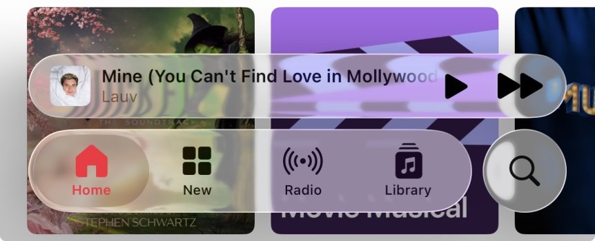
Just reading this thread and while I do love Liquid Glass, sometimes it can be hard to read. Here’s an example where I can barely make out the artists name under the current song.

But I like it how it is, and this is only when two colours don’t blend well, a few pixels up or down and the issue would be gone.
 

Attachments

  • IMG_7199.jpeg
    IMG_7199.jpeg
    117.7 KB · Views: 59
I wish Apple would get a grip on themselves and do something right the first time without having to rely on beta testers to tell them how a user interface should work. Whether they work in this department or not, everyone who works at Apple should be embarrassed with what's taking place in public view. It's downright pitiful how far they have fallen.
My frustration is that they went thru a major UI redesign with iOS 7 but these betas look like they didn’t learn a single thing from that experience. There’s still absolutely shocking stuff that shouldn’t have even made it to beta 1.
 
On the one hand, they need to get it right by putting the right side on the right before comments are left telling them to put the right image on the left before the right image on the right. On the other hand, it’s important to put the left image on the left with the right text describing both the right image and the left image, reading left to right, so no reader is left wondering whether the left image is right or if the right image has been left on the left or on the right in a way that’s not right. Hopefully it’ll all be alright in the end (by which I mean clearly half-left and half-right, respectively).
And here I was recovering from my fox in socks trauma. Thanks for that.
 
I like the stacked layers of glas in the first picture giving a 3D effect.
The iOS screenshots on the other side look quite flat and less glassy.

Will there at least be some parallax effect when tilting the phone?
Parallax is still broken on the home screen

It exists, but when you swipe to the widget page or app library it stops working until you reboot
 
Just reading this thread and while I do love Liquid Glass, sometimes it can be hard to read. Here’s an example where I can barely make out the artists name under the current song.

But I like it how it is, and this is only when two colours don’t blend well, a few pixels up or down and the issue would be gone.
it's funny (tragic) how the glass effect is so much different in ios than it is in macos. In macos it's essentially a blurred window with minor breakage on the edges.
 
  • Like
Reactions: mlayer
I'm not a fan of the color icon/text in the menu bar.

The new Games app is much easier to read and discern the active state than the Music app's menu design imo

Not sure if every app needs an accent color for branding purposes
View attachment 2530957View attachment 2530953
Agreed. Getting rid of accent would go a long way in improving legibility. Active view is already shaded white.

Edit: spelling
 
Register on MacRumors! This sidebar will go away, and you'll see fewer ads.