Become a MacRumors Supporter for $50/year with no ads, ability to filter front page stories, and private forums.
Are you providing feedback to Apple or just commenting here?
Both. The entire OS26 beta has been a mess from day one and with the public beta due any day there may not be any massive changes before September.

Others may feel different but I just found the glass aesthetic to make far too much of the OS illegible, change for changes' sake. They brought in more frosted elements in answer to feedback and it made some difference but their answer to the control centre (at least on the iPad) is to darken the whole screen rather than reduce the transparency.

My biggest concern is that they've poisoned the well. Previous big updates were normally confined to one product then rolled out or back as needed. This year they've applied an aesthetic I personally do not like to everything.

Ill put up with it on my iPad because it's a work device. But I already sold my iPhone and went back to Android and I'm in the process of switching my Mac for a Surface. I was hopeful Apple would continue to move further from the glass-thetic but it seems the opposite is true.
 
This design is severely lacking in accessibility and exemplifies the concept of form over function. Design should prioritize simplicity and avoid being intrusive. This does not.

View attachment 2531028
I like the concept and overall aesthetic, but not over accessibility and comfort for the user. If I had my druthers, the OS would look something like an airplane cockpit GUI, but with everything customizable by the owner.
 
Why is this trying to imitate the look of Windows Vista? I remember also that the original version of MacOS X Leopard and iOS 7 similarly were waaaay too transparent and then Apple had to backtrack like they are with this. Sometimes, changing the look is just looking to fix things that don’t need to be. The current iOS look is great. If anything, I’d love to see more visual simplification. It’s what always made Apple’s devices more enjoyable to use. Changes that make the screens look more cluttered interferes with usability.
 
  • Like
Reactions: 212rikanmofo
Can "glass" fx be entirely turned off for those of us who value good UX over battery draining gimmicks?

Since it seems like there are major usability issues inherent to core of the "glass" concept it would be ethical to have it off by default.
yes, stay on iOS 18 and do not update. It's nice that there are options right?
 
I like the concept and overall aesthetic, but not over accessibility and comfort for the user. If I had my druthers, the OS would look something like an airplane cockpit GUI, but with everything customizable by the owner.
As a software engineer in a highly regulated industry, I place a strong emphasis on accessibility and strict adherence to WCAG standards. That’s why I find Apple’s Glass redesign of iOS concerning. While Apple may have the freedom to prioritize aesthetics over usability, this new direction feels far from accessible - even for users without disabilities.

In modern web development, especially in industries where compliance and inclusivity are non-negotiable, this kind of design would be unacceptable. Clarity, contrast, and ease of interaction aren’t just checkboxes - they’re foundational to good user experience. Apple’s design may be visually striking, but it compromises usability in ways that would never pass muster in a standards-compliant environment.

Of course, I digress. Those standards unfortunately do not apply here.
 
Yeaaaaaa.....I'm definitely NOT a fan of this liquid glass look they are going for. Translucent elements are fun in theory and can look good with certain backgrounds behind them but they are a nightmare to balance properly. Apple has seriously lost it's way. The elements of iOS are spaced incorrectly all over the place. I notice it constantly while using my iPhone. They need a serious overhaul of the entire iOS experience...and yes I get that this kind of change is a huge undertaking and redesigning an entire OS from scratch will take some time but Apple is a VERY large company with unlimited resources so they should be able to do way better than this. It's dissapointing to say the least.
 
Yeah but you scroll, and as you do it changes and you can clearly see where the button is and you know what the button does. Your focus is on the content (photos), not on the button. It’s not like it’s washed out and blurry all the time, screenshots don’t do it justice.
This! I haven’t installed the demo yet but in presentation the movement and effects as you scroll aided in the visibility. Static screenshots will never do it justice.
 
'Liquid Glass' is such an unnecessary and unwanted update. It's simply change for the sake of change because the functional improvements from each iteration of iOS are minimal, at best.
If they’re not taxing the gpu/processor in some way then what reason do you have to upgrade?

They forgot though - to also make it more productive. This literally is change for the sake of the shareholder.
 
Hey, at least look at the bright side.

Flat Design is pretty much DEAD!!!! Celebrate!

Screenshot 2025-07-22 at 7.00.48 PM.png
 
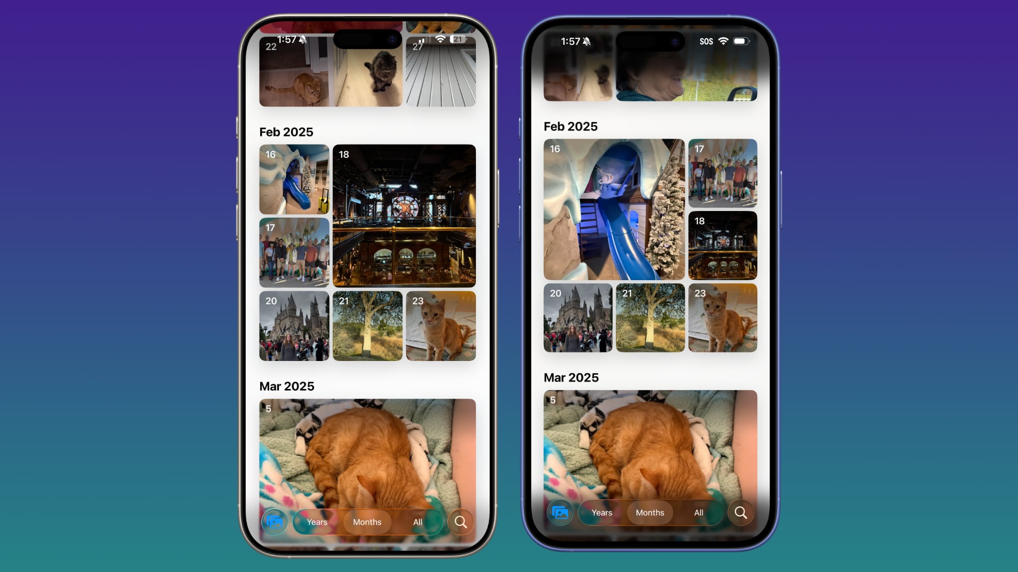
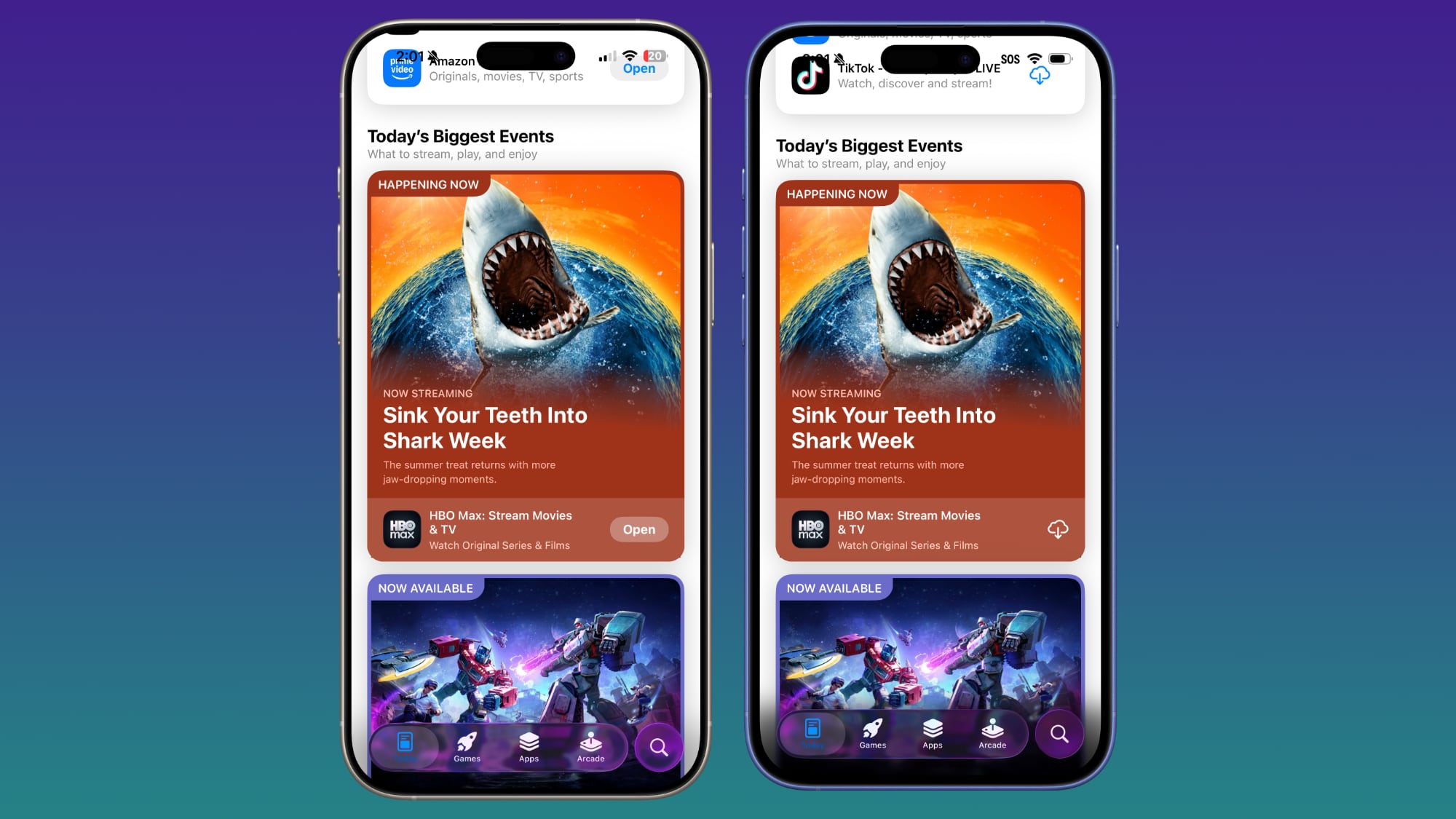
In response to criticism about too little Liquid Glass in beta 3, Apple has upped the translucency in several areas.
Just curious how MR knows this? Or are they just making an assumption? Because the same thing was said about beta 3. After beta 3 dropped there were posts proclaiming the death of liquid glass because of social media complaints. Now it’s back because of social media complaints?

Now that the heavy lifting design work has been done, yes— it’s that simple.
Do you have an example?
 

ios-26-beta-4-photos.jpg

Beta 4 on left, beta 3 on right

ios-26-beta-4-app-store.jpg

Beta 4 on left, beta 3 on right
The blue icon on the very left at the bottom of the first two beta side-by-sides shows how the background itself impacts “readability”. The translucency back and forth across the iOS 26 betas reminds me of the current US tariffs policy. I’d say the design of iOS 27 next year will be called “liquidated glass” .
 
I really don’t get all this vitriol for Liquid Glass. I haven’t run into any legibility issues except for maybe a few corner cases. I think in some cases the wrong color is used in the foreground, (I guess I really like the refraction effect) But Apple will continue to tweak this.

It really shines in motion, i.e. when you’re scrolling. Some of the still screenshots I’ve seen just don’t do it justice.

I guess I’m surprised how divisive of an issue it is. People seem to either really love it (me) or really hate it.
 
Did apple actually listen and get rid of that useless blur at the top & bottom of some apps like safari & messages?

Please say yes… even if it isn’t true 🫣😅
They’ve modified safari a bit so that elements on webpages that are fixed to the top or bottom don’t get accidentally blurred on scroll, but the blur is still used elsewhere — somewhat successfully imo. It helps in quite a few areas
 
A lesser talked about fact. After going trying to see how to integrate our brand design with liquid glass I was so pleasantly surprised to find everything related to liquid glass stuck behind private apple classes. I.e if you sneakily use them you risk app rejection or account suspension. So all these nice tweaks they are doing to for e.g fix an issue in safari here or photos there - are not available to the res of us.
Its navigation apis all over again.
All hail our Apple overlords
 
  • Wow
Reactions: alanvitek
Can we get to the best part about Liquid Glass? Apple will be releasing ground breaking and innovative LiquiMojis
 
A lesser talked about fact. After going trying to see how to integrate our brand design with liquid glass I was so pleasantly surprised to find everything related to liquid glass stuck behind private apple classes. I.e if you sneakily use them you risk app rejection or account suspension. So all these nice tweaks they are doing to for e.g fix an issue in safari here or photos there - are not available to the res of us.
Its navigation apis all over again.
All hail our Apple overlords
Is that just because it’s beta? Why would Apple try to prevent using Liquid Glass? I’ve seen an app in TestFlight that is redesigned with LG.
 
Register on MacRumors! This sidebar will go away, and you'll see fewer ads.