Become a MacRumors Supporter for $50/year with no ads, ability to filter front page stories, and private forums.

MacRumors

macrumors bot
Original poster


In his Power On newsletter today, Bloomberg's Mark Gurman said the latest internal version of iOS 27 does not have major Liquid Glass design changes, but there might be a new system-wide setting for precisely adjusting the look of the interface.

iOS-27-Glass-Slider-Feature.jpg

iOS 26.1 lets you choose between "Clear" and "Tinted" options for Liquid Glass, with the "Tinted" look adding more opacity to user interface elements. And with iOS 27, which is expected to be released later this year, Apple might go even further.

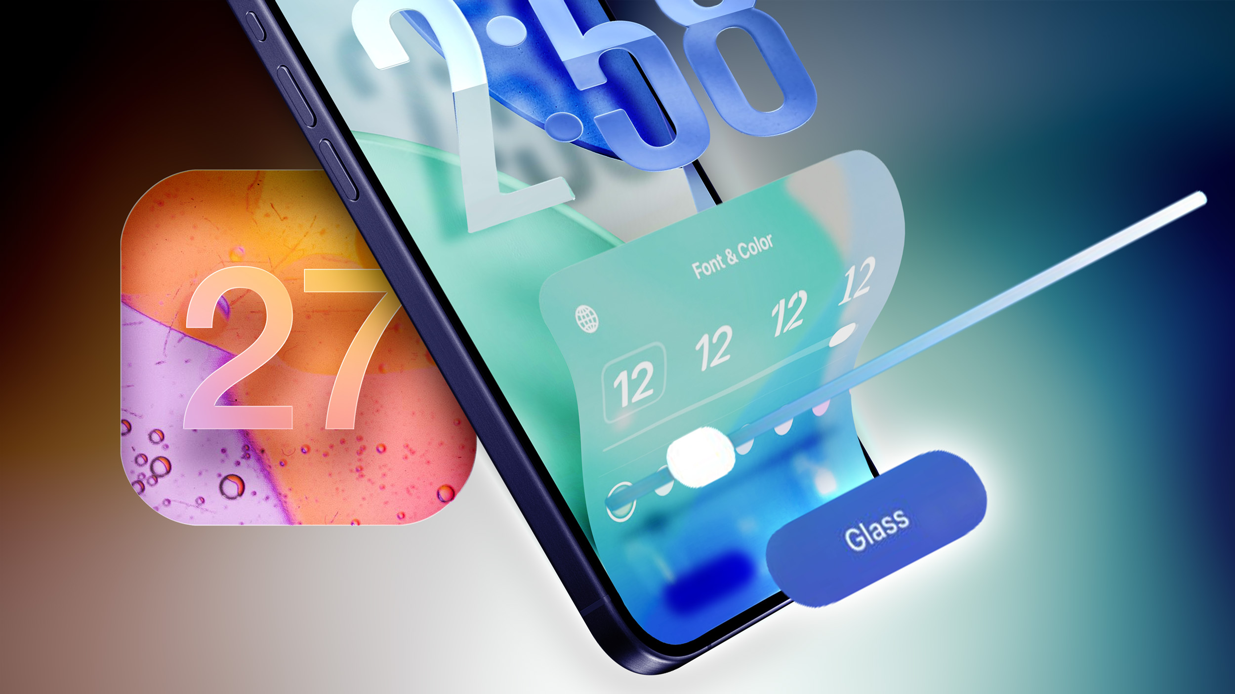
iOS 26.2 introduced a slider that allows you to manually adjust the opacity of Liquid Glass, but only for the Lock Screen's clock. Starting with iOS 27, Gurman said the setting might be expanded to the entire operating system.

Apple was initially working on a system-wide Liquid Glass slider for iOS 26, but it ran into engineering challenges when trying to extend it across the entire system, according to Gurman. However, he said Apple could go back to the drawing board and manage to get the system-wide slider working in an iOS 27 version.

"Apple is trying again now for iOS 27," said Gurman, in a social media post referring to the system-wide Liquid Glass slider. "TBD if it lands."

iOS 27 beta testing should begin in June, ahead of a September release.


Article Link: Apple is Aiming to Add a System-Wide Liquid Glass Slider to iOS 27
 
Last edited:
Screenshot 2026-03-15 at 09.53.24.png


So much of the problem is shown right here 👆

Conceptually, it's flawed.

It's not additive or more usable to have colors & content "bleeding through" onto controls from underneath.

That may demo well for being "fun, flashy, cool and wow", but it effectively just adds friction and frustration as it lessens legibility and clarity of controls one is trying to interact with.

The seeds of this flawed ideology go all the way back to when Safari on macOS started "tinting" based upon what is behind the window. It's just insane when you think about it.

Imagine if road signs along the highway were sort of translucent and showed "hints" of the scenery behind them.
 
View attachment 2613749

So much of the problem is shown right here 👆

Conceptually, it's flawed.
Precisely. Transparency isn’t the biggest issue, the concept itself is. The whole behaviour of the UI doesn’t add anything meaningful to the experience.

It’s actually quite sad looking at Sequoia now, because that interface truly subscribes to less being more.
 
Precisely. Transparency isn’t the biggest issue, the concept itself is. The whole behaviour of the UI doesn’t add anything meaningful to the experience.

It’s actually quite sad looking at Sequoia now, because that interface truly subscribes to less being more.

I was watching a video on the Macbook Neo and for the love of god, why would anyone want all the reflecting and refracting of light all over the controls for the video?

It was INSANELY distracting and annoying, when I just wanted to hit the pause button.
 
This slider is one minute coding, maybe seconds with AI. They make this sound as they need to code this for a year.

I'll bet the underlying code is a complete disaster. Years and years of getting 'new' features to market ASAP is a good way to end up with an unwieldy mess. "Just get it out the door - we'll work on implementing it properly later."

I'm hoping Apple is using 27 as an opportunity to step off the gas and get their house in order.

Some internal vibecoding should really help that problem.
/s

😂🤣

Soon nobody at all will know how to fix anything in that code!
 
Precisely. Transparency isn’t the biggest issue, the concept itself is. The whole behaviour of the UI doesn’t add anything meaningful to the experience.

It’s actually quite sad looking at Sequoia now, because that interface truly subscribes to less being more.
I still have Sequoia running on an old Mac and it's SO MUCH BETTER. It is super clean and laser-focused on functionality; in other words, the exact opposite of Tahoe.
 
This glass concept was and is a really bad idea accepted and possibly promoted by the managers. I bet devs weren't listened to. They know how stupid idea it was and still is. Now the same managers must somehow accept it was not that wise to go with it and revert asap. 🙂
 
Register on MacRumors! This sidebar will go away, and you'll see fewer ads.