How about they simply disable the tint effects, making the UI more readable and reducing GPU use and thus saving battery in the process?
Got a tip for us?
Let us know
Become a MacRumors Supporter for $50/year with no ads, ability to filter front page stories, and private forums.
Apple is Aiming to Add a System-Wide Liquid Glass Slider to iOS 27
- Thread starter MacRumors
- Start date
- Sort by reaction score
You are using an out of date browser. It may not display this or other websites correctly.
You should upgrade or use an alternative browser.
You should upgrade or use an alternative browser.

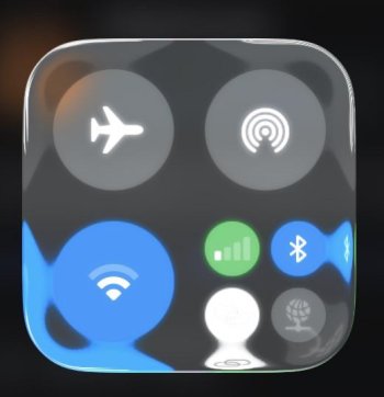
Well said!View attachment 2613749
So much of the problem is shown right here 👆
Conceptually, it's flawed.
It's not additive or more usable to have colors & content "bleeding through" onto controls from underneath.
That may demo well for being "fun, flashy, cool and wow", but it effectively just adds friction and frustration as it lessens legibility and clarity of controls one is trying to interact with.
The seeds of this flawed ideology go all the way back to when Safari on macOS started "tinting" based upon what is behind the window. It's just insane when you think about it.
Imagine if road signs along the highway were sort of translucent and showed "hints" of the scenery behind them.
So many resources, so much time… wasted!
B4U
macrumors 601
Just add an option: Turn that 💩 off.
It just takes courage!
It just takes courage!
Admiral Fart
macrumors regular
It may sound ridiculous that Apple can't create a system-wide option to turn off Liquid Ass, but these are the same people who can offer an option to turn off Liquid Ass for the clock in iOS 26, but not in MacOS 26. So much for design consistency across platforms. Wasn't that the purpose of Liquid Ass, to make everything look like Vision Pro? Because that's clearly what people were clamoring for. The stench of that device's failure is going to infect Apple's products for years, probably long after it's discontinued.
Bodhitree
macrumors 68030
This is what you get when you have too many high-concept people and not enough nuts-and-bolts people in management.
CATiNTHESTORE
macrumors 6502a
CATiNTHESTORE
macrumors 6502a
Joke aside, we have only one problem: Apple doesn't admit its mistakes
The first thing they need to do is change the name and drop the “GL”.
Mity
macrumors 65816
Just remove it already. Admit defeat like with the TouchBar and move on. Liquid Glass is not functional and it looks worse than iOS 18.
darngooddesign
macrumors Core
That’s Gurman and MacRumors, not Apple, for you.There "might" be a toggle...
Oh look, there's that flip-flopy keyword again 🙄
Reason077
macrumors 601
I’m not an engineer, so maybe I don’t get it. But, you can make the whole iOS look crappy. But you can’t give us 5 levels of adjustable crappiness or the ability to revert?
What am I missing.
Liquid Glass is the software equivilent of the butterfly keyboard debacle. Everyone knows it's a bit crap, but they worked hard on it so it might take a few years to admit their mistake and do something about it. Kind of a pride thing, I suppose?
Will they do anything when you open a home screen folder and see apps on top of apps?
As annoying as Liquid Glass looks, I am more concerned with the system slowdowns.
New iPhones, old iPhones, they all seem so much slower and laggier since upgrading to iOS26. I don’t know how much of that is due to the extra system resources needed to make things like icons shimmer depending on the phone angle vs how much of that is just down to poor software that hasn’t yet been fully optimized. And the delays in the keyboard - OMG!!! I actually have friends and family asking me for third party keyboard recommendations now!!!
Either way, I would prefer a fast, snappy, solid phone than a “pretty shimmering” slow phone.
marzer
macrumors 65816
For all the concerns for turning down or turning off, I'd recommend you try messing with Display & Text under Accessibility settings. Using increased contrast and borders really improved the UI for my tastes. You can even turn off transparency completely. But I don't, I like some transparency in the ui.
Edit: I forgot to mention. On the new edit Home Screen function, where it lets you change icon tint and color, there's a contrast control element to the upper left of the panel. That can also improve the viewing of the new glass affect on the Home Screen.
Edit: I forgot to mention. On the new edit Home Screen function, where it lets you change icon tint and color, there's a contrast control element to the upper left of the panel. That can also improve the viewing of the new glass affect on the Home Screen.
Last edited:
the 12th Doctor
Suspended
Cydia can make a come back here and let us do what we want with the UI. Bring back Muscle Nerd and crew. Let’s go.
darngooddesign
macrumors Core
I still have the Realize theme on my old 4. Fun fact, you can actually use AirPods 3 on an iPhone 4 with iOS5.Cydia can make a come back here and let us do what we want with the UI. Bring back Muscle Nerd and crew. Let’s go.
Last edited:
Radeon85
macrumors 68000
I’d honestly love that. Personally, I have no issues reading content with 'liquid glass,' and I love that the content beneath is still somewhat viewable instead of being blocked off by whatever UI is on top. Of course, it can be improved on—nothing is perfect—but if Apple wants to keep this UI around for the next 5 to 10 years, I have zero issues with it for now.View attachment 2613749
Imagine if road signs along the highway were sort of translucent and showed "hints" of the scenery behind them.
How do you know that the majority hated it? I suppose you've surveyed all the Apple users out there about what they think of it on the 2 billion plus devices.How about just an option to revert to the previous UI that not a majority hated?
turbineseaplane
macrumors Penryn
I’d honestly love that.
You'd love partially transparent road signs?
I promise you, in practice, you would absolutely not.
ipedro
macrumors 604
When a design team has so little faith in their work that they let the end-user ratchet it down.
Steve, we're not inKansas Cupertino anymore.
Steve, we're not in
Let's just move to the next UI refresh ASAP.
There's no fixing liquid glass.
There's no fixing liquid glass.
Sputman99
Suspended
Another layer of ugly from another level of stupid - I hate have weird glass effects, weird corners and spidery lines competing with the pixel resolution and the silly flashes and pops. Thing is if you use accessibility to modify the UI it makes it worse - worse UI decision and a backwards step - I suspect it'll be a year before things are fixed
Reason077
macrumors 601
Instead of a slider, I'd like to see a liquid glass switch. The options would be:
Liquid glass:
Liquid glass:
- ON
- OFF
boswald
macrumors 68030
Excellent news! I'll probably set mine to half or 3/4 so it looks more like the frosted glass look of the Vision Pro interface (if possible).
Register on MacRumors! This sidebar will go away, and you'll see fewer ads.