Become a MacRumors Supporter for $50/year with no ads, ability to filter front page stories, and private forums.
It's one tab down from either Mac, iPad or iPhone.

If you want the all accessories page there's a dropdown for it. Or just go here: http://www.apple.com/au-hed/shop/accessories/all-accessories
In addition, if you click the Search button, you get a quick link to the accessories page (which I presume is how you also got that link)
Screen Shot 2015-08-06 at 7.03.54 PM.png
 
I agree that the accessories will probably see a drop in online sales, the impulse buying is somewhat gone with this redesign.
 
  • Like
Reactions: AleXXXa
Everything is appearing massive on my Mac screen. Endless scrolling. Sometimes I cannot even see whole objects at once. Endless scrolling. Oversized objects are a bad internet fashion. Endless scrolling. The new Apple website takes it even further. Endless scrolling. No! Endless scrolling. I got a bigger screen to see more, not to have large images and the same content. I don't like endless scrolling.

I know what you mean. Apple wants to show everything as large as possible, but it makes it harder to really see the actual product as a whole. And the giant products feel like someone's hand is in my face, very uncomfortable.
 
Geez did people spend more than 5 seconds on the website? Or did they just rush here to complain because different automatically equals bad these days. :rolleyes:
Agree with you so much. It's not that much different from before. Now it's all in one place. Looking for iPhone stuff? Go to the iPhone page where you'll find everything you need! Need a Mac? Go to the Mac page! So on and so forth.
 
Geez did people spend more than 5 seconds on the website? Or did they just rush here to complain because different automatically equals bad these days. :rolleyes:

Agree with you so much. It's not that much different from before. Now it's all in one place. Looking for iPhone stuff? Go to the iPhone page where you'll find everything you need! Need a Mac? Go to the Mac page! So on and so forth.

It's incredibly difficult to compare prices for different models on one page and comparitive shop between a Mac Pro, an iMac, or a Retina MacBook Pro. With this new design it would take literally 2 hours to do all the comparitive shopping to check it all out, you would have to load or 30 pages, and sub-pages and so on, it is a nightmare.
 
The idea behind removing a store and adding purchase button to product pages is nice but the overall redesign is meh. Too much scrolling and empty space. If someone needs to learn about iPhone features he'll be tired in a minute.
And I'd add Accessories tab instead of the removed Store.
 
  • Like
Reactions: AleXXXa
It's incredibly difficult to compare prices for different models on one page and comparitive shop between a Mac Pro, an iMac, or a Retina MacBook Pro. With this new design it would take literally 2 hours to do all the comparitive shopping to check it all out, you would have to load or 30 pages, and sub-pages and so on, it is a nightmare.
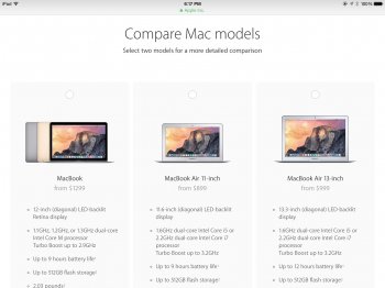
Did you miss this link by chance? https://www.apple.com/mac/compare/
There's a compare icon on the sub banner under the Mac section. It lets you select two models for a more detailed comparison.
 

Attachments

  • image.jpg
    image.jpg
    298 KB · Views: 130
It's incredibly difficult to compare prices for different models on one page and comparitive shop between a Mac Pro, an iMac, or a Retina MacBook Pro. With this new design it would take literally 2 hours to do all the comparitive shopping to check it all out, you would have to load or 30 pages, and sub-pages and so on, it is a nightmare.

Really? Incredibly difficult? I just did exactly that, compare a MacPro, iMac, and MacBook Pro on specs and price. Took less than a minute. Super easy.

Maybe a Windows platform is better suited for your needs?
 
How do you navigate to buy an iPod?
As before (the iPod tab had already disappeared earlier, I think when they added the watch), you go to the Music tab and scroll down. I think they should have put a link in the second navigation bar (where in other tabs the subcategories are listed) on the Music page. Or stashed them under iPad.
 
  • Like
Reactions: georgeperez
Agree with you so much. It's not that much different from before. Now it's all in one place. Looking for iPhone stuff? Go to the iPhone page where you'll find everything you need! Need a Mac? Go to the Mac page! So on and so forth.
Yeah, before, when I wanted to look up specs (incl. the different configuration that were sold), I always hesitated a bit where to start as some specs were only to be found under, eg, the Mac tab, and others, like the maximum capacity of the SSD storage in the Store tab.
 
How do you navigate to buy an iPod?
Seems they don't want to sell iPods. Look in the Apple Store (the one you can actually walk into), there's a very small section with iPods, not even displaying all colors. They used to have a transparant display with all colors nano's etc on them.
 
  • Like
Reactions: Mactendo
Register on MacRumors! This sidebar will go away, and you'll see fewer ads.