I didn't realise suggested stuff gets mixed in with your music in My Music - I assumed it was separate in For You and New, and that My Music was, well, your music.
Probably isn't any reason they couldn't make the bottom tabs customisable.
I guess as I only tend to go Artist > Album > Song there isn't much buried away that I'd use much.
As I said before that was my biggest issue with Spotify - when you tap on an artist it took you to a single list of all that artist's songs, rather than their albums.
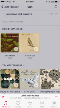
Albums in the "My Music" section have suggestions (ads) after them.
See the attached image of the content at the bottom of an album I own.
I KNOW the artist's other albums and even own one.
Also, I clearly know who Iron & Wine, Sufjan Stevens, and The Shins are... Because I don't live under a rock AND own at least one album by each of them.
When I buy an album, I don't expect to have to look at this useless crap every time I play it.
I think it's disrespectful to the artists who make these albums too. This is the place that their album lives digitally and it is cluttered with ads. You've finished listening to this crap, now buy more, more, more.
Like I said, it feels like a store... Not my personal library.
[doublepost=1462498163][/doublepost]I THINK I figured out my issue after an ENTIRE YEAR of frustration.
I've been getting constant pop ups asking me to sign up for Apple Music and suggestions all over the place.
Saying "no thanks" to the subscription pop ups does nothing but delay them for a few minutes. Saying "no thanks" in the "For You" tab allows you to turn this crap off. These screens look identical but I've never hit "no thanks" in the For You tab, as I don't ever go there, and if you do, you can just switch tabs to get away from the ad.
This was a serious UI failure. I've told this App I don't want Apple Music 100 times, I just wasn't telling it in the right tab and that tab is a place I can't use, so I never purposefully go there.