That is why I opted for the whole control/address bar to be on the bottom. Sure I was used to having it up top from computer web browsers, but it didn't take long to adapt to having it on the bottom and it's easier to reach.Love this! I'll be using the URL on top option, I feel. That said, why the HECK is the new tab button now in the top left corner, the further possible distance from my thumb?
Got a tip for us?
Let us know
Become a MacRumors Supporter for $50/year with no ads, ability to filter front page stories, and private forums.
Apple Offers Safari Design Choices in iOS 26, Learning from Past Criticism
- Thread starter MacRumors
- Start date
- Sort by reaction score
You are using an out of date browser. It may not display this or other websites correctly.
You should upgrade or use an alternative browser.
You should upgrade or use an alternative browser.
johnsawyercjs
macrumors 68000
As I understand it, it's been measured as being 34% betterColor me curious. Is this a quantifiable improvement?

Seems about 27% betterAs I understand it, it's been measured as being 34% better
dumastudetto
macrumors 603
Safari offers a best-in-class experience for every user. It's good that options exist within the UI framework to give customers the choice they need to avoid installing any of the privacy-crushing alternative browsers.
hektor6tygr
macrumors member
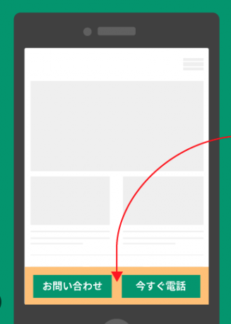
As a web designer, I'm curious about how sites who use bottom navigation (ex: contact CTAs) will deal with the new design. Because now the default is a persistent floating bar.
It will be interesting to see, but I feel very very sure Apple dealt with not just bottom navigation but in general being able to clearly see the bottom of any page. I might guess that if the web page has a limited size that fits on the phone (perhaps with its own inner scrolling pane if needed) then the entire page is visible above the floating tab. The floating tab might only cover part of the web page if the bottom (or top if you have the address tab there) is on a page that scrolls because its larger than the phone's view.As a web designer, I'm curious about how sites who use bottom navigation (ex: contact CTAs) will deal with the new design. Because now the default is a persistent floating bar.
Asthmatic Kitty
macrumors regular
Having the address bar on the top looks so alien to me now. How did we live like that for so many years?!
hektor6tygr
macrumors member
Most screenshots show the bottom of the page being blurred though. My concerns are that if you designed a bottom CTA that was flush to the bottom of the screen (like the screenshot), you'll definitely need to redesign it.It will be interesting to see, but I feel very very sure Apple dealt with not just bottom navigation but in general being able to clearly see the bottom of any page. I might guess that if the web page has a limited size that fits on the phone (perhaps with its own inner scrolling pane if needed) then the entire page is visible above the floating tab. The floating tab might only cover part of the web page if the bottom (or top if you have the address tab there) is on a page that scrolls because its larger than the phone's view.
Attachments
johnsawyercjs
macrumors 68000
That's the difference between actual measurements and "feels like"Seems about 27% better
Plutonius
macrumors G4
I think that most people just want the ability to select what browser is used as default and they are not worried about customizing Safari.
nathansz
Suspended
nathansz
Suspended
Compact is just so much better. I love the compact url bar already on macOS Safari. Looking forward to this
I've got bad news for you.......
nathansz
Suspended
I think that most people just want the ability to select what browser is used as default and they are not worried about customizing Safari.
I would think that it would never even occur to most people to instal a different browser on their phone
Last edited:
Stromos
macrumors 65816
Window manager on iPads including my Mini.... giving people choice in UI/UX.....
How scared is Apple right now to be doing customer positive things? Where are all the people that said choice is bad and too confusing?
Was this an amazing WWDC? No. Was it the best one is the last 2-3 years? YEAH.
How scared is Apple right now to be doing customer positive things? Where are all the people that said choice is bad and too confusing?
Was this an amazing WWDC? No. Was it the best one is the last 2-3 years? YEAH.
It’s always something
macrumors 6502a
It does, though: Chrome doesn’t come installed by default on anything other than Android (and maybe not all of Android either), but it’s the #1 browser by a country mile.I would think that it would never even occur to most people to instal a different browser
Happy to see that there is an option to switch back to older design. Prefer the bar to be on top.
Marty80
macrumors 6502a
I am using the default layout, but it is complete pain as to access tabs, bookmarks etc you need to access sub menus.


klasma
macrumors G4
Apple prefers that people use Safari, though.I think that most people just want the ability to select what browser is used as default and they are not worried about customizing Safari.
SoldOnApple
macrumors 65816
ForkHandles
macrumors 6502a
Some would askI for one, prefer the address bar at the top. That’s how it’s always been for me, and it’s what I’m used to. Also, I’m too old to change. Hopefully that will continue to be a choice.
What’s the point in having a mind if you never change it?
It’s great to have choice, but the fact they needed to introduce the choice shows the new layout isn’t great.
Using it for a day now I’ve switched back to the bottom layout, the fact that closing tabs takes three times longer on the new layout shows they’ve gone for form over function - even worse is I don’t think the form is great, this liquid glass nonsense is just dated and ugly.
Using it for a day now I’ve switched back to the bottom layout, the fact that closing tabs takes three times longer on the new layout shows they’ve gone for form over function - even worse is I don’t think the form is great, this liquid glass nonsense is just dated and ugly.
sunapple
macrumors 68040
Offering different options for Safari, Mail, Photos, etc, just indicates to me that they are no longer able to design a proper UI. I mean, Apple used to make products that work right out of the box. The magic touch was simply a thought-out user experience that was easy to understand. In the last few years we have seen changes, seemingly for the sake of making changes, then reversing those changes in later updates, and now they're just offering three versions. If they were really learning from past mistakes, they could make the right decision and go with one good UI.
Playing with the beta and… I’m scared. This material is giving me Vision Pro nausea without the Vision Pro. Might have to boycott the update.
Register on MacRumors! This sidebar will go away, and you'll see fewer ads.