Got a tip for us?
Let us know
Become a MacRumors Supporter for $50/year with no ads, ability to filter front page stories, and private forums.
Apple Offers Safari Design Choices in iOS 26, Learning from Past Criticism
- Thread starter MacRumors
- Start date
- Sort by reaction score
You are using an out of date browser. It may not display this or other websites correctly.
You should upgrade or use an alternative browser.
You should upgrade or use an alternative browser.
Bottom seems like the way every app should be designed in the large phone era… really great ergonomicsI'm still using the top variant. Maybe I should finally give the bottom option a chance🤔
They wiped out compact tabs in the macOS beta incredibly.Compact is just so much better. I love the compact url bar already on macOS Safari. Looking forward to this
Last edited:
"Functionally, the Bottom and Top Tabs operate in the same way as the Safari Tab bars in iOS 18"
This isn't correct. Unlike iOS 18, you can now swipe between tabs with the Top layout. Previously you could only achieve this with the Bottom layout.
This isn't correct. Unlike iOS 18, you can now swipe between tabs with the Top layout. Previously you could only achieve this with the Bottom layout.
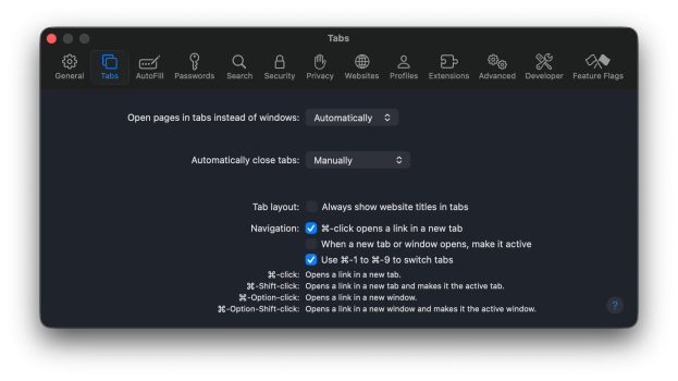
I don’t have the Compact option no more on macOS 26 looks like it was removed.Was there another option other than these? I thought the Compact layout was the new version.
View attachment 2518670
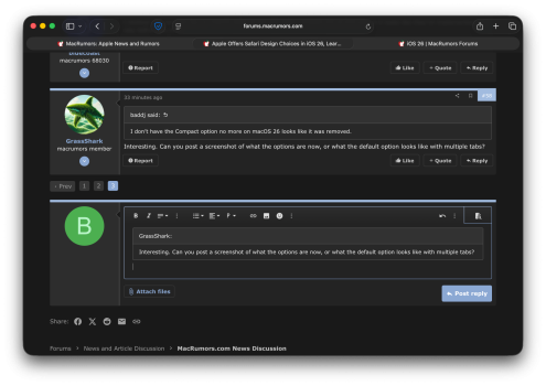
Interesting. Can you post a screenshot of what the options are now, or what the default option looks like with multiple tabs?I don’t have the Compact option no more on macOS 26 looks like it was removed.
I like the options. I'm definitely a URL-at-the-top guy.
Oh man, that sucks. Hopefully it’s just a beta thing and they’ll bring it back for the proper release.
I'm surprised they kept the Stage Manager option. After upgrading, iPadOS asks you to pick between full screen or window mode, Stage Manager isn't even an option then. A fresh iPadOS install - even on the mini - doesn't ask and defaults to window mode. I feel like we'll probably see Stage Manager go away in a future update. Also, kinda makes their whole argument about Stage Manager only working on M-series iPads look incredibly silly. I still remember how many people where defending that particularly weird decision (even despite Apple already had to backtrack that at the time for the iPad Air 4).Window manager on iPads including my Mini.... giving people choice in UI/UX.....
How scared is Apple right now to be doing customer positive things? Where are all the people that said choice is bad and too confusing?
Was this an amazing WWDC? No. Was it the best one is the last 2-3 years? YEAH.
I hated the tabs on bottom layout when it first came out and avoided using it for years.
I eventually decided to give it a try again on a trial basis — use it for a week, and if I still hated it, revert. I never went back to tabs on top after that.
Thanks for sharing - I’ve heard the same frustration from many friends who still won’t even give it a shot.
Personally, when I see a change that makes sense, I’m all for it. The bottom address bar felt like a smart, much-needed update.
I totally get that everyone has their own pace and preferences when it comes to change. But flat-out refusing to try something just because it’s different—that’s the kind of mindset that holds things back.
Kudos to you for giving it a chance!
Last edited:
Yeah. iPadOS Safari tabs got ugly again.They seem to have removed the compact layout from iPadOS
This was a feature I was looking forward to at the time, I don't really mind whatever they have now, but the placement of the '+' for new tabs is horrendous. All the way at the top left instead of somewhere in the bottom.I hated the tabs on bottom layout when it first came out and avoided using it for years.
I eventually decided to give it a try again on a trial basis — use it for a week, and if I still hated it, revert. I never went back to tabs on top after that.
Ps. I choose the 'bottom' layout as you can actually see the url. The 'compact' one only shows a small part of the url.
I guess the blur helps readability of the UI and status info.wtf are the very top and bottom of the web pages blurry. You're losing like 5% of the real estate to pages .. and that's not even an area covered by a floating element. This feels like horrible UI design circa 2002View attachment 2518646
Psychology is interesting even when dealing with yourself isn't it? Pushing yourself past resistance to change is important and I wrestle with it all the time too.I hated the tabs on bottom layout when it first came out and avoided using it for years.
I eventually decided to give it a try again on a trial basis — use it for a week, and if I still hated it, revert. I never went back to tabs on top after that.
It does, though: Chrome doesn’t come installed by default on anything other than Android (and maybe not all of Android either), but it’s the #1 browser by a country mile.
On desktop sure. We’re talking about iOS
It's on the top on iPadOS and macOS. You're not just old, you like the consistency.I for one, prefer the address bar at the top. That’s how it’s always been for me, and it’s what I’m used to. Also, I’m too old to change. Hopefully that will continue to be a choice.
One thing I didn’t like about the bottom option is that it makes the address field smaller. From the screenshots, this is apparently still the case with the new design.I'm still using the top variant. Maybe I should finally give the bottom option a chance🤔
Have you been using macOS for four years not knowing Compact View is an option in Safari?What about design choices in macOS Safari? I still miss the modern tab design they introduced a few years ago but then quickly reverted due to complaints 😔
Register on MacRumors! This sidebar will go away, and you'll see fewer ads.


