This change completely doesnt make sense, it goes against all their design principles, there is no reason to put the logo there, and i think we can all see that apple doesnt like change, unless for good reason. USB-C? EU forced them, Camera bar on the 17 Pro? Oops telephoto needs more space so we have to. Apple wont change something especially this dramatically unless they have to, i dont see any reason for them to change position.
Got a tip for us?
Let us know
Become a MacRumors Supporter for $50/year with no ads, ability to filter front page stories, and private forums.
Apple Planning to Change iPhone 17 Pro's Logo Placement
- Thread starter MacRumors
- Start date
- Sort by reaction score
You are using an out of date browser. It may not display this or other websites correctly.
You should upgrade or use an alternative browser.
You should upgrade or use an alternative browser.
that certainly makes sense, given the images shown in the post, it looks like magsafe would have enough space to move down as well, at which point the apple and magsafe could be centred in the glass section or whatever of the phone.Ive been saying for years that MagSafe should be moved down a few mm. Could this logo move be in conjunction with that? If so, this isn’t about the logo, but MagSafe.
Ever since about the iPhone 14 Pro generation, the enormous camera bump has made it problematic with some MagSafe stand designs, because the camera bump gets in the way. Moving the MagSafe down a few mm would help in this regard.
View attachment 2524518
Call it a wild guess, a shot in the dark, a flight of fancy, but I’m guessing the Apple engineers who design iPhones base their decisions on where the MagSafe hardware goes on consideration related to what else goes where on the inside of the phones.Ive been saying for years that MagSafe should be moved down a few mm. Could this logo move be in conjunction with that? If so, this isn’t about the logo, but MagSafe.
Ever since about the iPhone 14 Pro generation, the enormous camera bump has made it problematic with some MagSafe stand designs, because the camera bump gets in the way. Moving the MagSafe down a few mm would help in this regard.
View attachment 2524518
EugW
macrumors P6
I think it may just be centred on the back of the phone. It is on my 12 Pro Max. I think it is on the 16 Pro Max too, but I don't have one to check. I do know the Apple logos of the 16 Pro and 16 Pro Max are not at the same height when the phones are standing up so I suspect the Apple logo of the 16 Pro is also centred on the back.Call it a wild guess, a shot in the dark, a flight of fancy, but I’m guessing the Apple engineers who design iPhones base their decisions on where the MagSafe hardware goes on consideration related to what else goes where on the inside of the phones.

If the MagSafe ring is moved down a couple of mm, it might no longer be perfectly centred when the phone is horizontal, but then again it might not really matter much because MagSafe would easily be strong enough to hold the phone in place even if it's a couple of mm off centre. It would also of course depend upon the weight distribution inside the phone too. A physically off centre MagSafe ring could still be close to the true centre of gravity horizontally.that certainly makes sense, given the images shown in the post, it looks like magsafe would have enough space to move down as well, at which point the apple and magsafe could be centred in the glass section or whatever of the phone.
Last edited:
sleep/to/dream
Suspended
Agreed. If Apple designed everything they make to be utilitarian, their products would look just like everyone else’s. It’s okay to have small sacrifices in usability for the sake of beauty, imo.I found the outrage over it super dramatic. The battery lasts months and even if you ignored countless low-battery alerts, just plug it in, get a cup of coffee, and by the time you're back it has enough charge for your day. Then plug it in when you're finished to charge the battery to full.
Honestly if they had the charging port at the front of the mouse a lot of people would leave them plugged in forever, which is first of all bad for the battery, and also not aligned with the aesthetic desk Apple wants us to have ha
artifex
macrumors 6502a
I'd prefer not to have a big logo* advertising my phone's brand to people, too. But I'm not sure a big bare brushed metal slab would look good, either. It's too bad they couldn't engrave a grippable stylish pattern on the back.Apple could remove the logo for all I care. If anything I would love a nice clean slab to look at.
*I loved it on my 2007 blackbook, though, because I thought it was so neat that it used the screen's existing backlight. But there's no nerdy-cool aspect to the current arrangement.

thebart
macrumors 6502a
WinstonSmyth
macrumors regular
Innovative, groundbreaking
Apple may reposition the Apple logo on the back of the iPhone 17 Pro for the first time in six years, according to a new leak that points to the redesigned top camera system potentially requiring the visual shift.
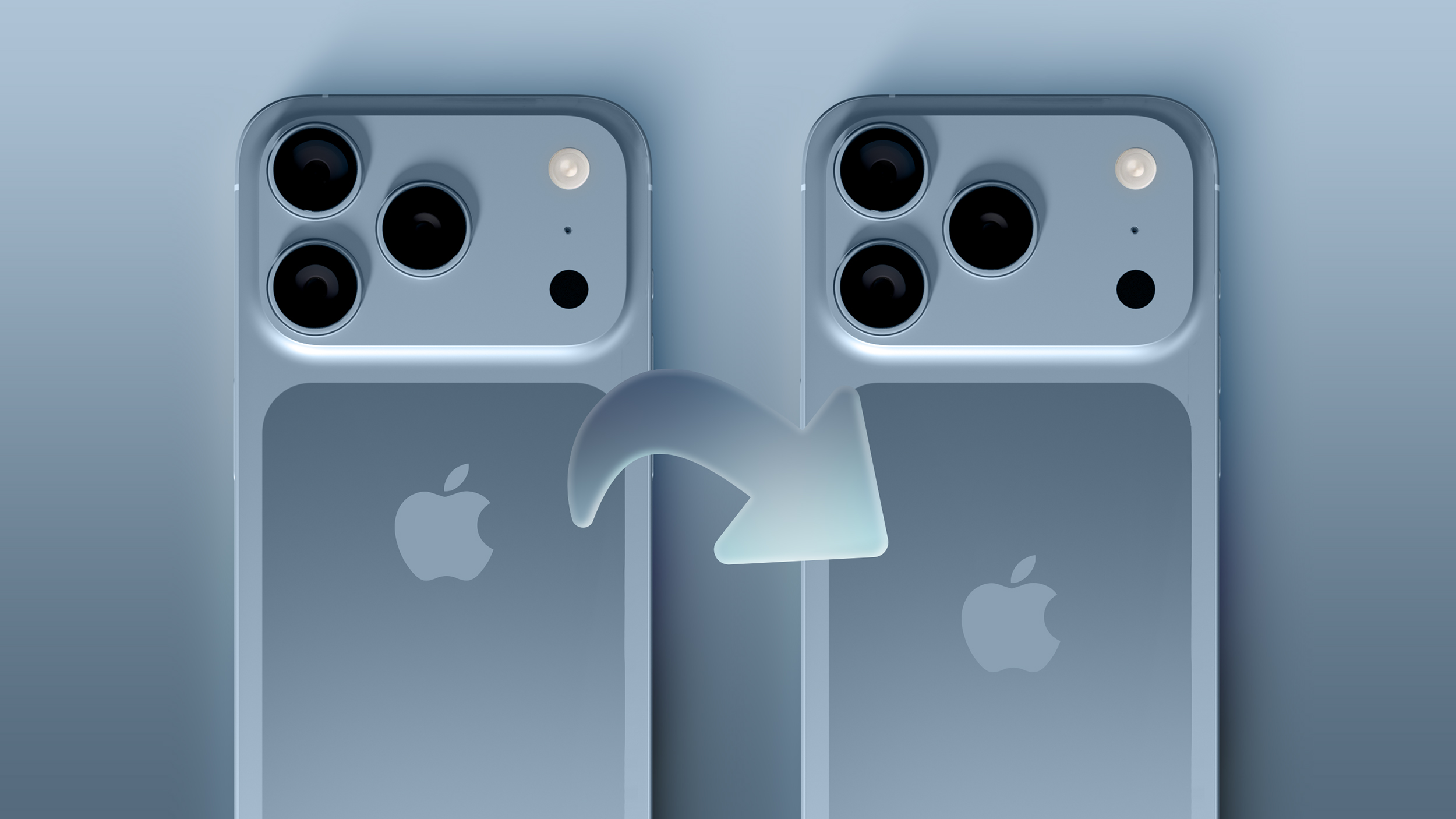
The claim originates from the leaker known as "Majin Bu," who posted an image and description of the alleged change on social media and their personal blog. According to Bu, the Apple logo will move to be noticeably lower on the iPhone 17 Pro, closer to the bottom-center of the device's rear. The shift is apparently necessitated by the new, full-width camera bar that is expected to span the entire width of the back of the device. The camera design is as a significant departure from the current module layout, with both the flash and LiDAR scanner moving to the right edge of the device.
This is the first report to link the anticipated top camera redesign with a repositioning of the Apple logo, but the change could make sense. The iPhone 17 Pro is expected to move to a new aluminum frame that encompasses almost the entire rear, with a cutout for a glass squircle below the full-width aluminum camera bump to enable wireless charging. As a result, it could make sense for the Apple logo to be centered within that glass cutout.
However, moving the Apple logo could cause some amount of confusion among users or require changes to the way MagSafe-compatible accessories are designed. This is because since its introduction with the iPhone 12, the Apple logo has indicated where users should align MagSafe accessories, with the magnets embedded beneath the center of the back panel around the logo.
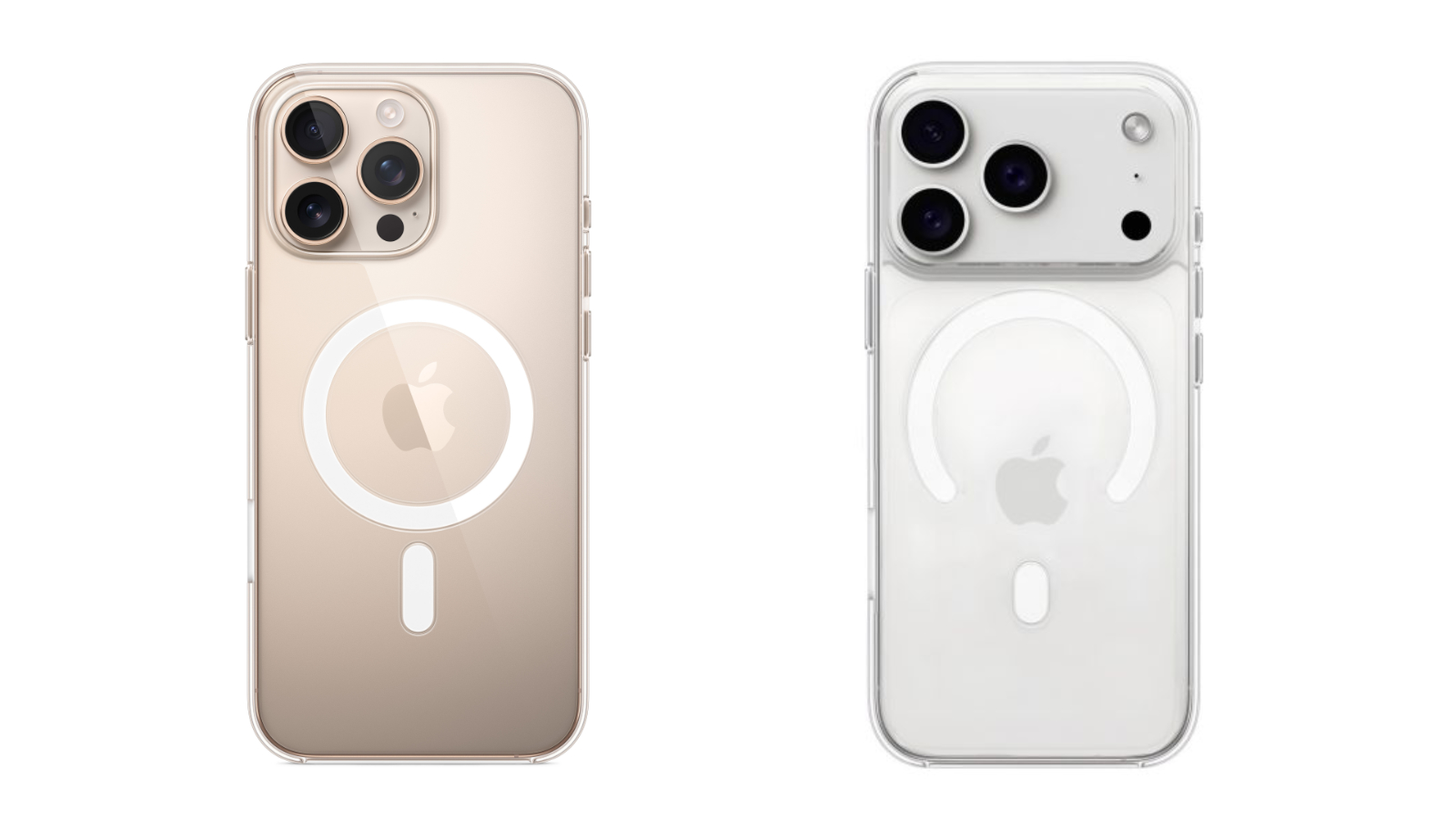
Apple's iPhone 16 Pro Max clear case and Majin Bu's render of an iPhone 17 Pro Max clear case design.
Majin Bu added that a company which makes accessories for Apple devices has begun adapting their case production based on this new logo placement. In one image shared on his website, Majin Bu shows a transparent case with a break in the circular MagSafe ring to expose the repositioned Apple logo. This suggests that Apple may not be altering the internal placement of the MagSafe magnet array, which would otherwise require extensive changes to a broad range of accessories. Accessory manufacturers are said to be watching the situation closely.
Leaker Sonny Dickson has since corroborated the rumor with digital schematics, suggesting that iPhone 17 accessories will move to a new design with a break in the circular MagSafe ring to expose the repositioned Apple logo:
Apple has made notable changes to the placement and styling of the rear logo in the past. From the original iPhone through the iPhone X, the logo was placed higher up on the back, and a small "iPhone" inscription appeared toward the bottom. With the iPhone 11 lineup, Apple removed the "iPhone" wordmark entirely and centered the Apple logo on the rear for visual balance with the new square camera bump. This layout has remained consistent across all subsequent models, including the iPhone 16 Pro.
Article Link: Apple Planning to Change iPhone 17 Pro's Logo Placement

attila
macrumors 65816
When there is no news/rumors, every little change is news
but also: "No news is good news"
darngooddesign
macrumors Core
I seriously doubt anyone can see the apple on the back of my phone. It's either facing the ground or my hand is blocking it if I should be holding it up to my head while making a call.I'd prefer not to have a big logo* advertising my phone's brand to people, too. But I'm not sure a big bare brushed metal slab would look good, either. It's too bad they couldn't engrave a grippable stylish pattern on the back.
*I loved it on my 2007 blackbook, though, because I thought it was so neat that it used the screen's existing backlight. But there's no nerdy-cool aspect to the current arrangement.
darngooddesign
macrumors Core
darngooddesign
macrumors Core
I don't think it takes much courage to post an unsubstantiated rumor which you can later counter with "Apple changed its plans".baw god king. the amount of courage this took is staggering.
Lifeisabeach
macrumors 6502
My case completely obscures it. Hmm. I never thought about it actually, but I wonder if the Bullstrap logo aligns with the Apple logo? And will they adjust the placement of their own logo to match Apple’s change?I seriously doubt anyone can see the apple on the back of my phone. It's either facing the ground or my hand is blocking it if I should be holding it up to my head while making a call.
The only time I ever see the logo is when I get a new phone or remove it from the case to clean it.
F-Trunks
macrumors regular
WhoooshI don't think it takes much courage to post an unsubstantiated rumor which you can later counter with "Apple changed its plans".
jeremyw013
macrumors member
this iphone 17 pro concept is one of the most hideous phones i've ever laid my eyes upon. that being said, i'm going to be realistic and i seriously doubt this will actually happen. it's a really weak rumor based on what i've read. these changes don't make sense.
Apple may reposition the Apple logo on the back of the iPhone 17 Pro for the first time in six years, according to a new leak that points to the redesigned top camera system potentially requiring the visual shift.
The claim originates from the leaker known as "Majin Bu," who posted an image and description of the alleged change on social media and their personal blog. According to Bu, the Apple logo will move to be noticeably lower on the iPhone 17 Pro, closer to the bottom-center of the device's rear. The shift is apparently necessitated by the new, full-width camera bar that is expected to span the entire width of the back of the device. The camera design is as a significant departure from the current module layout, with both the flash and LiDAR scanner moving to the right edge of the device.
This is the first report to link the anticipated top camera redesign with a repositioning of the Apple logo, but the change could make sense. The iPhone 17 Pro is expected to move to a new aluminum frame that encompasses almost the entire rear, with a cutout for a glass squircle below the full-width aluminum camera bump to enable wireless charging. As a result, it could make sense for the Apple logo to be centered within that glass cutout.
However, moving the Apple logo could cause some amount of confusion among users or require changes to the way MagSafe-compatible accessories are designed. This is because since its introduction with the iPhone 12, the Apple logo has indicated where users should align MagSafe accessories, with the magnets embedded beneath the center of the back panel around the logo.
Apple's iPhone 16 Pro Max clear case and Majin Bu's render of an iPhone 17 Pro Max clear case design.
Majin Bu added that a company which makes accessories for Apple devices has begun adapting their case production based on this new logo placement. In one image shared on his website, Majin Bu shows a transparent case with a break in the circular MagSafe ring to expose the repositioned Apple logo. This suggests that Apple may not be altering the internal placement of the MagSafe magnet array, which would otherwise require extensive changes to a broad range of accessories. Accessory manufacturers are said to be watching the situation closely.
Leaker Sonny Dickson has since corroborated the rumor with digital schematics, suggesting that iPhone 17 accessories will move to a new design with a break in the circular MagSafe ring to expose the repositioned Apple logo:
Apple has made notable changes to the placement and styling of the rear logo in the past. From the original iPhone through the iPhone X, the logo was placed higher up on the back, and a small "iPhone" inscription appeared toward the bottom. With the iPhone 11 lineup, Apple removed the "iPhone" wordmark entirely and centered the Apple logo on the rear for visual balance with the new square camera bump. This layout has remained consistent across all subsequent models, including the iPhone 16 Pro.
Article Link: Apple Planning to Change iPhone 17 Pro's Logo Placement
jeremyw013
macrumors member
the good thing is, this is a super weak rumor. looked at the guy's blog, most of his past predictions were totally wrong. either that or painfully obvious "predictions"Oh my, the iPhone 17 Pro just keeps getting more and more ghastly to look at.
darngooddesign
macrumors Core
I dont mind the new bump design and I think black/dark grey might be the way to go.

Having contrast between the matte and shiny doesn't bother me in the same way it didn't bother me on the 5/5S.

Having contrast between the matte and shiny doesn't bother me in the same way it didn't bother me on the 5/5S.