Become a MacRumors Supporter for $50/year with no ads, ability to filter front page stories, and private forums.
This is the 3rd thread that you started about this dock suggestion...

Thank you for noticing, but that wasn't the point of this thread. I wanted this thread to be a place to post suggestions for improving iOS 7. I mentioned the dock again just to get the ball rolling.

And there are many threads discussing suggestions and improvements for iOS 7.

Sure, you can find suggestions for improvements in just about every thread. But I don't recall one that was specifically dedicated to that subject. It's possible I missed it, of course. If so, I apologize for the redundancy.
 
I have no idea whether Apple hires people to read message boards like this one, looking for feedback and suggestions, but if I were them, I would.

They have the developer program, who all legitimate iOS7 users are members of.

If you are really wanting to have an impact on the future of iOS or OS X development, get a developer program account (it's not THAT expensive) and get legit access to all the software, dev tools, and ability to submit bug reports and be involved.

I do have a developer account (just iOS, not OS X), and I have submitted bug reports to Apple. But thanks for the suggestion.
 
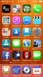
Frosted dock can look great, depending on choice of wallpaper

True, but it can also look crappy. Again, depending on choice of wallpaper.
 

Attachments

  • 2013-06-16225014.png
    2013-06-16225014.png
    821 KB · Views: 142
I don't mind the dock the way it is...but what I would like to see it the Control Centre completely fill the screen when opened, I think Apple could fit more settings/shortcuts (or something) in the little space in at the top when in portrait orientation.

I also agree the Control Center should fill the screen, expect on a personal opinion I'd want them to spread the controls out instead of adding more. Currently, the music controls and the brightness slider seem a bit cramped IMO.
 
I also agree the Control Center should fill the screen, expect on a personal opinion I'd want them to spread the controls out instead of adding more. Currently, the music controls and the brightness slider seem a bit cramped IMO.

Totally agree!
 
I'd really like to see a "show all/hide not on phone" toggle in the music app for iTunes Match subscribers. Having it buried in the settings app is a royal pain sometimes.
 
Let a right-to-left swipe unlock the lock screen too.

In iOS 6 we unlocked the lock screen by sliding a button in a track. It was obvious that we had to swipe left-to-right. Now, though, there is no track, and the entire screen moves when we swipe. Sometimes, even though I've been unlocking my phone for years, I find myself accidentally swiping right-to-left, and I wish Apple would let that gesture unlock the lock screen, too.

The reason I sometimes swipe the wrong way was explained very well by iCarabma, so I'll just quote him/her:

"But now it's as if you are sliding the lock screen away. And that feels you should flick it to the left to advance. Like turning a page in a book. Or more accurately like flipping to the next screen of icons. You want to go forward, you naturally want to move to the right, and that means you want to flick the lock screen left."

Exactly.
I don't know about that. Aside from pretty much everyone already being used to a particular way of unlocking the screen, so there's really nothing new about it and nothing "hard", adding something like this could make it even worse for those who are having issues with their phone unlocking accidentally much more in iOS 7 than before given the already redesigned lock screen that is much easier to "open".
 
Register on MacRumors! This sidebar will go away, and you'll see fewer ads.