star-affinity
macrumors 68020
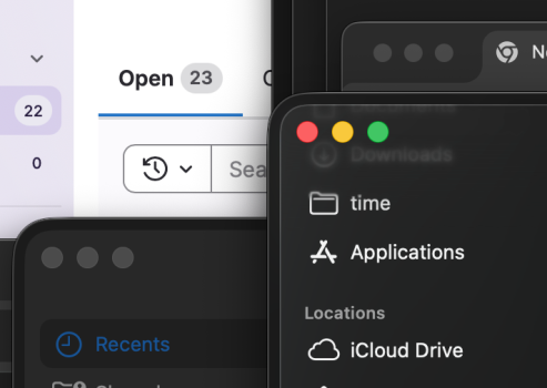
It's not that bad and it it's pretty stable overall for me. The problem I see is mostly visual. Attaching three examples from macOS 26.2.First time I haven’t upgraded Mac OS by the .1 update. All the comments are still holding me back - is it really that bad?!
The glassy background of the app switcher can look nice but depending on what's underneath it can look quite off at times when some objects underneath gets ”light scattered” by the glass. Here is the red ”current time” bar from Google Calendar that look like two blurry lines under the app switcher in this example:
And here is the app switcher again over a bright background – not so easy to read the text under the apps when they are also white:
Now one would think that changing the new Liquid Glass option to ”Tinted” should affect the tint of the glassy app switcher background, but it doesn't – it stays the same.
Now, what you can do is go to Settings -> Accessibility -> Displays and enable Reduce transparency, but that makes things very opaque which takes me to an example with the opaque app switcher (i.e. Reduce transparency = on) showing another problem I don't remember seeing in previous macOS versions.
If you open many enough apps so the app switcher start to touch the edges of your screen and then keep opening apps, the text under the leftmost and rightmost app gets misaligned. The longer the name of the app the more misaligned the text gets:
Last edited: