Got a tip for us?
Let us know
Become a MacRumors Supporter for $50/year with no ads, ability to filter front page stories, and private forums.
Apple Repeatedly Showing iPhone 14 Pro Design With No Dynamic Island
- Thread starter MacRumors
- Start date
- Sort by reaction score
You are using an out of date browser. It may not display this or other websites correctly.
You should upgrade or use an alternative browser.
You should upgrade or use an alternative browser.
Quu
macrumors 68040
I suspect originally this i design was going to play into their marketing with iPhone being written on the screen in images to depict the i as the first letter.
But later on when they came up with the Dynamic Island (as a software UI thing) they realised it looks better when passive to have a pill shape and not two disjointed cutouts.
And this may be why some of their marketing imagery is using the earlier design but I'm just theorising.
But later on when they came up with the Dynamic Island (as a software UI thing) they realised it looks better when passive to have a pill shape and not two disjointed cutouts.
And this may be why some of their marketing imagery is using the earlier design but I'm just theorising.

nattK
macrumors 6502a
I think the Occam's razor was that the iPhone 14 Pro's original product bezel image was 100% hardware (as product bezel images have always been), hence the sideway i. However, they decided later on that it would be a better idea marketing-wise to show the unified software+hardware Dynamic Island, hence the updated product bezel image with a single pill.
Mousse
macrumors 601
Leak detection. Give different departments different designs. It makes it easier to narrow down the source of leaked information. With a proper enough paper trail, they might even find the individual(s) responsible for the leak.Apple itself was perpetuating the pill-and-hole design—posting fake leaks to throw everyone off. Apple has a history of doing this.
FastLaneJB
macrumors regular
I also thought this but then the A16 has sub-pixel antialiasing hardware that they specifically said was for this feature. That might not be true of course but if it is they planned this years in advance.My first though was that Dynamic Island was a late addition to the software.
Tagbert
macrumors 604
No, it was kept secret, even within Apple, to avoid leaks. DI is much too complex and well executed to be a last minute rush job.So it's a last moment move !
Tagbert
macrumors 604
If you check the tech specs for the new phones, the screen is around 20px taller to compensate for the slightly lower DI. The result is about the same amount of safe area under the DI as under the notch.Just finished setting up my 14 Pro and i've got to say, after having the notch on the X, 11 Pro, 12 Pro and 13 Pro - this is the first one i've actually noticed. It's feels a bit obtrusive, it feels a bit low down compared to the notch (it is) so screen real estate is less...the content starts further down on the phone.
I'll get used to it but considering all the moans the notch never once bothered me in 4 years of using it - and this, initially has.
Dynamic Island was not a selling point for me, if I could turn it off and have the phone look like that, and have iPhone 13 pro style notifications I would!
Perhaps later options of "reduce motion" will enable it down the road. That is, if there is any active display medium between the punch and sensor area.
Perhaps later options of "reduce motion" will enable it down the road. That is, if there is any active display medium between the punch and sensor area.
nvmls
Suspended
Yea, the notch gets away easier in terms of display content, but aesthetically as hardware design is an aberration, though as with anything, YMMV. DI on the other hand, looks "prettier" with its animations but overlays everything, which is not ideal either.Just finished setting up my 14 Pro and i've got to say, after having the notch on the X, 11 Pro, 12 Pro and 13 Pro - this is the first one i've actually noticed. It's feels a bit obtrusive, it feels a bit low down compared to the notch (it is) so screen real estate is less...the content starts further down on the phone.
I'll get used to it but considering all the moans the notch never once bothered me in 4 years of using it - and this, initially has.
Until they find a way for a clean edge to edge display, these are all "band-aid" workarounds.
Tel Angor
macrumors newbie
Well that makes sense because we had the same information until days before the event
Apple is repeatedly depicting the iPhone 14 Pro's rumored "pill and hole-punch" display cutout design with no Dynamic Island, despite this not being an option on the device.
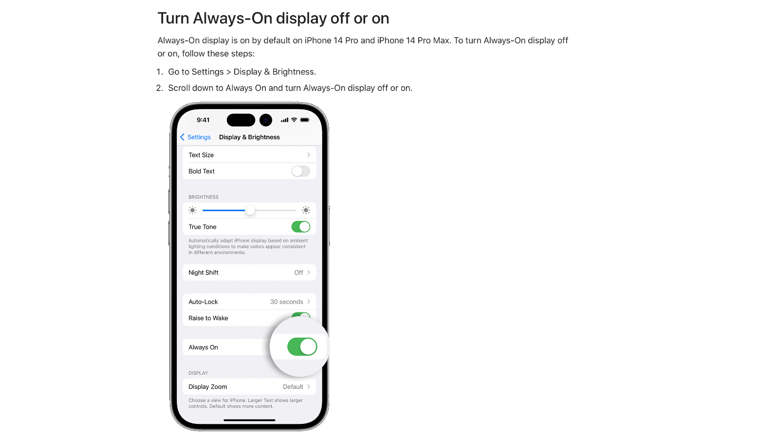
Apple Support document showing the rumored "pill and hole-punch" cutout design.
In a new support document titled "Use Always-On display with your iPhone 14 Pro or iPhone 14 Pro Max" that was published yesterday, Apple clearly shows the device's two display cutouts with usable display area between them and no Dynamic Island. This is at least the third time that the design as been spotted coming out of official Apple sources.
Evidence of Apple explicitly using the rumored "pill and hole-punch" design was first spotted in the initial graphics that were posted on Apple's website following its "Far out" event. Shortly after, Apple posted developer resources for the iPhone 14 Pro showing the display cutouts alone, before reuploading the resources correctly showing the Dynamic Island.
The repeated error is curious given that there is currently no way to disable the Dynamic Island and allow content between the two display cutouts to appear normally. The graphics are also striking given that for much of the iPhone 14 Pro's rumor cycle, the device was expected to look exactly like this. Rumors of the Dynamic Island and the two display cutouts appearing as a single "pill" thanks to software enhancements only emerged a week before the Apple event.
The blunders could indicate that the Dynamic Island was intended to be an optional feature or was even a fairly late-stage decision in the iPhone 14 Pro's development. It seems most likely that due to the siloed nature of Apple's internal structure, employees responsible for web design, developer resources, and support documents were unaware of the Dynamic Island until directly before the Apple event.
When information about the Dynamic Island solidified, it was assumed that prior rumors proclaiming a design with two visible display cutouts were derived simply from hardware leaks, with software still being heavily locked down. Apple's repeated illustration of the rumored design suggests that the initial understanding of how the display cutouts would look may have been more official than previously thought.
Article Link: Apple Repeatedly Showing iPhone 14 Pro Design With No Dynamic Island

"It seems most likely that due to the siloed nature of Apple's internal structure, employees responsible for web design, developer resources, and support documents were unaware of the Dynamic Island until directly before the Apple event."
With all the hype that leads up to every Apple product launch and the ever-increasing accuracy of the leakers, I can understand going to great lengths to suppress knowledge of such new features. Like it or not, D. Island certainly made the product announcement more fun.
With all the hype that leads up to every Apple product launch and the ever-increasing accuracy of the leakers, I can understand going to great lengths to suppress knowledge of such new features. Like it or not, D. Island certainly made the product announcement more fun.
nelloismello
Cancelled
Exactly this. This was genius because all the rumours were based on the "i" shaped cut-out, but in hypothetical reality, Apple was keeping the dynamic island a secret.It was probably done to control leak and mislead Chinese competitors. Many Chinese companies specialize in making a fake iPhone that looks like the next model. They would immediately create a punch hole version thinking it’s the new trend, until a rude awakening a week before apple releases. Letting these support documentation and translation team know what they are doing is not that important when the wrong graph does nothing to the content of the documents and is an easy fix.
Apleeseed84
macrumors 6502a
I finally saw the green and orange light on the pill cutout and it was weird because it was brief and i thought i was tripping lolol.
Saturn1217
macrumors 68000
Imagine if the dynamic island was leaked and then an android competitor had a chance to copy it (probably not as well) BEFORE Apple had a chance to announce?
That would have been a disaster.
I imagine that the DI was locked down tight to prevent leaks.
That would have been a disaster.
I imagine that the DI was locked down tight to prevent leaks.
CarAnalogy
macrumors 603
I’m hoping Dynamic Peninsula comes to the iPhone 13 Pro.Dynamic Archipelago in the next update
FelixDerKater
macrumors 68040
It also seems unlikely that one of the core interaction points of iOS was a “late addition”.
I’m still of the opinion that the “Dynamic Island” is nothing more than Apple trying to take what is essentially an eye sore and making it seem like something great.
I’m a pretty big Apple fan, having owned only iPhones since 3GS and multiple MacBooks and an iMac, but this is one of the biggest “Apple sheep” announcements I’ve seen so many people get convinced is great (calling it “core” anything).
This is along the lines of the animated emoji thing that nobody uses, but at least most people knew that was a gimmick when it was announced.
The fact that so few people see this as nothing more than a gimmick is amazing.
Most are saying it was Apple trying to make it an amazing, well-kept secret. I think it was an afterthought that happened late in the game, just to reduce the negativity around still having a cutout.
Case in point, Apple explicitly moved the Safari address bar to the bottom of the screen because nobody wanted to reach the top. An now they add this permanent “interaction point” to the top of the phone, once again out of reach, giving it a catchy name, and marketing it as this secret amazing innovation.
It’s lipstick on a pig.
Tagbert
macrumors 604
The Dynamic Island design and dynamics look very solid and well designed. That doesn’t happen quickly and at the last minute. This looks like a feature that was designed and developed along side the cutouts. The fact that we didn’t get any hints of the software is likely down to Apple siloing their teams so that only the team doing the dynamic effects knew it was being done. Hardware is hard for Apple to keep from leaking because too many outsiders need to know about it. Software is much easier to keep hidden until it is ready.I’m still of the opinion that the “Dynamic Island” is nothing more than Apple trying to take what is essentially an eye sore and making it seem like something great.
I’m a pretty big Apple fan, having owned only iPhones since 3GS and multiple MacBooks and an iMac, but this is one of the biggest “Apple sheep” announcements I’ve seen so many people get convinced is great (calling it “core” anything).
This is along the lines of the animated emoji thing that nobody uses, but at least most people knew that was a gimmick when it was announced.
The fact that so few people see this as nothing more than a gimmick is amazing.
Most are saying it was Apple trying to make it an amazing, well-kept secret. I think it was an afterthought that happened late in the game, just to reduce the negativity around still having a cutout.
Case in point, Apple explicitly moved the Safari address bar to the bottom of the screen because nobody wanted to reach the top. An now they add this permanent “interaction point” to the top of the phone, once again out of reach, giving it a catchy name, and marketing it as this secret amazing innovation.
It’s lipstick on a pig.
I fully expect the dynamic island to remain even after Apple is able to move the camera and faceID under the screen. There is just too much useful functionality in the software. It will just become a software-only UI component.
gk_brown
macrumors 6502
It seems to me that, from a functional standpoint, Dynamic Island-like behavior could just as easily have been implemented with the traditional notch (although a smaller notch would have made it a bit easier).Just finished setting up my 14 Pro and i've got to say, after having the notch on the X, 11 Pro, 12 Pro and 13 Pro - this is the first one i've actually noticed. It's feels a bit obtrusive, it feels a bit low down compared to the notch (it is) so screen real estate is less...the content starts further down on the phone.
spazzcat
macrumors 601
This wasn't communication breakdown; it was most likely done on pupose to prevent leaks. Anyone who thinks communication differs from WFH has no idea how communication happens in a business/office.I LOVE the flexibility of working from home, but I can see communication breakdowns like this occurring more frequently with people scheduling their own work hours and not being held to in-workplace standards. All depends on leadership.
Register on MacRumors! This sidebar will go away, and you'll see fewer ads.