Become a MacRumors Supporter for $50/year with no ads, ability to filter front page stories, and private forums.

MacRumors

macrumors bot
Original poster
Apr 12, 2001
68,103
38,855


Apple today shared a new support document that explains how users can ensure that an app's menu bar items do not appear hidden behind the notch, or the "camera housing" as Apple calls it, on the new 14-inch and 16-inch MacBook Pro models.

scale-to-fit-notch-setting-macos.jpg

In the support document, Apple says users can turn on "scale to fit below built-in camera" for an app to adjust the active area of the display, ensuring that the app's menu bar items appear below the notch and are always visible.

Menu bar items appearing hidden behind the notch was demonstrated by Quinn Nelson, host of the YouTube channel Snazzy Labs.

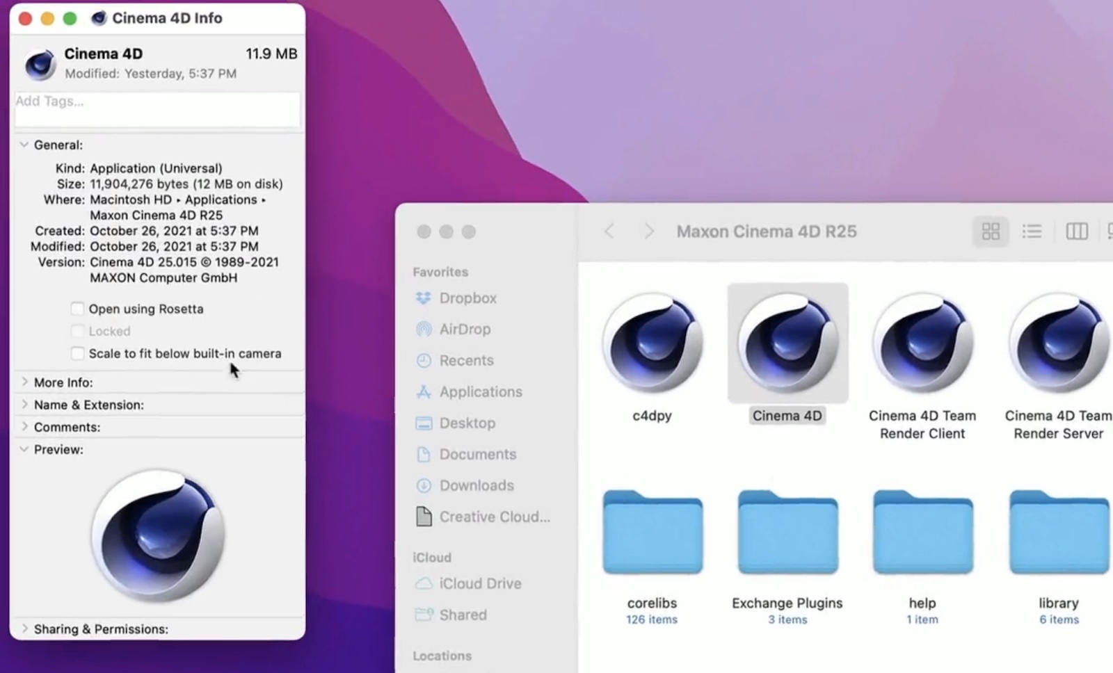
To turn on "scale to fit below built-in camera" for an app on the new MacBook Pro models, open the Finder app and click on Applications in the sidebar. Then, right click on the desired app and select "Get Info." In the Info window that opens, check off the "scale to fit below built-in camera" box and the display will automatically adjust when the app is open.

The setting was demonstrated in a tweet by Joseph Angelo Todaro, a design advocate for Sketch.


Apple notes that developers can update their app to work better with the notch, in which case the "scale to fit below built-in camera" setting no longer appears.

Article Link: Apple Reveals 'Scale to Fit' Setting to Prevent a Mac App's Menu Bar Items From Being Hidden Under Notch
 
This really should be enabled by default. I love a lot about my new MBP, including the screen space gained by the taller screen, but the notch does get in the way, mostly because of menu bar apps like istat and app menus can get confused or lost under it, something anyone whose ever used a Mac could have foreseen.

Edit: just watched the video. Does the setting really just make the top bezel huge again rather than shrink the font and spacing of or abreviate menu items? Seriously? I just want to be able to make the menu items have a smaller font and tighter spacing to fit more up there, is that so hard?
 
Did you notice that “scale to fit” restores the bezels of the previous generation MBP on the left and right side as well (not just the top of the screen)? This is how it maintains the aspect ratio. It is literally scaling down the whole screen
 
The video shows the entire screen shrinking at the same aspect ratio, bizarre. I would have expected the menubar to simply slide down the same number of pixels as the notch is tall, making it the same total aspect ratio as previous MBPs

This is going to be annoying for pixel critical work that designers (and artists, etc) do, as it's no longer a perfect 2x multiple PPI (for the default scale resolution, at least). Scaling the entire screen down a bit means you're no longer integer scaling the display.
 
This really should be enabled by default. I love a lot about my new MBP, including the screen space gained by the taller screen, but the notch does get in the way, mostly because of menu bar apps like istat and app menus can get confused or lost under it, something anyone whose ever used a Mac could have foreseen.

Edit: just watched the video. Does the setting really just make the top bezel huge again rather than shrink the font and spacing of or abreviate menu items? Seriously? I just want to be able to make the menu items have a smaller font and tighter spacing to fit more up there, is that so hard?

Just go to System Preferences > Display, click Scaled > More Space and voila... not so hard if you try it.
 
Did you notice that “scale to fit” restores the bezels of the previous generation MBP on the left and right side as well (not just the top of the screen)? This is how it maintains the aspect ratio. It is literally scaling down the whole screen
This is probably the quickest way for macOS devs to implement while they figure out a better way later (if Apple allows that to happen).
I too wished the menu bar just got pushed down.
 
Since the OS controls the menu bar, why not just ensure items can't end up under the bar. With a mouse they could scroll the menu bar left/right and with the trackpad there could be a clickable "more" ..." near the notch. In a short time, app developers would change the menu structure to fit.

The File, Edit, Window and Help menu titles could also auto downgrade to a simple icon if the menu area was too wide to fit everything.
 
It boggles my mind that in 2021 Apple released computers which can hid critical information (i.e., menu bar items) by default. Is all this screwing around really worth it for a tiny percentage increase in the total screen area?

With all the stupid decisions made by the Mac team over the years, it is easy to see why their market share is so low. It really is sad.
 
Just go to System Preferences > Display, click Scaled > More Space and voila... not so hard if you try it.
Not at all what I'm talking about. I use quickRes and usually am running resolutions higher than apple's highest allowed. I've been doing this since the first retina MBP in 2012, there's no reason to waste 3/4s of your resolution just because some people have terrible eyesight. What I'm looking for is something like this:
 

Attachments

  • Screen Shot 2021-10-28 at 1.00.50 AM.jpg
    Screen Shot 2021-10-28 at 1.00.50 AM.jpg
    34.9 KB · Views: 183
Is it just me, or did Apple used to avoid the word "bezel"? They used it in this document, but IDK. I feel like they would use words like "border".
 
  • Like
Reactions: DaPizzaMan
The video shows the entire screen shrinking at the same aspect ratio, bizarre. I would have expected the menubar to simply slide down the same number of pixels as the notch is tall, making it the same total aspect ratio as previous MBPs

This is going to be annoying for pixel critical work that designers (and artists, etc) do, as it's no longer a perfect 2x multiple PPI (for the default scale resolution, at least). Scaling the entire screen down a bit means you're no longer integer scaling the display.
The DPI does not change, only the active area.
 
Register on MacRumors! This sidebar will go away, and you'll see fewer ads.