Become a MacRumors Supporter for $50/year with no ads, ability to filter front page stories, and private forums.


Apple today provided public beta testers with a third beta of macOS Tahoe, the newest version of macOS that's set to launch this fall. The third beta comes one week after the second macOS Tahoe public beta, and it corresponds to the sixth developer beta.

macOS-Tahoe-26-Thumb-2.jpg

Public beta testers can download macOS Tahoe from the Software Update section of the Settings app after signing up for the betas on Apple's website.

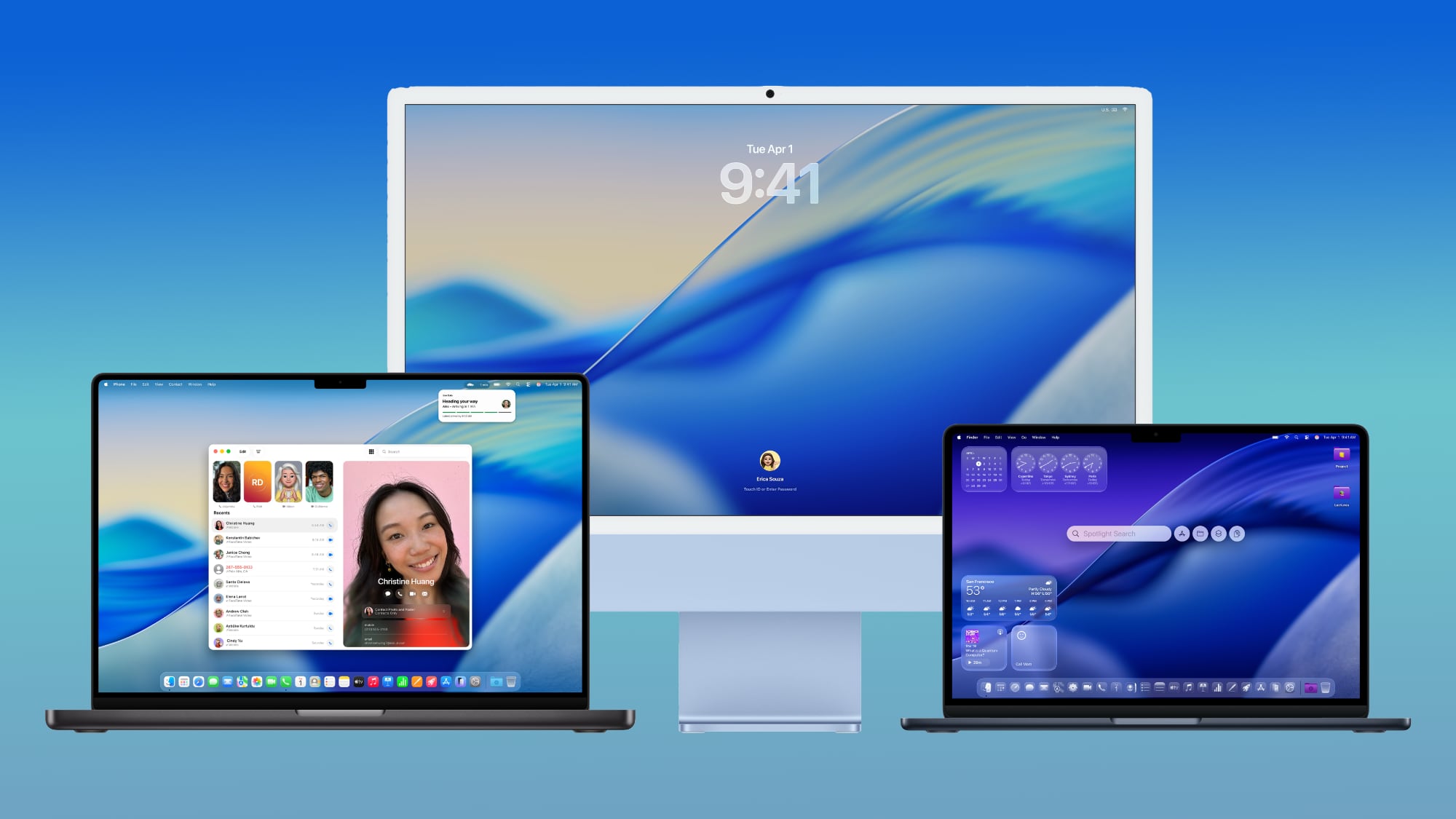
macOS Tahoe has the same Liquid Glass design as iOS 26, and it extends to app icons, folders, the Dock, in-app navigation, menus, the Control Center, and the Menu Bar. The Control Center and the Menu Bar are customizable, and you're also able to customize folders, app icons, and widgets.

macos-tahoe-design.jpg

Safari has an updated tab design and a redesigned sidebar, and Apple has brought the Phone app to the Mac for making phone calls through Wi-Fi Calling. The Phone app supports the new Call Screening and Hold Assist features.

Spotlight has been overhauled with improved search and the ability to execute hundreds of actions without opening up an app. There's a new Games app with a Game Overlay feature, and developers have access to Metal 4.

More on what's new can be found in our macOS Tahoe roundup.

Article Link: Apple Seeds Third macOS Tahoe Public Beta
I am doing the dive. I have not not not not, and not, done beta since like back in G3 era? My old M1 MacBook Air though is a likely victim at this point, camera is dead, low RAM, so away we go. The Air's downstairs churning away on the download - which is plenty big papa san.
 
Has anyone noticed the cmd-tab pop up has bad alignment issues on laptops? For me, the app name on the first and last apps show up under the second and next to last icons. Looks like they increased the radius of the round corners to the point where it pushes the text in so much it doesn't align with the icon anymore.

And the highlight around the icon is nearly non-existent, like 1 or 2 pixels. This issue doesn't happen on a monitor. I'm guessing it's a scaling issue.
Good eye there.
 
Has anyone noticed the cmd-tab pop up has bad alignment issues on laptops? For me, the app name on the first and last apps show up under the second and next to last icons. Looks like they increased the radius of the round corners to the point where it pushes the text in so much it doesn't align with the icon anymore.

And the highlight around the icon is nearly non-existent, like 1 or 2 pixels. This issue doesn't happen on a monitor. I'm guessing it's a scaling issue.
Looks fine on historic M1 Air. So far it looks damn bland to me. I will have to dig for nitpicking stuff.
 
Liquid Glass is getting more refined in its look. But... It still interferes with function and you need to choose backgrounds carefully.
I can’t stand the notch on my MBP, so I have a black background to ensure I don’t have to look at the notch. It definitely makes Liquid Glass seem almost irrelevant.
 
I still think using LaunchPad is the least efficient way to launching apps, but that's just my opinion.
If using one finger tip to access all your apps and launch what’s desired in under a second is the “least efficient”, my 30 years of using computers has not been enough to know how to use one. But I concede that may be true given that Apple has also chosen to eliminate this method. Of course, I would expect they also remove this “least efficient” method from the iPhone and iPad.
 
That is not at all the same functionality.
Your right — it's actually better — rather than pages and pages with no reasonable way to organize them simply, it now starts by showing a row of your recently used apps, categories you can immediately jump to (like Utilities, productivity or social), all without taking over your entire screen. It puts the emphasis on typing a letter to narrow down the remains results — which is the exact same functionality the last one had – but in a more useful and contextually aware implementation because your screen hasn't been blurred out, nor do you have to swipe through pages to find what you want. PLUS it adds the ability to jump into an iPhone app right there (if you want, you can easily turn it off).
 
  • Love
Reactions: _Mitchan1999
I'm waiting for the Macbook Pro 26 with the M26 processor, because clearly padding numbers means it's better.. amirite?
I mean, you do realize it's just the year so that users can know if they have the latest one, right? Never in the history of anything has a higher number actually equaled "better". Thinking they are padding numbers to make people think it's more advanced is laughably cynical.

The hilarious thing is those labels are probably going to happen so people know what model year they have... no different than cars.
 
Broke my 27" Intel iMac. Finished the progress bar, went black, and never returned to Apple logo. Tried SMC reset and a million other combinations of removing the power cord and pressing the on/off button and still nothing.
 
If using one finger tip to access all your apps and launch what’s desired in under a second is the “least efficient”, my 30 years of using computers has not been enough to know how to use one. But I concede that may be true given that Apple has also chosen to eliminate this method. Of course, I would expect they also remove this “least efficient” method from the iPhone and iPad.
If you can go from a mouse pointer anywhere on the screen to triggering LaunchPad to aiming to any app and tapping/clicking an app to launch it in under a second, props to you. Sincerely, that's impressive. Personally, I find it quicker to cmd-space and typing a couple characters since there's no need to move the mouse, and it keeps the mouse where it was. Admittedly, I've been at this a bit longer than you, so maybe I need to hit the Aimlabs. 😆 I've also removed 90% of the icons from the Springboard of my iPhone and iPads too since it's maddeningly cluttered to use folders and slow to flip pages. It's so much faster to just start typing an app's name.
 
Looking forward to see what text they've rendered unreadable this time because they're married to their Liquid Glass high concept instead of basic usability.
The good news from what I've seen is they have options to mitigate any usability problems. I'll give the defaults about a week or so to see if they grow on me but I may well change the options after that. A 'cool' look is fine and maybe a bit welcome but I agree not at the price of readability.
 
I think I may appreciate the enhanced Spotlight the most. I already use it on Sequoia to launch any apps not on my Dock or to find how to adjust some setting so I'm already programmed to readily hit CMD Space.
 
Have you tried putting the Applications folder in the dock? I’ve always found this to be faster and more convenient than Launchpad. Idk why it isn’t there by default, honestly
Well Applications is already in the pinned list in Finder so it's only one extra click away from being on the Dock.
 
Launchpad is still gone, right?
I’m not downgrading until it’s back or there’s an alternative app.
There used to be one called Square One in the pre-OSX days.


Version 4 was for system 8 and up ( I think) and had tabbed pages. I had one tab for office type programs, one for graphics, and one for utilities.
 
Last edited:
Launchpad is still gone, right?
I’m not downgrading until it’s back or there’s an alternative app.
You launch Spotlight and the apps are right there with a single click. So CMD Space then a single click (or type part of the name of the app).
 
Register on MacRumors! This sidebar will go away, and you'll see fewer ads.