Wow! Can it be?
Apple today updated its Apple Store app for the iPhone and iPad, introducing a new icon that better matches the Liquid Glass design changes added in iOS 26 and iPadOS 26.
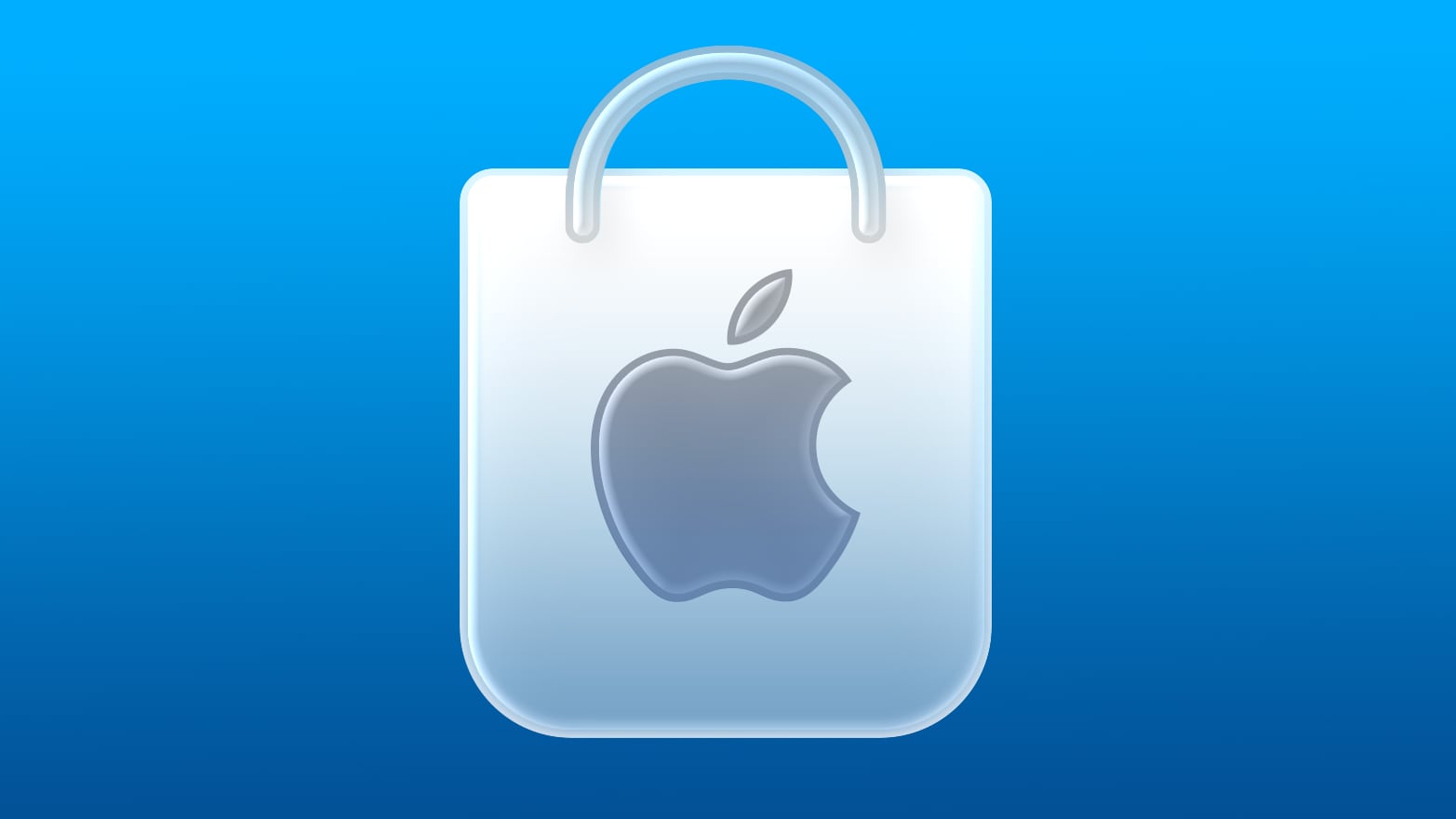
The new version of the icon features a Liquid Glass shopping bag on a blue gradient background. The prior version of the icon had a blue shopping bag on a white background.
Apple also adopted Liquid Glass design elements for the rest of the app, adding a transparent, rounded navigation bar with a Liquid Glass slider, and an updated search interface. Aside from these design changes, the content in the app is the same.
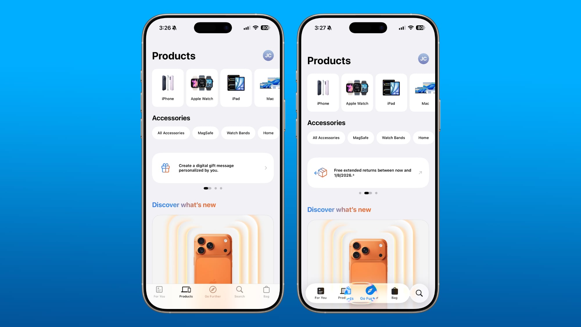
The Apple Store app features Apple products and accessories, as well as quick access links for support. It can be downloaded from the App Store for free. [Direct Link]
Article Link: Apple Store App Gets Liquid Glass Update With New Icon
Got a tip for us?
Let us know
Become a MacRumors Supporter for $50/year with no ads, ability to filter front page stories, and private forums.
Apple Store App Gets Liquid Glass Update With New Icon
- Thread starter MacRumors
- Start date
- Sort by reaction score
You are using an out of date browser. It may not display this or other websites correctly.
You should upgrade or use an alternative browser.
You should upgrade or use an alternative browser.


Instantly reminded me of the G4 cube.

Canubis
macrumors 6502
Really like this one, gives strong aqua vibes.
Reminds me to the apple logo found on the nice quicksilver PowerMac G4s. 🤍

Reminds me to the apple logo found on the nice quicksilver PowerMac G4s. 🤍
tomtad
macrumors 68040
DBZmusicboy01
macrumors 65816
aParkerMusic
Suspended
Cue the “not buying another iPhone until they bring back the mini!!!” remarks.
Yes, it has nothing to do with the article. Exactly.
Yes, it has nothing to do with the article. Exactly.
RSmith2023
macrumors 65816
Icon on my 17 PM (26.2 b2) is still the same… How are they pushing it out? Surely they aren’t wasting bandwidth to push out an icon
Never mind… they disguised an icon update as an app update… 🤦🏽♂️
Never mind… they disguised an icon update as an app update… 🤦🏽♂️
Last edited:
coolfactor
macrumors G3
The whole Liquid Glass UI is a nod to the old Aqua UI. This looks like a modern take on the original OS X design. I think it looks great.
For those saying things like "Steve Jobs is rolling around in his grave" or "Jobs would not approve" -- he approved the original Aqua theme. Would he approve this? I have no idea and neither do any commenters here.
And yet that's what all the poo-pooers keep missing. Liquid Glass is not just a visual appearance, or a "skin", like Aqua was, but embodies actual physics in its design. The morphing of controls from one shape to another, or two objects together into one, is genius and so fluid. It makes the interface feel so alive and fun to use.
Good work, Apple. Shame that people just love to complain about everything under the Sun when changes are implemented, like switching from gasoline engines to electric. It's happening. Deal with it.
coolfactor
macrumors G3
My only issue with the design is the outside stroke along the bag and the Apple logo. Seems very un-Apple like in regards to past designs and is what it feel amateurish to me.
If you look closer, it's more like the polished edge of a sheet of glass. Zoom out and that "thick stroke" you're seeing is just a subtle touch of the design that's needed to give the icon some depth.
It looks great. Though I'm not surprised most here are going non-linear over it.
coolfactor
macrumors G3
Quite embarrassing that all Apple apps weren’t upgraded to the new style at iOS 26 launch
Hmmm, so looking at the alternative universe where everything was "done" on Day One... and then we'd have months and months of nothingburger coming out of Apple... how many complaints would that garner, I wonder? Is progression an embarrassment?
Apple does what they want, when they want, assign premium prices and laugh all the way to the bank. It’s good to be Apple 😂Can’t believe iOS 26 has been out for two months and Apple hasn’t finished updating the default app icons yet.
turbineseaplane
macrumors Penryn

conmee
macrumors 65816
You think the mini faithful are bad? Just wait until Apple cancels the Air… 😉Cue the “not buying another iPhone until they bring back the mini!!!” remarks.
Yes, it has nothing to do with the article. Exactly.
On topic, even iOS 18 can’t escape with updated icons sporting faux Liquid Glass touches to remind the recalcitrant non-upgraders of what they’re missing.
#mini4life
KoolAid-Drink
macrumors 68000
They forgot to update the keyboard inside the app. It's still sporting the "classic" iOS 18 look.
Edit: Weird, after tapping the X button above the keyboard, it kind of blinked out and back in, then changed to the new iOS 26 keyboard. So odd.
Edit: Weird, after tapping the X button above the keyboard, it kind of blinked out and back in, then changed to the new iOS 26 keyboard. So odd.
saturn88
macrumors 6502
Skeumorphism
Apple today updated its Apple Store app for the iPhone and iPad, introducing a new icon that better matches the Liquid Glass design changes added in iOS 26 and iPadOS 26.
The new version of the icon features a Liquid Glass shopping bag on a blue gradient background. The prior version of the icon had a blue shopping bag on a white background.
Apple also adopted Liquid Glass design elements for the rest of the app, adding a transparent, rounded navigation bar with a Liquid Glass slider, and an updated search interface. Aside from these design changes, the content in the app is the same.
The Apple Store app features Apple products and accessories, as well as quick access links for support. It can be downloaded from the App Store for free. [Direct Link]
Article Link: Apple Store App Gets Liquid Glass Update With New Icon