Become a MacRumors Supporter for $50/year with no ads, ability to filter front page stories, and private forums.
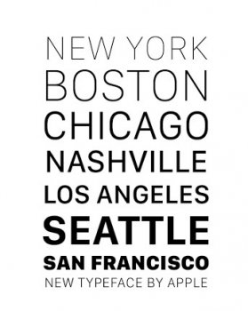
Here's what it looks like in action.
Warning: If for any reason you decide that you want to replace the OS X System Font on your own please use caution to remove it before upgrading to OS X 10.11. Apple was quick to DMCA the Github repository that had the font because if the new font isn't removed as a system font when the user upgrades to 10.11, Apple's replacement font will not show up. Messing with system fonts is really nasty and can ruin your experience.

osx10-11.png
 
Last edited:
After reading this, I looked at my watch and iphone and could not tell the difference. I had to study them for a couple of minutes to begin to see a difference.

So, I am clearly visually-font-impaired. As long as they don't use anything too outlandish like this, then I think we are okay.
 
Change for the sake of change.

I was in a classroom in 2011 and I booted up my macbook in a room full of PC users. Someone commented how nice it was to hear the Apple chime and a few others joined in in agreement.

Part of what made Apple great was the consistent experience, the tech improved, the interface improved, but the look and feel stayed the same as much as possible without hurting innovation. The Macs had a refined feel and for decades, everyone associated that noise with their great apple experiences.

At the same time, MS would change all their sounds and the whole feel of the OS with each version so it was all just so much blah noise.

Now Apple wants to keep changing their look and feel over and over and over for the sake of change. Even getting rid of the white apple-pulse light just takes away from the premium Apple feel. If they have to change the font for some innovative reason, great…but when they keep changing it just so you always know you're on the NEW ONE, they destroy their own branding and they're just like MS.
 
For a moment I thought im in the thread back in ios7 days where everyone was hating Helvetica Neue. But no, now everyone likes Neue and everyone hates the new one.


I like it.
 
How about going back to the Jobs-era trend of innovating instead of copying Microsoft and Google? Specifically, I mean how about going back to the iOS 6 fonts and skeuomorphic design instead of continuing to copy Microsoft and Google's implementation of thin fonts and flat design?
 
Shoot me now. I hate that font. :mad: It looks to much like Android. What is happening to my Apple, that I love.

Wait you hate it because it looks like android? Not because it's not readable to you? Because it looks like android? What if apple changes it to comic sans, it's not like android. Would it be ok? Lol
 
Someone named Steve left the building.

I suppose Apple should get rid of extensions, 3rd party keyboards and actual notifications as well as those are too much like Android?

Apple needs OS X, iOS and Watch OS to have more visual consistency not less. I hope we get a dark theme in iOS but I won't be surprised if we don't see that until/if Apple ships iPhones with OLED displays.
 
I won't be happy with yet another OS X release. How about letting 10.10 mature a little and get back some of that famous OS X rock-solid stability that we haven't seen for years?.

Well, rumors are that iOS 9 will be more of a Snow Leopard release, focusing on stability rather than features. Hopefully 10.11 follows suit.
 
How about going back to the Jobs-era trend of innovating instead of copying Microsoft and Google? Specifically, I mean how about going back to the iOS 6 fonts and skeuomorphic design instead of continuing to copy Microsoft and Google's implementation of thin fonts and flat design?

I will literally burn all of my Apple products if they went back to the skeuomorphic design :mad: . That was the one and only thing I didn't like about Apple.
 
Well, rumors are that iOS will be more of a Snow Leopard release, focusing on stability rather than features. Hopefully 10.11 follows ****.

What I found interesting is that you misspelt "suit" to something that caused the forum software to blank the word out. What word, similar to suit, do your fingers naturally and instinctively type instead that would be offensive I wonder...
 
  • Like
Reactions: grahamperrin
Just put a bold text option in OS X and I'm fine.

I don't need it with iOS, but it would help when sitting far back at a desktop with all the translucency.
 
I really dislike the thin fonts. Hopefully they will keep an "bold text" option. It is the first thing I turn on on all of my i devices.
 
Register on MacRumors! This sidebar will go away, and you'll see fewer ads.