Become a MacRumors Supporter for $50/year with no ads, ability to filter front page stories, and private forums.
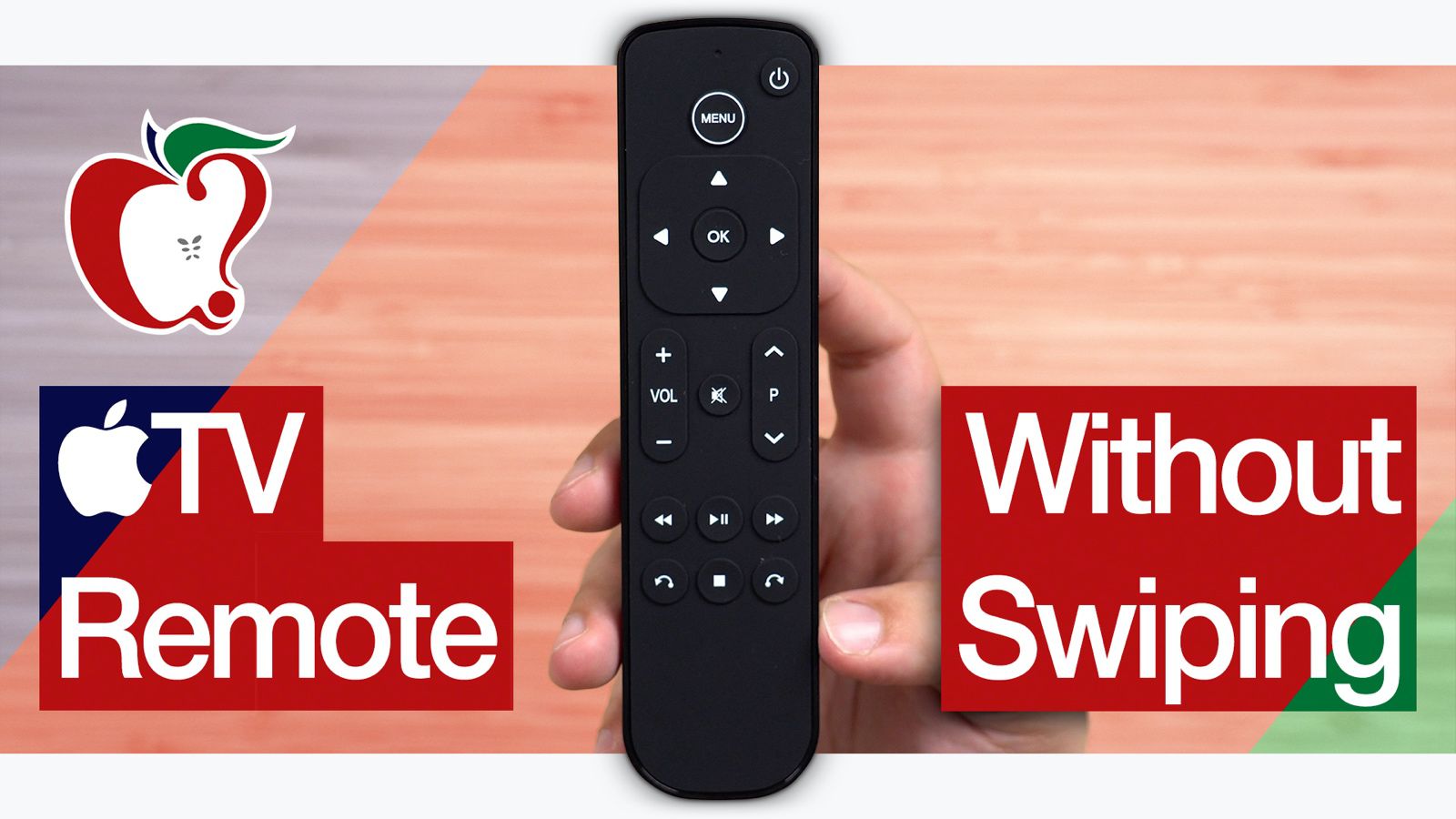
I have a love/hate/tolerate relationship with this remote.

Once I got used to it...I started to love being able to scrub video. (Occasionally that can be a pain, but overall it's good).
Hate: If that thing falls into the couch...well you're screwed!
Tolerate: the design. It could be much better. But I can deal with it. And aside from scrubbing video...swiping through everything else can become a bit of a chore. Could be better, but again...I can deal with it.
 
For me, a tap is a precise gesture. A swipe is an imprecise gesture. With a tap or a hold, a normal TV remote understands exactly what I want. However, the swipes with the ATV are often incorrect. To scroll channels in AT&T TV Now is annoying. Instead of tapping 3 times, I have to drag my finger across the pad, drag it again, and drag it again, hoping I didn't accidentally over/under drag. And of course I initially grabbed the remote upside down, so that meant my very first drag/swipe didn't register anything.
 
For me, a tap is a precise gesture. A swipe is an imprecise gesture. With a tap or a hold, a normal TV remote understands exactly what I want. However, the swipes with the ATV are often incorrect. To scroll channels in AT&T TV Now is annoying. Instead of tapping 3 times, I have to drag my finger across the pad, drag it again, and drag it again, hoping I didn't accidentally over/under drag. And of course I initially grabbed the remote upside down, so that meant my very first drag/swipe didn't register anything.

Settings > Accessibility > ... and then somewhere in there this is a trackpad sensitivity control. If you dial down the sensitivity a bit, it's a lot easier to avoid over-scrolling.
 
Settings > Accessibility > ... and then somewhere in there this is a trackpad sensitivity control. If you dial down the sensitivity a bit, it's a lot easier to avoid over-scrolling.

I've done all that, it's just a piss-poor user interface. The ATV remote is nice on the home menu, nice within HBO Go/Now, but very poor within the primary App I would use--AT&T TV Now
 
  • Like
Reactions: OddyOh
I've done all that, it's just a piss-poor user interface. The ATV remote is nice on the home menu, nice within HBO Go/Now, but very poor within the primary App I would use--AT&T TV Now

Oh yeah, I've run into that. A lot of the third-party apps have horrible UIs that play terribly with the remote. Scrubbing on the YouTube app is just atrocious, for one, and has nothing in common with how other apps work.

One thing that's kind of helpful is you can have more than one remote in play at a time. I have a Harmony and use that interchangably with the ATV one.
 
Definitely an example of form over function.

Apple since 2013 more often than not. Beyond the remote, signifying a selected entity on the ATV screen by a square /icon that’s SLIGHTLY larger than the rest is just so frustrating. Walk away and come back and you have to move the cursor/selected icon just to regain understanding of things. Apple’s 2nd design sin since 2013 - too often takes more steps to do what used to take fewer, seemingly for the sake of a more clean, uncluttered appearance.
 
Last edited:
  • Like
Reactions: OddyOh and HDFan
I think you are defining precision control incorrectly.

The harmony remote is actually more precise. Each d pad click is exactly one tile. If you use the touchpad and accidentally swipe instead of touching its edge, you risk going over more than 1 tile. That by definition is the opposite of precision control

I think what you’re saying is you like to quickly go thru tiles then switch to single tapping when you need. I wouldn’t define that as precision control though because there is a lot of room for error. For example, the text entry strip bar on the Apple TV is very cumbersome to use with the touchpad

I think he means when scrubbing through a video. Trying to do that with fixed buttons is aggravating and takes forever. (Assuming you need to rewind or fast forward beyond the 15 or 30 second increments some remotes give you)

On the touchpad it’s much quicker and precise for sure.

Except with YouTube since they switched to their garbage player instead of the native one.
 
For those of you who are in Switzerland, Salt developped a fully Apple TV compliant remote with no touch pad :
 
a fully Apple TV compliant remote
What do you mean by this?

The Salt Remote is missing the Home/TV button. I am not sure if that qualifies as "fully compliant", but if it does, I guess just about any IR remote can be considered "fully compliant", as the Salt Remote doesn't do anything different than any other IR remote.
 
What do you mean by this?

The Salt Remote is missing the Home/TV button. I am not sure if that qualifies as "fully compliant", but if it does, I guess just about any IR remote can be considered "fully compliant", as the Salt Remote doesn't do anything different than any other IR remote.

It is an IR remote that has been developped in collaboration with Apple:

"According to Salt, the Salt Remote was designed in close collaboration with Apple after the Salt TV customer base complained about the poor usability of the default remote that comes with the ‌Apple TV‌."

I personally did not buy one yet, but it could well be once apple remote get smashed on a wall...
 
Everyone is different. I love that little remote. It just works. I've never had a single problem with it. Scrolls perfectly, fits in the hand. Best remote I have ever used, by far.
 
Apple since 2013 more often than not. Beyond the remote, signifying a selected entity on the ATV screen by a square /icon that’s SLIGHTLY larger than the rest is just so frustrating.

Just upgraded my two ATV3's to ATV4's yesterday so I could use the Sling app(no need for 4k and a refurb Apple TV HD is the cheapest upgrade I could find). I completely agree with this, it just isn't obvious enough what is selected. In fact, I really dislike most of the interface changes. Sure, the ATV3 is certainly showing its age, but I really preferred the simple, elegant UI that is consistently dark. Even when you choose the dark mode on the ATV4, you are still blasted with lots of bright white items.

And, regarding the remote, yeah I hate that too. Not exactly new to me, I gave my daughter's family an ATV4 several years ago. But I just find it very awkward, and doing the initial setup was one of the most miserable user experiences I've ever had on an Apple device (and I go back to the Apple ][ in 1978).

I will adapt and adjust though, it's not the end of the world. But I am using my old silver ATV3 remotes, glad to see they are still compatible. :)
 
Last edited:
I will adapt and adjust though, it's not the end of the world. But I am using my old silver ATV3 remotes, glad to see they are still compatible. :)

That's great to hear I'm going to try the ATV3 remote.

My fiance's father lost his sense of taste years ago, and my left knee gives me issues when mountain biking and I've had to severely slow down my pace and aggressiveness. We both adapted and it was not the end of the world but wow, things were sure a lot better before and I'd change both in a heartbeat if I could, but I have no power in the matter. Given that Apple has a choice between delivering a control designed with robustness/function in mind instead of minimalist folly, there's no excusing them. :)
 
  • Like
Reactions: Boyd01
Register on MacRumors! This sidebar will go away, and you'll see fewer ads.