Become a MacRumors Supporter for $50/year with no ads, ability to filter front page stories, and private forums.

MacRumors

macrumors bot
Original poster
Apr 12, 2001
67,489
37,769


Apple today changed the subscription management interface on the iPhone and iPad, introducing a refreshed look that adds spacing between each subscription and it makes it clearer which subscriptions are active and inactive.

apple-subscription-changes.jpg

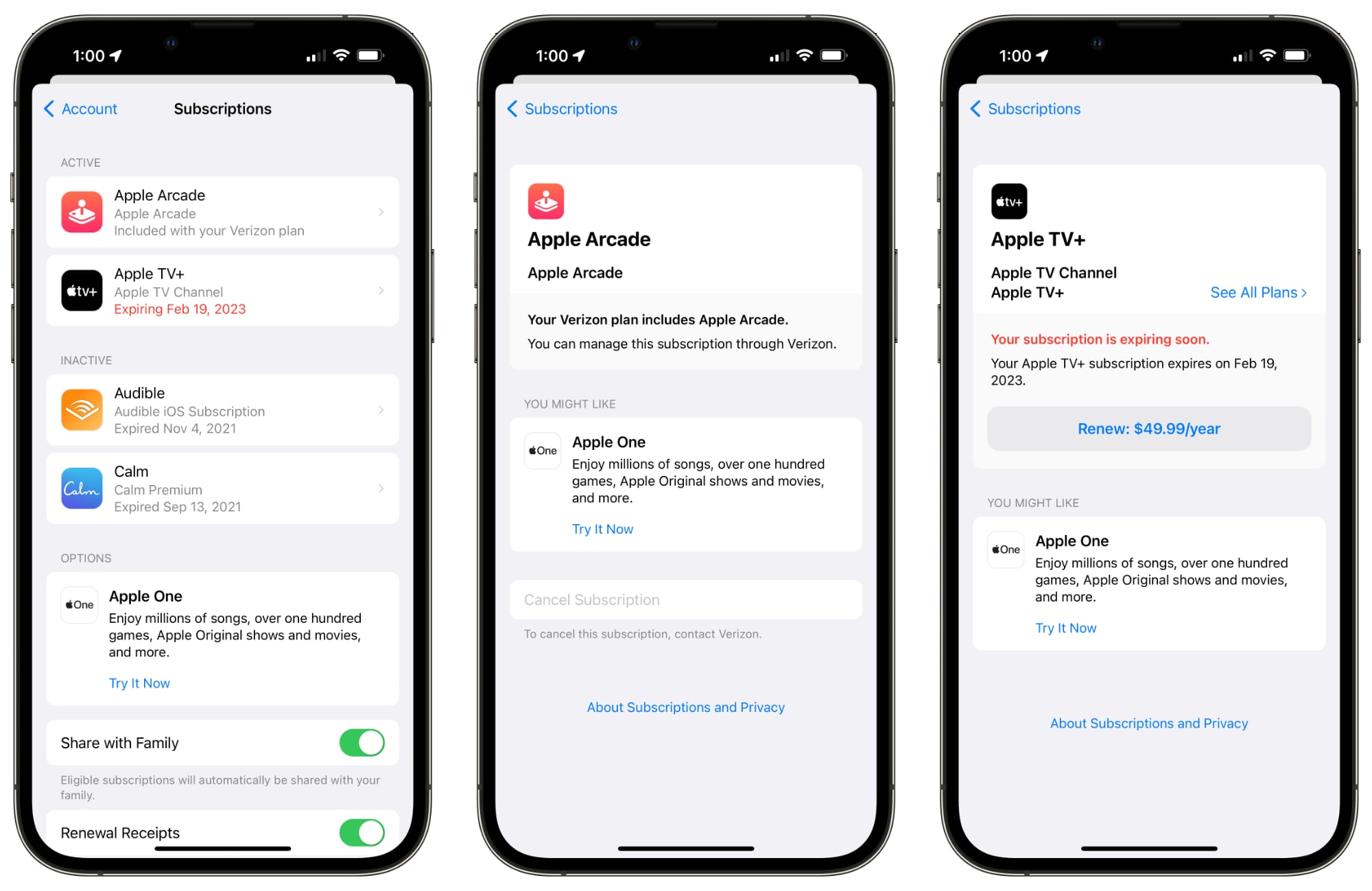
Tapping into a subscription provides details on the price of the subscription and when it is set to renew, plus the interface provides options to resubscribe to an expired subscription. Renewal buttons are more prominent than before, as are cancel buttons and options to change subscription plans for services like Apple One, Apple TV, and Apple Music.

The new subscription interface can be seen on devices running iOS 15.5 and later, including those with the iOS 16 beta. It does not appear to be available on iOS 15.4, so it may be limited to those with newer updates. No software update is required to see the refreshed interface because it loads a webview that Apple revamped.

The updated subscription interface is more in line with the rest of the Settings app changes that Apple made with iOS 15 and earlier updates, providing a simpler, more streamlined management system.

You can access the Subscriptions interface by opening up the Settings app, tapping on your profile picture, and then selecting "Subscriptions."

Article Link: Apple Updates Subscriptions Interface on iPhone
 
They are still not sorted by the renewal date with the ones that expire/renew first on top, which would make a lot of sense vs. alphabetical sorting (or just giving us the option). I have submitted feedback to Apple a while back to suggest this. It would also be nice to see the Calendar and/or Reminders integration for subscriptions, as you can already request Apple to give you a heads-up before renewing a subscription it would be convenient to have them inserted into the calendar/reminders.
 
  • Like
Reactions: BiscoDino and mhnd
I'm on iOS 15.4 and it looks the same as the screenshots in the article
 
You can still see the old interface if you go to the App Store app's Search tab, tap on your account picture, go to "Personalized Recommendations" and then tap "Subscriptions." Maybe they're still rolling it out everywhere? This is on iOS 15.5.
 
Next, address the installment plans in Apple Card. When you look its a single list of all that are active and paid. I like the option to purchase interest free but dont like the view on iOS. Its correct on the card.apple.com

Related to this, I like the update to the subscriptions view.
 
This new improvement is concealed for the inActive subscriptions, not to benefit that app owners I canceled my Robo killer app a year ago that is still showing up, now they have added the price as well, enticing you to re-subscribe.
It’s so annoying.
I’m sure they have a clause in their contract something to the effect of “ and if a subscription was canceled by the subscriber, we will keep your app in view in another section and we will include a renewal button.
After all Apple gets that percentage.
 
Can’t help but notice the giant ad at the bottom.

This is what Eddie Cue has been working on instead of Siri.
Well, if someone has a separate subscription for Apple TV+, Apple Arcade, and/or Apple Music, they MAY actually like Apple One.

It means Apple would get less money from the user, but the user would save money (and have access to something they might actually like and use).
 
This was very needed. Much cleaner. Thank you Apple! 📱

Would still love to be able to delete expired subscriptions.
It’s advertising. They want to keep reminding you. Even if it takes month and years for the expired subscription indication to go away. You just might change your mind.
 
I still can’t access or download the dozens of books I purchased from audible in the 2000’s. :rolleyes:
 
Register on MacRumors! This sidebar will go away, and you'll see fewer ads.