This is true everywhere, in the Watch and on the iPhone and on the iPad. I will tap a button, like the "back" button in Safari, and see the animation of the button but it doesn't actually do anything. Everywhere, the animations are irritating, but especially this outright broken behavior. Someone said "dumpster fire" and that's certainly apropos to the UX of iOS 26.Some users also report reliability issues, like tapping the start button and seeing the press animation without the workout actually starting
Got a tip for us?
Let us know
Become a MacRumors Supporter for $50/year with no ads, ability to filter front page stories, and private forums.
Apple Watch Users Claim Workout App Is Now Worse in Every Way
- Thread starter MacRumors
- Start date
- Sort by reaction score
You are using an out of date browser. It may not display this or other websites correctly.
You should upgrade or use an alternative browser.
You should upgrade or use an alternative browser.

Everyone pressures Apple for being "behind" on AI support, and when they add more of it, people complain how it affects the performance.
I believe Apple Intelligence features are currently too heavy for a subset of devices. I had to turn it off on my M1 Air 8GB due to constantly running out of System Memory during sleep.
As for the non-optimal UI design in the latest iteration, zero excuse for that. Let's hope they revisit that soon and fix it. Touch-friendly during activity is crucial on a watch screen.
And reactions like yours are why Apple will continue getting away with horrible design and engineering decisions instead of calling them out for what they are and reporting them.Haha, we're not THAT frustrated. Nobody's gonna sell us any Garmins until they can do contactless payments, stream our music, do phone calls, texts, email, alert emergency services and loved ones if we fall, and the list goes on.
I've followed Apple (via MacRumors) since 2003, and I've never thought Apple released a "worse" OS until iOS26. This headline grabbed my attention because I totally agree about the difficulty using the workout app. It's terrible. But it's not just the Workout app. If anything, Apple taught us to prioritize UX, but with iOS26, they've traded UX for pointless UI changes. I hope they listen and get it right in iOS27.
This is but one example of how ALL of the new OS's contain ridiculous, frivolous, irritating, unnecessary, made-for-hype changes that decrease functionality at the expense of... what? Entertainment? Gloss?
What a disappointment.
That's not entirely true. The new Liquid Glass UI is definitely more taxing on the hardware, though, and we're clearly seeing where it's failing in the UX department.
I genuinely don’t understand why companies insist on complicating simple UI, especially for essential functions like this and email. Good design is about simplicity, not piling on features nobody asked for.
The only thing I actually appreciate in watchOS 26 is the ability to create workouts on the iPhone instead of on the watch’s tiny screen. Beyond that, there was no need to change anything. It often feels like designers make changes just to justify their own roles rather than to improve the user experience.
The only thing I actually appreciate in watchOS 26 is the ability to create workouts on the iPhone instead of on the watch’s tiny screen. Beyond that, there was no need to change anything. It often feels like designers make changes just to justify their own roles rather than to improve the user experience.
Great list here, I'm just walk and ride bike, but the top 3 are so true. I used some of these to send to: https://www.apple.com/feedback/watch/I'm a triathlete. It is. And let me explain why. Do note, some of this stuff has been carried over for many years.
1. The interface is slow and clunky. When you are working out, the last thing you need is an unresponsive interface. It needs to be quick and actionable. The animations take forever. Reduce Motion helps this a bit, but all the movement is awful for precision tracking and utility.
2. The digital buttons are small. Why are they so small? Make them big so the touch surface for them is easier to hit.
3. Ending a workout and starting another immediately is glitchy and slow. Same applies for adding one to the previous one is as well. Sometimes it works immediately, sometimes it takes 10 seconds. This is important to me because I chug through runs, rides and swims back-to-back.
4. Workout metrics get covered whenever custom intervals start. This is terrible because I like to check my metrics as soon as intervals start to adjust as needed. The mitigation is to tap the screen to jump back to your custom views.
5. Default settings make little sense for the user experience. For example, Precision Start is off by default; Voice Feedback is on by default; Press to Pause is off by default. Should be inversed. Press to Pause takes over the screenshot functionality, I get it, but what's more important in a watch? Screenshots or pausing a workout?
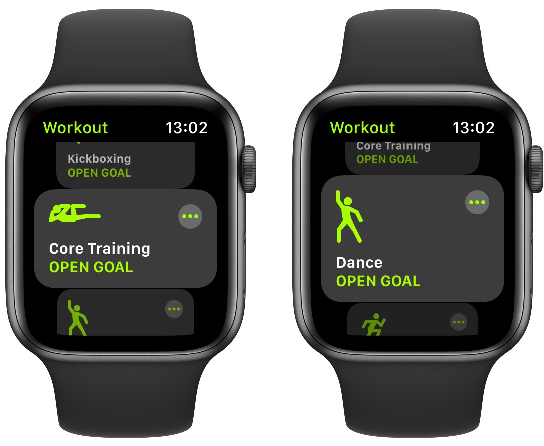
6. When you go to Custom Workouts for a specific workout type, it "suggests" my Custom Workouts. **** off. I know what I'm doing, and it's not what I want to do most of the time. It also defaults to this view.
7. You cannot delete race routes. Why is the app setting these without an option to remove?
8. Autoplay Media shuffles a playlist in a specific order and it affixes that order. This is a bug and needs to be fixed.
There's probably more, which I will add to this list.
In general, it is clear that the Workout app is handled by a design and engineering team which have no idea or interest in what athletes need. It's disappointing. And third-party alternative apps are not much better. Every day I'm inching closer to getting a Garmin or Coros.
User feedback will get Apple to fix the interface issues they create now and then.And reactions like yours are why Apple will continue getting away with horrible design and engineering decisions instead of calling them out for what they are and reporting them.
Frequent feedback from Garmin owners in nearly every discussion about Apple Watches does more damage than anyone realizes. People felt that way about Apple users back in the day.
Confirms suspicions that it's not only me. Just today I did a treadmill walk at the gym and when I got home, my Ultra congratted me for doing a 5k run. Yay! Wait..what? I realized it was because I started the wrong workout type (ie, indoor run instead of indoor walk) because....the new scrolling UI is horrible.
User feedback will get Apple to fix the interface issues they create now and then.
Frequent feedback from Garmin owners in nearly every discussion about Apple Watches does more damage than anyone realizes. People felt that way about Apple users back in the day.
I own both; a Series 10 and a Garmin 265.
I have been submitting feedback to Apple for years asking for some way to stop a workout, and change a workout, without using the screen. Nothing.
Haha this is my post on Reddit. 😂 I didn’t expect it to takeoff the way it did.
I've been getting the unresponsive issue where it looks like you're tapping but nothing happens, and it happens a lot with gloves that I never had a problem with previously.
However, for me, it was already going downhill when they insisted on shoehorning the Fitness tile into the Workout selection because the watch tries to update and reload that tile every time, so either I can't do anything until that finishes or I tap the first workout item (that being the last one I used), but it opens the Fitness tile that was invisibly actually the first item. It's maddening because physical activity tracking features (including workouts) is probably like 80% of the reason I still wear my Series 5 versus just going back to a "dumb" watch. Glanceable notifications are most of the remaining reasons I use it. I'd love to try a Garmin but there's no way I could justify that cost for the minimal actual needs I have.
However, for me, it was already going downhill when they insisted on shoehorning the Fitness tile into the Workout selection because the watch tries to update and reload that tile every time, so either I can't do anything until that finishes or I tap the first workout item (that being the last one I used), but it opens the Fitness tile that was invisibly actually the first item. It's maddening because physical activity tracking features (including workouts) is probably like 80% of the reason I still wear my Series 5 versus just going back to a "dumb" watch. Glanceable notifications are most of the remaining reasons I use it. I'd love to try a Garmin but there's no way I could justify that cost for the minimal actual needs I have.
I'm guessing your watch is not able to use Siri then? I have a cellular plan for my AWU and Siri is really good at starting and ending workouts, which is good with the change to the UI. But everyone I see at the gym with a watch also has their iPhone nearby. I can change workouts by asking Siri to end the workout, then ask for a new one. I have playlists on my phone for different gym workouts and Siri is handy for that and for skipping a song I don't want, increasing volume, turning on transparency mode, etc.I own both; a Series 10 and a Garmin 265.
I have been submitting feedback to Apple for years asking for some way to stop a workout, and change a workout, without using the screen. Nothing.
I'm guessing your watch is not able to use Siri then? I have a cellular plan for my AWU and Siri is really good at starting and ending workouts, which is good with the change to the UI. But everyone I see at the gym with a watch also has their iPhone nearby. I can change workouts by asking Siri to end the workout, then ask for a new one. I have playlists on my phone for different gym workouts and Siri is handy for that and for skipping a song I don't want, increasing volume, turning on transparency mode, etc.
Where I typically run, and where I would need this, there is no cell service. Big local state park and attached national forest.
Last edited:
I couldn’t agree more! Actually, the UI consistently worsened over the last two watchOS versions! Using the AW has become a pain! Previously switching to a new workout used to be so simple: press the + button, and select the next workout in large icons and legible letters, DONE! Now it is a nightmare: after pressing the + button you get to list with narrow icons and tiny letters so getting your finger while walking/running is a challenge , and it doesn’t start the new workout! It presents you with a list of unnecessary complications with quick start on top! I am swearing and cursing this UI every given day!
I agree it’s a change for the change’s sake so Apple can report 700+ changes in watchOS. Whoever is responsible for this abomination should be fired on the spot!
I agree it’s a change for the change’s sake so Apple can report 700+ changes in watchOS. Whoever is responsible for this abomination should be fired on the spot!
Agree 100%, it's so stupid. Also, be able to remove certain workouts. I will never use swimming, dance, tai chi, etc. Get them off my screen. And the READY 1, 2, 3 should be optional.
Another crappy upgrade nobody asked for- now it takes twice as long to start a work out- 100% crappy experience now- this is the stuff that makes me rethink my 2 decade long dedication to Apple
Apple Watch owners have been voicing their frustration online over changes to the Workout app that Apple introduced in watchOS 26, with many finding the redesigned interface makes starting exercises difficult and exasperating.
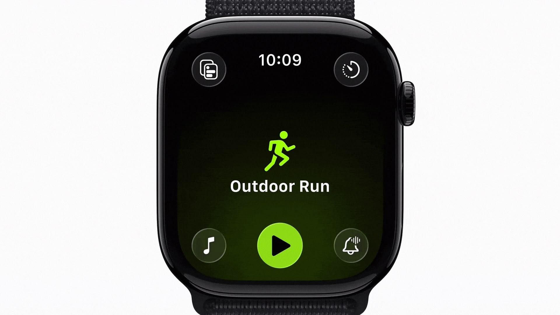
When Apple launched watchOS 26 in September, the Workout app went from large, easily tapped workout tiles to a scrolling, corner-button interface. Instead of tapping a workout once to begin, users now select the workout type, and then tap a smaller play button that appears after a brief animation. Apple has also integrated music and podcast setup directly into the Workout app itself, so users can configure audio to automatically begin playing when they start exercising.
However, many of the changes appear to have become a major source of frustration over the last couple of months, based on a Reddit thread on r/AppleWatch that's full of complaints. "Touch targets are way too small," one user wrote. "Often times I have to tap the play button several times to get the workout to start."
Another user said the update has been "absolutely horrible," adding that "activating a swimming workout has become impossible once in the pool." Several swimmers echoed this view. One notes that the latest design makes it "impossible to reliably start or switch workouts once you're wet or mid-lap."
The redesigned layout also moves common controls like goal settings, quick-start options, and frequently used workouts into different positions. Long-time users say this breaks years of muscle memory. "What I used to be able to do in my sleep without thinking now takes my full brain capacity and always annoys me just before my workout," one user noted.
Some users also report reliability issues, like tapping the start button and seeing the press animation without the workout actually starting, or walking workouts failing to register completely. Mis-starts are another recurring issue. "I've accidentally started the wrong workout so many times," one user wrote. "The play button loads late, so I think I'm scrolling, but I actually tap it the moment it appears." Another said they've watched the button animate when tapped, "and then found out later that it didn't actually register."
The old Workout interface in watchOS 11
"The scrolling is so bad now," wrote another user, while others said the interface simply feels laggy. One explained that "the delay between selecting and starting is so long that I constantly overshoot or open the wrong thing."
Some users have turned to Siri voice commands to bypass the new interface altogether, while others rely on the Action button on Apple Watch Ultra models to start workouts directly. A few say they've been letting auto-detection handle walking and cycling sessions simply because it's less tedious than navigating the UI.
What have your experiences been with the Workout app on Apple Watch since the watchOS 26 update? Do you get on with the redesigned interface, or is it a step backwards from watchOS 11? Let us know in the comments.
Article Link: Apple Watch Users Claim Workout App Is Now Worse in Every Way

I hate this update with the white hot intensity of a thousand burning suns. Complication for the sake of complication. Every aspect of this update is demonstratively worse than all previous versions. The entire WatchOS team is unfit to work at Burger King. Someone made this and was pound of it? Please examine your life choices and reject anything that involves a human interface because you have failed completely. Just one recent example:
Finished a 2 mile run to the gym, hit Traditional Strength Training, destroyed myself in the free weights for 2 hours, go to turn off my workout and Apple Watch is on the screen waiting for me to choose quick start or one of the other workouts. A good 600 calories and 2 hours of work simply not recorded because of Apple Watch software. Is there anyway to turn this options off? I never, ever want to choose any version of the workout except what I just pressed. When I press run, I’m running, when I press walk, I’m walking. I will never, ever choose any variation of any workout. WTF did the watch think I was going for 2 hours while I’m weight training in zone 2? Nothing? I stop moving for 2 minutes during a workout and the watch always asks “are you done with your workout”? But 2 hours of elevated heart rate and it can’t be bothered to ask maybe you are working out instead of waiting for a button to be pushed? How do I turn these options off forever?
What a miserable experience tracking workouts on the Apple Watch has become.
So much of Apple's 27/28 OS updates are just gonna be reverting their awful decisions for 26, I feel.
The damn play button, super annoying. Finding the workouts are difficult and you have to scroll through a lot of text to find what you need
it is rubbish! It is difficult to select the exercise, when it is finished and you go back to the Home Screen, when the screen turns off it decides to go back into the workout app! Plus I had endless very annoying Siri cut ins telling me my split times etc when walking the dog! I am not sure he can move that fast! There was literally nothing wrong with how it was, and they screwed it up for what? Sake of change? But I won't start on iOS 26 and the damn timer app..
Register on MacRumors! This sidebar will go away, and you'll see fewer ads.