Got a tip for us?
Let us know
Become a MacRumors Supporter for $50/year with no ads, ability to filter front page stories, and private forums.
Apple Watch Users Claim Workout App Is Now Worse in Every Way
- Thread starter MacRumors
- Start date
- Sort by reaction score
You are using an out of date browser. It may not display this or other websites correctly.
You should upgrade or use an alternative browser.
You should upgrade or use an alternative browser.

Yes BUT.. workout buddy is awesome, I get so excited to start a workout and hear all my stats, or get motivated halfway through a hike!
I love when all of the wanna-be Watch App Developers chime in. I actually love the new interface and rarely to I ever touch the watch face. Siri does everything I need it to do whether I'm in the pool, on a run, on a bike, etc. I don't not understand why people don't simply ask Siri to do what needs to be done for their workouts. I'm sure there are use-cases where it is insufficient, and I still don't get why people go to online forums to make their complaints instead of engaging with Apple to suggest improvements and enhancements. Some people just enjoy complaining...like me complaining about "people"!
Apple Watch owners have been voicing their frustration online over changes to the Workout app that Apple introduced in watchOS 26, with many finding the redesigned interface makes starting exercises difficult and exasperating.
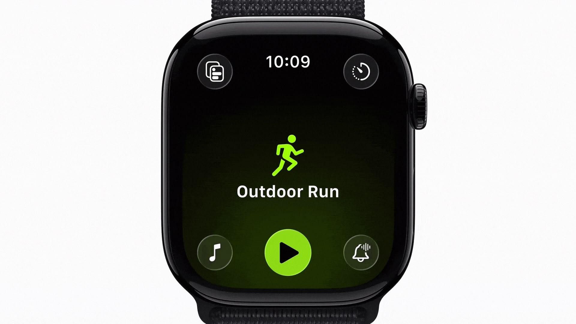
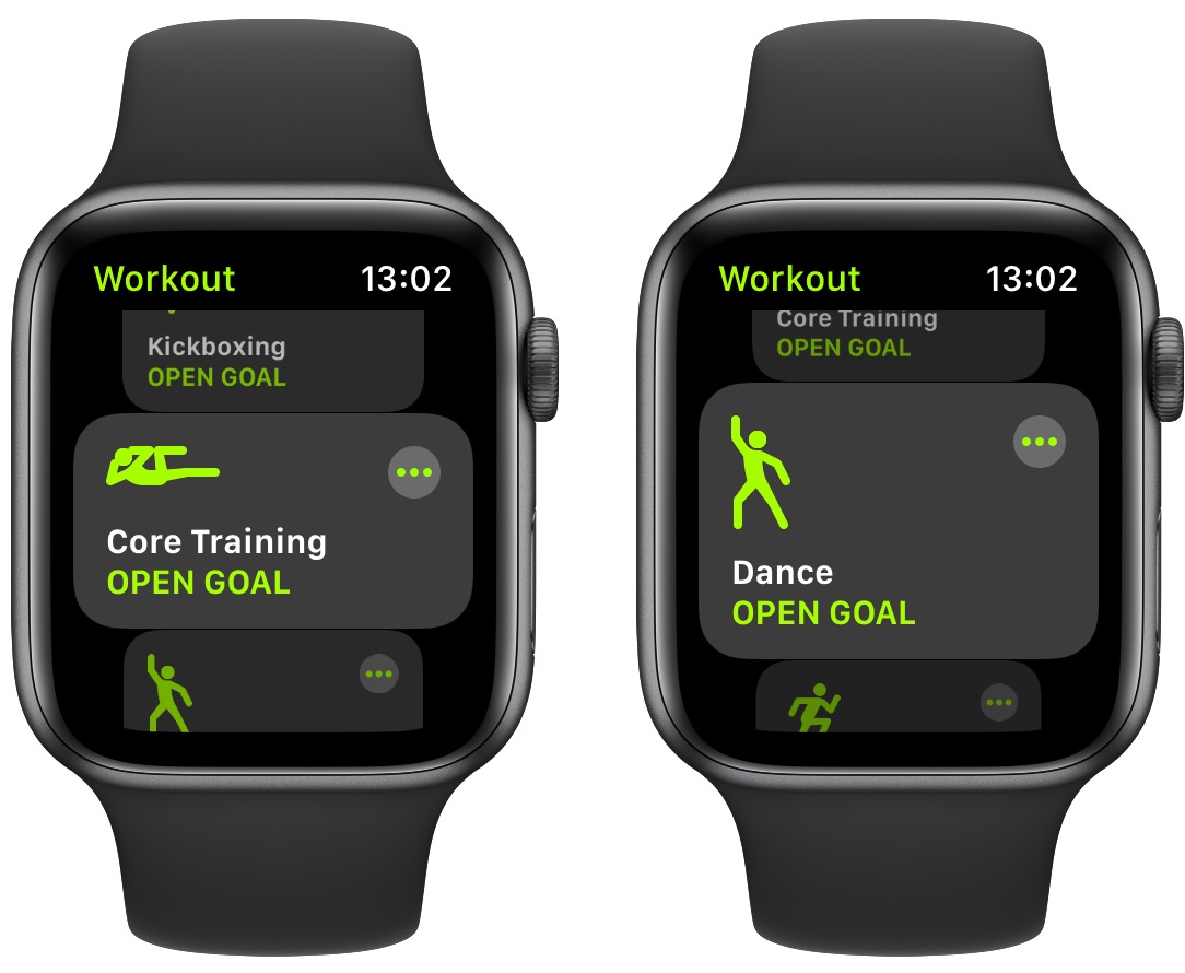
When Apple launched watchOS 26 in September, the Workout app went from large, easily tapped workout tiles to a scrolling, corner-button interface. Instead of tapping a workout once to begin, users now select the workout type, and then tap a smaller play button that appears after a brief animation. Apple has also integrated music and podcast setup directly into the Workout app itself, so users can configure audio to automatically begin playing when they start exercising.
However, many of the changes appear to have become a major source of frustration over the last couple of months, based on a Reddit thread on r/AppleWatch that's full of complaints. "Touch targets are way too small," one user wrote. "Often times I have to tap the play button several times to get the workout to start."
Another user said the update has been "absolutely horrible," adding that "activating a swimming workout has become impossible once in the pool." Several swimmers echoed this view. One notes that the latest design makes it "impossible to reliably start or switch workouts once you're wet or mid-lap."
The redesigned layout also moves common controls like goal settings, quick-start options, and frequently used workouts into different positions. Long-time users say this breaks years of muscle memory. "What I used to be able to do in my sleep without thinking now takes my full brain capacity and always annoys me just before my workout," one user noted.
Some users also report reliability issues, like tapping the start button and seeing the press animation without the workout actually starting, or walking workouts failing to register completely. Mis-starts are another recurring issue. "I've accidentally started the wrong workout so many times," one user wrote. "The play button loads late, so I think I'm scrolling, but I actually tap it the moment it appears." Another said they've watched the button animate when tapped, "and then found out later that it didn't actually register."
The old Workout interface in watchOS 11
"The scrolling is so bad now," wrote another user, while others said the interface simply feels laggy. One explained that "the delay between selecting and starting is so long that I constantly overshoot or open the wrong thing."
Some users have turned to Siri voice commands to bypass the new interface altogether, while others rely on the Action button on Apple Watch Ultra models to start workouts directly. A few say they've been letting auto-detection handle walking and cycling sessions simply because it's less tedious than navigating the UI.
What have your experiences been with the Workout app on Apple Watch since the watchOS 26 update? Do you get on with the redesigned interface, or is it a step backwards from watchOS 11? Let us know in the comments.
Article Link: Apple Watch Users Claim Workout App Is Now Worse in Every Way

I love when all of the wanna-be Watch App Developers chime in. I actually love the new interface and rarely to I ever touch the watch face. Siri does everything I need it to do whether I'm in the pool, on a run, on a bike, etc. I don't not understand why people don't simply ask Siri to do what needs to be done for their workouts. I'm sure there are use-cases where it is insufficient, and I still don't get why people go to online forums to make their complaints instead of engaging with Apple to suggest improvements and enhancements. Some people just enjoy complaining...like me complaining about "people"!
Siri doesn't work when you have no cell connection, or at least it didn't. Where I run, there is no cell service. Additionally, when I'm absolutely our of breath after sprinting up a very trail in the woods for several minutes, the last thing I want, or are able to do, to is try to talk to my watch in a comprehensible way.
As your recommendation to talk to Apple, you can't "engage" with Apple. You submit a feedback, and who knows if it's read or not. There is no confirmation, no email saying it was successfully sent..it just disappears, and hopefully someone who has some influence reads it, but for all I know it goes to /dev/null.
Edit: It's also unprofessional as hell to be talking to your watch at a race. I run a dozen a summer, and half a dozen in the winter...which is also a situation where it wouldn't work, as my watch is covered by my gloves and jacket.
Last edited:
I missed all the excitement since I switched to a Garmin Forerunner when I got serious about running... not looking back. What I get for free with Garmin is superior to the apps offered with subscriptions on the Apple Watch.
I efn' hate the 'start' button, makes is much harder to tap, almost fell off my bike a couple of times))
As another commenter already said, this is just change for the sake of change. Nothing about it is an improvement. The whole screen one icon at a time versus the steady scroll of icons while selecting a workout is annoying, and then having to wait for the GD "play" button to load before I can actually start my workout even more so. Who thought this was a good idea? I honestly hate everything about it, much like iOS26 which itself was just a bunch of Change for the Sake of Change rather than solid quality of life improvements.
Apple really lost sight of what the watch is supposed to be when they launched OS10. It isn’t supposed to be a colorful, nice to use UI with tiny touch targets. It’s supposed to be an informational device that you use in as small doses as possible. I’ve heard people voice complaints with the workout app IRL as well. The key (if you’re doing a singular workout) is simply to ask Siri to start it for you
Thanks for adding nothing to the conversationAbsolute poppycock
I go for a run, at some point my watch says, "You're running, want me to record it?" I click a big pill button. Job done.
I go cycling, at some point my watch says, "You're cycling, want e to record it for you?" I click big green pill button. Job done.
I go hiking, at some point my watch says "You're walking, want me to record it for you?" No Godammit, I'm hiking, I need altitude here.
The new interface is fine, stop complaining and get you're backsides back in your training shoes.
I swim and have no issue tapping the button when wet, or at least I don't feel it's worse than before, I'm fine with the UI, it's not a bid deal, most of my workouts are suggested as widgets anyway
Just to add my voice to the discussion: I hate the latest update with a forking vengeance! The workout app was already clunky enough but the latest update made a not so good state of affairs even worse. Animations now take even longer to resolve, ending one workout and starting another is a chore because you need to wait for every screen in-between to resolve and it's just generally very unfriendly to people that do more than one workout or want to activate things whilst already on a workout. The scroll is slow and you have to be precise selecting a workout button or it will select a different one for you and it will not allow you to choose the one you want until the scroll animation is finished, the physical scroll wheel does not immediately activate scroll not just for this app but for everything in the god damn watch, adding delays and a sense of immense frustration to using it. Clearly they have no clue what people that actually exercise need from this app and in general seem to prioritise animations over functionality. While it might be fine for light use, it's a nightmare for speedy, effective interaction with the watch.
Hopefully sales will drop off so Apple gets the message. With a Trumpian knee bender as CEO, it's no wonder the quality of the products is deteriorating. Focus isn't where it should be, the user experience.
Hopefully sales will drop off so Apple gets the message. With a Trumpian knee bender as CEO, it's no wonder the quality of the products is deteriorating. Focus isn't where it should be, the user experience.
swimmer here. The swim workout function isn't great, so I use the swim.com app - reason being apple watch just doesn't capture kick board laps with any accuracy (they advertised that it does, but it so doesn't; it missed half of my kick board laps. half. that's bad). In the swim.com app, there's a little icon on my watch face to start, and I can at any time set a number of yards for a drill workout, so with everything drill related, nothing gets missed.
Also - pretty much everything everyone else has said is true for me re: the UI - just terrible after this new update.
Finally - for the first time since I've been using Apple Watch (I started with the first one), I have had the thought about going back to an analog watch. Just the thought occurred mind you, not there yet... here's why - the Apple Watch gets used by the various apps/companies as a marketing device. That makes me so mad. Granted, I can manage that to a large degree - but I haven't figured out how to eliminate it without sacrificing important notifications.
Absolute poppycock
I go for a run, at some point my watch says, "You're running, want me to record it?" I click a big pill button. Job done.
I go cycling, at some point my watch says, "You're cycling, want e to record it for you?" I click big green pill button. Job done.
I go hiking, at some point my watch says "You're walking, want me to record it for you?" No Godammit, I'm hiking, I need altitude here.
The new interface is fine, stop complaining and get you're backsides back in your training shoes.
I keep that automatic workout crap turned off. When I start running is when I start running, not when my watch decides I've started running. Not terribly useful when you're actually training and timing your workouts, or running a long race and want pacing info.
Last edited:
The new interface is indeed horrible. Scrolling between workouts is a pain. Most of the time I scroll too fast and go one or two workouts too far in the list. Or it moves to the next one with delay, just as I press play. Usually, play doesn't work on first tap, but it does always when it moves to the next one with delay. If the interface worked well, it is still a step back, but at least it wouldn't be as bad.
Based on my experience, my wife hasn't upgraded her watch just yet.
Based on my experience, my wife hasn't upgraded her watch just yet.
Completely agree with all of the above. Especially the fact that the touch target to start the workout has been reduced in size and move to the bottom of the screen. Does anyone at Apple that designs the UI actually use the product anymore? Is Apple’s Alan Dye also responsible for the Watch interface as well? I think they have lost the institutional knowledge of good user interface design since the more senior staff have moved on and retired. This does not bode well. Maybe if they make John Ternus the CEO he can right the ship.
Apple Watch owners have been voicing their frustration online over changes to the Workout app that Apple introduced in watchOS 26, with many finding the redesigned interface makes starting exercises difficult and exasperating.
When Apple launched watchOS 26 in September, the Workout app went from large, easily tapped workout tiles to a scrolling, corner-button interface. Instead of tapping a workout once to begin, users now select the workout type, and then tap a smaller play button that appears after a brief animation. Apple has also integrated music and podcast setup directly into the Workout app itself, so users can configure audio to automatically begin playing when they start exercising.
However, many of the changes appear to have become a major source of frustration over the last couple of months, based on a Reddit thread on r/AppleWatch that's full of complaints. "Touch targets are way too small," one user wrote. "Often times I have to tap the play button several times to get the workout to start."
Another user said the update has been "absolutely horrible," adding that "activating a swimming workout has become impossible once in the pool." Several swimmers echoed this view. One notes that the latest design makes it "impossible to reliably start or switch workouts once you're wet or mid-lap."
The redesigned layout also moves common controls like goal settings, quick-start options, and frequently used workouts into different positions. Long-time users say this breaks years of muscle memory. "What I used to be able to do in my sleep without thinking now takes my full brain capacity and always annoys me just before my workout," one user noted.
Some users also report reliability issues, like tapping the start button and seeing the press animation without the workout actually starting, or walking workouts failing to register completely. Mis-starts are another recurring issue. "I've accidentally started the wrong workout so many times," one user wrote. "The play button loads late, so I think I'm scrolling, but I actually tap it the moment it appears." Another said they've watched the button animate when tapped, "and then found out later that it didn't actually register."
The old Workout interface in watchOS 11
"The scrolling is so bad now," wrote another user, while others said the interface simply feels laggy. One explained that "the delay between selecting and starting is so long that I constantly overshoot or open the wrong thing."
Some users have turned to Siri voice commands to bypass the new interface altogether, while others rely on the Action button on Apple Watch Ultra models to start workouts directly. A few say they've been letting auto-detection handle walking and cycling sessions simply because it's less tedious than navigating the UI.
What have your experiences been with the Workout app on Apple Watch since the watchOS 26 update? Do you get on with the redesigned interface, or is it a step backwards from watchOS 11? Let us know in the comments.
Article Link: Apple Watch Users Claim Workout App Is Now Worse in Every Way
Surprisingly the auto detection is pretty cock on. I find that training runs are already counting the minutes by the time I need pace info.I keep that automatic workout crap turned off. When I start running is when I start running, not when my watch decides I've started running. Not terribly useful when you're actually training and timing your workouts, or running a long race and want pacing info.
Obviously it’s no good for a race, for that you’re measuring there exact seconds of your finish time.
Perhaps it’s because I have an Ultra, but even with my massive hands, I have no problems in programming workouts or starting the timers.
I don’t love the new interface but am getting used to it. My biggest gripe is outdoor running on Ultra without my phone. In the old operating system each mile completed was announced, pace per mile, and average pace for the run. I don’t run with my phone since the Ultra has cellular connectivity. In OS26 no mile notifications are called out, no pace, no average pace. Very frustrating the watch requires a phone for basic functionality. Bring back some off-phone functionality for runners!
Apple Watch owners have been voicing their frustration online over changes to the Workout app that Apple introduced in watchOS 26, with many finding the redesigned interface makes starting exercises difficult and exasperating.
When Apple launched watchOS 26 in September, the Workout app went from large, easily tapped workout tiles to a scrolling, corner-button interface. Instead of tapping a workout once to begin, users now select the workout type, and then tap a smaller play button that appears after a brief animation. Apple has also integrated music and podcast setup directly into the Workout app itself, so users can configure audio to automatically begin playing when they start exercising.
However, many of the changes appear to have become a major source of frustration over the last couple of months, based on a Reddit thread on r/AppleWatch that's full of complaints. "Touch targets are way too small," one user wrote. "Often times I have to tap the play button several times to get the workout to start."
Another user said the update has been "absolutely horrible," adding that "activating a swimming workout has become impossible once in the pool." Several swimmers echoed this view. One notes that the latest design makes it "impossible to reliably start or switch workouts once you're wet or mid-lap."
The redesigned layout also moves common controls like goal settings, quick-start options, and frequently used workouts into different positions. Long-time users say this breaks years of muscle memory. "What I used to be able to do in my sleep without thinking now takes my full brain capacity and always annoys me just before my workout," one user noted.
Some users also report reliability issues, like tapping the start button and seeing the press animation without the workout actually starting, or walking workouts failing to register completely. Mis-starts are another recurring issue. "I've accidentally started the wrong workout so many times," one user wrote. "The play button loads late, so I think I'm scrolling, but I actually tap it the moment it appears." Another said they've watched the button animate when tapped, "and then found out later that it didn't actually register."
The old Workout interface in watchOS 11
"The scrolling is so bad now," wrote another user, while others said the interface simply feels laggy. One explained that "the delay between selecting and starting is so long that I constantly overshoot or open the wrong thing."
Some users have turned to Siri voice commands to bypass the new interface altogether, while others rely on the Action button on Apple Watch Ultra models to start workouts directly. A few say they've been letting auto-detection handle walking and cycling sessions simply because it's less tedious than navigating the UI.
What have your experiences been with the Workout app on Apple Watch since the watchOS 26 update? Do you get on with the redesigned interface, or is it a step backwards from watchOS 11? Let us know in the comments.
Article Link: Apple Watch Users Claim Workout App Is Now Worse in Every Way
I have always gotten very good use out of FitIV pulse:

 apps.apple.com
FITIV Pulse AI Workout Tracker App - App Store
Download FITIV Pulse AI Workout Tracker by MotiFIT Fitness Inc. on the App Store. See screenshots, ratings and reviews, user tips, and more games like FITIV…
apps.apple.com
I was literally telling my wife last night how horrible it is. I understand why Garmin is better and the use of the physical buttons but dang has the watch gotten even worse. It’s horrible. Did a 1000 meter swim two nights ago, it was great it auto passed once but it also only recorded half of the workout and to top that off it kept pausing. Did a run last night and yep it didn’t start when I told it to or tapped it. It’s basically useless for cycling, running and swimming. I like it for day to day but again it’s bad. Ultra watch2 btw. Horrible user expense now.
I use Siri to start a workout, mainly because the workout interface has always been bad. Siri works 9/10 out of the time. It's one of the few things that it does that is pretty ok.
However, switching to a new workout type is annoying. Please can we just make quick start the default and skip that extra button press?
It's a worrying trend at Apple - the UX 'fit and finish' is getting sloppier year on year - and their software feels buggier.
A snow leopard moment for all of their platforms is needed.
Apple need to take a huge step back of what they have and just make it work better rather than keep piling on feature after feature each year.
Especially as many of which sound cool when you hear about them at WWDC but then are underwhelming and inconsequential when you get to use them.
Case in point - the workout buddy. Sure it's OK, I don't mind it. But would I miss it if it wasn't there? No.
It is at times but why when I hit continue and I’m at a 8 minute pace for several miles it says paused when I look at it.Surprisingly the auto detection is pretty cock on. I find that training runs are already counting the minutes by the time I need pace info.
Obviously it’s no good for a race, for that you’re measuring there exact seconds of your finish time.
Perhaps it’s because I have an Ultra, but even with my massive hands, I have no problems in programming workouts or starting the timers.
Not just the Apple app. I’ve had so many connectivity issues with the Shred app for lifting that I dumped my watch for workouts.
When it works, it’s great. Unfortunately, it’s luck of the draw when that happens…
When it works, it’s great. Unfortunately, it’s luck of the draw when that happens…
Yeah the lack of a rucking exercise mode is puzzling as people like Garmin have had that for years.So it's not just me... we went from usable to clunky so quickly.
As I usually ask this rhetorical question.... does Apple even test their stuff? Maybe also run these redesigns by real users and not just staff looking to redesign something that for the most part works fine just because they have an urge to reinvent the wheel? Great opportunity to introduce bugs.... but I won't rant now on the seemingly decreasing thoroughness of their testing.
It's nice they've added more activities like pickleball & what not, but there's also a growing number of people who ruck for exercise and I've sent feedback multiple times asking to add it and it's still absent. In rucking you need to add the weight you're carrying so that your VO2 max doesn't tank. If you don't figure in that extra weight it thinks you're working so hard to carry your own body weight and your VO2 max drops.
Sigh
Running this on a Series 7. The most annoying bug I’ve been experiencing is with my custom workouts. During almost every workout (which is set up as a traditional strength workout), the transition to the next set after a recovery will break and no longer say “Now: next exercise name. Open goal.” nor will it show which repetition I’m in, and it will no longer give me a wrist tap when recovery is done. Just goes straight into the next set or exercise. So now I have to stare at my watch during a recovery phase.
Register on MacRumors! This sidebar will go away, and you'll see fewer ads.