
Apple in iOS 16 and iPadOS 16 has overhauled the design of the Books app, simplifying the interface and adding some new customization tools.
In iOS 15, there's a toolbar at the top of the app that provides access to the chapter index, font adjustments, search tools, and bookmarks, but in iOS 16, everything has been moved to the bottom of the app.
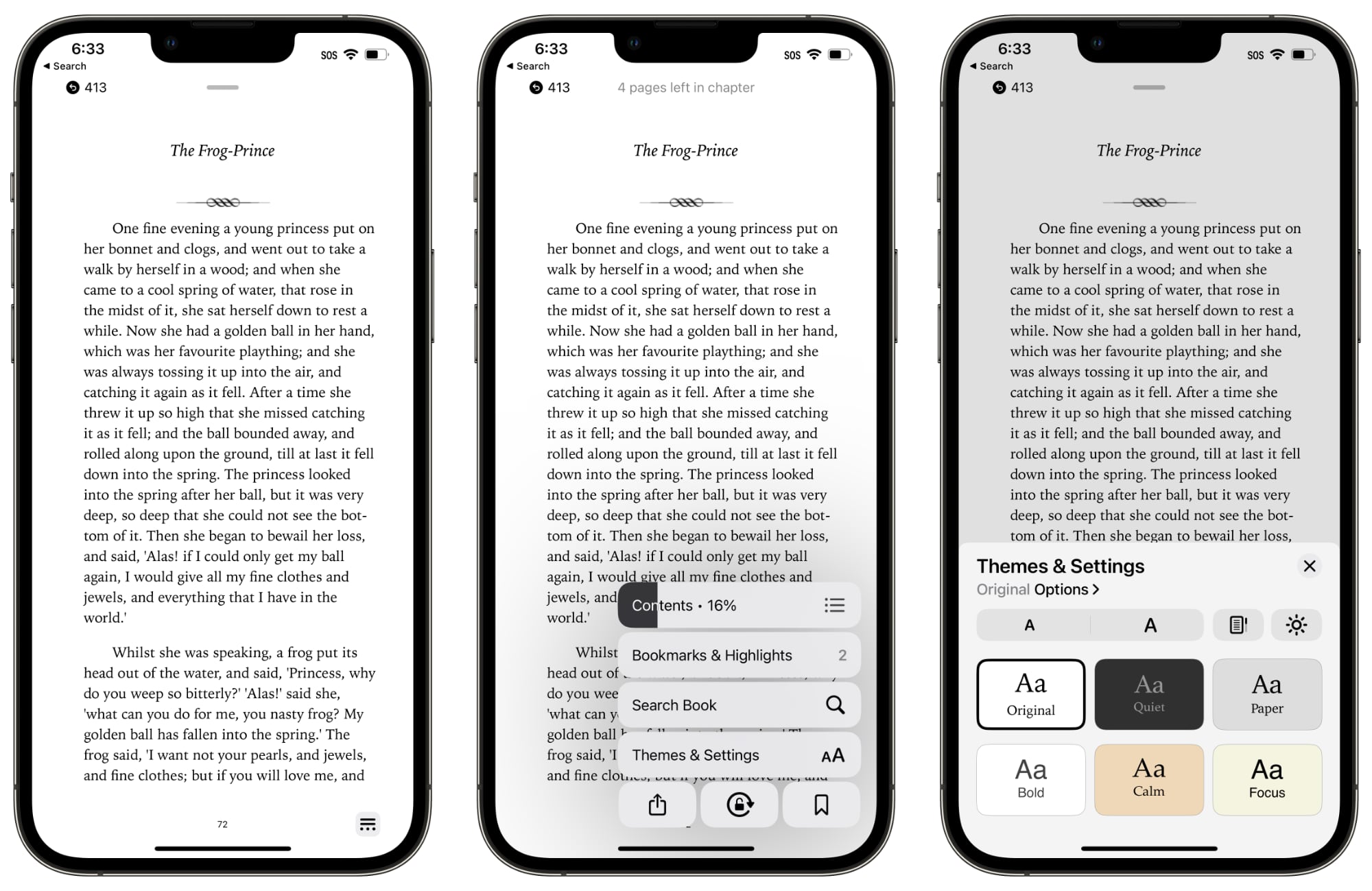
There's a single tappable icon at the bottom of the book interface to access the settings. It provides a distraction-free reading experience, but it's worth noting that it can't be tapped away.
Tapping on the button brings up all of the available settings in the Books app. The top menu bar features the table of contents, while there's also an option to tap in to see all of your bookmarks and highlights.
The search interface is also available, and search does not appear to have been updated. There's a one-tap option for locking orientation, bookmarking a page, and accessing the share sheet.
Tapping on Themes and Settings brings up options to change the font size and the color of the background. There are a few new color options in iOS 16, including a lighter gray, a different shade of white, and a light yellow.
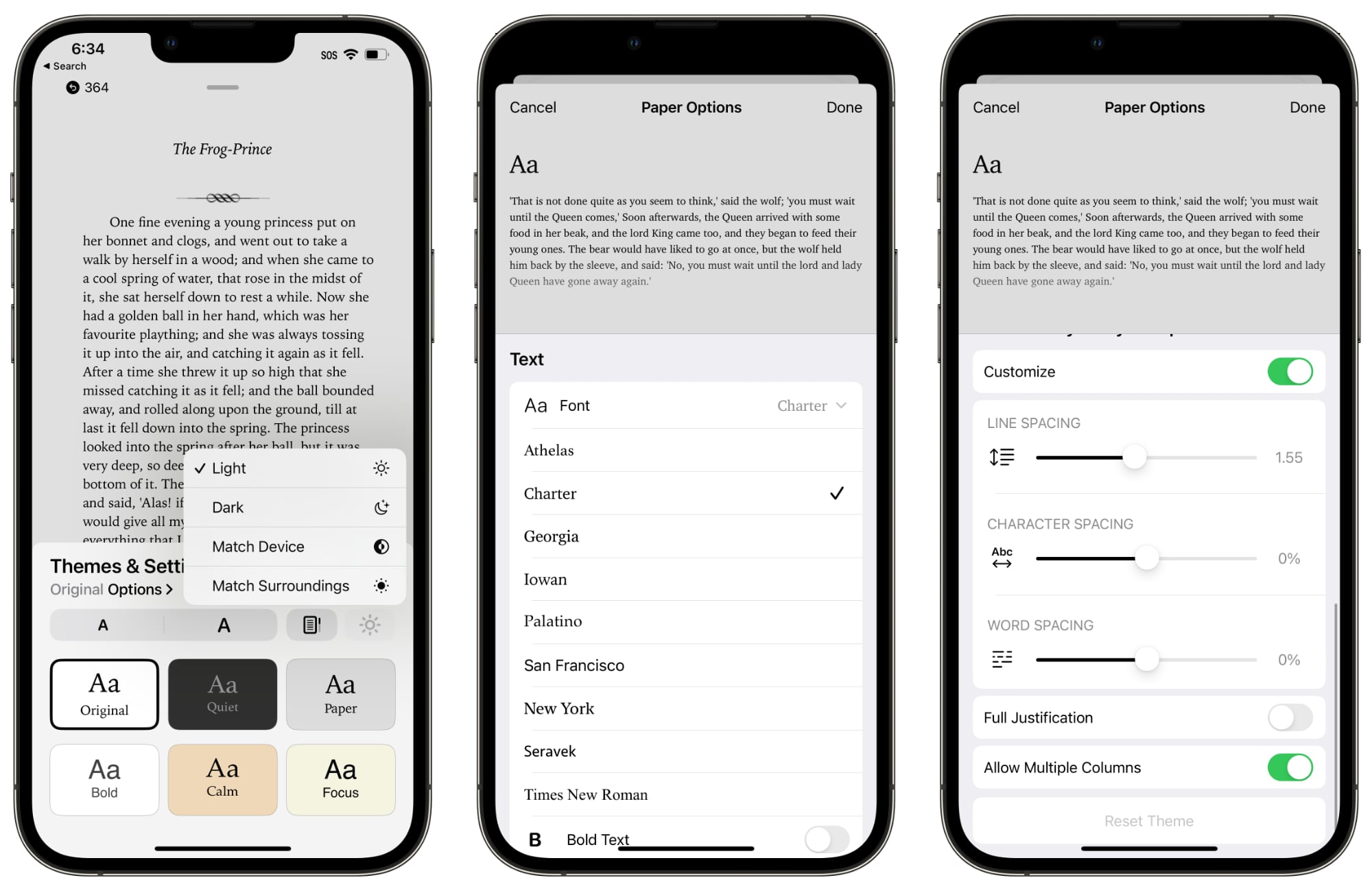
You can turn on vertical scrolling in this interface, and elect to activate Light Mode, Dark Mode, match the device settings, or match the ambient lighting with True Tone.
Tapping on Options brings up different fonts and the option to bold the text. There are easy to access Accessibility settings for adjusting line spacing, word spacing, and character spacing, along with toggling on full justification. Apple has also changed the way that pages turn.
All in all, the changes bring more customization options to the Books app on iPhone and iPad, and access to features like search and bookmarking still takes about the same amount of time despite the fact that they're now in a menu.
Article Link: Books App Gets Redesign in iOS 16 and iPadOS 16
Last edited:
