bmac89
macrumors 65816
Disappointed to see the skeuomorphic page turning get removed. The new animation is so average and clinical. I hope the rest of the changes are nice in practice because Books is my favorite app to read in.
If you haven’t already, please provide feedback to Apple regarding page animation and progress bar. If they want this new animation then why not allow a toggle in settings. I’m not on the beta yet but will provide feedback.
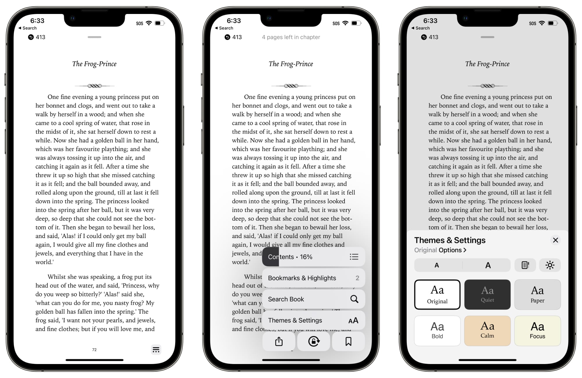
Wish they hadn't gotten rid of the bar at the bottom that indicated progress through the book and especially the number of pages left in the chapter. That gives me a good idea about whether I had enough time to read an entire new chapter (or how long I had left in a chapter).
yeah this change really confuses me. Bugs me that I have no clue the number of pages left in a chapter.
It was a beautiful and natural animation. Sad to lose it and just turn books into boring web pages.
..and Wow! They really make it worse, don't they?
I am a long time user of apple book. Can’t understand why they removed this animation. It’s a small detail that makes reading ebooks more natural. I don’t want to feel like I’m reading a PDF
Last edited: