Got a tip for us?
Let us know
Become a MacRumors Supporter for $50/year with no ads, ability to filter front page stories, and private forums.
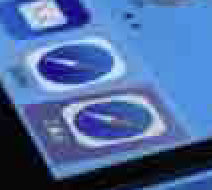
Call me crazy, but... [Safari icon different]
- Thread starter Seandroid
- Start date
- Sort by reaction score
You are using an out of date browser. It may not display this or other websites correctly.
You should upgrade or use an alternative browser.
You should upgrade or use an alternative browser.
EDIT - zoom into it with photoshop and you can clearly see the white tick marks, and the needle is red still.
Either I've become color blind or that needle is not red! As far as I remember, I have perfect vision.
100% guaranteed that is the combination of a chroma sampling compression artifact.
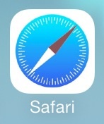
took about 2 seconds to take the safari icon from apple's website, drop it into photoshop, apply a hue/saturation filter to match the tint of the shot in question, scale it to match size, and then run it through a jpg compressor. boom. red is sucked right out.

ps yes, i'm aware this whole thread feels like

took about 2 seconds to take the safari icon from apple's website, drop it into photoshop, apply a hue/saturation filter to match the tint of the shot in question, scale it to match size, and then run it through a jpg compressor. boom. red is sucked right out.

ps yes, i'm aware this whole thread feels like

But "conspiracy theories" just seem so much cooler than likely practical explanations. ;-)100% guaranteed that is the combination of a chroma sampling compression artifact.
took about 2 seconds to take the safari icon from apple's website, drop it into photoshop, apply a hue/saturation filter to match the tint of the shot in question, scale it to match size, and then run it through a jpg compressor. boom. red is sucked right out.
View attachment 431628
ps yes, i'm aware this whole thread feels like
Image
100% guaranteed that is the combination of a chroma sampling compression artifact.
took about 2 seconds to take the safari icon from apple's website, drop it into photoshop, apply a hue/saturation filter to match the tint of the shot in question, scale it to match size, and then run it through a jpg compressor. boom. red is sucked right out.
View attachment 431628
ps yes, i'm aware this whole thread feels like
Image
Thanks =D that's a great explanation of what happened. Appreciated.
I wasn't attempting to make it seem like it was definitely the case if that's what it seemed like.
I don't mind being wrong.
100% guaranteed that is the combination of a chroma sampling compression artifact.
took about 2 seconds to take the safari icon from apple's website, drop it into photoshop, apply a hue/saturation filter to match the tint of the shot in question, scale it to match size, and then run it through a jpg compressor. boom. red is sucked right out.
View attachment 431628
ps yes, i'm aware this whole thread feels like
Image
Nice detective work! Great explanation.
Thanks =D that's a great explanation of what happened. Appreciated.
I wasn't attempting to make it seem like it was definitely the case if that's what it seemed like.
I don't mind being wrong.
no worries, and for what its worth, your mockup actually did look quite nice.
I think we are all going to be surprised.
Just saw another leaked shot today on appleinsider: http://appleinsider.com/articles/13...erprint-scanning-home-button-with-silver-ring

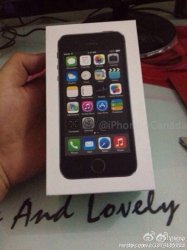
Based on the packaging in this picture, it looks like the default iOS 7 backgrounds are going to match the color of the phone itself. As this shot shows, the black phone has a nice black background for its default.
And there it is again, right there in the shot, a grey needle on the Safari icon. Is it possible that the same crappy compression artifact is happening again and again in these images?
The Safari icon was one of the most heavily criticized new icons after WWDC, so it's reasonable to think they would have spent some time rethinking it to make it less jarring. The grey needle version is certainly more neutral. I personally think works better in balance with the rest of the home screen.
We'll see in a few days.
Just saw another leaked shot today on appleinsider: http://appleinsider.com/articles/13...erprint-scanning-home-button-with-silver-ring

Based on the packaging in this picture, it looks like the default iOS 7 backgrounds are going to match the color of the phone itself. As this shot shows, the black phone has a nice black background for its default.
And there it is again, right there in the shot, a grey needle on the Safari icon. Is it possible that the same crappy compression artifact is happening again and again in these images?
The Safari icon was one of the most heavily criticized new icons after WWDC, so it's reasonable to think they would have spent some time rethinking it to make it less jarring. The grey needle version is certainly more neutral. I personally think works better in balance with the rest of the home screen.
We'll see in a few days.
Last edited:
The rest of the icons on the screen lack color depth and saturation too, like on the other leaked pictures. So suddenly Apple is going to go "gothic" and depressing with all the icon colors for the GM/final? Seems just a little silly.I think we are all going to be surprised.
Just saw another leaked shot today on appleinsider: http://appleinsider.com/articles/13...erprint-scanning-home-button-with-silver-ring
Image
Based on the packaging in this picture, it looks like the default iOS 7 backgrounds are going to match the color of the phone itself. As this shot shows, the black phone has a nice black background for its default.
And there it is again, right there in the shot, a grey needle on the Safari icon. Is it possible that the same crappy compression artifact is happening again and again in these images?
The Safari icon was one of the most heavily criticized new icons after WWDC, so it's reasonable to think they would have spent some time rethinking it to make it less jarring. The grey needle version is certainly more neutral. I personally think works better in balance with the rest of the home screen.
We'll see in a few days.
boring black wallpaper? going back to how the iPhone 3G wallpaper looks? I hope the default wallpaper is what currently shows on the apple site for iOS 7.
The rest of the icons on the screen lack color depth and saturation too, like on the other leaked pictures. So suddenly Apple is going to go "gothic" and depressing with all the icon colors for the GM/final? Seems just a little silly.
They pictures are low-quality, compressed, and taken in bad lighting, so you're right the whole thing looks dull and lacks saturation. I don't think these images suggest they are changing the color palette of iOS 7 at all. We will still see the vibrant new colors.
But when you look at the needle in context of the poor quality picture, it still looks like a light grey needle rather than a red one. I find it hard to see it as a compressed version of red, especially when you can still see a dull red on the left side of the Photos app icon.
As well as lack of reds or other brighter colors on pretty much all the other icons (since that seems to appear there as much as the gray of the needle)? There's no red on the calendar icon, no red in maps icon, colors are all washed out on the photos icon and reminders icon. Etc., etc., etc.I am betting on a grey needle
----------
But no red on the calendar icon, no red in the maps icon, no real colors on the dots on the reminders icon. Smaller elements got washed out even more, especially against other colors that are around them, and the needle isn't that big of an element on top of darker blue. Now I can't truly say it's impossible, but given all these other color inconsistencies on majority of the icons, it certainly makes it even less of a possibility than any colors are really noticeably changing for some sudden reason.They pictures are low-quality, compressed, and taken in bad lighting, so you're right the whole thing looks dull and lacks saturation. I don't think these images suggest they are changing the color palette of iOS 7 at all. We will still see the vibrant new colors.
But when you look at the needle in context of the poor quality picture, it still looks like a light grey needle rather than a red one. I find it hard to see it as a compressed version of red, especially when you can still see a dull red on the left side of the Photos app icon.
If you zoom in on the images at the link below, the needle is red.
http://www.iphoneincanada.ca/news/leaked-iphone-5s-box-fingerprint-ring/
http://www.iphoneincanada.ca/news/leaked-iphone-5s-box-fingerprint-ring/
I attached the image linked above for easy viewing. Clearly red.
Yep. Looks grey/blue till you click to view the full image.
Register on MacRumors! This sidebar will go away, and you'll see fewer ads.


