Become a MacRumors Supporter for $50/year with no ads, ability to filter front page stories, and private forums.

AidenShaw

macrumors P6
Feb 8, 2003
18,667
4,676
The Peninsula
Problems with OS X can be fixed with a few quick updates. Problems with Windows . . . require another version of Windows.

Clearly 10.6.2 is "too few" updates.

What's the difference between waiting for 10.x.5 and Windows XXX SP1? Doesn't seem to be much....
 

*LTD*

macrumors G4
Feb 5, 2009
10,703
1
Canada
Clearly 10.6.2 is "too few" updates.

What's the difference between waiting for 10.x.5 and Windows XXX SP1? Doesn't seem to be much....

Problems with Windows run far, far deeper than bugs. A lot of it is "by design." There is a good reason OS X is so easily differentiated from Windows.
 

macUser2007

macrumors 68000
May 30, 2007
1,506
203
Again the ugly head of feature-fanatics shows up in this forum.

1 - ... how absolutely INCOMPETENT Windows XP is in terms of multitasking and UI performance); if you're NOT using IE, you are NOT an ordinary Windows user;

2 - Safari is the BEST browser on OS X hands down; Firefox is ridiculously slow....

3 - As for Flash, which is purely Adobe's responsibility....

4 - ....it DOMINATES revenues when everyone else is just foundering. ...

Do you even attempt to make a coherent argument, or do you just like to hear yourself talk in superlatives?

You live in some parallel universe, which has little semblance to the one most people reside in:

Safari is the WORST browser of the three I tested with FLASH. I'll copy a previous post here:

"Some CPU measurements on Mac and Windows

O.K., I decided to check the same video (http://www.youtube.com/watch?v=jdOevbchxOc) on both Mac OS 10.6.1 and Windows 7, and in Safari and another browser.

Here are the results for CPU usage:

--------------------
Windows System (my HTPC, it's AOPEN 45-DR)

Windows 7, 32bit, on an Intel C2D P9500 2.53 GHz, 4GB RAM (3GB used under W7-32bit), Intel onboard GMA X4500MHD graphics with Intel Beta W7 driver.


Safari: SD=10%-15%
HD=15%-20% (occasional spike to 25%)

IE8: SD=1%
HD=1%-3% (occasional spike to 5%)

--------------------
Mac System

OS 10.6.1, 24" iMac, 2.4 GHz. 2GB RAM, ATI Radeon HD2600


Safari 64bit: SD=43%-46% (234MB Real Mem)
HD=67%-77% (209.8MB Real Mem)

The SD value is the combination of Safari itself (HD=8%-9% (205MB Real Mem)), and the Flash Player (Safari Internet plug-in, which Safari calls for HD content, and which registers additional 35%-37% CPU and 29MB Real Mem).

The HD value is the combination of Safari itself (HD=13%-15% (175.1MB Real Mem)), and the Flash Player (Safari Internet plug-in, which Safari calls for HD content, and which registers additional 54%-62% CPU and 34.7MB Real Mem).

Camino 2.0b3: SD=34%-35% (102.6MB Real Mem)
HD=47%-49% (101.2MB Real Mem)

Firefox 3.5.4: SD=30%-33% (91.6MB Real Mem)
HD=43%-44% (99MB Real Mem)

--------------------

The way I look at this, performance-wise and resource-wise, Safari basically sucks, compared to both the Mozilla browsers, and IE8. I really do not see, how anyone half-way reasonable, can keep blaming Adobe for this kind of abysmal performance in Safari.

Also, when I open my iGoogle home page, Safari takes noticeably longer to load everything, than either Camino or Firefox. On Windows 7, Safari is noticeably faster to load the same page, than on the Mac."

P.S. Comparing Webkit browsers in Windows 7, with the same video as above, Chrome runs the same as Firefox at 4% CPU, but Safari goes up to 25% CPU.
 

AidenShaw

macrumors P6
Feb 8, 2003
18,667
4,676
The Peninsula
Problems with Windows run far, far deeper than bugs. A lot of it is "by design."

On the other hand, "by design" Explorer is better than Finder according to many users of both. "By design" it's handy to resize windows by dragging on any border. "By design" some of the changes to the Windows 7 taskbar were so good that Apple had to copy them at the last minute for 10.6. "By design" Windows has supported 64 CPU systems (and extended that to 256 CPU for "Win7 Server"), while 10.6 had major repair work just to support 4 to 8 CPU systems.

Actually, much of it is not "by design", but "by opinion". Windows is fine and natural for many people, OSX is intuitive for others. The nonsense like "OMG Windows has the registry" is just as silly as "OMG OSX has little config files scattered all over the filesystem".

Both are good operating systems - and their differences should not be automatically viewed as flaws or advantages.
 

archurban

macrumors 6502a
Aug 4, 2004
918
0
San Francisco, CA
Wirelessly posted (Mozilla/5.0 (iPod; U; CPU iPhone OS 3_1_2 like Mac OS X; en-us) AppleWebKit/528.18 (KHTML, like Gecko) Version/4.0 Mobile/7D11 Safari/528.16)

Whatever matches, it doesn't matter because overall chrome is way faster than Safari. No doubt.
 

iMaggot

macrumors 6502
Jan 13, 2009
328
0
Your House
Again the ugly head of feature-fanatics shows up in this forum.

1 - I am not talking about Windows, I am talking about ORDINARY users with IE (even though Windows is, OF COURSE, crap; I am always amazed to see, at work, how absolutely INCOMPETENT Windows XP is in terms of multitasking and UI performance); if you're NOT using IE, you are NOT an ordinary Windows user;

2 - Safari is the BEST browser on OS X hands down; Firefox is ridiculously slow and good only for those that like to tinker with their browsers; Chrome is close but no cigar;

3 - As for Flash, which is purely Adobe's responsibility, I have only one thing to say: Click2Flash;

4 - Finally, Apple's purported "high horse" behavior shows in its awesome financial performance when compared with the rest of the market...it DOMINATES revenues when everyone else is just foundering. Nothing else needs to be said.

Lol you forgot 5 - Steve Jobs is God.
Fanboys are to funny :D
 

DMann

macrumors 601
Jan 13, 2002
4,001
0
10023
On the other hand, "by design" Explorer is better than Finder according to many users of both. "By design" it's handy to resize windows by dragging on any border. "By design" some of the changes to the Windows 7 taskbar were so good that Apple had to copy them at the last minute for 10.6. "By design" Windows has supported 64 CPU systems (and extended that to 256 CPU for "Win7 Server"), while 10.6 had major repair work just to support 4 to 8 CPU systems.

Actually, much of it is not "by design", but "by opinion". Windows is fine and natural for many people, OSX is intuitive for others. The nonsense like "OMG Windows has the registry" is just as silly as "OMG OSX has little config files scattered all over the filesystem".

Both are good operating systems - and their differences should not be automatically viewed as flaws or advantages.

Well then, we won't mention that "by design," it's somewhat irrational to have to click on a START button to SHUT DOWN.

"By design," having the Task Bar encasement be so short that the height of the icons bleed off the top edge, is shoddy, as is having them be too small when "small icon" is chosen.

"By design," having such a large amount of space separating icons not only looks bizarre, but wastes valuable space for "pinning" other quick launch items.

"By design," having 'maximized windows' displayed as buttons in the Task Bar is redundant, unnecessary, and wasteful of Task Bar space.

"By design," Hiding the Task Bar makes your list of programs, documents, minimized windows, menus, and system notifications disappear - everything, is gone.

"By design," "pinning" items to the Task Bar is far more click intensive than necessary.

With the Task Bar, if the application you want to pin is already running, you need to:

Right click on its icon

Choose “Pin this program to taskbar”

To remove a pinned application from the taskbar:

Right-click on its icon

Choose “Unpin this program from the taskbar”.

This is hardly more convenient than the Dock's solution, which allows one to drop in applications, folders, documents, devices, drives, and peripherals directly, swiftly, and with no unnecessary clicks.

"By design," not being able to pin a peripheral drive or USB memory stick image to the Task Bar is illogical and inconvenient.

"By design," ejecting devices takes too many clicks.

"By design," most desktop Gadgets are sub-par.

"By design," not being able to run applications outside of their folders is restrictive, and primitive.

"By design," the Control Panel is a cluttered mess:

windows-7-control-panel.png


Snow-Leopard-2.jpg


This is especially apparent when compared to the streamlined, hierarchical organization of System Preferences in SL.

"By design," the UI of W7 is noisy, chintzy, and prone to looking worse than the panel of a poorly packaged 27" iMac:

afm.jpg


Windows 7, by design
 

MagnusVonMagnum

macrumors 603
Jun 18, 2007
5,193
1,442
No Chrome for PPC = No Chrome for me (despite having a MBP that's Intel and a PC that could run it). I need a consistent browser platform across all the computers I use and the lack of support for the machine that is on 24/7 means I have no use for it. Firefox still gets the most use here.
 

jimmyjoemccrow

macrumors 6502
Jul 15, 2009
372
0
Well then, we won't mention that "by design," it's somewhat irrational to have to click on a START button to SHUT DOWN.

"By design," having the Task Bar encasement be so short that the height of the icons bleed off the top edge, is shoddy, as is having them be too small when "small icon" is chosen.

"By design," having such a large amount of space separating icons not only looks bizarre, but wastes valuable space for "pinning" other quick launch items.

"By design," having 'maximized windows' displayed as buttons in the Task Bar is redundant, unnecessary, and wasteful of Task Bar space.

"By design," Hiding the Task Bar makes your list of programs, documents, minimized windows, menus, and system notifications disappear - everything, is gone.

"By design," "pinning" items to the Task Bar is far more click intensive than necessary.

With the Task Bar, if the application you want to pin is already running, you need to:

Right click on its icon

Choose “Pin this program to taskbar”

To remove a pinned application from the taskbar:

Right-click on its icon

Choose “Unpin this program from the taskbar”.

This is hardly more convenient than the Dock's solution, which allows one to drop in applications, folders, documents, devices, drives, and peripherals directly, swiftly, and with no unnecessary clicks.

"By design," not being able to pin a peripheral drive or USB memory stick image to the Task Bar is illogical and inconvenient.

"By design," ejecting devices takes too many clicks.

"By design," most desktop Gadgets are sub-par.

"By design," not being able to run applications outside of their folders is restrictive, and primitive.

"By design," the Control Panel is a cluttered mess:

windows-7-control-panel.png


Snow-Leopard-2.jpg


This is especially apparent when compared to the streamlined, hierarchical organization of System Preferences in SL.

"By design," the UI of W7 is noisy, chintzy, and prone to looking worse than the panel of a poorly packaged 27" iMac:

afm.jpg


Windows 7, by design

Same tired **** you spout in other threads.

There are other ways to shutdown Windows you just list one. Look closely at any version of Windows after XP and there is no "Start".

I really don't see any icons on my taskbar bleeding off the top edge so I don't know what you're talking about.

I wouldn't say the space between the icons looks bizarre, I'll say that you are used to OSX. I'll tell you if the spacing on them is too great when I have around 20 programs open that aren't pinned there. I don't think thats ever gonna happen.

A maximised program is in the taskbar so it can be located easily if you put another maximised window on top of it. Are you referring to the window which currently has focus?

I can't really believe you can bring up this as a complaint about autohide. Surely a user using autohide has done so by choice and expects to have these things hidden until he decides its time to check them himself?

You are complaining about two clicks, on an action that is unlikely to be carried out often. I don't know about you, but I know which programs I use frequently, I don't unpin/pin regularly. And whats more I prefer clicking to dragging, especially on a trackpad where its awkward.

I haven't got a USB drive handy to test whether they can be pinned, can't comment.

You show your Mac bias by ejecting with a click. I eject with the button that is handily on my drive.

There is very little difference in quality of the gadgets between OSX and Windows 7, you are just showing prejudice now.

Not sure I know what you are talking about with the folders comment and I don't think you do either so again no comment.

You have deliberately chosen to show the control panel in grid view which is not default. The default view is category view which has around 8 categories. In any case, Control Panel has more hardware and more settings to deal with than OSX, which would rather you just left things as Apple set them.

The default scheme of Windows is colourful and warm. The default scheme of OSX is cold and humourless, not even stooping to a jingle as you log on. I'm playing Devil's Advocate here because I do like both, but in the face of such ignorant pretension I present a counter view.

A static screenshot of Aero Peek does not give a true representation of it in action. The picture with lines across the screen that you seem so keen to deride is present only for a second or two until you find the window you were searching for. If you are looking at the overall screen then you are not only stubbornly looking for things to nit pick you are using it wrongly.


But on topic, Safari may have the fastest java rendering engine but the milliseconds saved there cannot make up for all the time you will waste just using at as a browser. Its crap tab and search support are only partially corrected by Glims. Glimmerblocker is great but in Safari prone to rendering errors. I don't have the same errors on Camino or Chrome. Top Sites are useful but over the top for an older machine like a G4. In fact I just prefer Chrome's flat display even on my Macbook as its clearer.
 

*LTD*

macrumors G4
Feb 5, 2009
10,703
1
Canada

AidenShaw

macrumors P6
Feb 8, 2003
18,667
4,676
The Peninsula
We can spend all day making claims about what MS and Apple copied from each other.

Yes, they copy from each other - like the task bar copied some ideas from the dock, and Dock Exposé copied Aero Peek. Back and forth, forth and back. It's about time for Apple to do some major copying from the Windows filesystem/volume manager to clean up HFS+... ;) .


Well then, we won't mention that "by design," it's somewhat irrational to have to click on a START button to SHUT DOWN.

There's a button to do things, and one of items "to do" is to shut down. Seems perfectly natural to go to one place to do things. And why do you think that it's labeled "Start"?

To me it seems irrational to drag a removeable drive to the trash bin to eject it - I'd expect that to reformat the drive.


"By design," not being able to pin a peripheral drive or USB memory stick image to the Task Bar is illogical and inconvenient.

This one honestly amuses me - because I think that it illustrates how OSX and Windows have different philosophies.

I've never even considered putting a device in the task bar, it just seems wrong. Tasks belong in the task bar, not files.

By the way, you *can* pin a file/directory/device to Windows Explorer in the task bar, which makes sense to me.


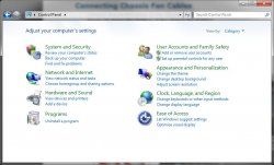
"By design," the Control Panel is a cluttered mess:

windows-7-control-panel.png


<cut>

This is especially apparent when compared to the streamlined, hierarchical organization of System Preferences in SL.

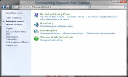
Nice that you clicked on "View all control panel items" and then complain that you see all control panel items. The default view (attached down below) is hierarchical. The first image is the top level view, the second when you select "Network" and move down the hierarchy to network items.

I hope that you were ignorant about Windows here, and not being dishonest.
 

Attachments

  • TopLevel.jpg
    TopLevel.jpg
    67.6 KB · Views: 65
  • Network.jpg
    Network.jpg
    57.2 KB · Views: 65

bobsbarricades

macrumors regular
Feb 4, 2007
206
0
i'm stoked.

I've been using it since it was released, exclusively, and guess what?!

IT HASN'T FREAKING CRASHED ONCE!

I'm sick of safari's joke performance with *anything* flash video related. Firefox bombs for god only knows what reasons, camino...i just don't like so I can't say.

I am so far, a fan. a big one.
 

DMann

macrumors 601
Jan 13, 2002
4,001
0
10023
Same tired **** you spout in other threads.

Since the same tired Windows hasn't changed significantly during the past year, the same observations still apply.

I really don't see any icons on my taskbar bleeding off the top edge so I don't know what you're talking about.

stack-icons-on-taskbar-in-windows-7-similar-to-mac-os-x-dock-with-7stacks.jpg


Some do, and some don't - the problem being that they need to be scaled at all, to fit inside of their enclosed 'buttons' - so much for Windows without Walls.

I wouldn't say the space between the icons looks bizarre, I'll say that you are used to OSX. I'll tell you if the spacing on them is too great when I have around 20 programs open that aren't pinned there. I don't think thats ever gonna happen.

I currently have 22 apps in the Dock, which can be magnified and resized to one's liking. The Taskbar ('Superbar') does not utilize space efficiently, IMO, and this would only seem to be a more critical issue for laptop users with 13" screens.

A maximised program is in the taskbar so it can be located easily if you put another maximised window on top of it. Are you referring to the window which currently has focus?

Flipping back and forth among maximized documents is a breeze using Exposé. Filling the Superbar with an icon of one or two documents, which are already in the forefront, for the sake of toggling between the two, seems redundant.

I can't really believe you can bring up this as a complaint about autohide. Surely a user using autohide has done so by choice and expects to have these things hidden until he decides its time to check them himself?

Why not? If I hide the Dock, corresponding menus are still available, as well as network status and notifications. Exposé allows one to navigate through documents while the Dock is in hiding.

Besides, I find using a key command to turn hiding on/off much less complicated than having to cull through a menu from the Start Button, and check or uncheck boxes.

You are complaining about two clicks, on an action that is unlikely to be carried out often. I don't know about you, but I know which programs I use frequently, I don't unpin/pin regularly. And whats more I prefer clicking to dragging, especially on a trackpad where its awkward.
Nevertheless, I find the 'click-drag' approach to be much more direct and less cumbersome - to each his own.

I haven't got a USB drive handy to test whether they can be pinned, can't comment.

I suggest that you try it sometime, along with any other peripheral or external drive.

You show your Mac bias by ejecting with a click. I eject with the button that is handily on my drive.

I prefer the eject button on the upper right side of the keyboard, or the keyboard command: ⌘E. Reaching behind or out of the way to access an eject button on a drive, a button which may, or may not even exist on many drives, is a bit inconvienient, IMO.

Not sure I know what you are talking about with the folders comment and I don't think you do either so again no comment.

No?

Can you run an application on a Windows desktop without making an alias? This comes in handy when testing apps, deciding whether or not you want to keep them. If not, simply trash the app from the desktop to the trash - no uninstall necessary for the majority of them, thus no chance of disabling your OS via f****** up The Registry either.

You have deliberately chosen to show the control panel in grid view which is not default. The default view is category view which has around 8 categories. In any case, Control Panel has more hardware and more settings to deal with than OSX, which would rather you just left things as Apple set them.

That is the point - the System Preferences panel is the 'grid view' of OS X System Preferences. If more hardware and/or settings become necessary via additional Preference Panes, they are organized in this fashion as well, which is much more sensible, consistent, and methodically categorized.

The default scheme of Windows is colourful and warm. The default scheme of OSX is cold and humourless, not even stooping to a jingle as you log on. I'm playing Devil's Advocate here because I do like both, but in the face of such ignorant pretension I present a counter view.

The default scheme of Windows is, to put it gently, IN YOUR FACE.

OS X becomes as warm and as colorful as the desktop photo of your liking. The GUI is far less intrusive, and stays out of the way of the user. We won't dare mention UAC.

A static screenshot of Aero Peek does not give a true representation of it in action. The picture with lines across the screen that you seem so keen to deride is present only for a second or two until you find the window you were searching for. If you are looking at the overall screen then you are not only stubbornly looking for things to nit pick you are using it wrongly.

I find the entire UI to be of a Fisher Price experience, IMO - cheap skins which are more detracting and distracting, than beneficial, IMO.

To me it seems irrational to drag a removeable drive to the trash bin to eject it - I'd expect that to reformat the drive.

As soon as a device is clicked on, the Trash icon transforms into an 'Eject,' icon -- of course, you knew this already.

eject-2.jpg


I hope that you were ignorant about OS X here, and not being dishonest.
 

CQd44

macrumors 6502a
Jul 27, 2009
630
0
Edinburg, Texas
In Windows 7 you CAN drag a program to the task bar to pin it. Just wanted to point that out.

Personally, I can't stand the UI in OS X. A combination of the unified task bar and Finder just kill it for me ):

I find file manipulation much easier in Windows, mostly because of cut and paste and being used to explorer and being able to click like a madman to get to where i want in no time.
 

AidenShaw

macrumors P6
Feb 8, 2003
18,667
4,676
The Peninsula
As soon as a device is clicked on, the Trash icon transforms into an 'Eject,' icon -- of course, you knew this already.

I was ignorant of that change - so it looks like that complaint can be put into the archive of past "transgressions", like the "Start Menu".

Sounds like an inconsistent kludge, though, for the trash bin to morph into something else. Windows seems much more consistent here ("Eject" is an entry on the context menu for the device).
 

Yidaki

macrumors newbie
Jul 5, 2009
17
8
You haven't changed your Default Web Browser Pref!

I downloaded chrome and instantly went back to safari. Chrome actually opened safari up when I went to an RSS bookmark. Why should I use a browser that will open up another browser when I hit a link or bookmark.

Shujin - This will happen in any other browser you use without changing your 'Default Web Browser' Apple stashed this setting away in your Safari - General Preferences. It used to be in the more logical place of System Preferences :-/
 
Register on MacRumors! This sidebar will go away, and you'll see fewer ads.