At first I was excited about it but the more videos I watch and the more I think about it the less sure I become with it.
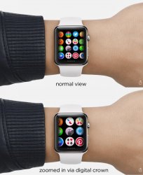
It's the 'universe' it sounds simple to begin with, just browse to the app you want, and click it. Well what happens when you have tonnes of apps which I am sure will eventually happen. Can you imagine the amount of scrolling around on that tiny display you will be doing? We take it for granted because on an iPhone we simply swipe down and type what we want when we have so many apps and it's instant. On Apple Watch it's not that simple nor is it as elegant.
I am just worried that it's going to become nauseating, so much so that I may deliberately install fewer apps just to avoid this problem.
What do you guys think?