Got a tip for us?
Let us know
Become a MacRumors Supporter for $50/year with no ads, ability to filter front page stories, and private forums.
Dial Screen..
- Thread starter furam90
- Start date
- Sort by reaction score
You are using an out of date browser. It may not display this or other websites correctly.
You should upgrade or use an alternative browser.
You should upgrade or use an alternative browser.
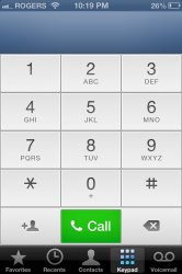
The whole color scheme of this update is off. I have no problem with the change in the dial screen, but then the in call scren is the old one.Why did they change it and make it fugly? Looks like something you'd see on Windows 95, WTF?
If you're going to update something, update something that actually changes and make it look sleek. C'mon apple.
Isn't consistency is the first rule of design?
who cares what it looks like, it still works exactly the same
sooo many people bitching about the smallest, stupidest things in ios6
sooo many people bitching about the smallest, stupidest things in ios6
Why did they change it and make it fugly? Looks like something you'd see on Windows 95, WTF?
If you're going to update something, update something that actually needs changes and make it look sleek. C'mon apple.
Agreed. It looks cheesy like something from Android. The previous dial pad looked beautiful.
Speaking of colors, why is the status bar at the top of the screen sometimes blue like when you launch Settings, Mail, or Instacast? It looks horrible and it's inconsistent.
I know it's absolutely nitpicky, but the lack of simple uniformity bugs me. Yeah, it still works the same, and yes, I know it's my thing. But still. It feels like to total package is lacking, whether it works or not.who cares what it looks like, it still works exactly the same
sooo many people bitching about the smallest, stupidest things in ios6
I like it. Am I the only one?
I do also. It looks very clean in my opinion.
Agreed. It looks cheesy like something from Android. The previous dial pad looked beautiful.
Speaking of colors, why is the status bar at the top of the screen sometimes blue like when you launch Settings, Mail, or Instacast? It looks horrible and it's inconsistent.
Ahh yeah! I didn't bring that up, but it's terribly annoying. Another fail in design. If it aint broke don't fix it.
----------
someone post a screenshot?

who cares what it looks like, it still works exactly the same
sooo many people bitching about the smallest, stupidest things in ios6
Erm, everyone?!
Erm, everyone?!

if that was true then the other 3-4 people in this thread would go against that, just like me
I like it. Am I the only one?
Nope. I prefer it to the old one as well. Personally, I felt that the color scheme of the old dial was kinda off. You know, the bluish tint was kinda weird.
But yeah the problem is uniformity, all the apps seem to be so individual and not work so well with each other in tone.
I agree, I didn't understand the dialer and the flipping back to the old call screen. It's looks half thought out.
who cares what it looks like, it still works exactly the same
sooo many people bitching about the smallest, stupidest things in ios6
I care. The old screen was easier on the eyes, particularly when dialing in the dark. Seems like they couldn't think of enough real features to add so they decided to mess with things that aren't broken.
I'll probably get used to it, but I not like it now. Was kinda a shock to see - the old one was more elegant, IMO. Perhaps it's more visible in high ambient lighting conditions...
Nah, the designers were just bored and inverted the colors
the phone, music app and battery indicator are just so blah. i really hate them. they look like a 2005 ipod take on things. or kindle options on their black and white reader. maybe they could have at least given the option between the new "sleek" and classic look we'd grown so accustom to.
Register on MacRumors! This sidebar will go away, and you'll see fewer ads.


