Become a MacRumors Supporter for $50/year with no ads, ability to filter front page stories, and private forums.

eddjedi

macrumors 6502a
Original poster
Sep 7, 2011
632
853
Having recently installed and played around with 10.4 on my Cube, and with 10.14 coming out next week, it dawned on me how few of OS X's new features I use 10 releases later. I've been a Mac user since OS 9 so have had every version of OS X, and I find myself less and less excited about new releases. I would have been scouring the internet for the GM by now 5 years ago, but I'm not that bothered about Mojave from what I've seen.

Anyway back to Tiger, the one thing I can think of that I use a lot now is Quicklook (pressing space on a file to preview it.) That was/is a really useful feature, and Tiger feels clunky without it. In fact I now find myself using Quicklook for reading, listening and watching most things rather than opening up the files. But other than that, it's a really nice OS. I can live without the last 10 years of UI changes, in fact I really like the design of Tiger.

There's no real point to this thread, other than saying I think Apple did a pretty good job making an OS that still feels usable a decade later, and I'd be interested to know if anybody else has found any 'killer features' in more recent versions that I may be missing out on?
 

eyoungren

macrumors Penryn
Aug 31, 2011
29,604
28,367
Well, you're mentioning Tiger.

But, in all possible cases I use Leopard on my PowerPC Macs. It includes Quicklook.

But to directly answer your question, no - not really. I have a Mac now that is capable of using Messages and so I am logged in, but I have no dependency on it.

Apple hasn't really offered much that I depend on past Leopard or iOS 6. One of my MBPs uses Snow Leopard but that's really just a polished version of Leopard.

I've had more annoyances than anything else. Lion introduced a new Finder window minimum. Below that you cannot size windows down. Which is a problem because I have a lot of windows open at work I need made small so I can fit all of them on one monitor without them overlapping.

Mavericks introduced a SMB bug that means InDesign won't work over a network for any more than 24 hours unless I force slower speeds or restart the Mac once a day. Yosemite fixed that, but now I'm on El Capitan at work and it has it's own issues. My workaround to make windows smaller on Yosemite no longer works and when I delete items on network volumes or different disks it requires a confirmation box (for "Delete Immediately). There is no way to disable that confirmation box.

I like the later ability to be able to stretch windows just by grabbing a side (up or down, left or right) but I really have no affinity for OS X past Snow Leopard.
 
  • Like
Reactions: B S Magnet

Raging Dufus

macrumors 6502a
Aug 2, 2018
636
1,174
Kansas USA
I don't make use of the new features unless it's the only way of getting done what I have to get done; in which case to me it's no longer a feature but an annoyance. But that's me.

In all fairness, though, my experience only extends as far as El Capitan, which I jumped to - purely out of necessity - straight from Leopard. The only update between those two, that I've experienced, is Snow Leopard...which I liked very much and would happily use if I felt that the Intel hardware it runs on could truly be secure...but I digress. Had I upgraded with each new version as Apple released them, I might be on their bandwagon with each round of newly introduced features; but that's not what happened, and in using El Cap I usually find myself longing for Leopard.

I've made such a jump before though, and had a totally different experience. When Tiger came out, I jumped straight to it from OS 9. I didn't really care for OS 9; I found very little about it to be intuitive, coming as I had from early Windows versions. Tiger, on the other hand, was a wonderful experience. When Leopard came out, I preferred Tiger to it for a while, but was eventually won over by its overall smoothness, and I came to enjoy the new features it brought like Quicklook and Spaces.

I've tried every version of Windows and various flavors of Linux as well; but to this day, a PowerPC Mac running Leopard is my favorite computing experience, bar none.
 
  • Like
Reactions: z970 and eyoungren

pl1984

Suspended
Oct 31, 2017
2,230
2,645
I'm right there with you. For me the numerous UI / feature changes which have occurred over the decades have done little, if anything, to improve my workflow. In fact I might argue they've done just the opposite...slowed down my workflow as I have to adjust to changes.

Some simple examples:
  • Why must the maximize/minimize/close buttons move from one side of the window to the other?
  • Why must the scroll bars become razor thin? Especially in the days of HD monitors?
  • Why must the scroll bars disappear? Especially in the days of HD monitors?
  • Why must the scroll bar behavior change when clicking in the empty portion of the bar? Instead of the traditional page by page behavior it now moves the page to the, relative, position where the scroll thumb is located?
I could go on listing all kinds of examples. Features are similar...I don't find use for most of them. I'm no luddite but I see no benefit to these changes other than for change sake. I understand the need to keep the OS "fresh" and I can adapt but I do know where you're coming from.
 

eyoungren

macrumors Penryn
Aug 31, 2011
29,604
28,367
…and I came to enjoy the new features it brought like Quicklook and Spaces.
Yet another reason I don't particularly care for later versions of OS X.

With Spaces you can set it up any way you like. But with later OS X this gets neutered into Desktops. Unlike Spaces, desktops can only be side to side and you can't cycle from the last to the first. It's irritating.
[doublepost=1537449593][/doublepost]
I'm right there with you. For me the numerous UI / feature changes which have occurred over the decades have done little, if anything, to improve my workflow. In fact I might argue they've done just the opposite...slowed down my workflow as I have to adjust to changes.

Some simple examples:
  • Why must the maximize/minimize/close buttons move from one side of the window to the other?
  • Why must the scroll bars become razor thin? Especially in the days of HD monitors?
  • Why must the scroll bars disappear? Especially in the days of HD monitors?
  • Why must the scroll bar behavior change when clicking in the empty portion of the bar? Instead of the traditional page by page behavior it now moves the page to the, relative, position where the scroll thumb is located?
I could go on listing all kinds of examples. Features are similar...I don't find use for most of them. I'm no luddite but I see no benefit to these changes other than for change sake. I understand the need to keep the OS "fresh" and I can adapt but I do know where you're coming from.
One of my biggest issues is that at some point Apple decided to emulate the GUI of iOS 7. That means light color and white everywhere. If it wasn't for XtraFinder and it's ability to make black Finder windows I'd have been blinded a long time ago.
 

pl1984

Suspended
Oct 31, 2017
2,230
2,645
Yet another reason I don't particularly care for later versions of OS X.

With Spaces you can set it up any way you like. But with later OS X this gets neutered into Desktops. Unlike Spaces, desktops can only be side to side and you can't cycle from the last to the first. It's irritating.
This is another reason to dislike new features: Apple changing or removing them.
 
  • Like
Reactions: z970 and eyoungren

bunnspecial

macrumors G3
May 3, 2014
8,352
6,495
Kentucky
I'm a heavy user of Mission Control, something not present in Tiger. Leopard and Snow Leopard have spaces, but I honestly prefer Mission Control. I'm likely in the minority on that, though.

I use Messages all the time-to the point that I run El Capitan or later on everything so that I can get SMS integration into messages(yes, I know it works in Yosemite, but I HATE Yosemite).

I actually rather like Launchpad, although I know many folks here hate it. With that said, it's usually faster for me to launch programs either from the Applications folder or, more often than not, Spotlight.

Some of the changes in the last few versions have been for the worse IMO, though. I don't like the new Disk Utility, for example. There are also features I don't really care about, like Siri. I think the version of iTunes in Snow Leopard was probably the high point of the program. Apple has replaced Aperture and iPhoto with Photos. I'm not really an Aperture user(I have Aperture 3 on my Mac Pro, but prefer Lightroom) but I find Photos too "heavy" for what I wanted to use iPhoto for, and WAY too "light" to be an Aperture replacement.

The change in function of the green "button" drives me nuts-as of Yosemite it defaults to making the program full screen. Consequently, I've gotten in the habit of double clicking the menu bar to maximize the window.

I don't hate the Yosemite+ "flat" UI as much as I initially did, but still using a pre-Yosemite version of OS X is a breath of fresh air.
 

eddjedi

macrumors 6502a
Original poster
Sep 7, 2011
632
853
Some interesting opinions. I've never got on with Spaces, LaunchPad, Mission Control etc, they all just seemed like unnecessary gimmicks to me. But I appreciate that may just be the caveman in me. One thing I've just thought of that drives me nuts is the so-called "natural scrolling" - how on earth is scrolling the wrong way compared to how you've done it for the previous 20 years natural? It's always the first thing I turn off after an OS install. I'm dreading the day Apple remove the ability to disable it for us 'legacy' users.
 

eyoungren

macrumors Penryn
Aug 31, 2011
29,604
28,367
Some interesting opinions. I've never got on with Spaces, LaunchPad, Mission Control etc, they all just seemed like unnecessary gimmicks to me. But I appreciate that may just be the caveman in me. One thing I've just thought of that drives me nuts is the so-called "natural scrolling" - how on earth is scrolling the wrong way compared to how you've done it for the previous 20 years natural? It's always the first thing I turn off after an OS install. I'm dreading the day Apple remove the ability to disable it for us 'legacy' users.
You need a reason to use Spaces and other bits. When you have one then the feature becomes useful.

I like spaces at work because it allows me to organize things. For instance, I'll have a browser window in one space. inDesign, Photoshop and Acrobat in another space, Word and email in another space and so on. What that lets me do is leave windows in those apps open. No having to hide apps or move windows around so I can see content between apps.

But if you don't have a reason to use the feature in that way then it's as you said. Most people are in only one app at a time.

It's the same concept as multiple monitors. Lots of people don't get why people such as myself run multiple displays - until they actively see the reason (or develop a reason) for it themselves.
 

pl1984

Suspended
Oct 31, 2017
2,230
2,645
It's the same concept as multiple monitors. Lots of people don't get why people such as myself run multiple displays - until they actively see the reason (or develop a reason) for it themselves.
LOL! My experience has been the opposite of yours. People don't understand how I get by with a single display. We need to exchange our "people" so we're matched :D
 
  • Like
Reactions: z970 and eyoungren

eyoungren

macrumors Penryn
Aug 31, 2011
29,604
28,367
LOL! My experience has been the opposite of yours. People don't understand how I get by with a single display. We need to exchange our "people" so we're matched :D
LOL! Yeah.

Our editor had a small display. When we hired the assistant editor I had to set up her dual display PC. Nice 23" monitors. Well, it seems she'd never used dual displays and so her reaction was "Why do I need two"?

So, she asks the editor if she wants one of them because it's much larger than the editor's current display. Editor says yes.

A few weeks down the line of using InDesign on ONE display the Assistant Editor starts kicking herself and massively regretting her decision to let that second display go. Only now she can't get it back. And the way tech buys around here work she won't get another display for years now. :)

A few years back one of my coworkers started working with me and then saw the benefit of multiple displays. She's up front now and doesn't really do anything that requires multiple displays anymore. But there's no way someone is going to pry them out of her hands now. She gets it and wants to keep it. :D
 
  • Like
Reactions: bobesch

eddjedi

macrumors 6502a
Original poster
Sep 7, 2011
632
853
I work in software development so often have mulitple apps open (especially browsers) I have just personally never found it more convenient to navigate to a different space/desktop than to just click the app I need in the dock, both require one action. Maybe if I gave it more time I'd get used to it, but I'm about a decade late :)

The multiple monitors comparison is interesting, I will use multiple screens if available but do not feel limited without them. I think it's because I used a 27" iMac for 5 years when they first came out, and at the time 27" was already an obscene amount of desktop space.
 
Last edited:

z970

macrumors 68040
Jun 2, 2017
3,589
4,541
I'm a heavy user of Mission Control, something not present in Tiger. Leopard and Snow Leopard have spaces, but I honestly prefer Mission Control. I'm likely in the minority on that, though.

I use Messages all the time-to the point that I run El Capitan or later on everything so that I can get SMS integration into messages(yes, I know it works in Yosemite, but I HATE Yosemite).

I actually rather like Launchpad, although I know many folks here hate it. With that said, it's usually faster for me to launch programs either from the Applications folder or, more often than not, Spotlight.

Some of the changes in the last few versions have been for the worse IMO, though. I don't like the new Disk Utility, for example. There are also features I don't really care about, like Siri. I think the version of iTunes in Snow Leopard was probably the high point of the program. Apple has replaced Aperture and iPhoto with Photos. I'm not really an Aperture user(I have Aperture 3 on my Mac Pro, but prefer Lightroom) but I find Photos too "heavy" for what I wanted to use iPhoto for, and WAY too "light" to be an Aperture replacement.

The change in function of the green "button" drives me nuts-as of Yosemite it defaults to making the program full screen. Consequently, I've gotten in the habit of double clicking the menu bar to maximize the window.

I don't hate the Yosemite+ "flat" UI as much as I initially did, but still using a pre-Yosemite version of OS X is a breath of fresh air.

Couldn't have said it better.
 

eyoungren

macrumors Penryn
Aug 31, 2011
29,604
28,367
I work in software development so often have mulitple apps open (especially browsers) I have just personally never found it more convenient to navigate to a different desktop than to just click the app I need in the dock, both require one action. Maybe if I gave it more time I'd get used to it, but I'm about a decade late :)

The multiple monitors comparison is interesting, I will use multiple screens if available but do not feel limited without them. I think it's because I used a 27" iMac for 5 years, and at the time 27" was already an obscene amount of desktop space.
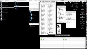
At work I have a 30" ASUS for my main display and two 23" displays. My dock is on the far right on the right display. So clicking on an app in the dock involves moving the damn mouse off my main screen all the way over. I don't keep the dock on my main display because it limits the size of InDesign layout windows. I'd rather that space be used by the Control Panel.

I do use CMD+Tab a lot though. But since my hands are 95% of the time on the keyboard it's also just easier to use CMD+Arrow key to switch right or left (up and down at home).

My left monitor has nothing but open Finder windows for all the folders I access routinely. My right monitor has Chicken of the VNC running, connected to our headless Applescript server (a G4) so I can see it's desktop at a glance. The right monitor also shows my printer windows so I can see what jobs are printing.

One display would mean having to cycle through all of this and would mean I'd have to continually open and close folders. It's just easier to drag content from a server window into InDesign if the window is already open.

With spaces, having the ability to leave my browser window open while I'm doing stuff like posting on MacRumors while not having that window interfere with InDesign, Photoshop and Acrobat windows is a feature to me.

Left Display -> InDesign CC.png
Primary Display (center) -> InDesign CC 3.png
Right Display -> Chicken of the VNC.png
 
Last edited:

bunnspecial

macrumors G3
May 3, 2014
8,352
6,495
Kentucky
I too use Spaces/Mission Control/Virtual desktops to organize different programs.

In a lot of ways for me, it's sort of the mental "break" of having different tasks assigned to a different desktop. If I'm in full-blow work mode, maybe I'm in a Word/Excel desktop or in one of my other work specific programs. If I'm browsing the internet or doing something else, that has its own desktop. It just makes sense to me to spread them out, and I feel limited when I don't have them.

Even with multiple monitors, I may have several programs going but I "collect" them in a space/desktop for a particular task. A couple of big monitors, though, do allow me to have some bleed-over-i.e. maybe Mail or Messages is parked in one corner.

BTW, if I'm working in Photoshop or some other image editing software, I feel REALLY cramped if I only have one display. The image I'm working on is on the main screen, and a secondary display holds toolbars, pallets, etc. With any given set-up in this situation, my primary display will generally be the one with the best color fidelity and not necessarily the largest, although often those are one in the same. On my Mac Pro at home, the primary display is a 27" LED Cinema(one of the ones that looks like a Unibody iMac) while the secondary display is a 23" acrylic ADC Cinema. I can't stand to even view photos on the old ADC display now.
 
  • Like
Reactions: eyoungren

Amethyst1

macrumors G3
Oct 28, 2015
9,796
12,201
When using a version older than Tiger, I find myself missing Spotlight as I regularly use that. When using Tiger, I occasionally miss QuickLook and Spaces (there's VirtueDesktop for that, though). Of the features introduced in newer versions of OS X, Mission Control is the only one I use.

As for multiple monitors vs. Spaces, I use a single display (a 23" acrylic Cinema) with my main system. I have at least five spaces: one for my browser window, another for mail, another for whatever I'm currently working on, a fourth for a couple of Finder windows of my most commonly used folders and a fifth which is usually dedicated to a VM, VNC window or something along the lines of that.
 
  • Like
Reactions: eyoungren

eyoungren

macrumors Penryn
Aug 31, 2011
29,604
28,367
Everyone seems to like Spotlight. :)

I hate it and it have disabled on all of my Macs (including the MacPro at work). Of course that disabled Finding things, but hey…EasyFind. Better than Spotlight AND the standard Finder search.

However, it would seem a lot of you use it as a launcher. Well, okay. But, I've been a fan of Quicksilver by Blacktree for quite a while now.

If you're missing using Spotlight as a launcher on Tiger, well…use Quicksilver: https://qsapp.com/archives/

This version, Quicksilver ß36 (Uploaded: 28 Jul 2011), at the very bottom of the page is for Panther. So yeah, you can get a launcher on Panther too. Anything above that is Tiger and going on up into Leopard and beyond.

PS. On my systems, I've set Quicksilver to use the key combo for Spotlight. Hah! :D

PPS. Setting EasyFind up to use a trigger from Quicksilver means you can use CTRL+F or any key combo that will work system-wide to call the app. EasyFind works in Tiger too.
 
Last edited:
  • Like
Reactions: bobesch

z970

macrumors 68040
Jun 2, 2017
3,589
4,541
Everyone seems to like Spotlight. :)

I hate it and it have disabled on all of my Macs (including the MacPro at work).

However, it would seem a lot of you use it as a launcher. Well, okay. But, I've been a fan of Quicksilver by Blacktree for quite a while now.

If you're missing using Spotlight as a launcher on Tiger, well…use Quicksilver: https://qsapp.com/archives/

This version, Quicksilver ß36 (Uploaded: 28 Jul 2011), at the very bottom of the page is for Panther. So yeah, you can get a launcher on Panther too. Anything above that is Tiger and going on up into Leopard and beyond.

PS. On my systems, I've set Quicksilver to use the key combo for Spotlight. Hah! :D

Spotlight is easier.
 

eyoungren

macrumors Penryn
Aug 31, 2011
29,604
28,367
Spotlight is easier.
? Really?

CMD+Spacebar, type in first few letters of app, press return. App opens.

Only I'm looking dead center at the screen and not up in the right.

And, oh yeah. CMD+Spacebar, type in first few letters of app AND drop your file on QS. Bam, app opens and then opens your file. Or just type the name of the file directly.

QS also lets you set triggers. I have one here at work that lets me call a script that copy any files/folders I have selected to a specific spot. OPTN+S and done. It's got way more versatility than Spotlight.

Google Chrome.png
 
  • Like
Reactions: Dronecatcher

bobesch

macrumors 68020
Oct 21, 2015
2,142
2,220
Kiel, Germany
I'm right there with you. For me the numerous UI / feature changes which have occurred over the decades have done little, if anything, to improve my workflow. In fact I might argue they've done just the opposite...slowed down my workflow as I have to adjust to changes.

Some simple examples:
  • Why must the maximize/minimize/close buttons move from one side of the window to the other?
  • Why must the scroll bars become razor thin? Especially in the days of HD monitors?
  • Why must the scroll bars disappear? Especially in the days of HD monitors?
  • Why must the scroll bar behavior change when clicking in the empty portion of the bar? Instead of the traditional page by page behavior it now moves the page to the, relative, position where the scroll thumb is located?
I could go on listing all kinds of examples. Features are similar...I don't find use for most of them. I'm no luddite but I see no benefit to these changes other than for change sake. I understand the need to keep the OS "fresh" and I can adapt but I do know where you're coming from.

Fully agree. I've reset all the scroll bar madness to make them match Leopard.

I like Spaces but scrolling through the virtual desktops using the 4finger swiping gesture is even more convenient and comes close to multiple monitors. Since I'm somehow restless, when it comes to my working-space, I often tried but didn't get any satisfaction from using multiple monitors in one place ...

"Moom" is my favorite tool, the missing link between/for PPC and intel-Macs to arrange windows via green button or keyboard and keyboard-commands work the same way on all my different versions of OSX (Leopard/Lion/ElCap/HighSierra)

Most stuff on my Macs is somehow set to resemble Leopard, which had been on my first Mac ever ...
 
Last edited:

bunnspecial

macrumors G3
May 3, 2014
8,352
6,495
Kentucky
I'll just add that I'm not a fan of natural scrolling either. It's the first thing I change on any new 10.7+ OS X/macOS install.

I'm completely comfortable with it on a touch screen, but I have 20+ years of computer habits(going back to scroll wheel mice) ingrained in me to make it not work on a computer screen.

Plus, I use versions of Mac OS/OS X often enough where it's not an option that I don't care to relearn and have to deal with different habits on different computers. I want my scroll wheel mouse in OS 8.5.5(which I don't actually run on anything, but you get the idea) to scroll the same direction as the trackpad or scroll ball (on the Mighty Mouse) when I'm in macOS Mojave.
 
  • Like
Reactions: AL1630

AmazingHenry

macrumors 65816
Jul 6, 2015
1,285
534
Central Michigan
All that matters to me is the web browser, and the ability for some old emulation so I can run my MS DOS and Intellivision games. My text editor is Google Docs. I'd have a Chromebook right now, but I just can't stand how restraining it is. I like having access to the whole file system for some reason.

So, yeah, an old Mac would be fine if it was decently fast.
 

AphoticD

macrumors 68020
Feb 17, 2017
2,283
3,466
In all of this great discussion I think it’s worth mentioning that I love having my different Mac environments and appreciate their idiosyncrasies.

My daily driver Mac Pro is on El Capitan, I have an iMac on High Sierra, my G5 loves Leopard and my PowerBook G4 12” is solid on Tiger. I have recently tried to incorporate Panther into my workflow with a “new” Lombard purchase and it feels solid. I discovered Taco HTML editor and an old version of TextWrangler are completely usable on 10.3 as is an older version of Transmit for publishing web changes.

I like the diversity of having these Mac systems. There are quibbles with each OS (like disappearing scroll bars on some and lack of Quicklook on others), but I switch gears easily and I appreciate that they can mostly communicate with each other via my El Cap MP which acts as the bridge between the new and the old. Remote Desktop, File Sharing and even iTunes across all of these systems play nice enough. Xcode 1.5 on Panther and Xcode 10 on High Sierra can effectively compile much of the same Obj-C, C and C++ source code and they share a similar workflow.

In short, we’re really spoilt for choice. It’s a great time to be a Mac user!
 
  • Like
Reactions: bobesch and z970
Register on MacRumors! This sidebar will go away, and you'll see fewer ads.