Become a MacRumors Supporter for $50/year with no ads, ability to filter front page stories, and private forums.
To answer the OP: Not as much as he thinks and not as much as everyone hoped. It could have been better. I think what was missing was someone that was willing to break it down and hurt some feelings by telling them that the design looks crap. I can't see Tim Cook one-sentencing someone back to the drawing board like Steve Jobs. They needed someone to say "No." more.

It's crap? That's your opinion. I thought Steve Jobs fake leather and green felt was crap. He wasn't a design god either you know.
 
It's crap? That's your opinion. I thought Steve Jobs fake leather and green felt was crap. He wasn't a design god either you know.

My thinking that iOS 7 looks crap doesn't mean that I thought all prior efforts were awesome or anything. Previous examples of ugly design choices have no bearing on current ugly design choices.
 
They only promoted Ive a short while ago and look at how much they have changed. There will surely be more changes in a beta than we are used to. Someone said the beta was 3 months old. 3 months! Many of the things people are bitching about can easily be updated (icons). They will certainly change some of the interface as they spend more time with it. Its really stable given how much has changed. The cosmetic stuff is not a big deal.
 
You're right, it will get refined and I hope it becomes a lot more polished before the final version comes out to everyone.

While details may change, I personally feel that the general design language is confusing and harder to use. I've been running iOS 7 on my iPhone 5 since WWDC and I've noticed a few things:

There are a lot of menus that just disappear. So, in order to do a function, the user needs to do an extra tap just to bring the buttons to view.

For example, changing pages in iOS 6 Safari involved:
1. Tapping the "page change" icon.
2. Changing pages.

Now it involves:
1. Quickly scrolling down or tapping the URL bar to reveal the bottom bar of Safari, and the "page change" icon.
2. Tapping the icon.
3. Changing pages.

Now, this sounds like a small annoyance but I think it's revealing of the general missteps that have been made in the new UX.

Also, the constant white, similar icons, and thinness of text (and at times icon glyphs) can feel overwhelming at times, and makes finding the button you need more difficult.

General readability also suffers. Safari provides another great example of this. Now, tapping 'reader' often makes the article harder to read, due to the thin text and bright white background.


There are some good features in iOS 7. No, Apple is not 'doomed', and I'm sure iOS 7 will improve and iOS 8 will be better still. But the problems with iOS 7 do, I believe, go beyond 'childish icons'. There are elements of the new design language that I believe are simply not the right way to go.


Can't you just swipe from the edge and change pages?
 
Can't you just swipe from the edge and change pages?

Swiping from the edge left or right takes you to the previous or next page you were reading, if any. The problem is with moving between "tabs." Before, the icon to show the other "tabs" was always visible in the lower right corner. Now it slides out of view when you start reading a page. And to get it back, you have to tap a very specific part of the screen. This is inconsistent with previous behavior in other Apple iOS apps, such as iBooks, where tapping pretty much anywhere in the center of the screen brings the controls back up.
 
iOS 7 will take many updates and tweaks, as did iOS 6 to get that polished feel. Hopefully in the end all will look better than now.
 
I think everything looks a lot more smoother than iOS 6, more sleek and stylish. It's a good first take. Some people make it seem like Apple screwed this up the way Microsoft screwed up the Xbox one.
 
My opinion after reading this thread is that people just like to complain. Maybe it's human nature?
 
This is a Year Zero design, so it will improve over time.

Oh, and it's also a Beta.
 
They redesigned the entire OS in like 6 months. It's Ive's first major foray in to software design. I think we can cut Apple a little slack here. iOS 7 might not be perfect but it will get refined and improved upon. I suppose Apple could have waited until iOS 8 for the full redesign but then people would have complained about the UI being stale, Apple is doomed etc. I'm not judging iOS 7 until its installed on my phone and I get the opportunity to actually use it.

As somebody who's used it and reverted back to iOS 6, I can tell you it's a step backward. I get that the iOS team was on a tight schedule, but Apple sets their own deadlines. If the product wasn't ready, they shouldn't have shown it at WWDC. Since when has Apple trotted out half-baked software or hardware into the world in such an unrefined state? Besides Ping, and MobileMe, all iPhone-related hardware/software has looked solid even during their beta phases. I hope Apple can right the iOS 7 ship before it's too late.

----------

I like the new Safari Icon. It spells out minimalism.

In fact, I wouldn't mind a blue box with just an S.

Or, just an S and no background whatsoever. (or just the reverse, a blue box with nothing on it).:apple:

There's nothing minimal about having dozens of little ticks around that blue circle in Safari. It looks cluttered.
 
Although I do not like the new UI YET, I am positive it will grow on me. It's a fact of psychology that no one likes change. I used to proudly say I would never own anything but a flip phone, and would scoff at people with fancy phones like iPhones. When I got an iPhone for the first time I hated it. I hated my brand new truck when I traded in my old clunker. But eventually, like everything, it will grow on us and then and only then will we realize exactly how and why this change is for the better in every way. Ive has good taste; after all, this is the same guy who designed the MacBook Pro, so I have faith that He knows what He is doing.
 
The building blocks of the UI design are fine.
Its the execution. Not very polishes and in many ways.

Take Safari image posted earlier as an example.
If they would just put the old controls (in black or grey) on the transparent menu everything would be fine.

They thew the baby out with the bathwater.
They should have implemented the new UI concepts with iOS 1-6 style "hybrid" controls.
Its an issue of familiarity.
 
Last edited:
Well ios7 was definitely rushed. 7 months for a whole new look is just almost impossible to pull of. That's why I hope the inconsitensy will be ironed out in the following months n

Totally agree to that.

To be honest had hoped for something more "finished" regarding the look.

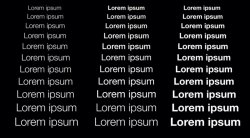
But...: Take a look under the hood of the UI concept. Those who have the wwdc app go and watch the interface video. That also gives me a clue why they are using Helvetica Neue.

One important part is the dynamic font concept which basically adjusts the font size and weight automatically from xs to xxxl. IOS now uses styles like in Pages or Word. To understand that, one has to know that fonts can have several weights,not only bold and reguar. But only a few have as many as Helvetica Neue. From ultra thin to extra bold.

Example: text in xs regular will display in a thinner weight than in xl regular. The user recognises it as the same weight and will have a much more harmonic impression. With that, also the layout automatically adjusts, like line height, spaces etc. All of such stuff will cumulate and contribute to an awesome looking Layout. Imho minimalistic styles need this kind of detail attention to not end up as boring looking bunch of text.

In this respect I believe that Jony has the skills to create something that looks and feels fantastic. But, screen stuff doesn't work the same like pysical products. It's a challenge.

My guess is also that the top most layer (icons) will be the last of that to finish.

I also deeply hope that they are working on their own (more elegant less feminine) font. MS did a knockoff of Helvetica and called it Arial many years ago. But they also developed new ones which are actually good looking. But creating such a complex font is a looooong process.
 

Attachments

  • 392942079.268286.jpg
    392942079.268286.jpg
    108.8 KB · Views: 108
Last edited:
I think that, although the color palette isn't my favorite, I love the interface design. The zoom in to folders, then zoom in to apps, reminds me of using Prezi.... It's fun. The multitasking and control center are terrific.

The OP raised the question of the up arrow on the lock screen: the arrows on top and bottom are indicators that swiping from these edges have a function, not that up is the unlock. (The arrow disappears if you disable the control center on the lock screen)

I can't imagine going back, even with a first beta.
 
So many people cried about a stale iOS but when change occurs, people suddenly love everything about iOS 6. Sure, iOS 7 isn't perfect, but it's in Beta! Personally, I love iOS 7. It convinced me to switch back from my s4 to my iPhone 5. When it came down to it, I just wanted a less stale iOS with some added features, and so far, I think iOS delivered. The one thing I'm still trying to get used to is Safari.
 
Sad, but so far, iOS7 is the first iOS that makes me think that going Android wouldn't be that big of a change.
 
If Johnny was ultimately responsible for the look of IOS 7 then he does not understand interface design.

I believe Apple will fix this before the release or they will be the butt of many jokes until they do.

Polarizing is not how you want your product described.

Form SHOULD follow function. In this case we have function taking a back seat to poor design being sold as minimalism.

At least the felt and wood were creative and they helped convey the purpose of the function they complimented.

A blank piece of paper isn't going to heighten a user experience. Be careful what you ask for. You might end up with a user experience which falls FLAT.
 
I'm gonna guess that he understands it better than pretty much everyone here.

OP seems to believe that he's better designer than Jony Ive himself.

----------

Form SHOULD follow function.

No. Form should BE function. That's what iOS 7 interface is. No unnecessary details or metaphors. Everything is just straight to the point, and looks brilliant as a result.

----------

Bring back forstall!

I think you forgot why he was taken out in the first place.
 
I really liked it. I installed it to play around with it for a bit. And going back to iOS6 feels really dated now.

My biggest complaint would be the speed of animations overall, would like them to be a bit faster.
 
I agree form should be function in the case of these icons. Well said.

I disagree that these accomplish what they should. Beauty is one of their elusive goals.
 
I don't like how the user interface just melds into the content. For example, in iOS 6 the blue bars on the top and bottom of safari separated actions the user can take, from the content of the webpage. Because most websites didn't have that blue as their background, the interface of the app and content of the webpage were separate, allowing us to quickly identify buttons (that were part of the app). But, with iOS 7, the interface is white (or a very pale grey) and the problem is most websites have white / pale backgrounds, making it very confusing where the content is and where the UI is, especially since the icons are sometimes there and sometimes not.
 
Sad, but so far, iOS7 is the first iOS that makes me think that going Android wouldn't be that big of a change.

I think we're getting closer to universal agreement on what the feature set of smartphones should be, and as a result Apple and Android are converging.
 
Register on MacRumors! This sidebar will go away, and you'll see fewer ads.