Become a MacRumors Supporter for $50/year with no ads, ability to filter front page stories, and private forums.

MacRumors

macrumors bot
Original poster
Apr 12, 2001
67,572
37,957


Apple today released the third betas of iOS 15 and iPadOS 15, and the company is continuing to refine the suite of new features that are coming in the update. There have been multiple complaints about Safari on iOS, so in the third beta, Apple has introduced some refinements.

iOS-15-General-Feature-Yellow.jpg

This article covers everything that's new in the third beta of iOS 15.
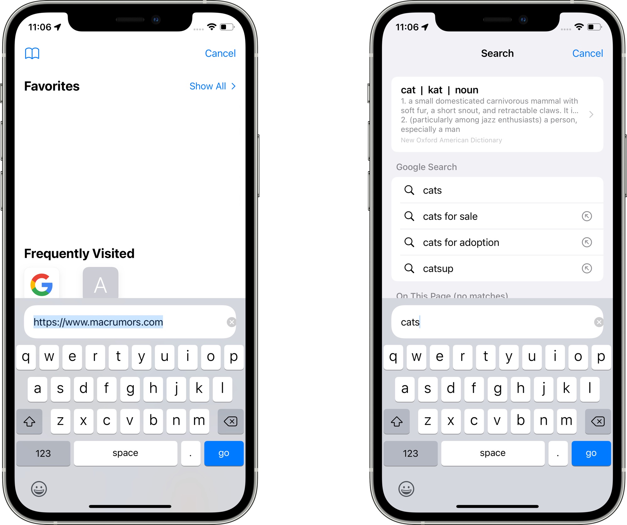
Safari Search

When you tap into a URL bar on a Safari tab, the interface for entering another URL or a search term has been relocated to above the keyboard. Previously, it was located at the top of the start page. The search interface has also been streamlined.

safari-search-interface.jpg

Safari Reload

There's now an option to long press on a floating tab bar to initiate a reload, which is an alternative to using the built-in menu option.

safari-reload.jpg

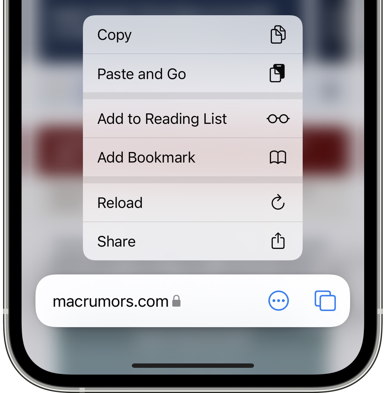
When you reload a tab in Safari, the tab gets a permanent reload icon that can then be tapped to refresh again. The reload icon is only available in portrait mode on iPhone, but it shows up in both portrait and landscape mode on iPad. Making the button appear requires an initial reload, something that Apple may streamline in the future.

safari-reload-ios-15.jpg


Safari Updates for iPadOS 15

The new Safari features introduced in iOS 15 and macOS Monterey were not brought to the iPad, so iPadOS 15 in beta 3 offers the same Safari experience as beta 2. Apple is, however, planning to add Safari updates to a future version of iPadOS 15, improving the usage experience on the iPad as well.

Daring Fireball's John Gruber says some of the same changes brought to iOS 15 and macOS Monterey will also be added in iPadOS 15.

The good news is that today's betas show that Apple has taken criticism of the new Safari UI designs seriously -- on MacOS, Safari once again defaults to showing the tab bar as a discrete UI element in the window, with one URL address bar. (Similar changes are coming for iPadOS, but didn't make it for today's beta.) The iOS changes today aren't as significant, but, having talked to folks at Apple, there are a lot of changes and refinements still to come as summer progresses.

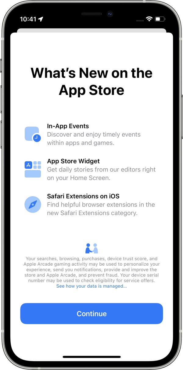
App Store Splash Screen

There is a new App Store splash screen that highlights new features available in the App Store in iOS 15 such as in-app events in apps and games, the App Store widget, and Safari Extensions on iOS.
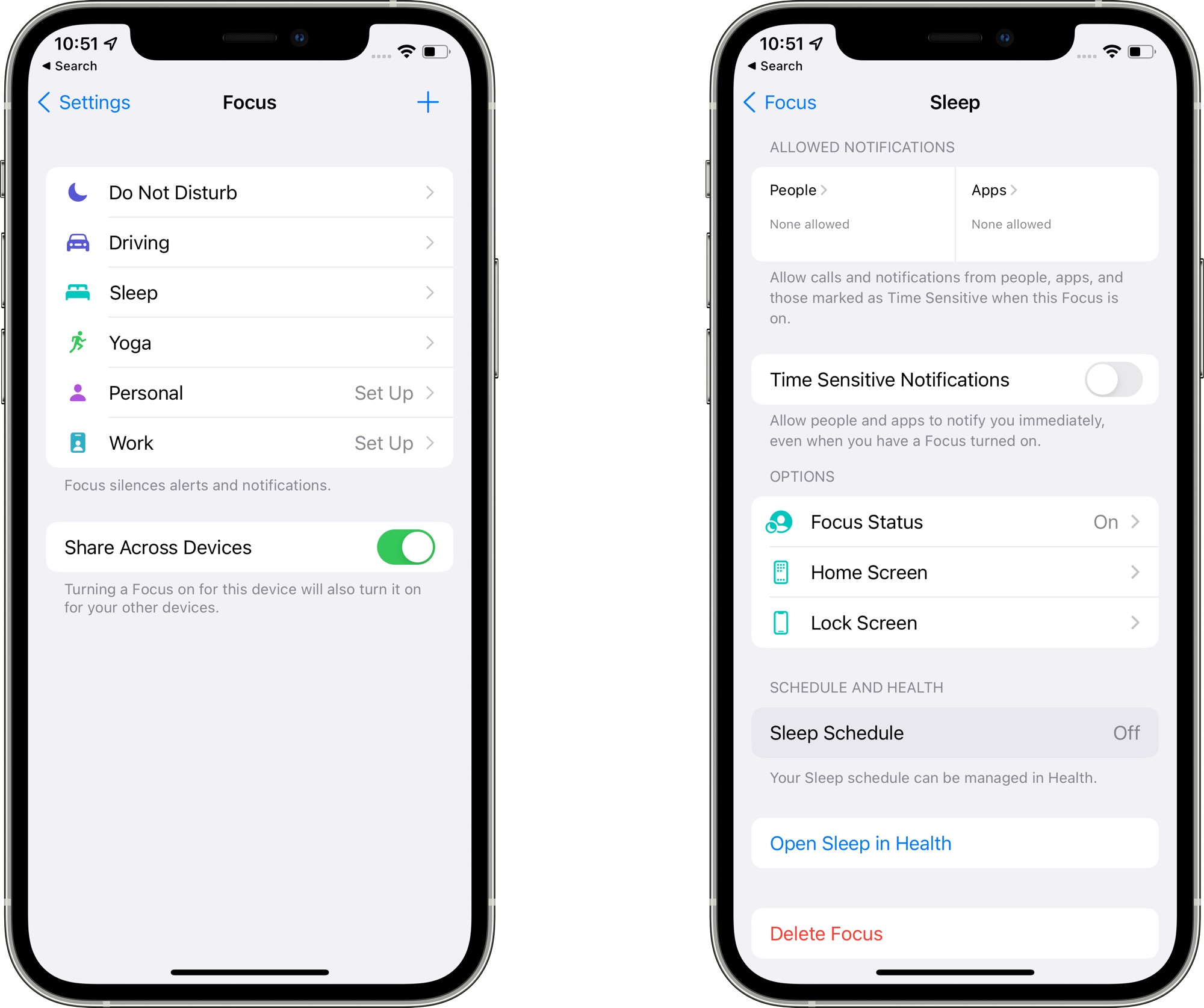
app-store-splash-screen.jpg

Focus Updates

In the Focus interface in the Settings app, Apple has removed the Focus Status and Phone Calls options from the main interface, relocating them into each Focus section.
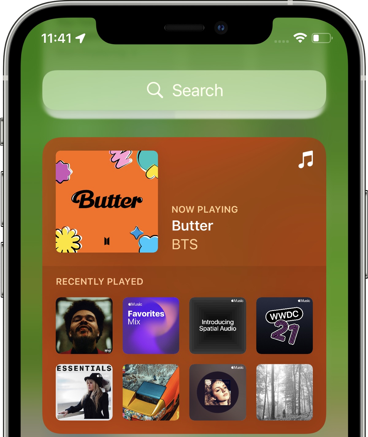
ios-15-focus-mode.jpg

Apple Music Widget

The Apple Music widget now changes color and art based on the individual song that's playing rather than using album art. It's also more clear when a song is playing and when it's paused thanks to a new "Paused" label.
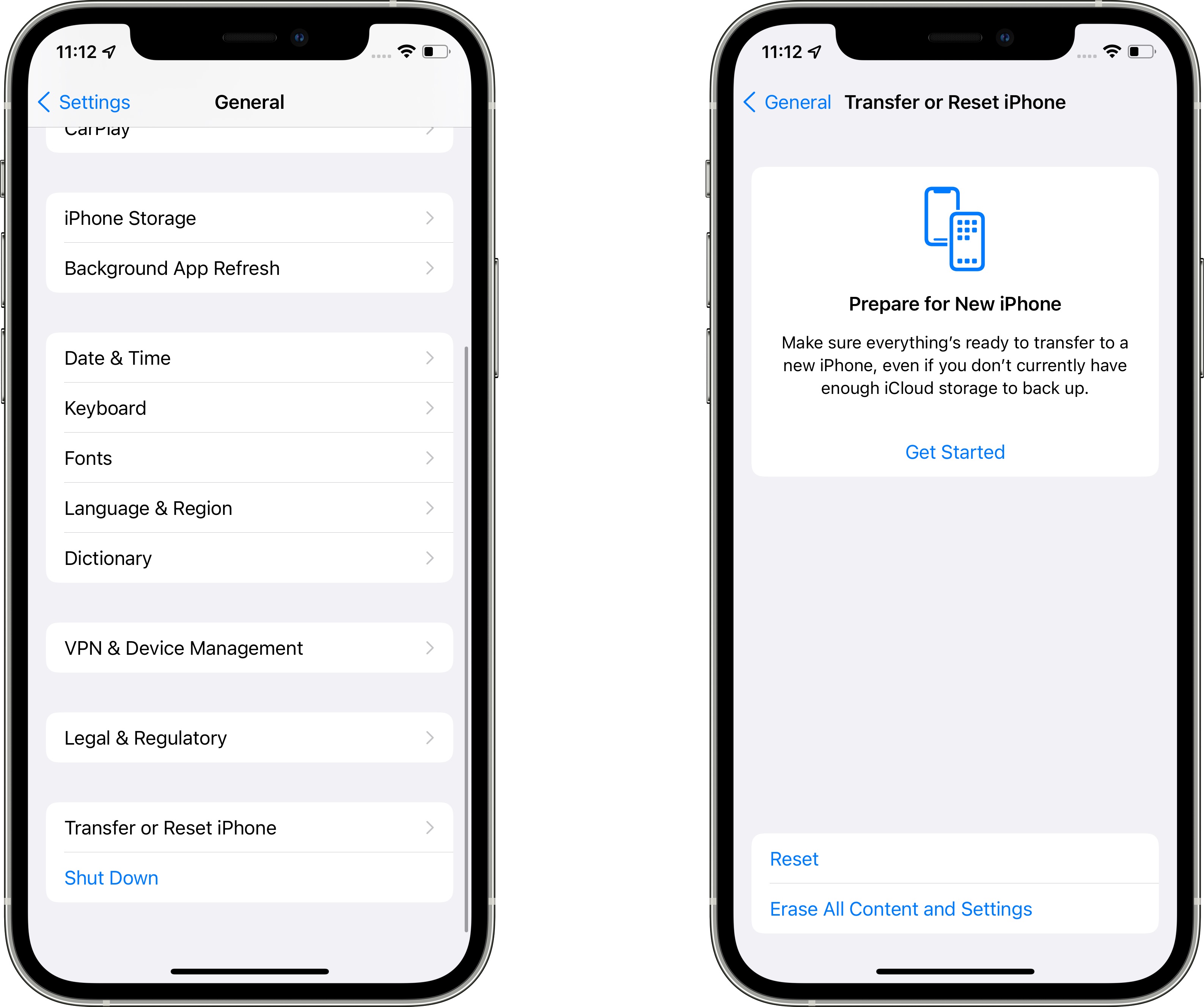
apple-music-widget-ios-15.jpg

Resetting iPhone

In the Settings app under General, the "Reset" button for the iPhone is now "Transfer or Reset iPhone." In this interface, the "Prepare for New iPhone" option is front and center. Prepare for New iPhone was an option in the prior beta, but Apple is now assuming that most people want to use this section to set up a transfer to a new iPhone. All of the reset options for Network Settings, Keyboard Dictionary, Home Screen Layout and more are still there, but are now housed under the "Reset" button.

ios-15-prepare-for-new-iphone.jpg

Shortcuts

There are actions for Background Sounds in the Shortcuts app to set a sound track, adjust volume, tweak volume when media is playing, and more.

Know of a feature that we left out? Let us know in the comments.

Article Link: Everything New in iOS 15 Beta 3: New Safari Search, Address Bar Relocation and Reload
 
Last edited:
Love the beta 3 Safari

Also, switching between Private and Standard tabs is now slightly easier and faster.

Another minor but significant change: now you can long-press on both expanded and collapsed toolbars to access the reload option, which makes refreshing pages a two-tap affair instead of three.
 
Last edited:
I'm glad that they seem to be focusing on stability for this release based on the early beta reports that I've heard. We don't need big changes each year. refinement is a feature too
I believe iOS 14 was refined and stable. Best in years in this regard.
 
Looks like the Safari team is in a bit of a scramble to recover the new UX, based on the clear button not being properly positioned in the new search bar...
 
  • Like
Reactions: LeadingHeat
While I’m sure they went through countless hours testing the UI/UX, having the url bar in the middle (top of keyboard) like that just seems so clunky. Plus how huge it is vs the size now. I’m sure it’ll be a transition at first, and I’ll get used to it. But I wonder why the change when macOS Safari is still at the top of the page.
 
While I’m sure they went through countless hours testing the UI/UX, having the url bar in the middle (top of keyboard) like that just seems so clunky. Plus how huge it is vs the size now. I’m sure it’ll be a transition at first, and I’ll get used to it. But I wonder why the change when macOS Safari is still at the top of the page.
I agree. The floating url bar gains nothing and screws up a vast swathe of the internet. So many sites/apps use a fixed footer and this makes them orphaned in the middle of the screen. Feels like change for changes sake.
 
While I’m sure they went through countless hours testing the UI/UX, having the url bar in the middle (top of keyboard) like that just seems so clunky. Plus how huge it is vs the size now. I’m sure it’ll be a transition at first, and I’ll get used to it. But I wonder why the change when macOS Safari is still at the top of the page.
Have you tested the beta yet? The search bar was jumping from the top to the bottom repeatedly while using safari. It was ridiculous, and not in line with their perceived goal of bringing the user elements closer to the bottom of the screen. That said, I’ll admit that it looks boxy in beta 3, which is in opposition to all the rounded corners we are seeing.
 
Last edited:
When you tap into a URL bar on a Safari tab, the interface for entering another URL or a search term has been relocated to above the keyboard. Previously, it was located at the top of the start page.
This opens up the possibility of building a footlong iPhone without requiring the user to jog their focus.
 
But I wonder why the change when macOS Safari is still at the top of the page.
It's on the bottom on ios because that's were people's thumbs are. It's on top on search becaus that's where people's eyes go for settings and menus and such since unlike Windows which has always had menus at the bottom, apple chose to have on top on macOS, and certainly seems better since when looking at a laptop or imac, etc your eyes are more aimed towards the top which is why the camera is there as well vs the bottom.
 
Fingers crossed for a public beta tomorrow, otherwise I'll just hit up the dev portal for this build (likely the same).
 
Wow, it’s almost like Apple is listening to our complaints!
That's a very good thing. Kudos to Apple! Maybe they'll listen to me too and redesign their systems in the next 10 years. I've been complaining about it since iOS 7 but because I'm an optimist I remain hopeful 😄
 
  • Like
Reactions: pdaholic
Register on MacRumors! This sidebar will go away, and you'll see fewer ads.