PsykX
macrumors 68040
Finally a design of Safari that makes sense and that gives us the ability to revert it back.
Ayyeee haha top hereYou guys top or bottom 👀 😉
U know why dude don’t hide nowSo, why are you asking? 👀
People complain that iOS hasn’t changed, then when it does change they still complain, can’t please everyone I guess. 🤷♂️
Keep the changes coming. 👌
I would think on the contrary. There are still many people who have smartphones as their first computer. A smartphone ux should not confirm to desktop ux.So glad Safari can be changed back to "normal". I hated the new design, and folks who are not computer savvy would have been COMPLETELY lost.
Well, we know what ios15 have that ios14 doesn't.This is why change for the sake of change is getting ridiculous. How long before iOS 15 keeps changing things back it’s nothing more than iOS 14.8?
PS: I’m perfectly fine with that.
Because the change was an affront to everyone’s muscle memory. It’s not a good idea to force radical ThinkDifferent™ changes on users without offering a legacy option. Take the introduction of ”natural scrolling” a few years back; They made it default but optional. Personally I decided to take the plunge, and after a few weeks of training I grew to prefer it and haven’t gone back since. But there are still many people out there who absolutely loathe it to this day, and will switch to standard the first chance they get. This Safari redesign is exactly like that, except Apple didn’t give users a choice. Now that’s been corrected.I thought the bottom bar for Safari makes sense since most phones are much taller nowadays. I don't get why people want to keep the address bar so far on the top.
"major" features that were not major at all. These updates are not worth a damn these days.that's 2 of the major features they announced being rolled back, so... what's actually going to be new?
But there is a change that is not optional, which is larger and taller phones. I am an old school PC user, but on phones, I loathe the top address bar. It's annoying and waste of effort to reach the top everytime I want to search or type in a url. I am amazed of people who are willing to adapt to the poor ux.Because the change was an affront to everyone’s muscle memory. It’s not a good idea to force radical ThinkDifferent™ changes on users without offering a legacy option. Take the introduction of ”natural scrolling” a few years back; They made it default but optional. Personally I decided to take the plunge, and after a few weeks of training I grew to prefer it and haven’t gone back since. But there are still many people out there who absolutely loathe it to this day, and will switch to standard the first chance they get. This Safari redesign is exactly like that, except Apple didn’t give users a choice. Now that’s been corrected.
Apple can be bold and arrogant, but they’re not stupid. If a change flops they listen and rethink. Even with hardware. There was the buttonless iPod Shuffle 3rd gen. Users gave it a hard pass, so for the 4th gen they went back to a design closer to the 2nd gen. There was the expandable cheese grater Mac Pro, replaced with a non-expandable trash can, replace by a cheese grater that takes PCIe.
How are people finding the Beta? Would you install it on your main device yet, is it particularly buggy? I'm keen to start using the new notifications features, but I don't want to make my phone very unstable in the meantime (I just switched from Android, so a bit of jank and bugginess is normal to me).
Depends on how you hold the phone I guess. I rest the bottom edge on my pinky, keep three fingers on the back for support, and operate the phone with my thumb. In default resting position the tip of my thumb has approx 1/5 screen above it and 4/5 below it, so reaching up is a breeze and reaching down is a chore. Then again I have large hands.But there is a change that is not optional, which is larger and taller phones. I am an old school PC user, but on phones, I loathe the top address bar. It's annoying and waste of effort to reach the top everytime I want to search or type in a url. I am amazed of people who are willing to adapt to the poor ux.
Look at messaging apps. The type box is at the bottom. I think people will actually appreciate the change.
Yeah, I do.U know why dude don’t hide now
I think the problem is not where the address bar is per se. It’s accumulated user experience fails that is the problem with new Safari. I haven’t used iOS 15 with iPhone yet but on iPad it’s atrocious. Who thinks it’s a good idea to have address bar changing place depend on the tab you’re on? That’s so confusing. That’s just one example. (and I don’t even want to rant on Refresh at this point. Yes, they fixed it but they shouldn't have released it in the form of first beta in the first place).But there is a change that is not optional, which is larger and taller phones. I am an old school PC user, but on phones, I loathe the top address bar. It's annoying and waste of effort to reach the top everytime I want to search or type in a url. I am amazed of people who are willing to adapt to the poor ux.
Look at messaging apps. The type box is at the bottom. I think people will actually appreciate the change.
Great Apple, now let’s get rid altogether of this mess and roll back to ios 14 Safari
Apple released the sixth beta of iOS 15 just a week after the fifth beta, but the new update brings some of the most significant tweaks that we've seen to iOS 15 during the beta testing period.
Safari Redesign
Apple in iOS 15 beta 6 has added a toggle to move the Safari address bar to the top of the interface, which returns Safari to an iOS 14-like design and mitigates all of the Safari changes introduced in earlier betas.
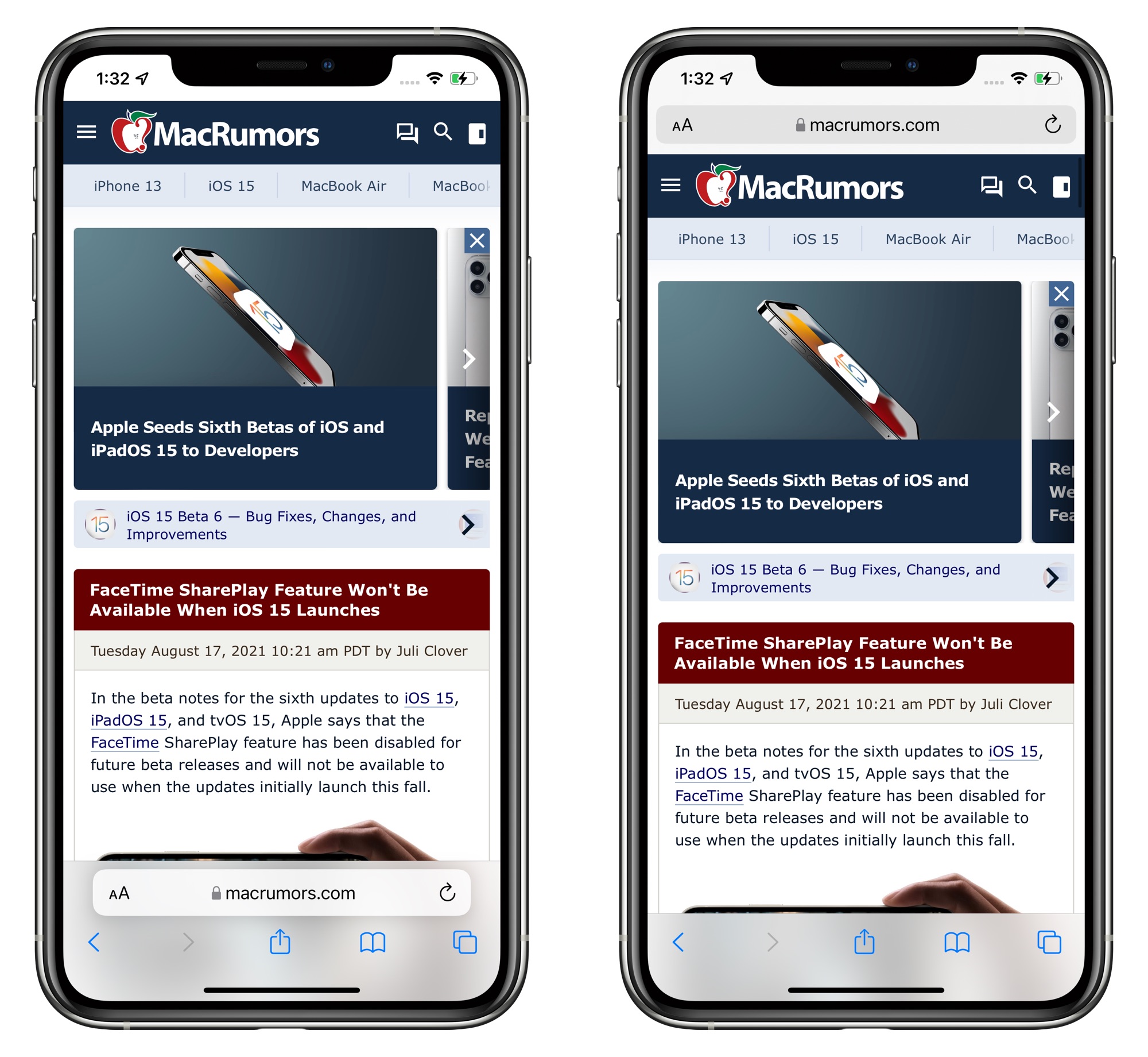
Those who prefer the bottom bar can still opt to have that toggled on with the Tab Bar view, but Apple has also changed the look and the url bar at the bottom has been merged with a dedicated control panel that does away with trying to merge all page management options into a single address bar view.
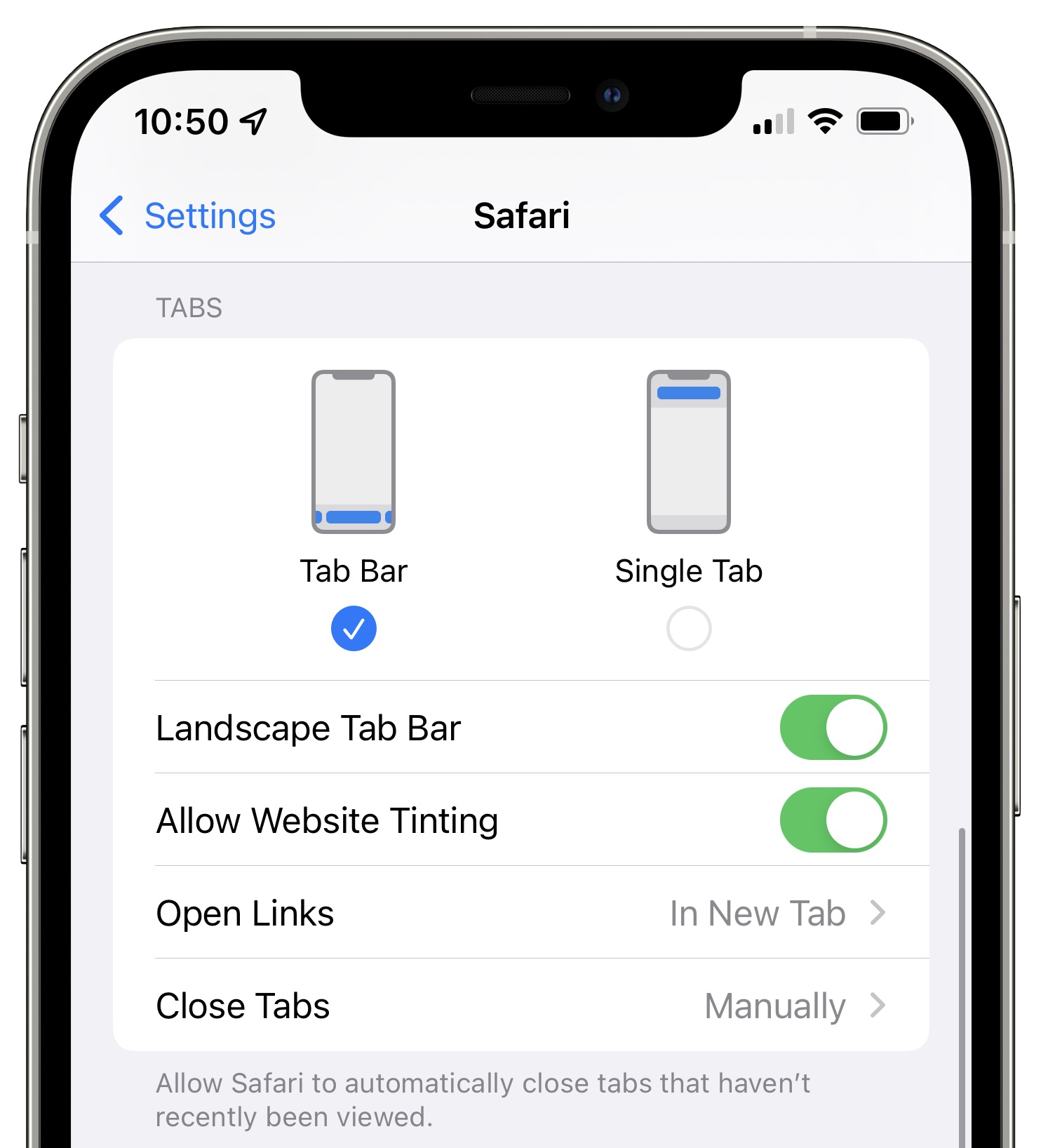
Safari design options let you swap between the Tab Bar at the bottom or the Single Tab at the top, plus there are toggles to disable website tinting and enable or disable a landscape tab bar. "Allow Website Tinting" appears to be the same as the prior "Show Color in Tab Bar" setting that was available in earlier betas.
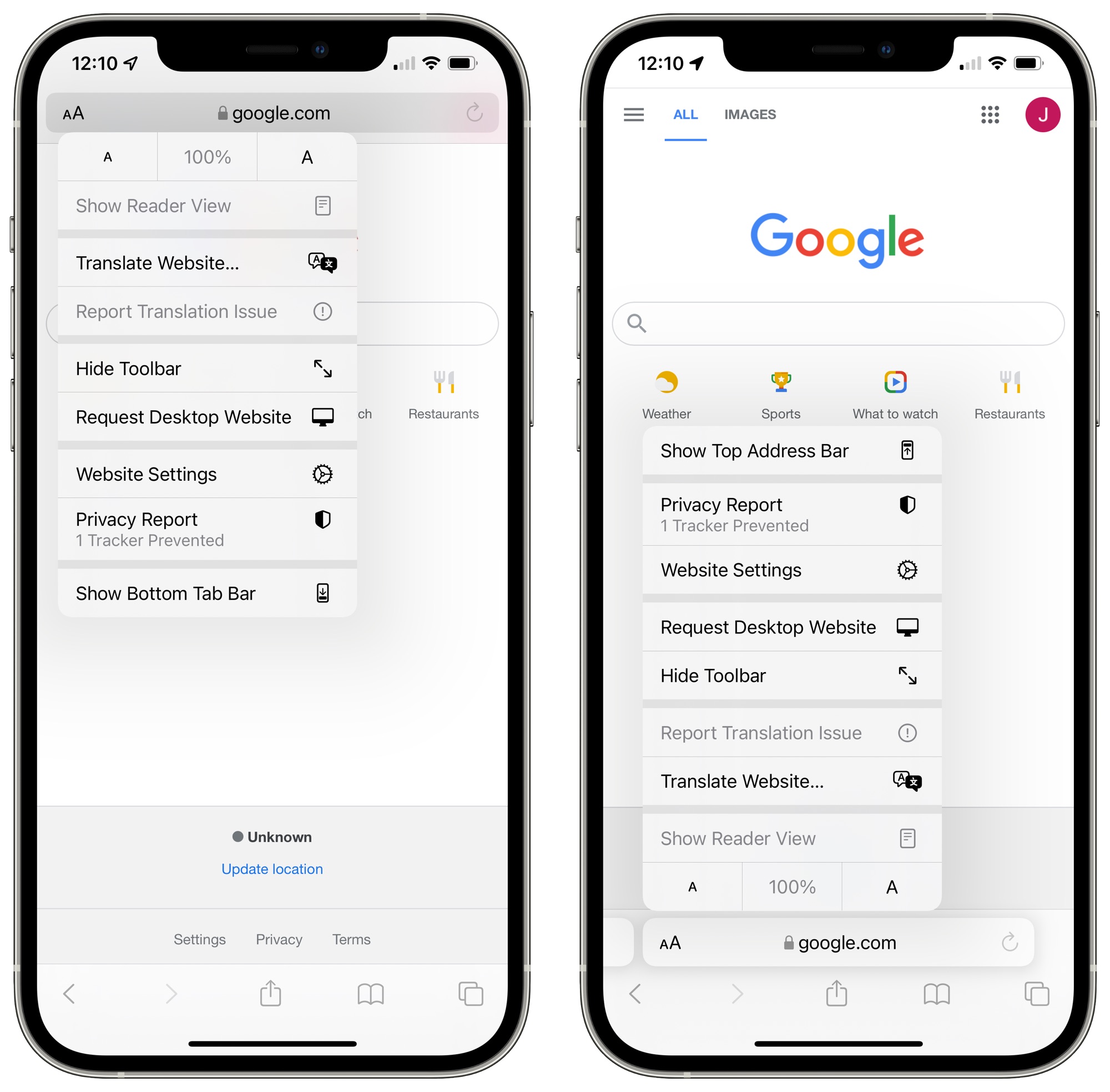
You can swap between the two views in Safari using the "Aa" menu right in Safari without having to access the Safari app.
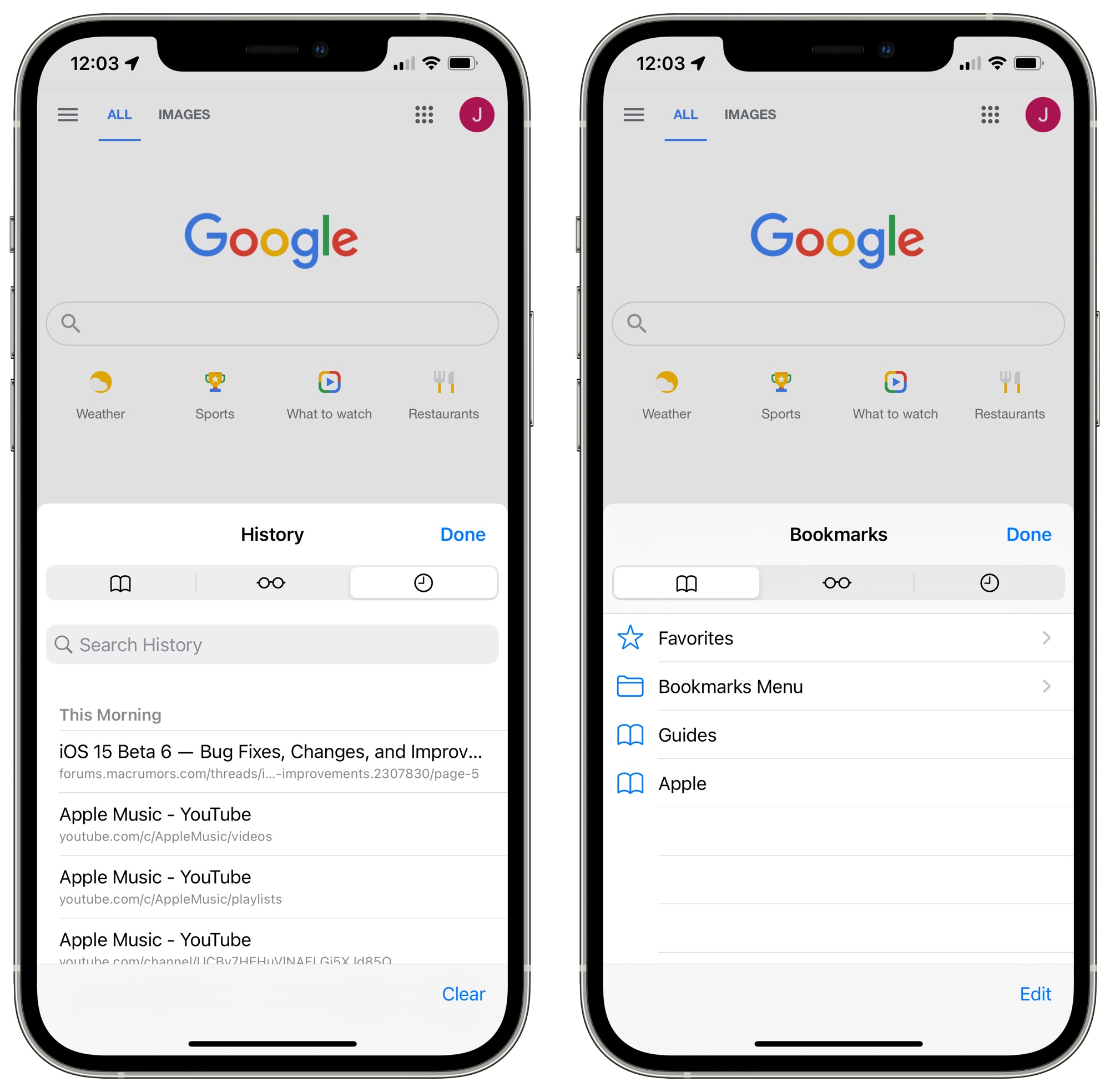
Safari Bookmarks and History
When accessing Safari History, Bookmarks, and Reading List in iOS 15 with the bottom Tab Bar view toggled on, the interface comes up from the bottom and takes up less space on the screen. With Single Tab enabled, the interface looks the same as it did before.
SharePlay Removed
SharePlay is no longer functional in the sixth beta of iOS 15, because Apple has temporarily removed it. When iOS 15, iPadOS 15, tvOS 15, and macOS Monterey launch, there will be no SharePlay feature available.
Apple instead plans to reintroduce SharePlay in a later software update this fall after the iOS 15, iPadOS 15, tvOS 15, and macOS Monterey updates debut.
Watch Face Automation
The fifth beta of iOS 15 removed the Automation for automatically setting a watch face on the Apple Watch at a specific time, but in the sixth beta, the option is once again available in the Shortcuts app.
Other New Features
Know of something new in the beta that we left out? Let us know in the comments below.
Article Link: Everything New in iOS 15 Beta 6: SharePlay Disabled, Safari Redesigned and More
And just cancel iOS 15 release at all LOLGreat Apple, now let’s get rid altogether of this mess and roll back to ios 14 Safari

