
Testing on the iOS 26.4 update is continuing, and Apple released the second beta today. The main new feature is an expansion of RCS encryption testing, but there are a few other small tweaks.
End-to-End Encryption RCS Testing
With the second beta of iOS 26.4, Apple is testing end-to-end encryption for text messages sent between iPhones and Android devices.
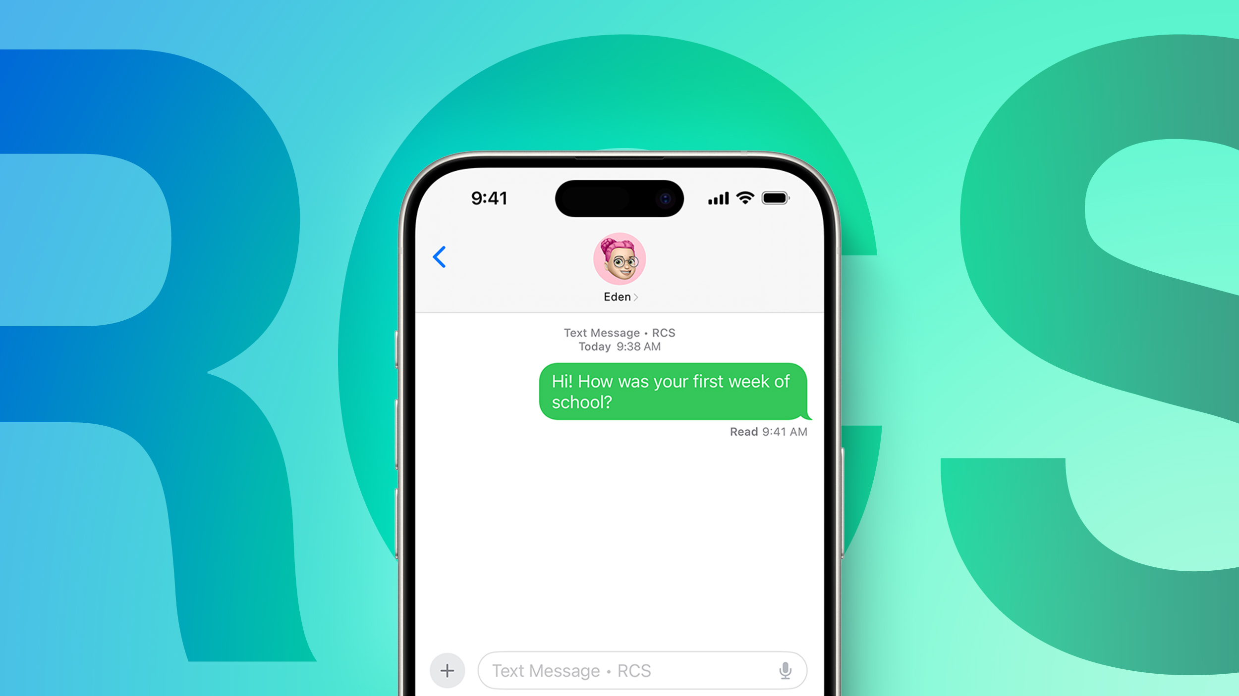
End-to-end encrypted messages can now be sent to an Android user, and if encryption is enabled, there will be a lock icon on the message. Encrypted conversations are not available for all devices or carriers during the texting period. iOS users will need to have iOS 26.4, and Android users need the latest version of Google Messages.
Apple does not plan to implement end-to-end RCS encryption in iOS 26.4, but it will come later this year.
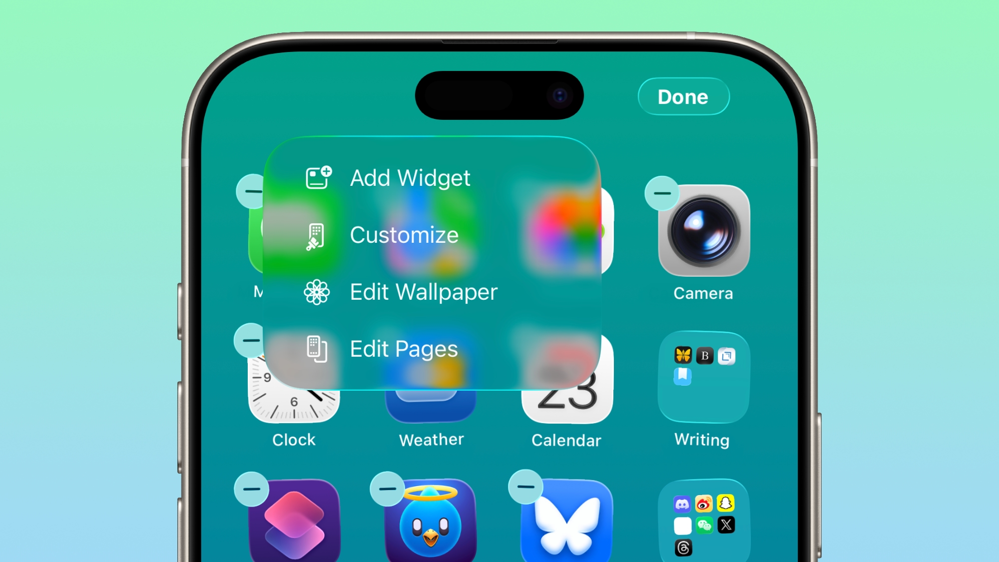
Home Screen
The "Edit" menu on the Home Screen uses more transparent Liquid Glass.
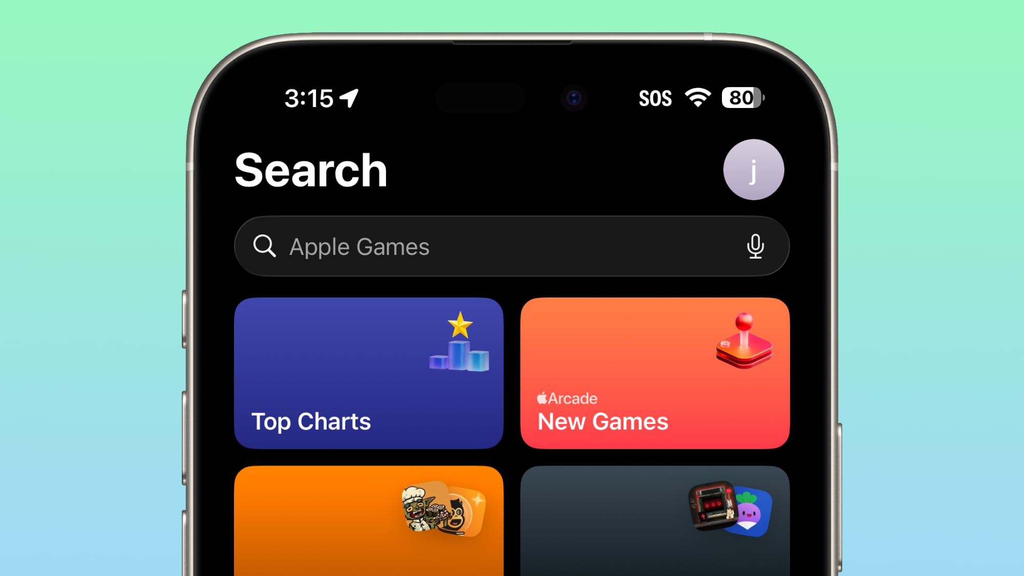
Games App
In the Games app, the search bar has moved from the bottom of the display to the top of the display.
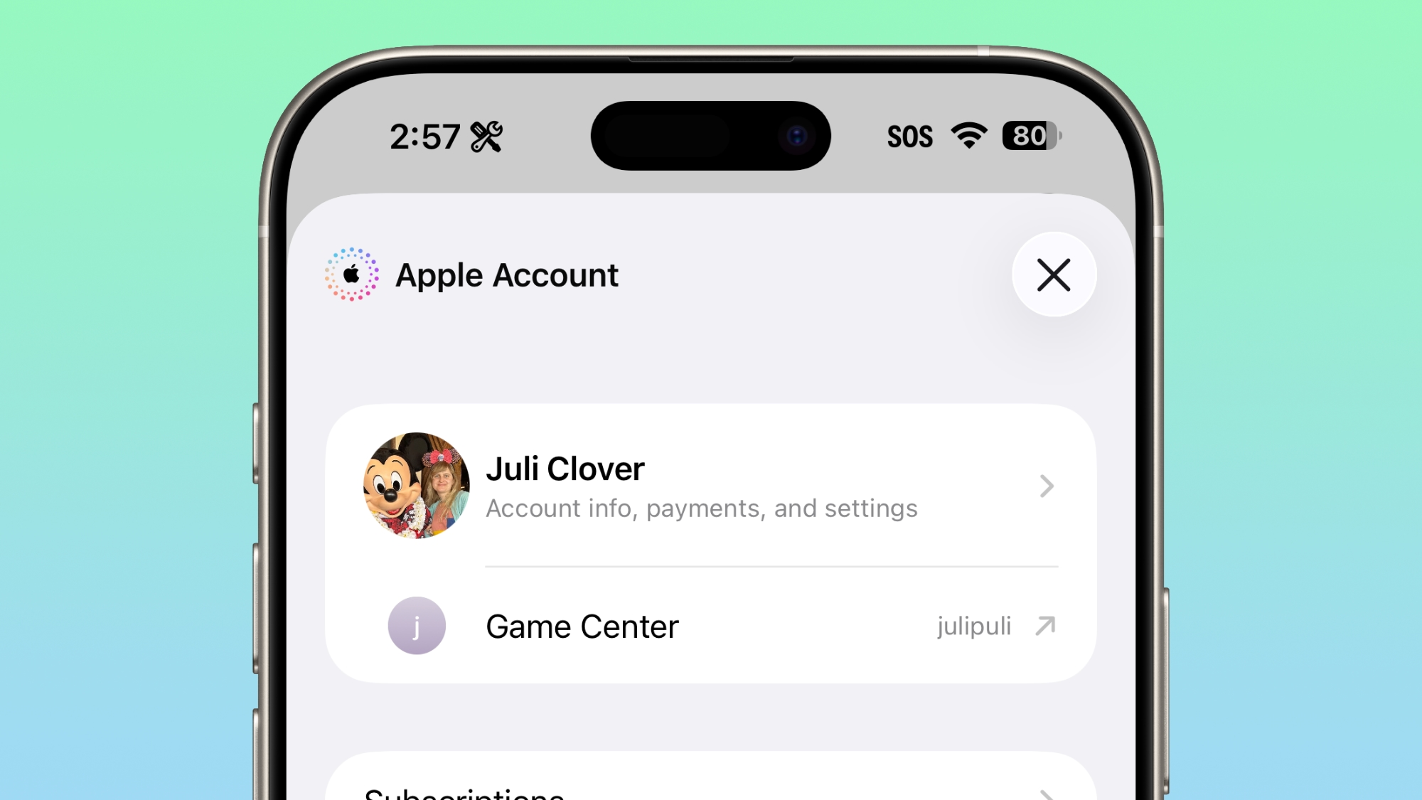
App Store and Apple Music
For the account hub options for the App Store and Apple Music, the "Apple Account" wording is now left aligned and has the same rainbow logo as the Apple Account in the Settings app
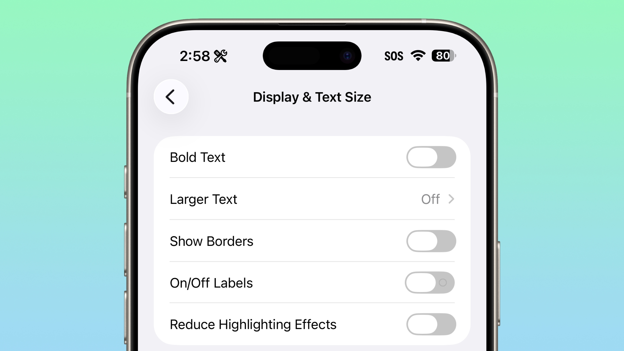
Accessibility
Under the Display and Text size section of Accessibility, there's a new "Reduce Highlighting Effects" option.
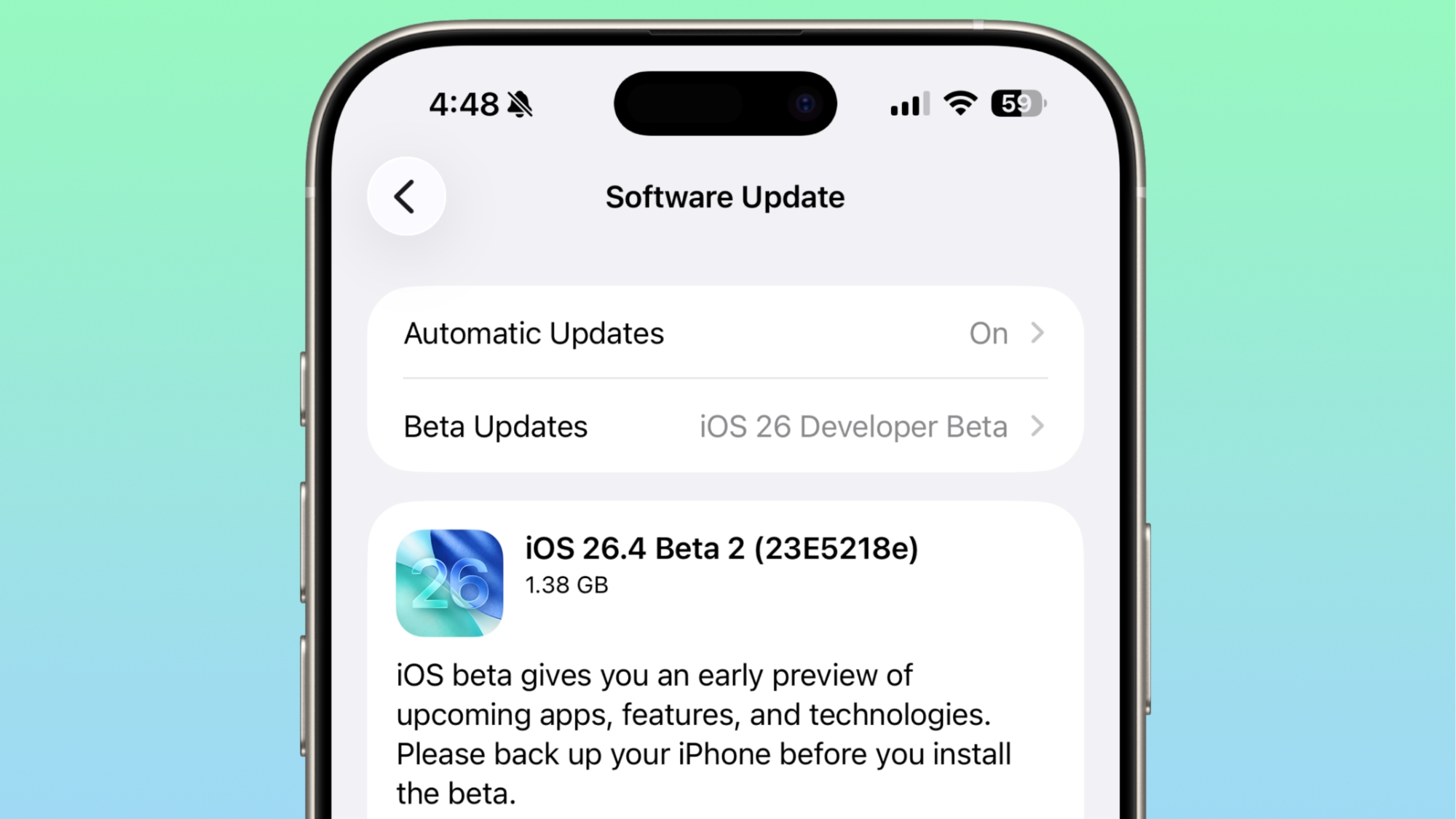
Software Build Numbers
When you're updating to a new iOS update in iOS 26.4, you can tap on the name to see the build number.
Beta Updates
Apple made a change to how betas work in iOS 26.4. If you are have betas toggled on but don't install any betas for a four month period, Apple will automatically switch you to the public release audience.
No Emoji
There are still no new emoji characters, despite signs of them found in the code in the first beta of iOS 26.4.
Playlist Playground
Playlist Playground is still limited to the U.S. and not available in Europe and other countries.
More New Features
We have a list of all the new features that were found in the first beta in our iOS 26.4 feature guide.
Article Link: Everything New in iOS 26.4 Beta 2
Last edited:
