It definitely does not. It’s all just as egregious as usual. The refractions around everything ruin Liquid Glass for me.I hope it stops them from moving when you move your phone around.

Got a tip for us?
Let us know
Become a MacRumors Supporter for $50/year with no ads, ability to filter front page stories, and private forums.
Everything New in iOS 26.4 Beta 2
- Thread starter MacRumors
- Start date
- Sort by reaction score
You are using an out of date browser. It may not display this or other websites correctly.
You should upgrade or use an alternative browser.
You should upgrade or use an alternative browser.

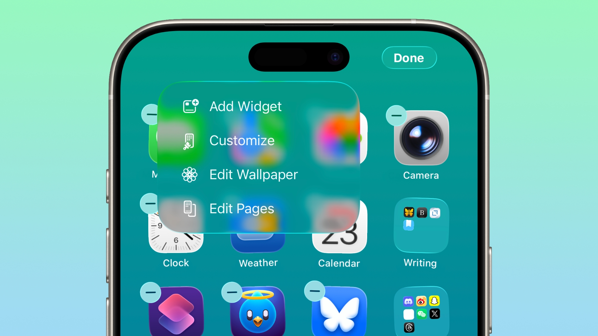
The "Edit" menu on the Home Screen uses more transparent Liquid Glass.
I'll pass, and remain on 26.0. With the iPhone 17 Pro, I'm still experiencing buyers remorse.
iOS and MacOs are just terrible from a design and functionality standpoint. Everyone I know feels like they can no longer type on thie iphones. Something broke.

Reeneman
macrumors 68020
26.0 is much worse than 26.3…I'll pass, and remain on 26.0. With the iPhone 17 Pro, I'm still experiencing buyers remorse.

stiligFox
macrumors 68000
It looks like they’re working on reverting the search to the way it used to work, which makes me happy.
The fact that currently in apps, tapping the search button replaces the rest of the menu options at the bottom of an app just seems… annoying for no good reason. It’s mostly in Music that it drives me crazy because if one time I use it, I search for a song, the next time I use it, I now have to do two taps to get back to my library or the home tab.
Having the search bar at the top and have the bottom bar remain static is less taps and also always shows what options are there instead of obfuscating them behind a meaningless music icon.
I love the Liquid Glass aesthetic but I feel like iOS 26 added a lot of things like this that require more button presses and I’m glad to see them reverting them. I hope they do it uniformly across all the apps…
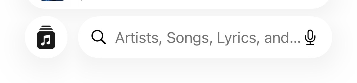
The fact that currently in apps, tapping the search button replaces the rest of the menu options at the bottom of an app just seems… annoying for no good reason. It’s mostly in Music that it drives me crazy because if one time I use it, I search for a song, the next time I use it, I now have to do two taps to get back to my library or the home tab.
Having the search bar at the top and have the bottom bar remain static is less taps and also always shows what options are there instead of obfuscating them behind a meaningless music icon.
I love the Liquid Glass aesthetic but I feel like iOS 26 added a lot of things like this that require more button presses and I’m glad to see them reverting them. I hope they do it uniformly across all the apps…

DocMultimedia
macrumors 68030
I'm not using the beta. I'm using the one that is already bad enough. 26.3. Based on posted images, 26.4 is getting even more transparent. A downhill mess.well you did sign to beta test the OS, this is what it means to test the beta, it is not the final release of the OS, it might look different when it gets final release.
Hopefully things change with 27.
Love-hate 🍏 relationship
Suspended
Battery life hasn't been improved for me on 26.3, fluidity has tho. I also get less than the myriad of bugs I used to getBoth are much better in 26.3 than earlier versions. So far, I haven’t seen any problems in 26.4b
Atomy_elektrony
macrumors newbie
What honestly amazes me is how many people seem to have seriously poor eyesight. I’d strongly recommend seeing a good ophthalmologist, because something is clearly wrong. Most of you keep going on about the “lack of readability” of Liquid Glass — and I have to ask: what exactly can’t you see there? I can see everything perfectly clearly — in the screenshots and in everyday use.
I’m actually glad that Apple often ignores comments from such “experts” as yourselves and follows its own path instead. If they listened to you, nothing would ever change — we’d have the exact same interface for 10, 20, even 50 years. You people are the real enemy of change. Your habits, your attachment to what’s familiar — that’s what keeps us stuck in something that hasn’t evolved in years instead of embracing innovation and progress. I don’t want that. I don’t want self-proclaimed experts like you who frankly have no idea what you’re talking about.
If you dislike it so much, then switch to Android with its ugly, childish interface. There’s no Liquid Glass there, and everything will be as “crystal clear” as you claim to need.
As for me, I’m genuinely happy with Liquid Glass — I like it. What they should really focus on is improving consistency across all apps, instead of obsessing nonstop over transparency levels.
I’m actually glad that Apple often ignores comments from such “experts” as yourselves and follows its own path instead. If they listened to you, nothing would ever change — we’d have the exact same interface for 10, 20, even 50 years. You people are the real enemy of change. Your habits, your attachment to what’s familiar — that’s what keeps us stuck in something that hasn’t evolved in years instead of embracing innovation and progress. I don’t want that. I don’t want self-proclaimed experts like you who frankly have no idea what you’re talking about.
If you dislike it so much, then switch to Android with its ugly, childish interface. There’s no Liquid Glass there, and everything will be as “crystal clear” as you claim to need.
As for me, I’m genuinely happy with Liquid Glass — I like it. What they should really focus on is improving consistency across all apps, instead of obsessing nonstop over transparency levels.
Do you actually find it perfectly legible? I don't just mean "can you still make out the letters"; but how easy is it to do so. Do you find this exactly as legible as crisp black text on a solid background?I'm asking because I find it perfectly legible, but don’t wear any corrective lenses.
Legibility can be measured objectively. It's not just on/off -- there's a sliding scale. Things that are less legible require more time to process. Yes, milliseconds, perhaps; but that's as fast as our brain is working, and there's all kinds of things to distract you at that rate. From your handle, I'm guessing you might know about how pattern recognition works in the brain.
There's a reason that books aren't printed with grey ink on grey paper. Typographers and typesetters study legibility at college. It's a thing. Saying "I can read it, therefore there's no legibility issue" is missing the point.
Last edited:

gaximus
macrumors 68030
This is what I came to say, I thought the new design is "Search bar at bottom of the scree". I think it's better there, and easier to reach, but it's taking me a while to learn it, and if it keeps moving around, I'll never get it.Is it just me or is search very inconsistent across apps?
Sometimes it’s at the top. Sometimes at the bottom.
It can be a bar. It can be a magnifying glass.
🤷🏻♂️
Is it? Should I upgrade? I usually leave it alone after purchase...this way I don't need to learn new bugs while current ones have been fixed. It merely means you keep on having bugs, just need to try to live with the changes.26.0 is much worse than 26.3…
I really wish they would separate their updates into separate packages, bit like iTunes got broken up:
Give a download for bug fixes. (yay!)
Give me a download for new features, possibly with new bugs. (optional for me)
Give me an option to have features removed. (depends on the features being removed)
Give me an option to totally alter the appearance. (with Liquid Glass I would have passed, YMMV)
neuropsychguy
macrumors 68040
I'll answer your questions briefly before I'm back to work.Do you actually find it perfectly legible? I don't just mean "can you still make out the letters"; but how easy is it to do so. Do you find this exactly as legible as crisp black text on a solid background?
1. Yes (although, what's "perfect"? Does such a condition exist?). It is easy for me. No eye strain, no difficulty for m that I've noticed. I've not had more eye stain. I'm not taking longer to do things on my devices that I've noticed. I haven't done fully scientific tests, however. If someone wants to pay me to do one, I will (see point 2). I can't speak for the experiences of others, I can only speak for my own.
2. I haven't done any direct comparisons. That would require a well-funded and large study displaying text on the same screens in the same conditions (e.g., overall luminosity of the screen) with a large sample of people from around the world. We'd need to measure things like reaction time, eye strain, reading comprehension, etc. I don't think it would be particularly feasible to do to get a fully fair comparison between the conditions or to conduct that. Again, if someone wants to cover my effort and the costs to do so, I will run this study.


Scooby_Snacks
macrumors member
The iOS search bar is a total disaster in iOS 26.. it used to be perfect, always located at the top, usually by pulling down - a behaviour that most of us learned and loved, then somebody thought it was a good idea to move it to the bottom of the screen which makes no sense - now apps that use the iOS search bar at the bottom of the screen have a much more confusing user experience, especially since search bars on other computing devices are always at the top of the app or page. I'm encouraged that they are moving the games app search bar back to the top and hopeful that maybe they'll revert back to the iOS 19 standard and abandon this terrible UX decision.Is it just me or is search very inconsistent across apps?
Sometimes it’s at the top. Sometimes at the bottom.
It can be a bar. It can be a magnifying glass.
🤷🏻♂️

Tagbert
macrumors 604
26.1, 2, and 3 brought a lot of fixes and performance improvements. Why stick to the dot-zero version?I'll pass, and remain on 26.0. With the iPhone 17 Pro, I'm still experiencing buyers remorse.
Yes, you should upgrade. These releases have mostly been bug fixes with only a few new features or visible changes. an upgrade from the .0 version will definitely give you fewer bugs and better performance in balance. 26.0 was rough. 26.3 feels quite smooth and stable, now. Still room for improvement but much better than before.
26.1, 2, and 3 brought a lot of fixes and performance improvements. Why stick to the dot-zero version?
Yes, you should upgrade. These releases have mostly been bug fixes with only a few new features or visible changes. an upgrade from the .0 version will definitely give you fewer bugs and better performance in balance. 26.0 was rough. 26.3 feels quite smooth and stable, now. Still room for improvement but much better than before.
Well, I upgraded. And indeed, feels the same. And the springboard doesnt feel laggy anymore. Thanks!

The Monkey 24/7
macrumors newbie
It isn't just you... and Apple are really starting to piss me offIs it just me or is search very inconsistent across apps?
Sometimes it’s at the top. Sometimes at the bottom.
It can be a bar. It can be a magnifying glass.
🤷🏻♂️