Become a MacRumors Supporter for $50/year with no ads, ability to filter front page stories, and private forums.

MacRumors

macrumors bot
Original poster
Apr 12, 2001
68,798
39,739


There's just about a month to go until Apple unveils new iPhones at its September event, and that means time is running out for Apple to perfect iOS 26. We've reached a weekly beta update cadence, and Apple seeded iOS 26 beta 6 to developers today.

iOS-26-Feature.jpg

There are changes to Liquid Glass, tweaks to navigation, new ringtones, and more.

Ringtones

There are now several variants of the Reflection ringtone, including Buoyant, Dreamer, Tech, Pop, Reflected, and Surge. Reflected is the "Alt 1" Reflection ringtone that was added in the second beta of iOS 26.

ios-26-beta-6-ringtones.jpg

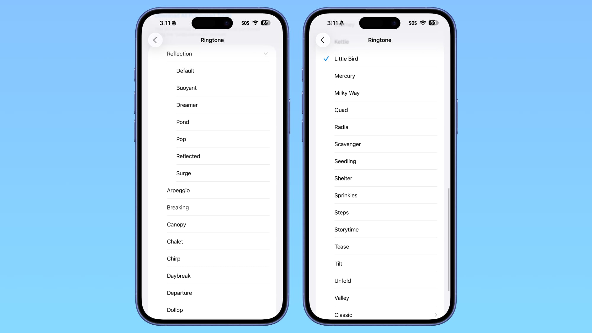
There's also a new Little Bird ringtone.
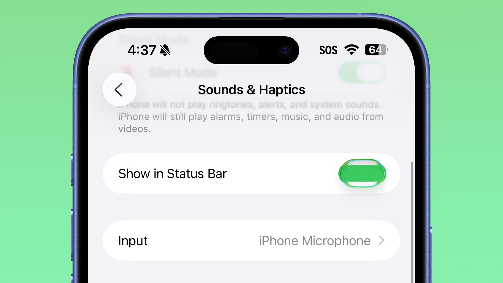


Toggles

Toggles now have a Liquid Glass effect when tapped.

ios-26-beta-6-toggles.jpg

Lock Screen

The Liquid Glass effect on the Lock Screen has been updated. The clock is more transparent than it was before, though it still has a frosted glass look.

ios-26-liquid-glass-lock-screen-changes.jpg
iOS 26 beta 6 on left, beta 5 on right

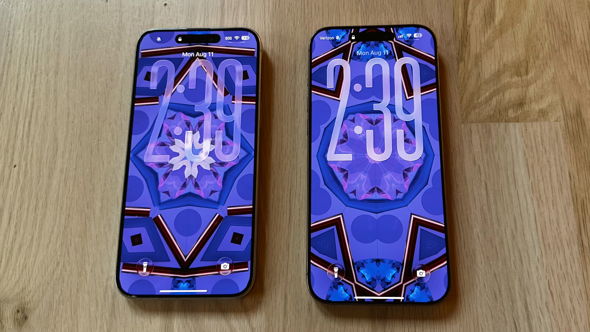
When entering a passcode, the passcode buttons are now more translucent than before.
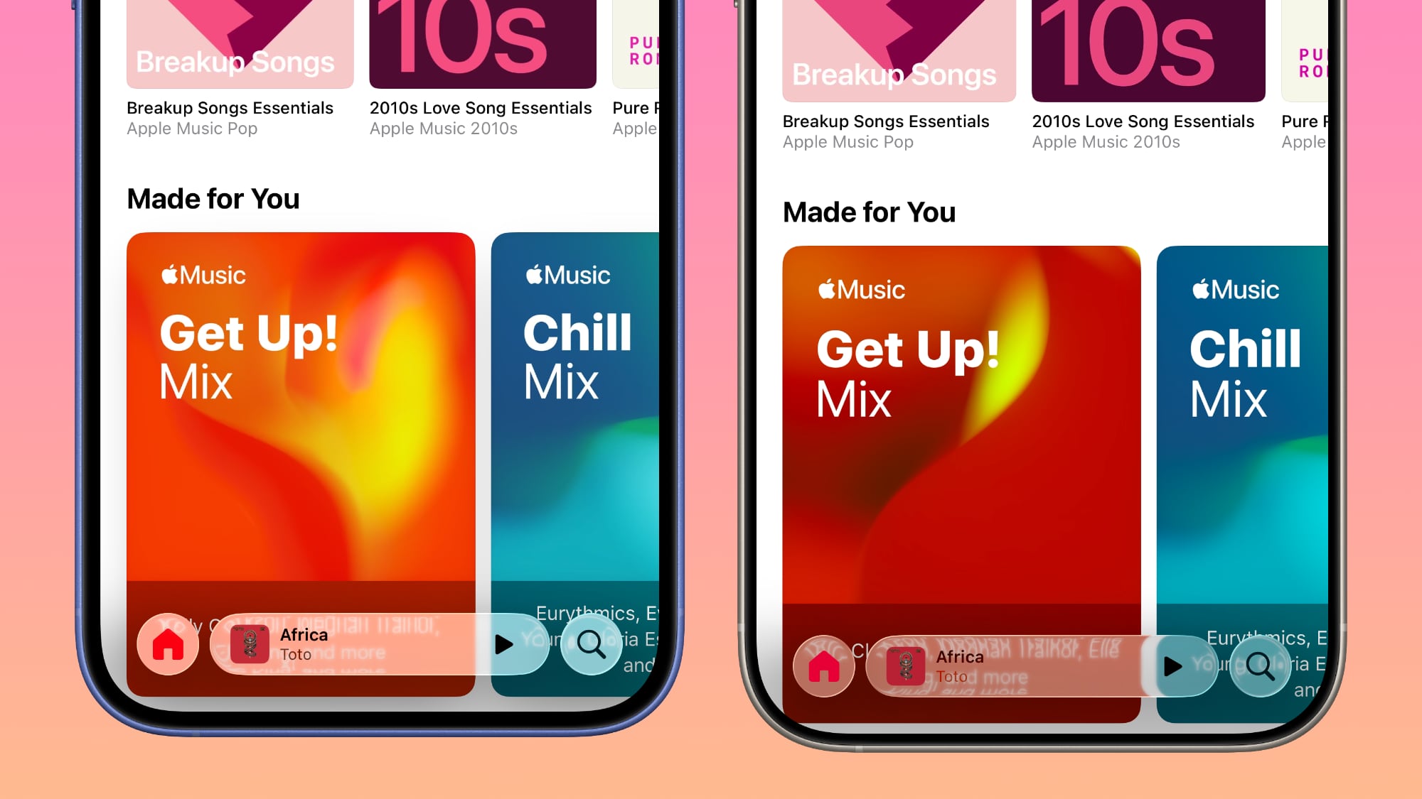
Navigation Bars

Navigation bars in apps have been slightly updated to enhance translucency without impacting readability.

ios-26-beta-6-navigation-bars.jpg
Beta 6 on left, beta 5 on right

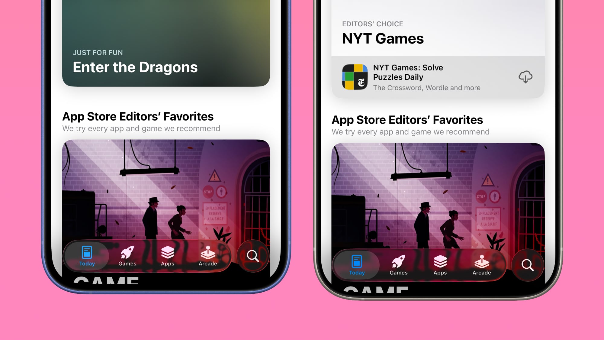
In some places, there's more translucency, but in others, the background is more opaque so that text can still be read even if the background is busy.

ios-26-music-app-beta-6.jpg
Beta 6 on left, beta 5 on right

App Animations

Apple changed the animation for opening and closing apps, and it's much faster than before so apps open more quickly. The animation has a very slight bounce to it, matching the bounce that's been added to the Lock Screen and Control Center.


Camera

Apple removed the toggle in the Camera app that allowed users to activate Classic Mode. Classic Mode reversed the scroll direction when switching from mode to mode in the app.

Now Classic Mode is the default, and there's no option to return to the animation from earlier betas.

ios-26-classic-mode-beta-5.jpg

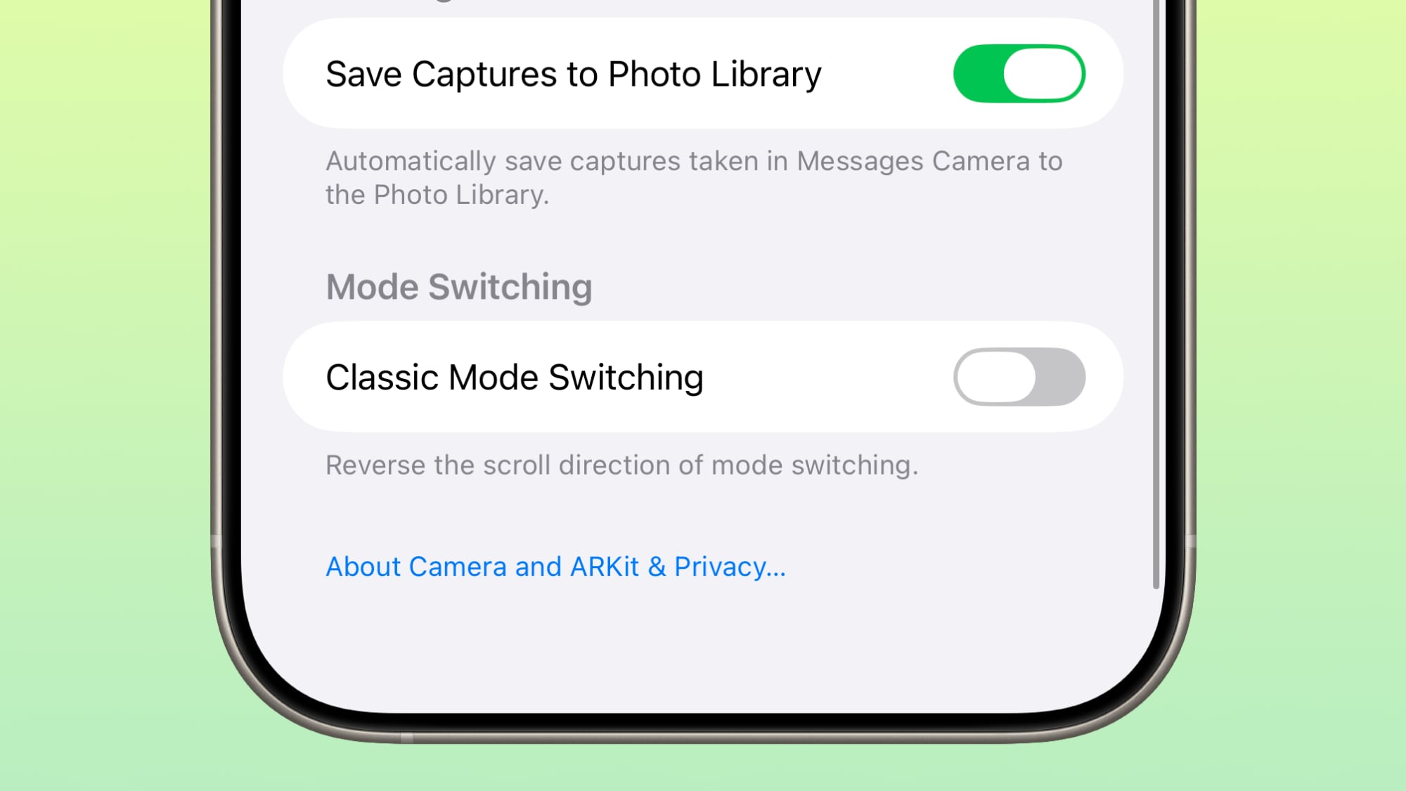
The toggle was initially added in beta 5.

Introductory Video

When you update to iOS 26, there's now an introductory video that walks you through the Liquid Glass design changes.


Preview App

Apple changed the design of the Preview app, adding larger buttons for creating a new document and scanning a document. When scanning a document, the location of the buttons has also changed, and they're at the bottom of the interface rather than the top.

ios-26-beta-6-preview-app.jpg

Read More

We have additional info on all of the new features in iOS 26 in our dedicated iOS 26 roundup.

Article Link: Everything New in iOS 26 Beta 6
 
Last edited:
  • Like
Reactions: jz0309
I feel Liquid Glass is getting better, but it's not there yet. It will probably be tweaked every time there is an update after the full release.

I don't understand why certain things like the lock screen clock being harder to read they thought is a good look. Also, the toggling looks ugly. However, I do like the animations more and how "snappier" things are
 
What are some bugs you have encountered that still exist?
They are all on iPad. Curious to know if others are seeing these issues.
1: when you click on the Home Screen (not an app icon) the screen opens the last app you were looking at.
2: if you have two apps open side by side, they both appear on the edges of the screen.

I haven’t loaded it on my phone because I can’t afford to be without the phone if something goes wrong.
 

Attachments

  • IMG_0154.png
    IMG_0154.png
    1 MB · Views: 38
Much less blur now on top in Safari on B6, looks significantly better. UI seems a lot snappier on my 16 PM. Great update so far.
 

Attachments

  • IMG_0009.png
    IMG_0009.png
    636.7 KB · Views: 55
  • IMG_0010.png
    IMG_0010.png
    705.6 KB · Views: 55
In English we read from left to right. So left comes old, right comes new. So left comes former beta, right comes new beta. Okay? Thanks.
Honestly it’s strange they’re still doing it at this point. The article becomes jarring to get through. Mind you, at least they didn’t swap half way through the article this time - or write beta 5 right, beta 6 left.
 
Last edited:
I feel Liquid Glass is getting better, but it's not there yet. It will probably be tweaked every time there is an update after the full release.

I don't understand why certain things like the lock screen clock being harder to read they thought is a good look. Also, the toggling looks ugly. However, I do like the animations more and how "snappier" things are
Yeah, that lock screen lock is now nearly unreadable.
 
  • Like
Reactions: bradjames83
I dont know what is going on with the articles writers phone but on my its not at all that opaque
 

Attachments

  • IMG_0117.png
    IMG_0117.png
    1.1 MB · Views: 39
I dont know what is going on with the articles writers phone but on my its not at all that opaque
You’ve probably already noticed it, but the system adjusts the effect based on the content underneath in an attempt to optimize legibility. It does this by some combination of adjusting the opacity of the gradient, inverting its color, and inverting the colors of the glass views themselves.
 
What is the purpose of the Preview app? It's just a carbon copy of the Files app, there's literally nothing different about it other than the weird backsplash that looks like a rendering error.
A purpose-built app to view and mark up files instead of manage them. Files that can be opened in Preview now open in the Preview app.
 
maybe one day in a decade or two we'll get a real system wide graphic EQ (no presets) and it will remember settings for each Bluetooth audio device... then the ios audio subsystem will move from 90s ipod tech to at least early 2000s. LOL... come on, apple please do it!
 
I just can’t get over the ugly pill shaped toggle. Old one looks much more pleasant. Why change toggle shape for the sake of change?
But I suppose that’s how Apple shoehorn unpleasant little things at us, considering after 6 betas they had no intention to revert the design back to pre-iOS 26 design.
 
Register on MacRumors! This sidebar will go away, and you'll see fewer ads.