Apple overhauled the Control Center in iOS 18, and it's one of the biggest changes to the iPhone and the iPad outside of the new Apple Intelligence features. The interface is much more customizable, there are more Control Center options, and controls can be accessed from new places.
This guide highlights all of the new Control Center changes that Apple added in iOS 18 (and iPadOS 18).
Reorder Controls
With iOS 17, you could choose some of the controls that were available in Control Center, but in iOS 18, customization goes much further. For the first time, you can rearrange Control Center quick access buttons into a layout that best suits your needs.
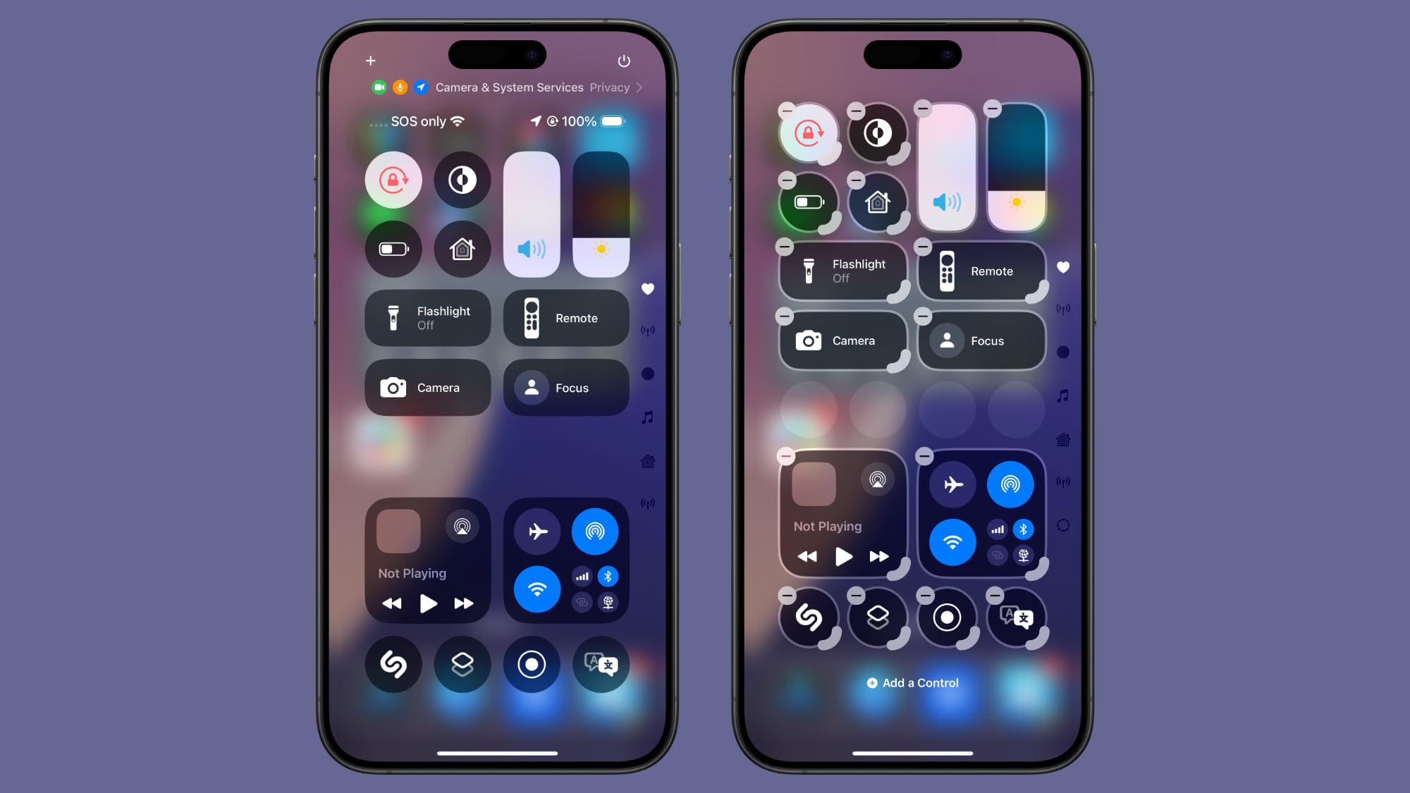
Apple has designed a Home Screen-style grid for the Control Center, with an 8x4 arrangement of open circular spots where different controls can be placed. You can fill up all the empty circle spots, or choose to leave blank spaces between columns and rows.
None of the Control Center buttons are permanent, and every one that you opt to use can be moved, duplicated, deleted, and rearranged as needed. To move controls, follow these steps.
- Swipe down from the right upper corner of your iPhone or iPad display to open up Control Center.
- Long press on any empty space and hold until the grid shows up, or tap on the "+" button at the upper left of the display.
- Use a finger to grab an icon and move it where you want it to be.
- Tap at the top or the bottom of the display to exit the grid mode.
Resize and Delete Controls
Control Center controls can be resized, so you can make your most used buttons bigger and easier to press. Single button controls like Dark Mode, Flashlight, Timer, Low Power Mode, Voice Memo, and Remote can be up to four grid circles in size.
Options include a single grid circle, a two grid circle that's horizontal, which adds the control's name, and a four grid circle arranged in a square shape. The majority of controls are limited to these sizes.
Some modules like volume and brightness can only be two horizontal circles in size, with Apple not offering an option to modify the shape or size. The aggregated connectivity controls can take up four spots of the grid in a square shape, or the entire thing with no options in between.
Controls like those for multiple smart home accessories and scenes have more sizing options and can be four grid spaces long or four spaces in a grid, eight spaces, sixteen spaces, or 24 spaces at maximum. The Now Playing control has a similar set of options, but can take up the entire grid.
To resize controls, follow these steps:
- Long press in an open space in the Control Center or tap the "+" button.
- Grab the bottom right corner of an icon, which has a curved, highlighted marker to indicate that it can be manipulated.
- Drag and pull outward to make a control bigger, or push up and over to make it smaller. There will be minimum and maximum sizes that vary for different controls.
- Tap at the top or bottom of the display to exit the editing menu, or just wait and it will close automatically after a few seconds with no interaction.
Controls Gallery
Control Center controls are now organized into a gallery that can be accessed from the Control Center interface. To get to the Control Center gallery, long press on the display or use the "+" button to enter editing mode, and then tap on "Add a Control."
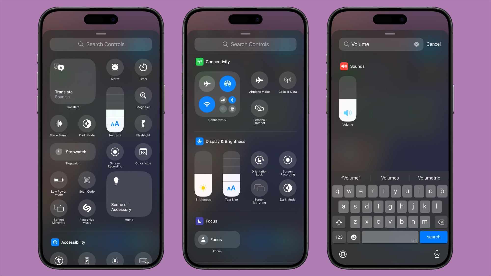
The main part of the gallery has a selection of suggested controls, and if you scroll down, you'll see options organized into the following categories: Accessibility, Capture, Clock, Connectivity, Display and Brightness, Focus, Hearing Accessibility, Home, Motor Accessibility, Notes, Now Playing, Remote, Shortcuts, Sounds, Translate, Utilities, Vision Accessibility, Voice Memos, Wallet, and Watch.
There is a search interface right at the top of the gallery so if you're looking for something specific, you can just search for it rather than having to swipe down to try to locate it manually.
Multiple Screens
Control Center has been just a single screen for the last few years, but that's changing in iOS 18. You can set up multiple screens for your controls, which means you can have dedicated pages for things like connectivity controls, HomeKit devices, and Accessibility options.
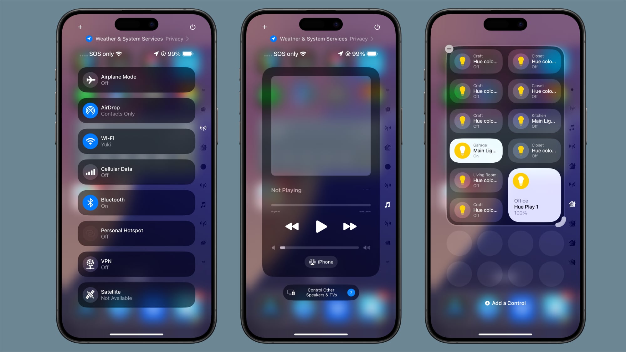
There are multiple pages by default when installing iOS 18, and you can customize them to your liking and add and delete pages. Control Center supports up to 15 separate screens.
Navigating through pages is done by swiping up and down through Control Center, tapping the small icons on the right side of the display, or holding a finger over the icons and scrubbing through them. As you add controls to different pages, Control Center automatically assigns an icon based on what's on the page. You can't customize the icons at this time.
Here's how to add pages:
- Swipe down from the right hand side of the display to get into Control Center.
- Tap on the circle icon at the bottom of the icon list, which denotes a blank page.
- Tap on Add a Control to select the controls that you want to include on the page.
- When finished, tap anywhere at the top or bottom of the display to exit editing mode.
There are some limitations to what can be on a single page. Control Center won't allow you to add a single-sized icon to a page and then create another page - the create new page option won't show up while an existing page still has enough space to accommodate icons. It does offer the option when a page is about half full, which provides enough wiggle room to have spacing between icons.
To remove a page, you just need to delete all of the controls on it following the steps up above.
Power Button
At the top right of the Control Center, Apple added... Click here to read rest of article
Article Link: Everything New With the iOS 18 Control Center
Last edited: