Become a MacRumors Supporter for $50/year with no ads, ability to filter front page stories, and private forums.

MacRumors

macrumors bot
Original poster
Apr 12, 2001
67,794
38,391


Facebook's "classic" web interface is set to become obsolete in September, according to a Facebook support page spotted by Engadget.

facebookredesign.jpg


Mark Zuckerberg unveiled the refreshed design over a year ago at Facebook's "F8" developer conference. It has been the default since May, with the option to voluntarily return to the previous design. From next month, there will be no facility to access the old design and all users will have the updated look.

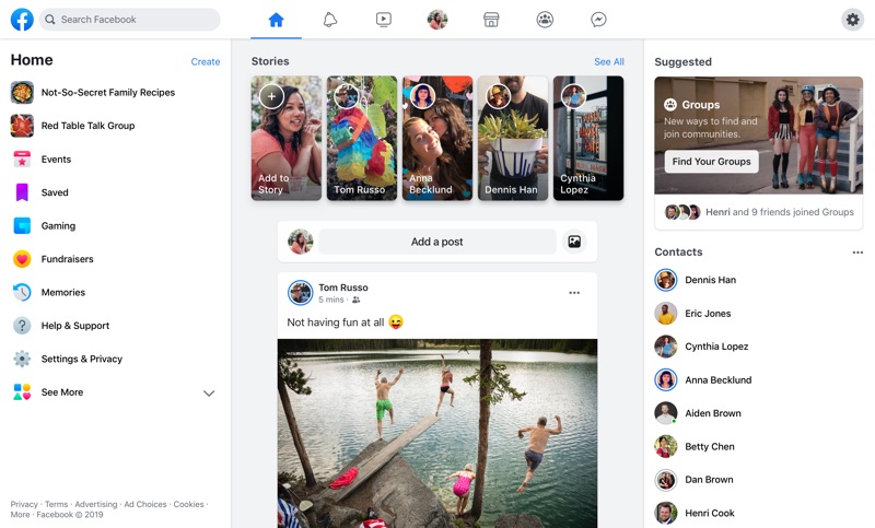
The new design is a significant change from how Facebook has looked for most of its life. It places more emphasis on groups, switching between public and private spaces, and displays more pronounced links to Facebook's updated Watch, Marketplace, and Gaming sections. The motivation behind the redesign was to bring the experience of the Facebook mobile app and the Facebook website to parity, and refresh the overall look of the social media platform.

Article Link: Facebook to Remove 'Classic' Web Design Option Next Month
 
  • Angry
Reactions: jbachandouris
Honestly I have been tiered of Facebook for a long time. Ever since they decides that the algorithm should decide what I see and killing the option "Most resent" which literally were the most recent post, not comments and such.
Only reason I still stick around is a little information that only comes in groups, and the calendar since most things are planed/made on Facebook.
And of course messenger
 
The new layout loses the Most Recent option for your newsfeed, in other words the Most Sensible option, so you're forced to follow their algorithm. When your newsfeed loads, across the top there are icons for gaming and marketplace that most people never use. Beneath that are large icons for those childish "Stories" that only people with truly short attention spans actually use. Likewise the row beneath that for rooms (is it?). The finally, you actually get to a post from someone. Or perhaps an ad for things they think you want.

Truly awful.
Most Recent is still on the left under more and right down the bottom.

Still there but a real PITA to get to.

Business pages look better layout but the rest is utter garbage.
 
It's been the default since May? I still have the old design, and there's been no option to change to the new one despite multiple articles claiming there's an option.

Same for me. Apparently if you were an early adopter and created an account on their first server, you still see the old design with no option to switch.
 
  • Like
Reactions: ErikGrim
It should be a plain white page saying "Close this page and get an actual life...". It has now been 16 months of irreversibly deleting my Facebook and Instagram accounts, and I have been blessed every minute since. The amount of time I got back for myself is unbelievable and I wasn't even an avid user!
 
I really dislike the new look and went back to Classic, I don't think they could put more wasted whitespace on the screen even if they tried, why are things so large now??! I only access it in the browser, I strongly dislike Facebook and I won't have the apps on my devices.

Really wish it was easier not to have Facebook, but I was the awkward one when a wedding was being organised via a Facebook group so ended up creating an account again, now most of my interest groups for cars have moved from the forums to Facebook groups . 😞
 
Most Recent is still on the left under more and right down the bottom.

Still there but a real PITA to get to.

Business pages look better layout but the rest is utter garbage.
Well when the businesses are the clients and the users are the product, that makes sense.
 
Register on MacRumors! This sidebar will go away, and you'll see fewer ads.