Finally, a lot of issues, such as the obtuse people not knowing what to tap (as if you really don't know after using a smartphone for however many years), can be fixed by proper iOS 7 app design. iOS 7 apps are supposed to have a control color, eg. yellow for Find My Friends. EVERY control should have that color, and non control text should be black. Apple's most recent updates do this well.
OK, you defend too much for iOS7 and you are going to pay for it.
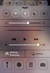
Look at the UI of the new control center:

Now, tell me how can I open the 'Music' app like I did in iOS 6? I can't.
You need to press the 'Play' button to start playing a song to have the UI displaying the name the currently playing track (under the progress bar). That name (in bold white text) is the 'button' for invoking the music app. What a obvious thing!
Again, at the same control center, look out the side by side 'Air Drop' and 'Air Play' rectangle areas.
Oh, I see, they are clickable buttons
But, in contrast to the standout Air Drop button with bold white text and icon, why the Air Play button looks nothing like a clickable button?
Even more funny, when I captured the screen dump, there was not any Air Drop peer around but I got the brighten up Air Drop button; in contrast, there is actually an Air Play server around, yet the Air Play button is flat and plain.
What a genius!
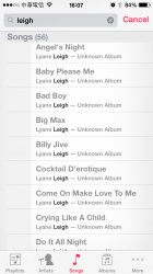
Now look at how Music player present all the artist, track, album etc. that match your search:

All the name of the found tracks are in gray color except the matched term is highlighted in black.
Since when users are suppose to interact with gray-out item?

