Become a MacRumors Supporter for $50/year with no ads, ability to filter front page stories, and private forums.
I often wish this site did the profile field bits on top of the posts instead of to the left. Example here (please never mind their images in sigs, thankfully that won't be something we see on MR) It takes a little while to get used to but I think it looks really nice and makes pages appear much tidier when larger images are posted.

I don't care for this at all. Putting the profile right on top of the post text visually and cognitively distracts from the information presenting in the post. The icons also intrude on the message posted.
 
I don't care for this at all. Putting the profile right on top of the post text visually and cognitively distracts from the information presenting in the post. The icons also intrude on the message posted.
Clearly we all have our preferences. I was once on a forum that had that style and I didn't like it at first but then it grew on me, especially when it comes to posting inline images.

I don't really care one way or another because I am fine with MR as it is but it was a suggestion. Bear also in mind that the link I provided has theirs centered and squished on the page a bit more than is desirable, I just couldn't find another example in the amount of time I allowed for finding a suitable link.

Sorry iBlue; I didn't mean to come down so hard on your point of view. Perhars I would like it better if I used it for awhile.
 
Something like this google search?
Personally, I like the way MR does it. But some like the iconic feel of the search bar. IMHO, that would be okay if there is a demand. But like you showed, it's already available via the drop down menu.

What I like about MR, is that it is easy to browse since there are few distractors. It's an effective presentation.

Sure some forums have info such at the exact post count. Who cares. If someone wants to know, they can always click on the members name and view their profile.
 
I disagree greatly with everyone

I love this forum for the way it looks

Not too complicated yet sophisticated

+1

Although a change would be nice, I don't see why it's necessary, I prefer seeing arn making other sites like AppShopper and Touch Arcade in his time.
 
Yeah, MR definitely looks a bit dated. If/when there is a redesign, I just really hope it isn't totally web 2.0-like. I think that the new design has to keep the same simple, classic, and uncluttered feel that the current site has.
 
I do agree MR is looking very outdated, and now that its getting a lot more traffic and recognition, it would be nice for things to look more 'polished'.

Although, if InsanelyMac's update is an example, I'd rather still oldschool-MR.

In one of the other Forum Design threads, someone designed a very beautiful layout/design.

I can't for the life of me remember who it was, but it was perfect IMO.
 
Macrumors just looks a lot like OS 9.

Somebody needs to tweak the website I think, not completely redesign it.

Leave the simple and effective layout the way it is, just make it look more modern. and preferably not cliche.
 
I like the first one. Not a bad start though.

I bet there are dozen great forum layouts out there that we all may like.

I wondered when MR gonna be redesigned? Maybe a minor bump, like how Apple did with their tabbing on apple.com, something like that.
 
The only things I can suggest would be to perhaps change the site's banner, and the other would be to change the forum color from blue to the burgundy in the MR logo. Other than that, it looks fine.
 
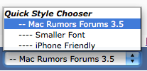
I like the current theme. Easy to read. If a redesign is implemented, please allow us the choice of the new or old theme. Just add to the list:
 

Attachments

  • Picture 2.png
    Picture 2.png
    12 KB · Views: 195
I agree--it would be nice to be able to change the colors. Also, another vote to incorporate MRoogle as the search function; the current one isn't very good. Otherwise I like the simple lay out.

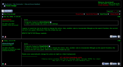
Maybe even automatically change the colors at night to a black background.
attachment.php
 

Attachments

  • Picture 4.png
    Picture 4.png
    119.4 KB · Views: 207
hmm I like it the way it is! I reckon we should leave it!

Its simple and functional. I mean design isn't exactly necessary and as someone has already said, "If it ain't broke don't fix it!"
 
This forum's much easier to read. I don't like the text squeezed into the smaller boxes on the other one.
 
Register on MacRumors! This sidebar will go away, and you'll see fewer ads.